This site uses cookies to improve your experience. To help us insure we adhere to various privacy regulations, please select your country/region of residence. If you do not select a country, we will assume you are from the United States. Select your Cookie Settings or view our Privacy Policy and Terms of Use.
Cookie Settings
Cookies and similar technologies are used on this website for proper function of the website, for tracking performance analytics and for marketing purposes. We and some of our third-party providers may use cookie data for various purposes. Please review the cookie settings below and choose your preference.
Used for the proper function of the website
Used for monitoring website traffic and interactions
Cookie Settings
Cookies and similar technologies are used on this website for proper function of the website, for tracking performance analytics and for marketing purposes. We and some of our third-party providers may use cookie data for various purposes. Please review the cookie settings below and choose your preference.
Strictly Necessary: Used for the proper function of the website
Performance/Analytics: Used for monitoring website traffic and interactions
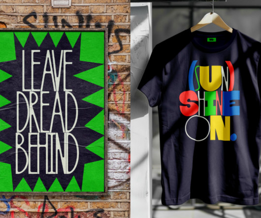
Otto by Dinamo Developed by Amsterdam-based designers Sam de Groot and Laura Opsomer Mironov, Otto is a text typeface with a cheerful, subtly cartoonish presence. Accompanying the font is an actual storybook—also called Otto—written and designed by de Groot.
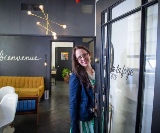
And Denise Foy, owner of De La Foye Design Studio , is quite clear about where her passion lies. De La Foye Design Studio describes itself as a place "where businesses come to find their inner creative voices when enhancing their brand and online presence". To create great websites, you need to have a passion.
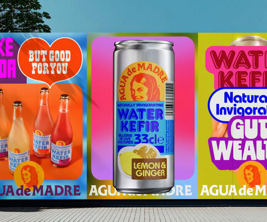
Designed by award-winning creative director Chris Chapman, adam&eveDDB's new brand identity for Agua de Madre fizzes with joy and purpose. Agua de Madre is a water kefir traditionally brewed in small batches in London. Chris's rebrand has captured all that I was aiming for when I created Agua de Madre," says Nicola.
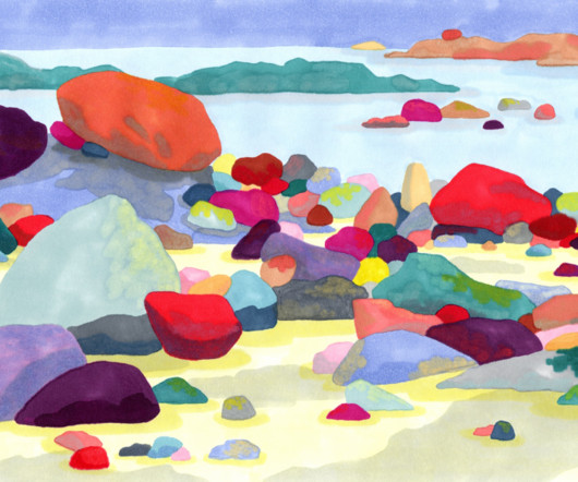
The striking forms of the boulders at Côte de Granit Rose in Brittany put Agathe's images of this area among the most memorable in her portfolio. She continues: "Living for a year by the sea made me want to draw the Breton coasts, challenging myself with landscapes I'd never drawn before.
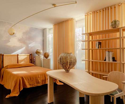
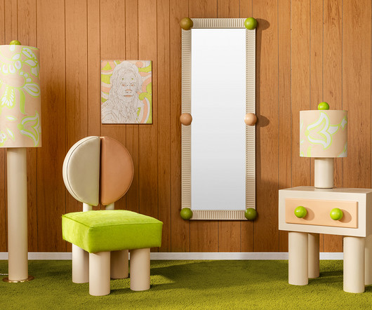
Portuguese furniture maker De La Espada is celebrating 25 years with the unveiling of the Twenty-Five Collection at The Future Perfect’s New York gallery space. Like all of De La Espada’s furniture, every product is made to order in their solar-powered plant in Portugal. Twenty-Five Bed, Special Edition.
Complementing this central theme, materials such as gabion walls, frosted glass bricks, and Ceppo De Gre stone were integrated to evoke a cohesive yet strikingly unique environment. True to its name, the Vaulted Monochrome Haus employs a grayscale palette, accented by Ceppo De Gre marble a rugged stone rarely used in Indian interiors.
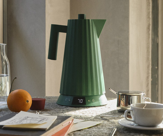
An expansion of the Pliss series by Michele De Lucchi , the new kettle offers precise temperature control and now comes in a soft, subdued blue, in addition to the original white, black, and green. I reduced my project to the essentials of a column with a rotating head and then preferred to have fun at the lathe, De Lucchi shares.
Developed by Bruno Bernard in collaboration with the Centre Scientifique de Monaco and the Comit National des Traditions Mongasques, it addresses the language's unique tonal accents with an intuitive input system. It's available to download for free.
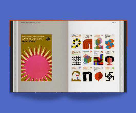
Rudolph de Harak Graphic Designer: Rational Simplicity book by Richard Poulin His love of books and sharing design with the world led him to release, Rudolph de Harak Graphic Designer: Rational Simplicity , a tribute to one of the most influential graphic designers of the mid-twentieth century.
Which brings us to the Devialet Dione Opéra de Paris, a special edition of the French brand’s iF Design Award 2023 and Red Dot Winner 2023 award-winning Dolby Atmos 5.1.2 Devialet’s standard matte black soundbar was handsome and capable enough already. connectivity.
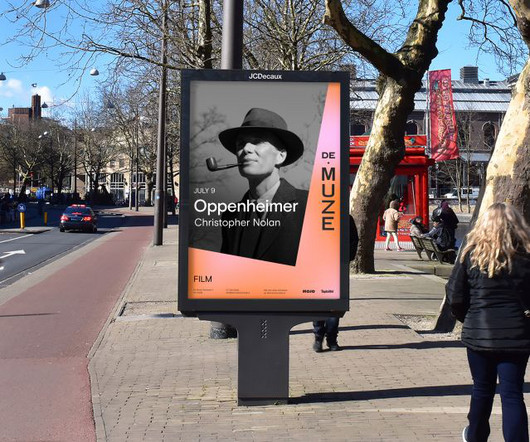
And it's this scene that sparked the fresh identity for the Theatre De Muze , a beloved cultural icon nestled close to the sea in The Netherlands. As always with these projects, the new identity also marks a new chapter for the Theater De Muze – a new dawn, and a new beginning, if you will.
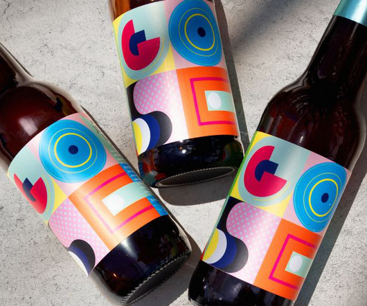
Bala co-founder Rodrigo de la Reguera remembers the first time he tasted GOSE beer one summer afternoon on a terrace in the Juárez neighbourhood of Mexico City. He describes his first experience of tasting it as "multi-sensory, with acidic notes and a salty, malty, and herbal profile".
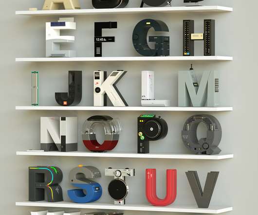
As a graphic designer based in Rio de Janeiro, Vinicius Araújo enjoys experimenting with letters and it’s very obvious in his latest side project, titled 36 Days Electronics. Mixing graphic design, industrial design, and typography, he created an entire alphabet in which brand styles are applied to letters.
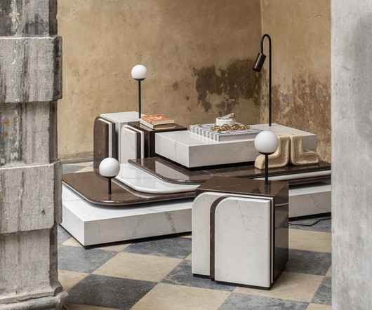
The ongoing exploration by Italian artist and architect, Vincenzo De Cotiis – recently presented at Carpenters Workshop Gallery in Los Angeles, California – examines cultural contamination, cross-pollination, and displacement through a palette of dark monochromes and organic compositions in a raw expression that is as decadent as it is daring.
HONDO Based between Palma de Mallorca, Spain and London, HONDO specialises in branding, editorial, typography and product design. Photo: Thomas Adank CAM – Centro de Arte Moderna Gulbenkian identity by A Practice for Everyday Life, 2024. Photo: Ed Park La Biennale di Venezia identity by A Practice for Everyday Life, 2022.
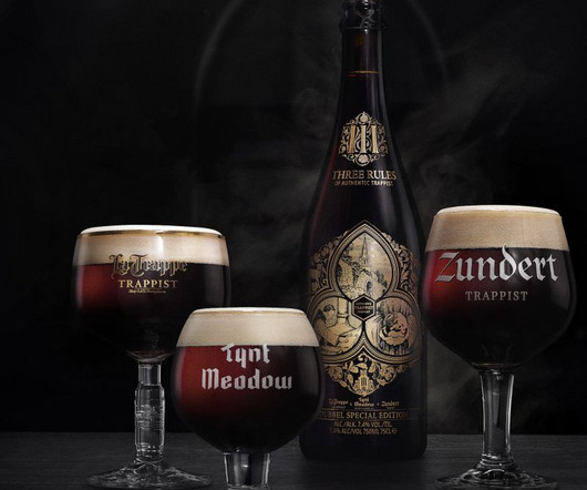
How Tte de la Course embraced the concept for a special edition Trappist beer and used it to craft an object of desire Golden artworks gleam on deep brown glass. Tte de la Course was asked to develop a name, package design and campaign, explains Ruud Cuijpers, creative director. Meticulously drawn gothic ornamentation.
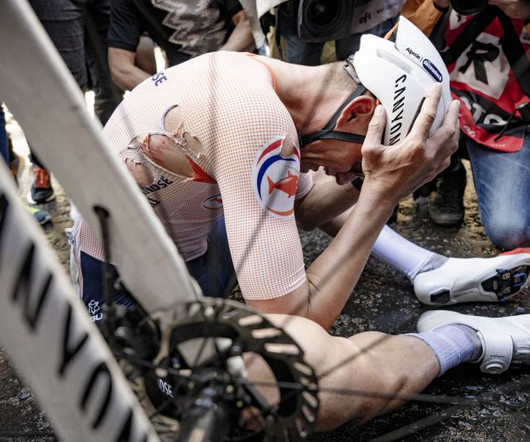
His work reminds us of infamous incidents like Giuseppe Guerini's collision with a spectator on Alpe d'Huez in 1999, Joseba Beloki's horrific fall that ended his career in 2003, or Mark Cavendish's numerous high-speed tumbles, which have become part of Tour de France lore. But it's not just the spectacular accidents that Kramon captures.
Brand and design studio Koto has found a novel way to communicate eco-friendly credentials with its identity for sustainable packaging company De-extinction. To help encourage people to remember to use eco-friendly alternatives, Koto has created a striking identity for sustainable packaging company De-extinction.
It started with an engagement and ended with the Galliforms furniture collection – that’s the story according to Leah Ring of Another Human and her now husband, artist Adam de Boer. The artistry of de Boer’s pattern work was drawn from the plumage of peacocks. (It’s
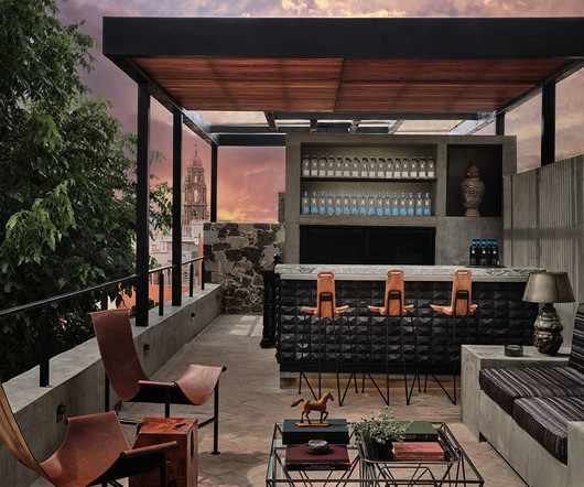
As the taxi’s tires hit the cobblestoned streets of San Miguel de Allende, Mexico, my curiosity to peel back the layers of this 16th-century colonial town ignited. The crowd was filled with a joie de vivre of passionate party people, with high standards and respect for true artisans.
For well-documented historical figures like Admiral Luis de Córdova, a Navy officer best known for his service in the Anglo-Spanish War, Jose worked directly from period paintings and images to ensure maximum historical accuracy. These broadly fell into two categories.
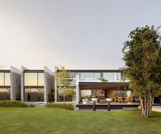
Located in Santiago de Querétaro, Mexico, Casa Catedral is a bold architectural project by Laboratorio de Arquitectura , spanning over 8,600 square feet. To see more from Laboratorio de Arquitectura, follow them on Instagram here. From the front, Casa Catedral appears to be a monolithic structure with no views to the inside.
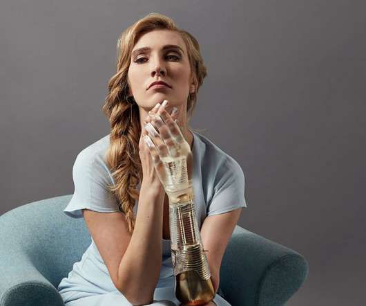
Artist and sculptor Sophie de Oliveira Barata has combined art, technology and science to create artificial limbs, which are wearable art pieces for performance and exhibition. Synchronised is a re-imagining of the prosthetic arm as a piece of jewellery. Image by Omkaar Kotedia, co-created with Dani Clode.
Who to include Artists in the connection include Anna Maria Kioss, Leonie Bos, Monique Bröring, Saša Ostoja, Anne Claire de Breij, Claudie de Cleen, Krista van der Niet, Paul Faassen, Michelle Wagenaar, Jaap Scheeren, Gino Bud Hoiting, Daantje Bons, Jan Rothuizen, Eva Cremers, Joost Stokhof, Willemien Ebbinge and Aisha Zeijpveld.
For Nancy Hou and Josh de Sousa, founders of design studio Hou de Sousa , urban thoroughfares and public squares are a blank canvas. In the Flatiron District in Manhattan, Hou de Sousa also recently installed a piece called “Tulips,” which reimagine lamp posts as giant flowers blossoming toward the sky. .
His most recent sketchbook was created last year for the Musée d'Histoire et d'Art de Bormes – MHAB – which serves the medieval village of Bormes-les-Mimosas on the French Riviera. We've published several books about aviators, the French aerobatic team Patrouille de France, and the National Air and Space Museum near Paris.
The main reference point for Hill’s designs was “the Dutch masters, specifically Bram de Does and the typeface Lexicon, regarded as one of the best type designs in history,” he says. “In As such, it’s also highly legible across even longer lines of text.
Funciona con todos los estilos de fotografía, tanto para influencer, fotos de viajes, como para tus fotografías de retrato y cualquier cosa que se te ocurra! Son absolutamente increíbles y quedan especialmente bien para fotografía de viajes y cinematográficas, aunque funcionan con todos los estilos de fotografía.
This technology can now also be applied to furniture, opening new doors for innovations in interior design and the hospitality sector,” said Astrid De Couvreur of Modular. This can be integrated into materials like wood and stone, creating an expanse of new material technology.
In 2020 he was featured in the De Young Open in San Francisco, a juried community art exhibition. Looking back, The de Young Open in 2020 was probably the most notable of my endeavours as an emerging artist.". Coming from a graphic design background, Patrick Nelson has been a full-time collage artist now for a number of years.
Most recently, we reported on their work for Theatre De Muze. "We Clients include disaster relief organisation Giro555, youth health community JOGG, research foundation Stichting Toekomstbeeld der Techniek, pregnancy and baby app 24baby and the Museum of Literature. We believe that making good work is not incidental," they say.
Gluck: Art and Identity by Amy de la Haye and Martin Pel. They included Lee Krasner and Elaine de Kooning, whose incredible talent was at times overshadowed by their husbands, Jackson Pollock and Willem de Kooning. It's all meticulously researched, fully comprehensive and endlessly fascinating.
In Paris’s 4th arrondissement near the historic Place de Bastille, a renovation has taken place within the prestigious Hotel de Sagonne. The Hotel de Sagonne is an architectural treasure protected by strict heritage regulations.
After experimenting and nailing down the perfect paint colors, she created resin surfaces using her own technique that adds the pièce de résistance to the wooden frames. Film credits: Direction by Jérôme de Gerlache, Images Jérôme de Gerlache/Pascal Boudet, and Music by Cyesm
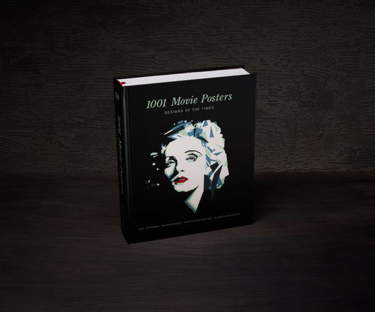
I limited the selection to final posters that were actually used for the promotion of films at the time of their first release and tried to pick out the crème de la crème from all genres and periods." "I wanted the book to cover the last 100 years of film poster design from around the globe," says Tony. "I
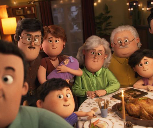
Authentic moments Miguel Alonso Lamamié de Clairac, senior brand manager of Suchard, explains the thinking behind the ad. It's all quite reminiscent of the Pixar movie Up in terms of its tone, animation style and the quiet efficiency of its visual storytelling.
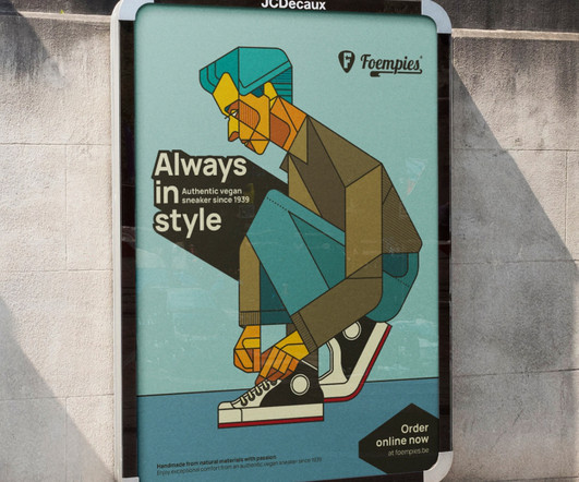
Artist Bart De Keyzer developed a personal project featuring Foempies, a vegan and sustainable shoe brand. Bart’s goal was to create something that puts honesty and simplicity first.
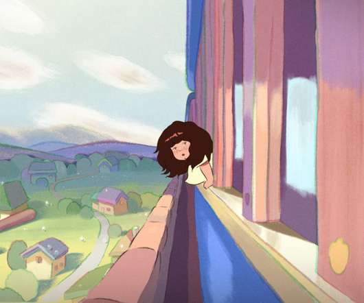
Remembers is headed up by Felix de Givry and Ugo Bienvenu, whose previous work includes striking animated visuals for Chanel's Métiers d'Art show, the Opéra national de Paris, and the music video for At The Door by The Strokes.
“La vie est une aventure faite de rencontres comme autant de lumiéres” – these poetic words by French designer Jean-Marie Massaud translate to “Life is an adventure made of encounters, each like a light.”
It's an approach that's clearly paid off because now, as an adult, he's an in-demand artist who has worked for the likes of Vice, De Correspondent, Illustratie Biennale, and many more. As I grew older, I got obsessed with drawing, and after seeing editorial illustrations in De Volkskrant (a big Dutch newspaper), it all made sense to me.
The sculptural artifact is an exercise in semiotics, distilling the tennis rackets iconic shape into a simple silhouette and blending it with that of an arch here, understood as a signifier for the Arc de Triomphe, which symbolizes victory.
Design Everywhere is a blog focused on showcasing carefully selected graphic design works and beyond around the world. These daily dose of visual inspirations are collected by Preston Tham. All works displayed here are rightfully credited to their respective owners.
We organize all of the trending information in your field so you don't have to. Join 66,000+ users and stay up to date on the latest articles your peers are reading.
You know about us, now we want to get to know you!
Let's personalize your content
Let's get even more personalized
We recognize your account from another site in our network, please click 'Send Email' below to continue with verifying your account and setting a password.


Let's personalize your content