This site uses cookies to improve your experience. To help us insure we adhere to various privacy regulations, please select your country/region of residence. If you do not select a country, we will assume you are from the United States. Select your Cookie Settings or view our Privacy Policy and Terms of Use.
Cookie Settings
Cookies and similar technologies are used on this website for proper function of the website, for tracking performance analytics and for marketing purposes. We and some of our third-party providers may use cookie data for various purposes. Please review the cookie settings below and choose your preference.
Used for the proper function of the website
Used for monitoring website traffic and interactions
Cookie Settings
Cookies and similar technologies are used on this website for proper function of the website, for tracking performance analytics and for marketing purposes. We and some of our third-party providers may use cookie data for various purposes. Please review the cookie settings below and choose your preference.
Strictly Necessary: Used for the proper function of the website
Performance/Analytics: Used for monitoring website traffic and interactions
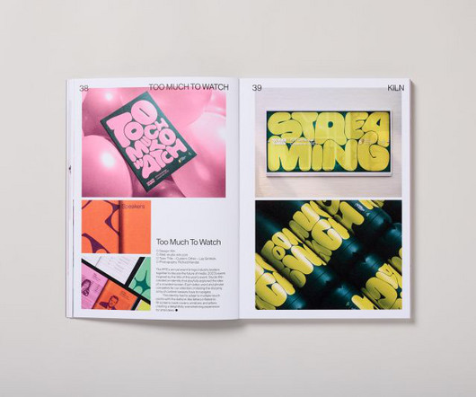
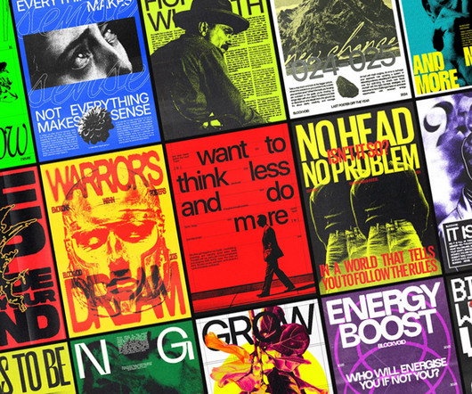
In an era when attention spans are dwindling and visual overload has become the norm, Counter-Print's new book celebrates the transformative power of expressive typography. It led to a book that considers the challenges of visual clutter by showcasing typography as a bold and innovative medium.
Explore the creative lettering posters designed with amazing hand typography to find inspiration for your next project. These typography designs show how thoughtful letter design can make a message more engaging and clear. The post 35 Remarkable Handpicked Lettering Typography Designs first appeared on Graphic Design Junction.
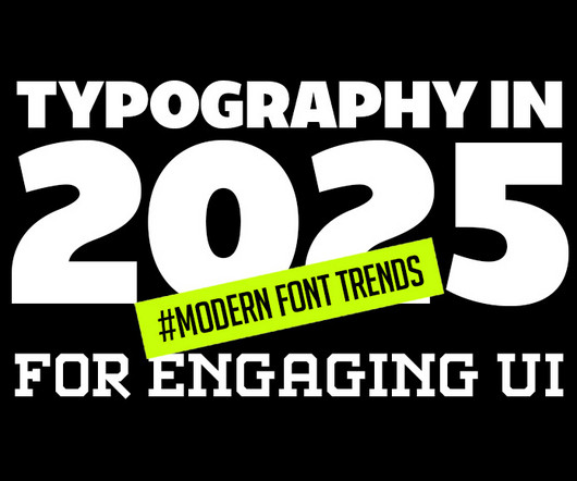
Typography is evolving rapidly, reshaping how we perceive and interact with digital designs. This article delves into the latest typography innovations that promise to make digital interfaces more engaging, accessible, and visually appealing. Minimalist and Clean Typography The “less is more” approach remains popular.
From neo-grotesques with a modern edge to culturally significant designs preserving endangered languages, these typefaces reflect the diversity and depth of contemporary typography. With low stroke contrast and two full sets of capitalsLatin and BlackletterPlace shines as a display face and a workhorse for complex typography.
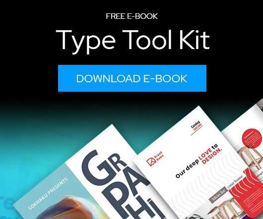
Download this free eBook to learn how you can create stunning typography, using the basics, such as placing text, to advanced controls like ligatures, variable fonts, effects, tracking, range kerning, and everything in between. Learn how to: Use Character Control to add variety to your font styles.
As we delve into graphic design trends 2025 , web design trends 2025 , and logo design trends 2025 , we’ll also highlight the influence of AI, typography innovations, and sustainable practices. Whether you’re a designer, marketer, or brand strategist, staying ahead of these trends is essential to creating relevant, impactful designs.
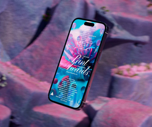
The awards' new visual identity embodies organic growth as a metaphor for creativity, blending generative design and dynamic typography. Typography played a fundamental role in ensuring the identity remained cohesive across all touchpoints. Townsend describes the creative process as an exercise in controlled randomness.
The rebrand draws heavily on the museum's iconic modernist architecture by Lina Bo Bardi, using a red-and-black colour palette and strong typography to reflect the building's striking visual presence. HONDO Based between Palma de Mallorca, Spain and London, HONDO specialises in branding, editorial, typography and product design.
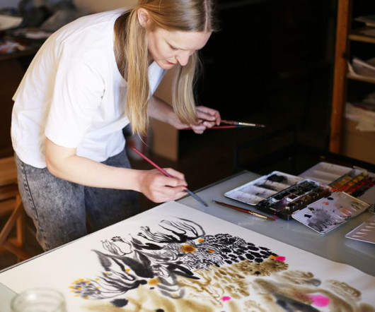
Throughout the process, she was constantly in discussion with the designer Yeti Lambregts about the composition, making changes to accommodate typography and other elements. For Orbital, Metsola used watercolours to paint a series of planets, swirls, and the Earth before combining them so they could wrap around the book.
Since then, this New Zealand foundry has carved out its niche in the competitive world of typography through a combination of accessible design and creative merchandising. Economic pressures Looking ahead to 2025, Daniel sees the typography landscape evolving in response to economic pressures. "I
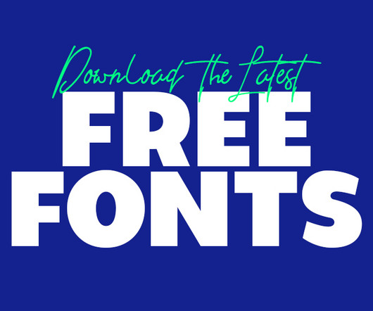
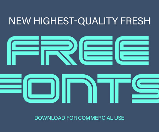
Using the latest free fonts and fresh typography styles can instantly improve your work and keep your designs looking modern and creative. Whether you’re designing a logo, creating typography for brochures, or working on brand guidelines, the latest free fonts can be a game-changer.
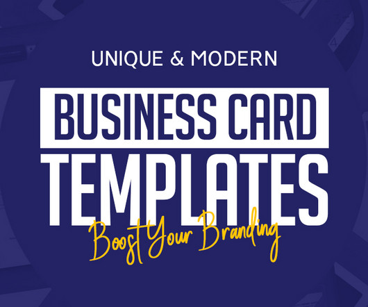
Bold TypographyTypography-centered business card templates have become increasingly popular for their ability to combine clarity with creativity. Bold typography often uses oversized fonts, creative alignment, or a combination of two different font styles.
It's clear that typography is a primary consideration throughout the characteristically understated, smart, timeless aesthetic of Vanderbrand's work. Again, the typography selection is superb, using Hal Four Grotesk by Studio HanLi, GT America by Grilli Type, and Burgess Pro by Colophon.
This trend takes inspiration from the past’s vision of the future, often characterized by neon colors, metallic accents, bold geometric shapes, and vintage typography. Graphic Design Elements: Designers use retro-futuristic color schemes and typography to create posters and social media graphics.
The Power of Fonts in Modern Design Typography is more than just arranging letters; its about evoking emotions and communicating messages effectively. Download Font Winter Half Free Font Typography breathes life into design, and free fonts open doors to endless creativity. Creating my own typeface has been a long-term dream of mine.
Creating efficient, consistent, and flexible typography for digital platforms using modern design system principles. At the heart of this approach is typography , which is how we make text look and feel. When typography is well-designed, users can engage with content smoothly without distraction.
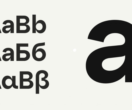
Nurom Next by The Northern Block Ten years in the making, Nurom Next represents a significant evolution in multilingual typography. Available in upright and italic styles, each with 13 matching weights, Sans Norm is designed for extensive reconfiguration and adaptable use across various design contexts.
These sessions revealed the need for nuance and flexibility in online readability and accessibility and how disabled people should be depicted in photography, and they influenced the studio's approach to typography, iconography, and illustration.
Homura Condensed Font Homura is a sans-serif display font that is inspired by newspaper headlines and modern typography. Perfect for Logos, greeting cards, quotes, posters, branding, business cards, postcards, movie titles, blog headers, art quotes, typography, magazines and more.
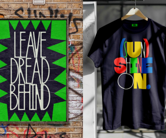
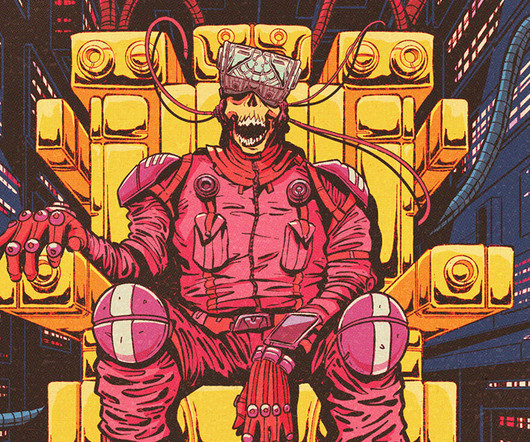
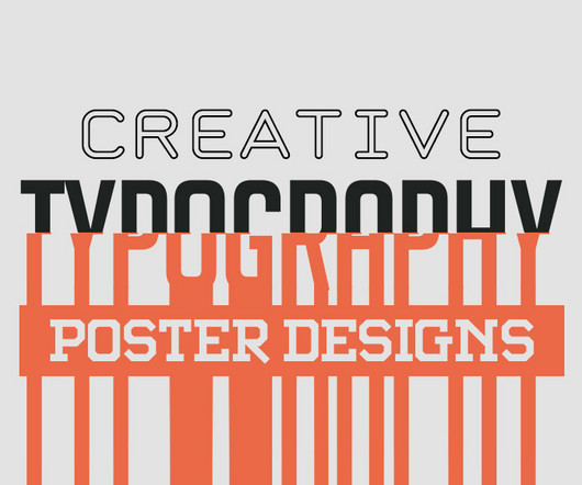
Whether you’re building a brand, promoting a gig poster, or filling a blank wall, the right typography can hold attention like nothing else. Lettering posters are more than just text. They carry structure, rhythm, and visual power.
The second month of 2025 brings us a rich harvest of new typefaces that perfectly illustrate typography's dual nature: serving designers' practical needs while pushing creative boundaries. marks a significant evolution in accessible typography. million API serves in a single week, its impact on everyday typography is already profound.
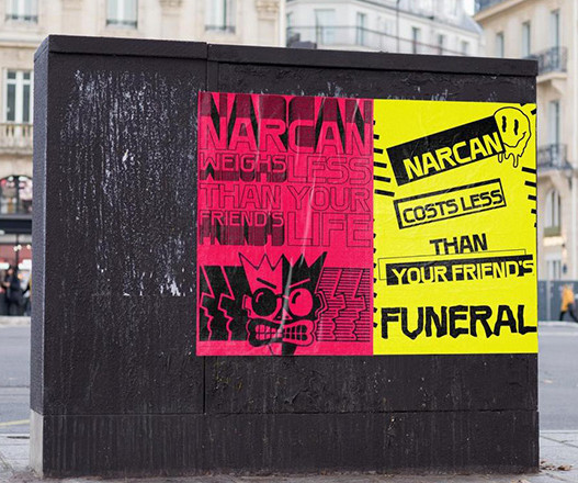
The collection incorporates the vivid color palettes, dramatic typography , and imaginative world-building that defined the era. While rooted in nostalgia, these posters feel modern and fresh, demonstrating Griffins ability to reinterpret classic influences in ways that resonate with contemporary audiences.
Typography can make or break a poster. Great poster typography is about more than picking a good-looking font. Well-spaced typography feels easier to read and more professional. When typography and imagery work together, the message becomes more cohesive and memorable.
Optimize Typography for Readability Fonts should be: Limited (2–3 max). Pick a Strategic Color Palette Colors shape perception. Best practices: Stick to 2–3 colors (too many = visual chaos). Align with brand colors. Use tools like Coolors.co for harmonious palettes. Legible (avoid overly decorative fonts). Hierarchical (e.g.,
As AI tools generate polished, predictable content, the role of typography has fundamentally shifted. Consequently, understanding the key typography trends in 2025 is not just an aesthetic exercise—it is a strategic necessity for anyone looking to communicate with clarity and impact.
The studio is widely celebrated for its bold use of colour, form and typography, pushing the boundaries of what branding and design can achieve. This year, they've also launched a sister agency focused on typography and type design, called Type of Feeling.
Typography is a vital element in any creative project, setting the tone and conveying the message with style. Typography trends are constantly evolving, and staying ahead of the curve means experimenting with new styles that can elevate your work.
Developer and digital art director Dan Powell explains how he used custom typography and generative tools to design the brand identity for Frontify Futures, an exciting new platform that explores tomorrow's brand-building landscape. Who knows where branding will go in the future?
The “ modern retro ” trend is marked by clean shapes, bold typography, and warm, nostalgic color palettes. Expressive Badge Designs with Artistic TypographyTypography is evolving beyond functional text, becoming an integral part of the badge design itself.
Use Typography to Build Identity Typography-based logos, where the brand name itself becomes the logo, are incredibly effective for startups. Typography can carry a logo on its own or complement a minimalist icon, reinforcing the brand’s personality.
Designed by Blackcatstudio for Adobe Illustrator, this Swiss Graphic Design-inspired poster template embraces the hallmarks of Swiss typography with precision and elegance. Typography takes center stage here, with the typefaces beautifully echoing the classic, clean-cut Swiss tradition, particularly the iconic Neue Haas Grotesk font.
From typography campaigns for climate refugees to soap that fosters body autonomy, this year's D&AD New Blood winners prove there's no shortage of fresh thinking or ambition among tomorrow's talent. The D&AD New Blood Awards have long been a launchpad for emerging talent, and this year's cohort is no exception.
They are a creative playground where typography, shapes, and symbolism converge. Ideal for packaging, merchandise, or branding, they offer a dynamic way to communicate values and aesthetics. Their flexibility allows designers to adapt them for any medium—be it digital platforms or print materials.
Japan Bento Japanese Style Display Font Japan Bento, Inspired by Japanese Kanji Typography. It offers a beautiful blend of traditional Japanese calligraphy and modern typography, which makes it perfect for various creative endeavors. Embrace the beauty of Japanese typography with “Japan Daisuki.” Download 15.
Exploring Motion Design with Kinetic Typography: Mat Voyce’s Type Scraps abduzeedo 1028—24 Discover Mat Voyce’s kinetic typography in motion design, blending animation and personality for impactful visuals. Mat Voyce’s “Type Scraps” collection is a captivating exploration of kinetic typography in motion design. The result?
Typography is a funny thing because while it's largely based on fundamental, eternal principles, it nonetheless continues to evolve year after year. RST Thermal by Reset RST Thermal is a variable font that blends classical typography with modern design, focusing on balance and contrast.
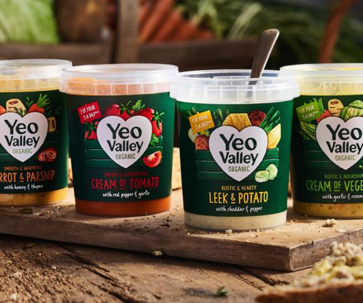
While the brand logo has been evolved, its hand-drawn typography and iconic heart shape have been maintained. It's clear that Yeo Valley Organic is a brand with incredibly strong values, so the new design system had to stay true to this.
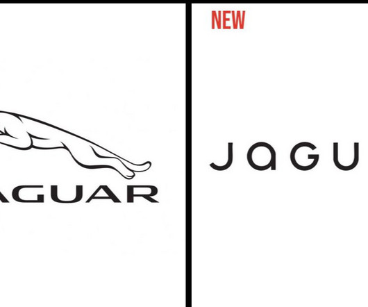
The typography is less “agressive”, with rounded lower-case letters and much bigger letter-spacing. For graphic designers, although the video was the main center of attention, the logo redesign didn’t go unnoticed.
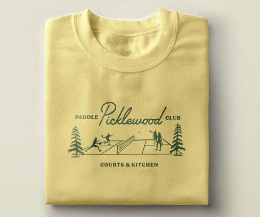
From the midcentury script typography to the playful supporting illustrations and colour palette to the custom plaid and argyle patterns, everything is designed with tongue-in-cheek. It's pickleball, after all."
For fashion, beauty, and lifestyle brands, typography is not just about readability—it’s a visual signal of identity, tone, and personality. Choosing the right stylish fonts can shape how your brand communicates with your audience.
The result is an arched wordmark that nods to '90s brand typography while remaining contemporary and adaptable across touchpoints. Typography was another key ingredient in capturing the right balance of nostalgia and modernity.
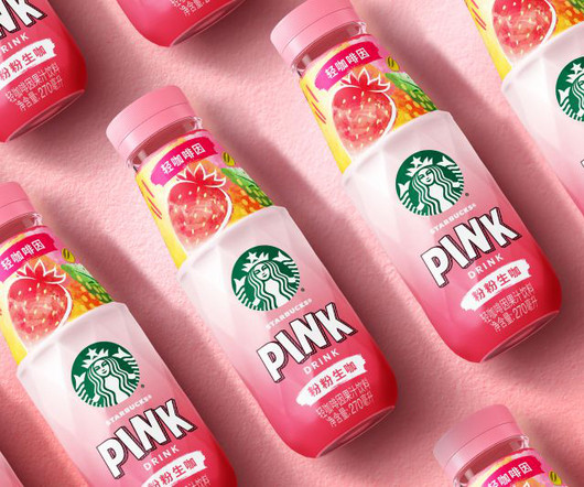
This includes playful hand-drawn typography for flavour names, vibrant colour systems tailored to local preferences, and expressive neck patterns that catch the eye and spark curiosity. Key Starbucks RTD equities remain intact, anchoring the product within the broader brand portfolio, but fresh elements elevate the experience.
Typography has always been a powerful tool in design, blending the art of arranging text with creativity to convey a message. With the advent of printing presses and later, digital technology, typography began to evolve rapidly. Timeless Appeal Unlike other design trends, typography is timeless.
We organize all of the trending information in your field so you don't have to. Join 66,000+ users and stay up to date on the latest articles your peers are reading.
You know about us, now we want to get to know you!
Let's personalize your content
Let's get even more personalized
We recognize your account from another site in our network, please click 'Send Email' below to continue with verifying your account and setting a password.


Let's personalize your content