article thumbnail

Laura Stein on the Five Books that shaped her approach to design, branding, and sustainability

Creative Boom

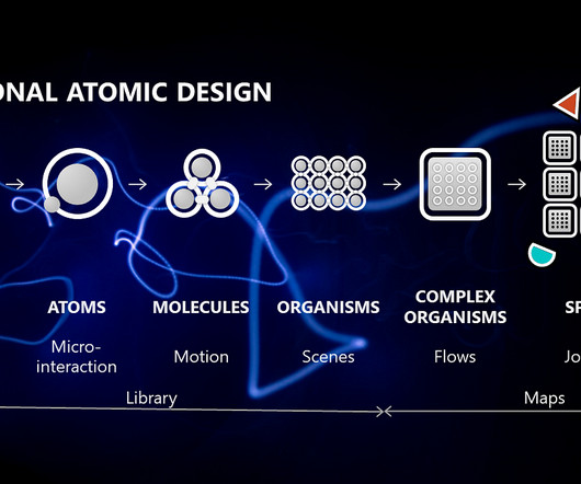
It's been quite a while since we last explored the inspiring world of book recommendations from leading creatives across the globe, but we're excited to bring the series back with a fresh perspective. They also provide insight into the creative process that continues to inspire her.

Branding 435
article thumbnail

How the Adobe Logo Reflects the Evolution of Digital Creativity

Inkbot Design

It was coloured in a bold red ( PMS 485 ) and was inspired by Adobe Creek, which ran behind co-founder John Warnock's house in Los Altos, California. When competitors were chasing flashy digital aesthetics, Adobe took the smarter routeevolutionary refinement rather than revolutionary redesign.

Adobe 40
Insiders

Sign Up for our Newsletter

This site is protected by reCAPTCHA and the Google Privacy Policy and Terms of Service apply.

article thumbnail

Fantasy Island shows Ireland from 70 photographers’ alternative perspectives

Its Nice That

Above Mervyn Smyth: Holy Cross (Copyright © Mervyn Smyth, 2002) The front cover of Fantasy Island always gets a reaction from anyone you show it to – an evocative school book design with a drawing that appears to have been drawn in pencil and partially erased.

article thumbnail

Free Font Of The Day : Coolvetica

Design Beep

Designed by Ray Larabie in 2002, this typeface takes inspiration from the iconic Helvetica but adds a relaxed, retro twist that makes it stand out. This is out daily free font of the day post. Fonts have personalities, and few are as effortlessly cool as Coolvetica.

Fonts 52
article thumbnail

AI Pace Layers: a framework for resilient product design

UX Collective

But first, a brief review of the precursors that inspired this framework will help you put it to gooduse. Jesse James Garretts 5 layers from The Elements of User Experience Design(2002) This framework doesnt focus on time, or on tension points resulting from conflicting velocities.

article thumbnail

Why the PayPal Logo is Both a Genius Move and a Boring Mess

Inkbot Design

” The eBay Years: Stagnation and the 2007 “Refresh” After being acquired by eBay in 2002, the PayPal logo entered a long period of quiet dominance. It whispered, “Don't worry, we're a proper financial institution, just… on your computer.” It was everywhere. It became part of the internet's furniture.

Brand 52
article thumbnail

Warning: This nausea-inducing optical illusion is not what it seems

Creative Bloq

Every issue is packed with art and design inspiration Delivered to your IOS or Android device Never miss an issue From £9.99 Its one of the best optical illusions around, and actually dates back to 2002 – but more on that, and how it works, in a moment. Why not try a subscription? But not all is as it seems.