This site uses cookies to improve your experience. To help us insure we adhere to various privacy regulations, please select your country/region of residence. If you do not select a country, we will assume you are from the United States. Select your Cookie Settings or view our Privacy Policy and Terms of Use.
Cookie Settings
Cookies and similar technologies are used on this website for proper function of the website, for tracking performance analytics and for marketing purposes. We and some of our third-party providers may use cookie data for various purposes. Please review the cookie settings below and choose your preference.
Used for the proper function of the website
Used for monitoring website traffic and interactions
Cookie Settings
Cookies and similar technologies are used on this website for proper function of the website, for tracking performance analytics and for marketing purposes. We and some of our third-party providers may use cookie data for various purposes. Please review the cookie settings below and choose your preference.
Strictly Necessary: Used for the proper function of the website
Performance/Analytics: Used for monitoring website traffic and interactions
I have been receiving a lot of of requests for a review on my Fujifilm X-T2. As some of you may know, I’ve had progressively nicer Canon SLR cameras since I was switched over from film (augh! yes- I used to shoot film exclusively as a necessity and not a novelty). I went through three or four (can’t remember for sure) models in over the past decade and I absolutely love those cameras!
The Meme Effect. There have been many internet crazes since the inception of the World Wide Web in 1989. Most are short-lived and seem to blow up overnight but fade almost as quickly. Some of these fleeting fads include the ice-bucket challenge, planking and the outrageously obnoxious supermarket-based spectacle that was gallon smashing. . But other online crazes have proved far more steadfast.
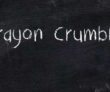
Experimenting and exploring new typefaces provides you a lot of design possibilities that can improve your design in terms of aesthetics. That is why having a great collection of fonts is a necessity for us designers. Chalkboard fonts are a classic font type that evokes ideas of school days long gone and quaint cafe menu boards. But not all chalkboard fonts are alike.
Written by Telepathy Design Manager, Brad Soroka, this article originally appeared on the Trello blog. There’s never been a better time in history to search out and uncover creative inspiration. In fact, the internet is uniting us like never before: it’s giving us all information overload. Regardless which professional field you’re in, access to (and accelerated growth of) online sources of ideas makes it even harder and more necessary to stay on top of trends, industry news, and more.
Speaker: Amber Asay, Creative Director and Founder of award-winning design studio Nice People
Understanding what trends are happening and how they’re impacting the competitive landscape is crucial to providing top dollar design strategy to your clients. With so many trends coming and going, it can be overwhelming to determine which ones you should capitalize on and which ones might not be worth the trouble. In this exclusive webinar with Amber Asay, we’ll explore graphic design trends that need to die, trends that are starting to pick up and why, trends that have come and gone, and how t
In 1928, Vincent Steer, the self-described “advertising typographer” behind the book Printing Design and Layout (1934), established the International Society of Typographic Designers (ISTD) in the UK. Steer’s aim was “to bring together in friendship and mutual help, all those with a love of the printed word”. From these guild-like beginnings, the ISTD has evolved to wield a growing international influence, gaining recognition (as its tagline notes) for “setting and promoting typographic standard
This week brought to a close another June of teaching Illustration at the School of Visual Arts Summer Residency. Now in it’s tenth year, the residency gives artists a chance to immerse themselves in the New York illustration world through a rigorous program of coursework, as well as visits with professionals, organizations, and exhibitions. Focusing on narrative illustration, my class guides students through the creation of a series of images inspired by a text of their choosing.
Contributed by Rumsey Taylor License: All Rights Reserved. Berthold Wolpe ’s Albertus typeface played a recurring role for credits in a variety of John Carpenter’s films. Long before you see the dogs transmuted into vicious, physically indeterminate fiends, or Kurt Russell’s monocular anti-hero, named “Snake,” surfing in the submerged city grid of a future dystopian Los Angeles, the essence of most any John Carpenter film is evident in its opening moments, even before his name is seen keystoned
Contributed by Rumsey Taylor License: All Rights Reserved. Berthold Wolpe ’s Albertus typeface played a recurring role for credits in a variety of John Carpenter’s films. Long before you see the dogs transmuted into vicious, physically indeterminate fiends, or Kurt Russell’s monocular anti-hero, named “Snake,” surfing in the submerged city grid of a future dystopian Los Angeles, the essence of most any John Carpenter film is evident in its opening moments, even before his name is seen keystoned
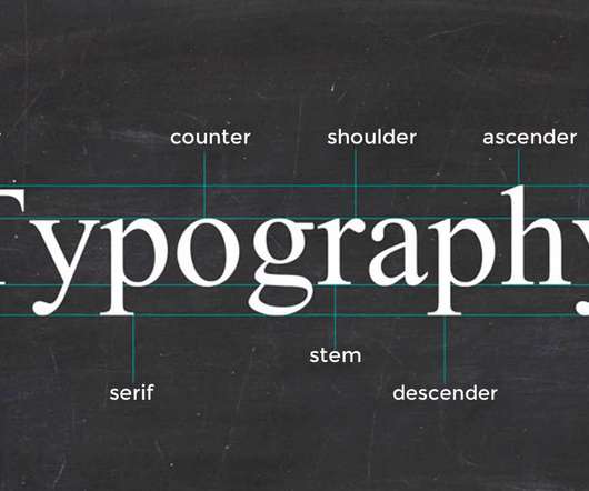
The more we communicate, the closer we become. Typography inspires us by reminding the world of a simpler time without connection. As designers and artists, we can carry that fascination into our work by studying the makeup of letters. If you prefer video tutorials, you can start with the basics of typography anatomy with this quick video from the Tuts+ YouTube channel.
Goodbye Summer, Hello Autumn! Inspiring Wallpapers To Start September Off Right (2017 Edition). Goodbye Summer, Hello Autumn! Inspiring Wallpapers To Start September Off Right (2017 Edition). Cosima Mielke. 2017-08-31T17:57:51+00:00. 2019-10-16T18:36:56+00:00. We are very thankful to all artists and designers who have contributed and are still diligently contributing to our monthly wallpapers creativity mission, who challenge their artistic abilities each month anew to keep the steady stream of
1. Avoid the Obvious. When reaching for a different weight, turning to a sympathetic but distinctively different typeface can add drama to a design. Sentinel and Archer are two slab serifs with very different origins — one a nineteenth century ‘Antique,’ the other a twenty-first century invention full of circular ‘ball terminals’ — but using them together adds visual interest to an otherwise muted composition.
Fresh Pickin’s is a new Organic Vegetable juice brand, designed by South African-based illustrator and animator Fran Labuschagne. A totally organic juice made from only the freshest of produce from a local family-run farm. The playful, changeable typography leads the brand’s modern, clean look, followed by Fran’s brilliant illustrations which depicts the different tastes depending on the season.
Brands must create and share impactful content to thrive, but they have less people, tighter budgets, and fewer resources to do so. Learn how to publish and market digital content with the same professionalism as organizations with million-dollar budgets.
When figuring out the curves feature on A Color Story , it can be confusing. So we’re having Arielle Vey share what she knows about curves and how they can make your photos pop! Hey, everyone! It’s Arielle, photographer and creator of the Weekend pack in A Color Story. I’m jumping in today to start a series of tutorials on curves and how to use this tool to its fullest potential.
Bring your blog to life with engaging blog images. Before we go through everything you need to know about blog images , it’s worth taking a look at a brief history of blogging. Blogging began to gain popularity during the early noughties and truly exploded with the rise of content marketing. Since then, blogging has completely changed the way we create content and communicate online.
Times New Roman is a font that is familiar to most people and has a rich and varied history. Most people have used Times New Room, also affectionately abbreviated TNR, at one time or another. For many, it is a default font in their word processing or email program. College professors and publications often require […]. The post The Font Series: Times New Roman appeared first on Design Roast.
Intro to the rebrand. Last week we launched the most complex rebrand we’ve ever done. We infamously put this project off for many years, due to the energy and resources that would be required to do it right. This wasn’t solely a new website and logo, this rebrand included a new direction with our company name and much of our design/brand system. At the same time, it had to embody where we came from and how we’ve evolved over the last 16 years.
As the design industry evolves, teams are facing new challenges and a need to produce more outstanding creative work than ever. Leaders must learn how to adapt their processes to solve today’s—and tomorrow’s—unique design challenges. In this e-book, you’ll learn how to establish your creative workflow and leverage the power of CorelDRAW® Graphics Suite to streamline the entire design process, from start to finish.
This is not a typical typeface review. It’s a review of a whole foundry. I don’t know why I took it upon myself to review fifty-two typefaces instead of just one, but I feel it’s necessary to review them together. These fifty-two typefaces gave me much joy in 2016, and I want to give some of that back to their creator. The Foundry. Stefan Ellmer (also known as Ellmer Stefan, following the Austro-Hungarian name order) is an amazing designer.
What's news with me? I guess, a lot, since it's been a while since I updated this page. The late summer and early fall have kept me plenty busy. It's that time of year again! As with past Octobers, I'm participating in #Inktober—the month of ink drawings shared on social media—with my own spin in the form of #Oinktober. If you'd like to follow my pigs' progress, check out my Instagram for a new pig drawing each day.
The new year is here and it is time to evaluate your fashion illustration career and make a mega-plan of action for 2018. It is time to move to the next level, commit yourself to your creative job and stretch yourself artistically. Here are 10 tips to kickstart your illustrator’s career. 1. Be intentional If you want to improve at anything, first of all, you have to decide to do it.
Welcome to our Design in 60 Seconds series, in which you can learn a new design skill, feature, or technique in just a minute! What Is Typography? Typography is more than just a cool font. It's the complete visual aesthetics of any written word. From the arrangement of your words to the spacing and more, there is so much to learn about the wonderful world of typography.
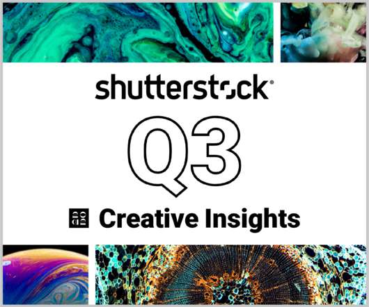
In today’s competitive markets, how do you make sure that your content not only stands out but performs well? How can you predict whether certain design choices will result in clicks, engagement, downloads, and other drivers of ROI? Shutterstock’s Creative Insights Report (Q3) is your window into the hottest trends that are transforming the creative world.
Pumpkins, Spooky Fellows And Fall Inspiration For Your Desktop (October 2017 Edition). Pumpkins, Spooky Fellows And Fall Inspiration For Your Desktop (October 2017 Edition). Cosima Mielke. 2017-09-30T14:03:20+00:00. 2019-10-16T18:36:56+00:00. This monthly wallpapers mission has been going on for nine years already , and we are very thankful to everyone who has and still is contributing to it each month anew.
I recently had the privilege of speaking at the third annual Typographics conference, an event organized by the Type@Cooper program at The Cooper Union, to share a new project with fellow designers. While visually this new typeface would be unlike anything we’ve ever done before, in many ways it’s the quintessential H&Co project, taking on many of the themes that have characterized our work over the past twenty-eight years.
The Colour Club have branded independent cafe, Shorty's, who serve some of the highest quality coffee and food. Obviously, they needed this go-to coffee house to look as good as its output tastes! The name of the brand, also by The Colour Club , evokes images of classic eateries and coffee houses from time immemorial. Less esoterically, the name is also a play on the 6"6 owner; they create lanky, illustrated legs to show off that morning coffee run.
I have been receiving a lot of of requests for a review on my Fujifilm X-T2. As some of you may know, I’ve had progressively nicer Canon SLR cameras since I was switched over from film (augh! yes- I used to shoot film exclusively as a necessity and not a novelty). I went through three or four (can’t remember for sure) models in over the past decade and I absolutely love those cameras!
Speaker: Eden Spivak, Design Expert and Editor at Wix & Nir Horesh, Accessibility Lead and Senior Product Manager at Wix
When we design products or websites for people like ourselves, there are many others who are, as a result, left out. From visually impaired users who rely on assistive technology, to people with a temporary injury such as a broken arm, tech users are forever diverse and beautifully unique. The products we design can, and should, reflect the extremely wide range of human experiences and needs.
The popularity of eBooks amongst consumers and B2B audiences continues to rise. Whether your eBook is distributed as a a content upgrades on your websites, a self-publishing platform such as Wattpad or commercial publishing site such as Amazon Kindle the one thing your eBook has to have is a cover that stands out on the digital shelf. Here are my top tips for creating irresistible eBooks your audience can’t wait to read: Stand out on the shelf.
When you’re at a party with new people, you don’t get balance sheets with everyone’s statistics and track record. You don’t form impressions based on their “friendship retention percentage” or “personal growth projections.” You decide who you like and don’t like based on their personality — their identity — because that’s just what humans do. So why would you think brands are any different?
Millennials are poised to become the largest demographic group in the world by the end of the decade. That’s less than 3 years away, folks, and as the stats start rolling in, we’re seeing that they have a very different approach to managing their finances. For starters, their trust in — and loyalty to — the big financial institutions is at an all-time low, and they’re responding by taking more direct control over their earning and investment decisions , as well as seeking advice from a much broa
This session will answer business law questions that people are asking most during the pandemic. If my business can’t pay its bills, can my creditors come after my personal assets? Do I have to pay the rent on my co-working space or office? Can my clients cancel signed contracts? Can I cancel contracts for things I no longer need because my business has slowed down?
In the beginning, there are many circles. These days you’ll find me in deep space as I complete final art for my next picture book collaboration with Candlewick Press. THE DAY THE UNIVERSE EXPLODED MY HEAD is a collection of humorous poems about space by poet, performer, and educator, Allan Wolf. Of course, sharing art at this stage is verboten, but here are a few details from my desk. sometimes with a dash of salt.
Now for the second instalment of 'showing you how I created the book cover artwork for Paisley Rabbit And The Treehouse Contest.' You can see the first part of this post here. I left you poised to start laying in the basic colours for Paisley Rabbit and the flycatcher birds. Below you can see that stage completed. I tend to take these photos at the end of a day's painting, not stage-by-stage, so in this shot you can also see I have started to define the creeping ivy.
Designing something directly on a computer, like many people do these days, risks letting the computer dictate the forms of the thing you design. It’s easier to draw a perfectly straight line in a font editor than it is to draw an organic-looking almost-straight line. Kakadu finds inspiration in the rigid vectors used in early technical computer fonts, and takes them as a challenge.
Why I Switched To Sketch For UI Design (And Never Looked Back). Why I Switched To Sketch For UI Design (And Never Looked Back). Ashish Bogawat. 2017-09-14T18:57:44+00:00. 2019-10-16T18:36:56+00:00. As the craft has evolved, so has its toolset; and from one app to rule them all — looking at you, Photoshop! — we have gotten to a point where it seems like a new contender among UI design tools crops up every month.
Thomas Edison once said “Vision without execution is hallucination.” This statement applies not just to invention, but to graphic design. One of the greatest strengths of graphic designers is the ability to first develop a concept and then execute it to make it real. From visualization and ideation all the way through to actuation and execution, each step of this process takes skill and expertise.
We organize all of the trending information in your field so you don't have to. Join 66,000+ users and stay up to date on the latest articles your peers are reading.
You know about us, now we want to get to know you!
Let's personalize your content
Let's get even more personalized
We recognize your account from another site in our network, please click 'Send Email' below to continue with verifying your account and setting a password.


Let's personalize your content