This site uses cookies to improve your experience. To help us insure we adhere to various privacy regulations, please select your country/region of residence. If you do not select a country, we will assume you are from the United States. Select your Cookie Settings or view our Privacy Policy and Terms of Use.
Cookie Settings
Cookies and similar technologies are used on this website for proper function of the website, for tracking performance analytics and for marketing purposes. We and some of our third-party providers may use cookie data for various purposes. Please review the cookie settings below and choose your preference.
Used for the proper function of the website
Used for monitoring website traffic and interactions
Cookie Settings
Cookies and similar technologies are used on this website for proper function of the website, for tracking performance analytics and for marketing purposes. We and some of our third-party providers may use cookie data for various purposes. Please review the cookie settings below and choose your preference.
Strictly Necessary: Used for the proper function of the website
Performance/Analytics: Used for monitoring website traffic and interactions
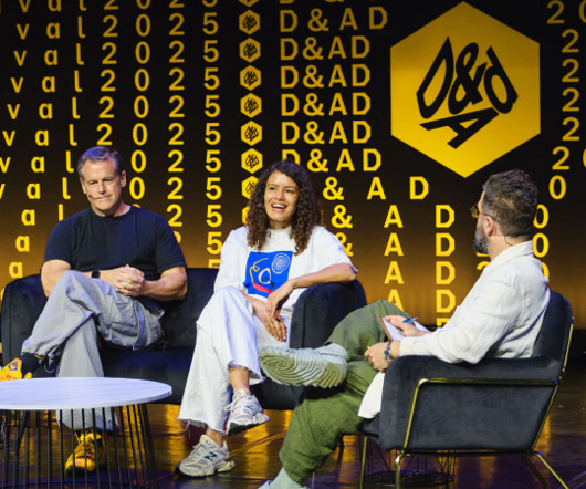
For this year's D&AD Awards and Festival, JKR has reimagined the experience from the ground up, building a campaign that celebrates not only creative excellence but also the energy that draws people into the craft. Few symbols hold the same weight in the creative industry as the D&AD Pencil. It's sharp, iconic, instantly recognisable, and it's been a beacon of excellence since 1962.
If only walls could talk – but what about windows? More than mere backdrops or fabric panels, window treatments quietly narrate a room’s intention, setting the mood as they interact with space and time, dimension and light. And how we dress our homes makes as much of a statement about who we are as the fashions we wear. So why not embrace better design?
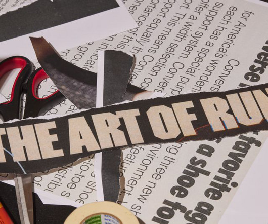
For its Spring 2025 campaign, Converse dove into its archive with a fresh twist, teaming up with graphic design legend David Carson and creative studio WØRKS to reframe its legacy for a new generation. Brands with deep-rooted histories face a unique challenge in preserving their legacy and keeping it alive in a way that resonates with today's audiences.
Speaker: Amber Asay, Creative Director and Founder of award-winning design studio Nice People
Understanding what trends are happening and how they’re impacting the competitive landscape is crucial to providing top dollar design strategy to your clients. With so many trends coming and going, it can be overwhelming to determine which ones you should capitalize on and which ones might not be worth the trouble. In this exclusive webinar with Amber Asay, we’ll explore graphic design trends that need to die, trends that are starting to pick up and why, trends that have come and gone, and how t
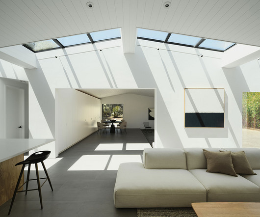
Designed by building Lab , this detached accessory dwelling unit (ADU) in Silicon Valley was born from a family’s desire to create a place where tradition, design, and flexibility could coexist. The homeowners – a couple with roots stretching from India and Japan, by way of Australia – approached the project with an idea that was as sentimental as it was practical.
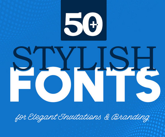
Here is the list of best stylish fonts which are perfect for wedding invitations and branding and also good for use as logo fonts. Stylish fonts set the tone before anyone reads a word. The post 50+ Stylish Fonts for Elegant Invitations & Branding first appeared on Graphic Design Junction.
With a playful identity and sharp strategic storytelling, Yoloh is cutting through a sceptical market and securing major investments across Europe, the Middle East, and the US. Breaking away from the grayscale world of insurance branding, personalised insurance platform Yoloh has launched a new identity with the help of Taxi Studio. The rebrand isn't just about aesthetics.
With a playful identity and sharp strategic storytelling, Yoloh is cutting through a sceptical market and securing major investments across Europe, the Middle East, and the US. Breaking away from the grayscale world of insurance branding, personalised insurance platform Yoloh has launched a new identity with the help of Taxi Studio. The rebrand isn't just about aesthetics.
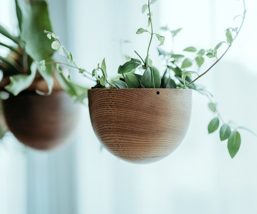
Blurring the lines between inside and outside is proven to benefit our health in immeasurable ways – boosting our immune systems, reducing overall stress , and even healing faster. In an increasingly stressful world, Japanese brand NECKTIE introduces hemisphere , a planter that combines the notion of honoring nature with the elegance of weightlessness.
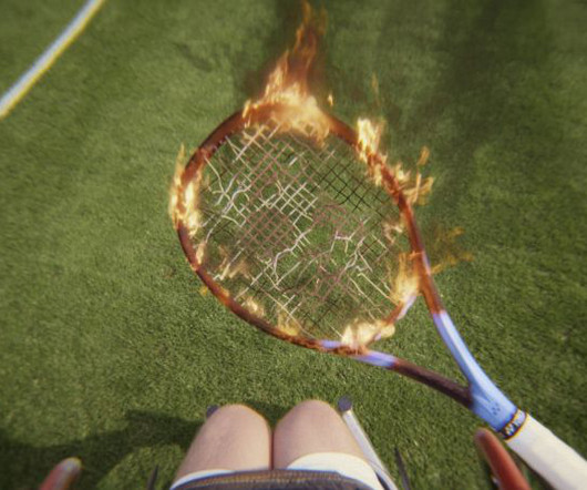
With 'There is only one Wimbledon', the All England Lawn Tennis Club and VCCP explore the intensity, pressure, and history that define the world's most prestigious tennis tournament. Few sporting events can claim the global reverence Wimbledon commands. Synonymous with tradition, excellence, and drama, it has remained an iconic fixture in the sporting calendar for more than a century.
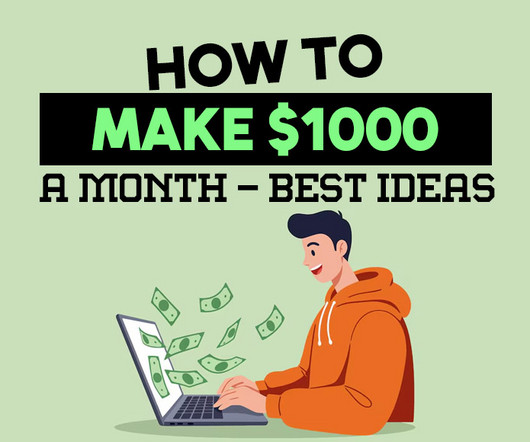
Making $1000 a month is not a fantasy. It is achievable, especially if you focus on consistent actions and realistic opportunities. The key lies in identifying income streams that match your skills The post How To Make $1000 a Month – 10 Best Ideas first appeared on Graphic Design Junction.
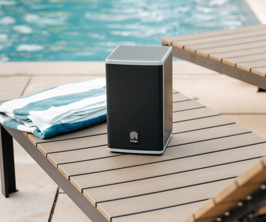
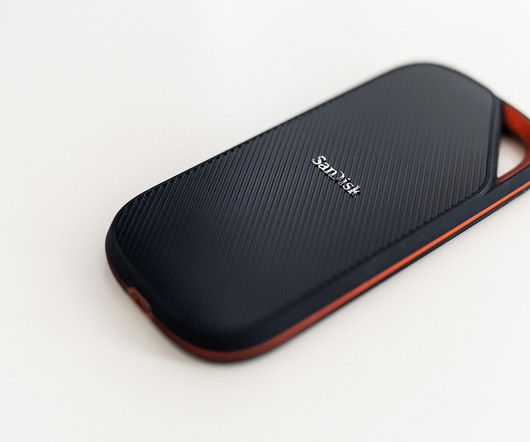
Bluetooth speakers are essential for on-the-go audio, but few are truly built for use in outdoor environments. That’s where Lodge steps in. The startup is rethinking how we power our music outdoors with the Solar Speaker 4 Series 2 , a rugged, solar-powered Bluetooth speaker designed specifically for long-term outdoor use – no outlet required. What sets the Solar Speaker 4 Series 2 apart is its built-in sustainability.
Brands must create and share impactful content to thrive, but they have less people, tighter budgets, and fewer resources to do so. Learn how to publish and market digital content with the same professionalism as organizations with million-dollar budgets.
Reading "Leeds during Thatcher: An." More from Work Search Search Events Next Generation Showcase Creative Jobs Board Home Menu Disciplines Advertising Animation Architecture Art Creative Industry Digital Event Fashion Film Graphic Design Illustration Photography Product Design Publication Popular Tags 3D Book Branding Collage Comic Exhibition Font Food & Drink Identity Logo Magazine Music Politics Portrait Poster Sport Sustainability Technology Typography Web Design Zine It’s Nice
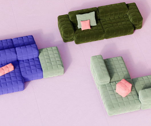
There’s no better feeling than curling up under your favorite blanket after a long day – unless, of course, you could turn that blanket into a whole sofa to sink into. That’s the idea behind HENN , the latest launch from Berlin-based brand Objekte Unserer Tage (OUT). With downy quilted covers, oversized cushioning, and an adaptable modular system, HENN isn’t just inspired by comfort – it magnifies it.
Today, we’re looking at the visual identity of the Leiria Film Fest ‘s 12th edition, created by the Portuguese designer Paulo Graça. This identity does something truly special. It captures the essence of film not as a high-brow, exclusive art form, but as a universal language that speaks to everyone. With a beautifully illustrative and almost “naive” aesthetic, Paulo Graça has built a graphic universe that feels both nostalgic and refreshingly modern.
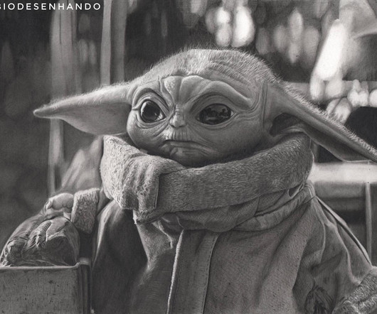
Fabio Gonçalves de Arruda, a São Paulo-based artist, creates hyperrealistic graphite drawings that are so detailed they resemble high-contrast photographs or film stills. His work merges classical techniques with pop culture influences, resulting in portraits that capture both likeness and deep character. Whether portraying Morgan Freeman’s expressive gaze or Nelson Mandela’s quiet intensity, Fabio masterfully balances precision with atmosphere.
Thomas Edison once said “Vision without execution is hallucination.” This statement applies not just to invention, but to graphic design. One of the greatest strengths of graphic designers is the ability to first develop a concept and then execute it to make it real. From visualization and ideation all the way through to actuation and execution, each step of this process takes skill and expertise.
Trying to decide which Adobe Creative Cloud apps to get? Here’s What Matters: What You Need (and What You Don’t) If you’re just stepping into the world of design, photography, or content creation, Adobe Creative Cloud can feel like both a dream and a maze. There are so many powerful apps, but also so many plans. Which apps do you actually need?
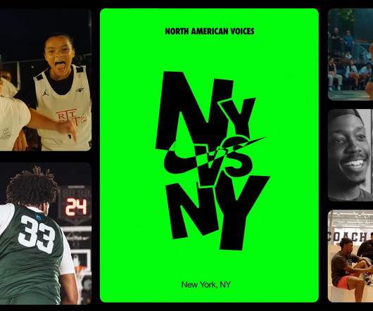
Behind Nike's Visuals: The Power of Motion Design abduzeedo 06/10 — 2025 Dive into Nike's "North American Voices" and its impactful motion design system. Discover how tailored visuals amplify compelling stories. Hey creatives! Ever wonder what happens when a global giant like Nike wants to tell its internal stories with impact? It takes a clever approach to visual communication, especially in the realm of motion design.
For architects, designers, or photographers, a portfolio is a visual manifesto, a testament to their design philosophy and professional capabilities. Finding the right format to present your work can be a challenge. You need something clean, professional, and impactful. This is precisely where a high-quality InDesign portfolio brochure template becomes an invaluable asset, allowing your work to take center stage.
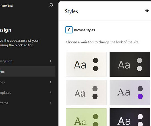
WordPress block themes offer plenty of flexibility. You can make style and layout changes within your web browser – no coding knowledge is required. They can also include extras like block patterns and style variations. Style variations give you a head start on design. They allow us to create multiple color and typography combinations. They also house custom block styles defined in the Site Editor.
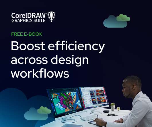
As the design industry evolves, teams are facing new challenges and a need to produce more outstanding creative work than ever. Leaders must learn how to adapt their processes to solve today’s—and tomorrow’s—unique design challenges. In this e-book, you’ll learn how to establish your creative workflow and leverage the power of CorelDRAW® Graphics Suite to streamline the entire design process, from start to finish.
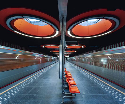
Europe is home to some of the world’s most renowned public transit systems, from the Paris Métropolitain to the Berlin U-Bahn to Stockholm Metro. The latter is incidentally home to a remarkable series of subterranean public art displays , too, the “world’s longest art exhibit” at more than 68 miles long. Artists have been instrumental in the design of the city’s stations since 1957, creating immersive, multi-sensory experiences that go far beyond conveying passenger
Tatyana Alanis is an illustrator and designer whose work seamlessly blends modern aesthetics with a nostalgic touch. Her keen eye for fashion and architecture allows her to transform everyday scenes into elegant, timeless compositions that have attracted major clients like Apple, Google, and The New Yorker. Now leading her creative studio, French 75, she continues to balance commercial projects with personal work, all characterized by a distinct yet understated visual language.
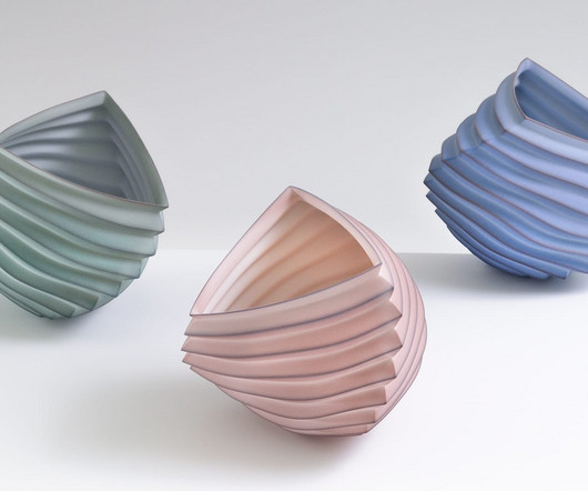
From delicately folded paper, Berkeley-based ceramicist Mark Goudy draws inspiration for an ongoing series, Origami. He describes his work as “minimal forms with hidden complexity,” building on a love for simple yet elegant forms that reflect nature’s inherent geometries. In meticulous sculptures that merge form and function, Goudy pulls from his experience as a 3D graphics hardware design engineer.
A Little Story About Forever is a new short film that combines creativity, advocacy, and imagination, demonstrating how small steps can lead to significant change in the fight against PFAS contamination. What do a toddler, a painter, and Mark Ruffalo have in common? In A Little Story About Forever, the latest short film from KEEN and artist-filmmaker Max Romey, they team up to tackle one of the world's more daunting environmental challenges: forever chemicals.
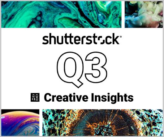
In today’s competitive markets, how do you make sure that your content not only stands out but performs well? How can you predict whether certain design choices will result in clicks, engagement, downloads, and other drivers of ROI? Shutterstock’s Creative Insights Report (Q3) is your window into the hottest trends that are transforming the creative world.
Summer events are meant to be full of good vibes: warm weather, cool drinks, and feel-good tunes. But for some, it comes with extra challenges. Inclusion might be a buzzword, but it’s also a baseline. It’s really the difference between someone feeling like a guest and feeling like an afterthought. A recent Deloitte study found that 60% of employees with disabilities have missed workplace events due to accessibility barriers, such as inaccessible restrooms Creating accessible events means designi
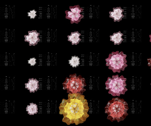
Annelie Berner used blooming flowers as a visual metaphor to show climate change. The piece is called Plant Futures. Plant Futures envisions how a flower might show climate data, data that could eventually shape our familiar surroundings into something entirely new. Looking at just one flower, what does it need to survive and how might those needs be impacted by future climates?
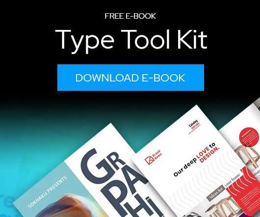
Download this free eBook to learn how you can create stunning typography, using the basics, such as placing text, to advanced controls like ligatures, variable fonts, effects, tracking, range kerning, and everything in between. Learn how to: Use Character Control to add variety to your font styles. Use Paragraph Control to manage spacing, alignment, justification and more.
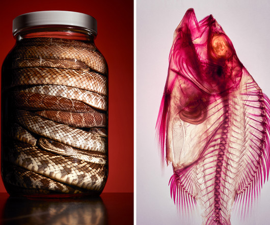
Natural history specimens typically sit in quiet stasis behind glass cases—labeled, cataloged, clinically lit. “Collective Knowledge from. The post Craig Cutler’s Bold Photography Reveals Museum’s Natural Treasures appeared first on Graphis Blog.
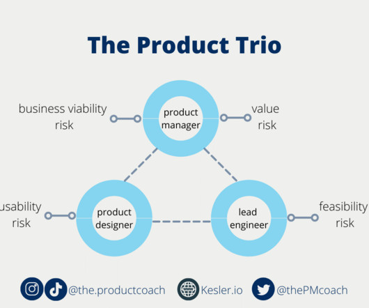
Sitemap Sign up Sign in Medium Logo Write Sign up Sign in UX Collective · Follow publication We believe designers are thinkers as much as they are makers. [link] Follow publication Member-only story Product trios are collapsing. Here’s how designers can smooth them over Here’s how to make the best of lopsided trios Kai Wong Follow 5 min read · 2 hours ago -- Share Photo by VAZHNIK: [link] “Think of the Holy Trinity: product manager, engineering lead, and designer.
Skip to main content Open menu Close menu Creative Bloq Creative Bloq Where creativity meets technology Search Search Creative Bloq Sign in View Profile Sign out Subscribe Design Art 3D Tech Entertainment Buying guides Magazines Imagine FX 3D World Events Vertex Brand Impact Awards More Creative Inspiration Professional Development AI Web Design Photography Reviews About Us Newsletters Design Magazine Subscriptions Why subscribe?
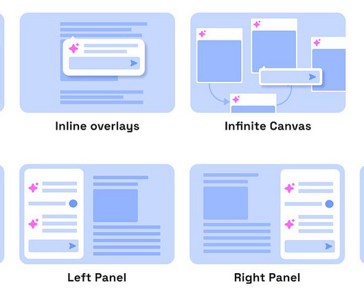
Mapping emerging AI UI patterns and how spatial UI choices shape AI experiences The rise of large language models (LLMs) and AI agents has supercharged familiar UI patterns like chatbots, but a new wave of interface layouts is beginning to take shape. The real opportunity now lies in embedding AI more deeply into sophisticated, task-oriented interfaces.
Speaker: Eden Spivak, Design Expert and Editor at Wix & Nir Horesh, Accessibility Lead and Senior Product Manager at Wix
When we design products or websites for people like ourselves, there are many others who are, as a result, left out. From visually impaired users who rely on assistive technology, to people with a temporary injury such as a broken arm, tech users are forever diverse and beautifully unique. The products we design can, and should, reflect the extremely wide range of human experiences and needs.
We organize all of the trending information in your field so you don't have to. Join 66,000+ users and stay up to date on the latest articles your peers are reading.
You know about us, now we want to get to know you!
Let's personalize your content
Let's get even more personalized
We recognize your account from another site in our network, please click 'Send Email' below to continue with verifying your account and setting a password.


Let's personalize your content