This site uses cookies to improve your experience. To help us insure we adhere to various privacy regulations, please select your country/region of residence. If you do not select a country, we will assume you are from the United States. Select your Cookie Settings or view our Privacy Policy and Terms of Use.
Cookie Settings
Cookies and similar technologies are used on this website for proper function of the website, for tracking performance analytics and for marketing purposes. We and some of our third-party providers may use cookie data for various purposes. Please review the cookie settings below and choose your preference.
Used for the proper function of the website
Used for monitoring website traffic and interactions
Cookie Settings
Cookies and similar technologies are used on this website for proper function of the website, for tracking performance analytics and for marketing purposes. We and some of our third-party providers may use cookie data for various purposes. Please review the cookie settings below and choose your preference.
Strictly Necessary: Used for the proper function of the website
Performance/Analytics: Used for monitoring website traffic and interactions
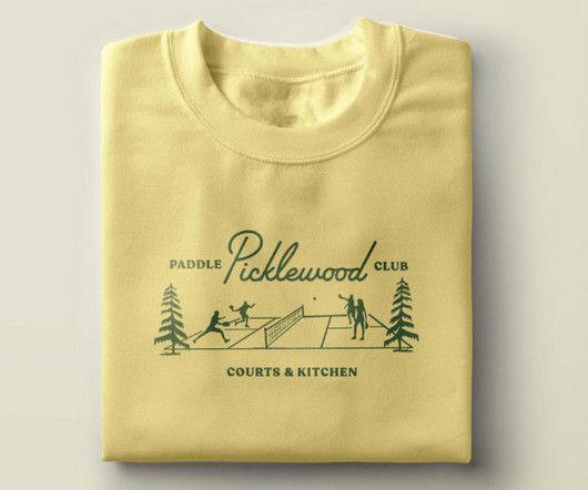
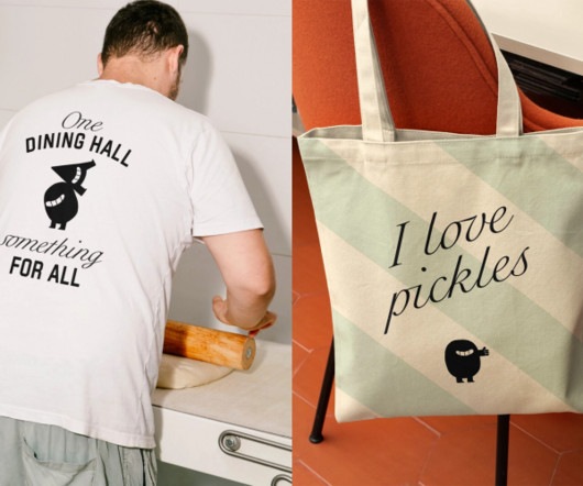
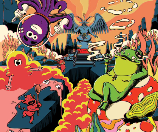
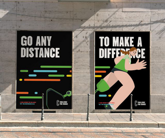
And they turned to local creative website agency People People to define and create a memorable brand and visual identity. From the midcentury script typography to the playful supporting illustrations and colour palette to the custom plaid and argyle patterns, everything is designed with tongue-in-cheek. It's pickleball, after all."
One Living by Derek&Eric From simplified skincare to tech-infused cosmetics, these cutting-edge branding initiatives are reshaping the health and beauty landscape worldwide. This pressure has sparked a wave of innovation in health and beauty branding. This pressure has sparked a wave of innovation in health and beauty branding.
At the cutting edge of conservation, Chester Zoo wanted a new brand and website to champion these nature-positive efforts. The branding agency soon got to work repositioning Chester Zoo's look and feel in a way that represented both the experience within the zoo gates and its greater purpose of serving nature as a whole.
Paula Scher , Michael Bierut, Marina Willer, Samar Maakaroun, Eddie Opara and others have led some of the most iconic branding and design projects of our time, and it's ultimately Pentagram's ability to evolve while maintaining high standards of creativity that's led them to top our list. The results are now in, and here they are.
Illustration by Mia Angioy for Creative Boom In the last of our special six-part series, we explore how sonic branding can elevate your brand's presence by leveraging Epidemic Sound's expansive library of music and sound effects. In 2024, the auditory experience has become crucial to crafting a cohesive and memorable brand presence.
To stand out in China's crowded RTD market, Marks has given Starbucks' fan-favourite Refreshers a striking new look, complete with a dynamic bottle shape and vivid visuals. The change aims to carve out fresh space in China's fiercely competitive ready-to-drink (RTD) market.
The London motion directors at Kitchen have unveiled a gorgeously dazzling and psychedelic animation for The Great Frog Vintage Market. Your eyeballs are in for a wild ride if you happen to land on any of the social accounts promoting The Great Frog a jewellery brand going back to the 1970s, famous for its eclectic rock star collections.
BrandOpus has refreshed the design of McCain Foods' whole GB and EU packaging portfolio, which now includes a new bespoke typeface and printed brand assets. This latest project has seen the new brand assets introduced on pack across all products, from croquettes and chips to wedges and fries.
A few years ago, the question was: should your brand identity include motion? So nowadays, the question is more like: how is motion interwoven into the heart of your brand? So nowadays, the question is more like: how is motion interwoven into the heart of your brand? Well, just think about how we communicate as humans.
Elections in the UK and the US led many big brands to put off their decision-making and budgeting – they want to see the lie of the land economically before investing in creative. We chatted with illustration agencies serving various creative and geographic markets to discover what they crave for the New Year.
This time, we've asked Laura Stein, CCO of Bruce Mau Design , to reveal her top five books that have shaped her approach to design, branding, and sustainability. Her work lies in culture, fashion, architecture, technology, education, and place across brand, print, motion, digital, and environmental. What if waste wasn't actually waste?
While Islington Square's original brand focused on residential sales, this new iteration aims to capture its transformation. While Islington Square's original brand focused on residential sales, this new iteration aims to capture its transformation. We have not retained any original assets besides the brand name."
Image licensed via Adobe Stock We speak to the great and the good to get the temperature of the industry as we head into the halfway point of the 2020s. As we approach 2025, the creative industry stands at a fascinating crossroads. The rapid evolution of AI is reshaping how we think about design.
Through its new identity, HALFDAY is serving up bold colours, playful illustrations, and a healthy dose of '90s nostalgia, proving that prebiotic tea can still have a rebellious streak. But for HALFDAY, a ready-to-drink iced tea brand aiming to balance nostalgic flavour with modern-day wellness, standing out was exactly the goal.
A deep dive into how design studio TEMPLO reimagined GF Smith's brand identity, balancing heritage with a bold, dynamic vision that embraces colour, movement, and a global creative community. But even the most established brands must evolve.
She says: "British Airways is such an iconic name, and it's inspiring to collaborate with a brand that connects people and destinations worldwide." For the editorial, BA required a set of six colourful, patterned illustrations to accompany the various sights highlighted in the article. million TikTok posts. million TikTok posts.
Enter Lazy Tan, the brand that wants to flip the script with its innovative, easy-to-apply, skin-friendly formula. Of course, the self-tan market has boomed in recent years, and we've seen everything from celebrity brands to natural claims, foams, oils, moussesyou name it.
Elections in the UK and the US led many big brands to put off their decision-making and budgeting – they want to see the lie of the land economically before investing in creative. We chatted with illustration agencies serving various creative and geographic markets to discover what they crave for the New Year.
With a dynamic new identity, DesignStudio's brand refresh for DNEG embraces motion, creativity, and innovation, reinforcing the VFX giant's position as an industry leader. DNEG, the world-renowned visual effects and animation studio with seven Academy Awards to its name, has revealed a brand refresh in collaboration with DesignStudio.
Taxi Studio has revealed its work on Carlsberg Elephant, which was designed to communicate its new premium position in India's evolving drinks market. With an incredible annual growth rate of 40%, Elephant is one of India's best-loved brews and an integral player in Carlsberg's growth strategy in this market.
Supple Studio and Studio Spilsbury came together to lead a refresh of the brand and packaging system that puts the farm at the heart of the brewery's visual and verbal identity. But the brand's farm-first ethos goes beyond the logo. Somer Valley Brewing isn't your typical craft brewery.
Influur helps content creators get work with brands for a decent compensation. Influur is a specialist agency that connects these creators, specifically in the areas of music, dance and lifestyle, with brands, helping them form impactful partnerships and reach specific target groups. It's a strange world we live in.
From soft, retro-inspired illustrations to packaging that demonstrates the product's effects, Them 1888's new milk powder brand is set to stand out among competitors. Danish brand Them 1888 has set out to satisfy this demand with a fresh look for its powdered milk product Grow Up, designed by the Danish agency Simply.
Launching a new shop is a brave enterprise in an increasingly challenging retail environment, and good branding can mean the difference between success and failure. I began my career at promotional marketing agency This Is BD , working on promotional and experiential projects for Arla Foods, Diageo and The Famous Grouse.
To help spread their message far and wide, Fluz recently teamed up with Koto , a brand and digital agency with studios in Berlin, London, Los Angeles, New York and Sydney, to craft a fresh brand to fuel Fluz's expansion. Typography and colours At the centre of the new identity is a bold and confident wordmark.
It seems like everyone from content creators to marketing professionals, photographers to animators, are discovering that they can use it to create professional content, quickly and easily, and without a big learning curve. I used to spend hours coming up with ideas and designing brand templates for them. I just design on the go."
The organiser of events for the marketing and fintech industries has a new dynamic identity, conveying the power of convergence. Following the recent sale of its digital commerce and product design businesses, Ascential has become more streamlined and focused on events serving the marketing and fintech industries.
This cherished brand, boasting a loyal fan base in Southern Helsinki and exceptionally tasty products, faced challenges in sustaining its brick-and-mortar stores and home delivery service," he explains. The market dynamics had shifted significantly during the pandemic," explains Piëtke.
Virgin Wines has introduced its first major rebrand in two decades, including a fresh logo, colour palette, and typography. Nathan Wadlow, brand and digital marketing director at Virgin Wines, said it was the company's intention to not only be recognised but to be hugely known for excellence.
Follio was created to fill a gap in the market for architecture and interior design tools. The intent behind Follio was to fill a gap in the market for architects and interior designers who had no guideline tools for their standards, specifications, and documentation. Its no-nonsense identity allows the platform itself to shine.
Food colouring products aren't all the same. Premium brandColour Mill needed help to stand out from the crowd, so it turned to Universal Favourite to give it a fresh new identity. Colour Mill is a family-owned, Australian-based food colour manufacturer specialising in the 'cake and bake' industry.
Swedish studio Bercow is helping the Nordic retailer reimagine 3,500 products across four countries, harmonising diverse market identities through clever use of a superellipse. Recently, it decided to consolidate its presence across four Scandinavian markets, which required a comprehensive rebranding effort.
Forest Gum by Jens Nilsson From plant-based ice cream to sustainable chewing gum, these forward-thinking branding projects are reshaping the food and beverage landscape across the world. With that in mind, we've picked five of the best new branding projects for September to inspire your own projects.
But when three craft breweries emerged in Murray Street, Port Moody, British Columbia, they didn't set out to steal each other's market share. We chatted with Kate and Phoebe Glasfurd, co-founder and creative director at Glasfurd & Walker, to find out how they approached this unique branding project.
Creative director Dave Rax walks us through his first big project as an independent after leaving Koto: a global brand redesign for SamBoat. Part of the challenge was the need to appeal to both ends of the market spectrum, from experienced skippers and seasoned sailing enthusiasts to novices and first-time day-trippers alike," Dave explains.
The studio has had a long-standing relationship with the brand's parent company, British Land, working with them on various projects over an eight-year period. While the old work once served its purpose, the brand's evolution made it apparent that it no longer aligned with Storey's current vision and future goals", says Agimal.
Studio Up North brings inclusive yet impactful branding to a global initiative empowering everyday athletes to "go the distance" for a meaningful cause. The brand's graphic centrepiece is a dynamic, track-inspired icon that doubles as a bold, abstracted 'C'a symbol of community, change, and commitment. This is a change for all."
Pentagram partners Luke Powell and Jody Hudson-Powell have collaborated with tech-driven travel platform Impala to create a new brand identity which finds the engaging, human side to its services. It includes a friendly tone of voice, a colourful visual identity and a bespoke typeface. No easy feat.
It's become a brand we see on our city streets and suburbs, with employees whizzing by on electric bikes to deliver restaurant food to our homes. The move is part of a drive to ensure competitive edge, distinction, and creative consistency across Deliveroo's ten local markets.
Spacemade is a co-working brand with a difference. The idea had been that while the B2B-intended branding for Spacemade was minimal and somewhat corporate, personality would come through in the designs for the individual locations. Crafted by Wildish & Co., This January, they decided it was time for a new visual identity.
Bristol-based agency Fiasco Design has partnered with leading West End theatre group Nederlander Theatre to spotlight their own story through a new brand and website. Since February this year, Fiasco has been working with the group to evolve its brand and elevate its UK presence.
The London-based studio collaborates with renowned illustrator Hedof to create upbeat and engaging branding for the Comedy Garden Festival. 57 Festivals is a London-based company specialising in live comedy. Since 2005, it has delivered comedy shows and festivals to select cities across the UK.
One of the world's biggest beauty brands needed a more consistent identity across all its global platforms. Those of a younger vintage, though, may be unaware that the cosmetics brand, originally founded in 1867, was a huge name throughout the 20th century, known for selling its make-up door-to-door. billion worldwide in 2020.
Available in cans of 250ml and 150ml with three key flavours, Walsh and her team were appointed to create the branding and packaging design for the launch of the new product line. The Bombay 99 name is an ode to the brand roots, referring to the pin code of their historic headquarters in Mumba," Jessica tells Creative Boom. "We
We organize all of the trending information in your field so you don't have to. Join 66,000+ users and stay up to date on the latest articles your peers are reading.
You know about us, now we want to get to know you!
Let's personalize your content
Let's get even more personalized
We recognize your account from another site in our network, please click 'Send Email' below to continue with verifying your account and setting a password.
Let's personalize your content