Remove 2013 Remove Fonts Remove Publication
article thumbnail

How the Adobe Logo Reflects the Evolution of Digital Creativity

Inkbot Design

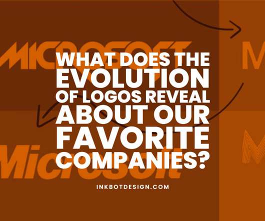
Apple had just gone public, Microsoft was still a tiny player, and graphic design software barely existed. Evolution Phase 1: 1990s Refinement By the early 90s, Adobe had transformed from a font technology company into a software powerhouse with Photoshop, Illustrator, and other creative tools.

Adobe 40
article thumbnail

Hyperreal photography meets minimal tech house: Facta’s new album features award-winning Pelle Cass

Its Nice That

" More from Work Search Search Events Next Generation Showcase Creative Jobs Board Home Menu Disciplines Advertising Animation Architecture Art Creative Industry Digital Event Fashion Film Graphic Design Illustration Photography Product Design Publication Popular Tags 3D Book Branding Collage Comic Exhibition Font Food & Drink Identity Logo (..)

Insiders

Sign Up for our Newsletter

This site is protected by reCAPTCHA and the Google Privacy Policy and Terms of Service apply.

article thumbnail

Evolution of the BP Logo: A Century of Design & Branding

Inkbot Design

It's the visual evidence of a century-long identity crisis in public. British Petroleum Shield (1920s-1947) When APOC became British Petroleum in the 1920s, they evolved into a shield featuring the letters “BP” in a bold serif font. The visual change maintained the shield but incorporated the new name. Surprisingly, no.

Brand 40
article thumbnail

Decoding the Cisco Logo: Symbolism, Branding, and Legacy

Inkbot Design

The typography became more substantial – communicating stability as Cisco went public in 1990. The System Rebrand (2013) In 2013, Cisco unveiled “The Bridge to Possible” – maintaining the vertical line motif but arranging them to create a more dynamic visual rhythm.

Brand 40
article thumbnail

The Xbox Logo: How Microsoft Fought, Stumbled, and Won

Inkbot Design

The font is cheesy. The jagged, comic-book font was retired. The Minimalist Turn (2013): The Xbox One and the Flat Design “Correction” The world changed between 2005 and 2013. The designers replaced the previous font with a new one. Character Over Perfection. The first Xbox logo is clumsy. Approachable.

article thumbnail

Jim Parkinson, 1941–2025

Typographica

He became the go-to guy for art directors looking to refresh their publication, and he redrew some titles multiple times over the years. Later in life, when Jim wasn’t drawing logos or making fonts, he was painting signs. Fonts In Use Type at work in the real world. Not how you think. Click here to cancel reply.

article thumbnail

14 fonts to fall in love with: trending typefaces that designers adore

Creative Boom

But while font choice may be deeply personal, that doesn't mean you can't play the field once in a while. After all, passions ebb and flow; similarly, designers' love affairs with fonts can sometimes be fleeting – like short, intense affairs that come and go. We share the highlights below: 14 fonts for February 14th.

Fonts 546