This site uses cookies to improve your experience. To help us insure we adhere to various privacy regulations, please select your country/region of residence. If you do not select a country, we will assume you are from the United States. Select your Cookie Settings or view our Privacy Policy and Terms of Use.
Cookie Settings
Cookies and similar technologies are used on this website for proper function of the website, for tracking performance analytics and for marketing purposes. We and some of our third-party providers may use cookie data for various purposes. Please review the cookie settings below and choose your preference.
Used for the proper function of the website
Used for monitoring website traffic and interactions
Cookie Settings
Cookies and similar technologies are used on this website for proper function of the website, for tracking performance analytics and for marketing purposes. We and some of our third-party providers may use cookie data for various purposes. Please review the cookie settings below and choose your preference.
Strictly Necessary: Used for the proper function of the website
Performance/Analytics: Used for monitoring website traffic and interactions
WRAP started as a government-funded body that worked with local authorities in the UK and has since scaled to become an international environmental NGO working with brands, citizens, and governments in over 40 countries. The rollout of WRAP's new identity reflects its position as a B2B and government-facing brand.
The free software community Mozilla has set out to reclaim the internet as a global public resource with a new "Grassroots to Government" design system developed by Jones Knowles Ritchie (JKR). The phrase "Grassroots to Government" underpins Mozilla's brand purpose and was the inspiration behind JKR's design system.
The logo aimed to create something big and bold that could stand out in both small podcast icons and large out-of-home advertising. "It It should also feel timeless, like an artefact you could pull from a vault of government secrets," explains Fresneda.
As we delve into graphic design trends 2025 , web design trends 2025 , and logo design trends 2025 , we’ll also highlight the influence of AI, typography innovations, and sustainable practices. A minimalist logo with a splash of maximalist color or texture gives brands a modern yet bold identity.
Make your Mark includes an animated smiling logo, playful fonts, bright colours, and bold graphics that reflect the vibrant nature of the food and drinks industry. From the animated smiling logo to playful fonts, bright colours and bold graphics, every element of the campaign reflects the vibrant and fun nature of the industry. "It
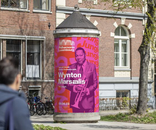
Most notably, the logo takes its cue from the building itself and uses the power of creative coding to pulsate the columns in response to the rhythm of any piece of music. The logo NB's logo design takes its cue from Philharmonie's iconic building, an architectural landmark in Luxembourg.
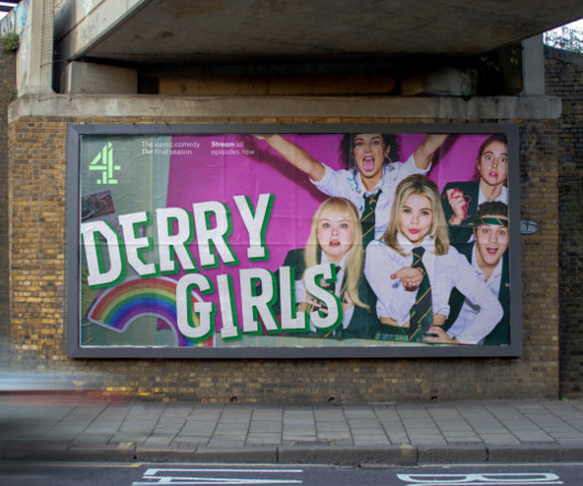
A consistent logo with parametric possibilities One of the key elements of the rebrand is bringing Channel 4's logo at the heart of the brand, alongside introducing a singular masterbrand colour. Optimised by Pentagram whilst retaining its legacy, the '4' logo was redrawn to hold a greater visual presence in digital assets.
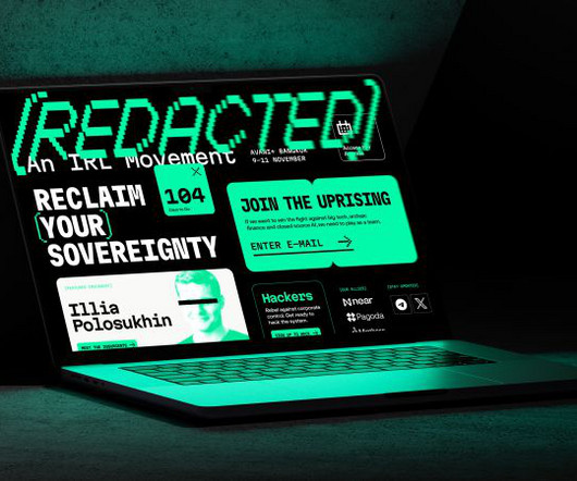
Those are the fundamentals, but bear in mind that Web3 isn't really something you can define yet: it's still very much in development and faces many challenges in terms of technical development, social acceptance, and government regulation. That's where [REDACTED] comes in.
It was the governing body for a range of aquatic sports but only had one of them in its title. Until recently, the governing body for aquatic sports in Britain, which includes swimming, diving, para-swimming, artistic swimming and water polo, was known as British Swimming. Thisaway also needed to develop a new brand name.
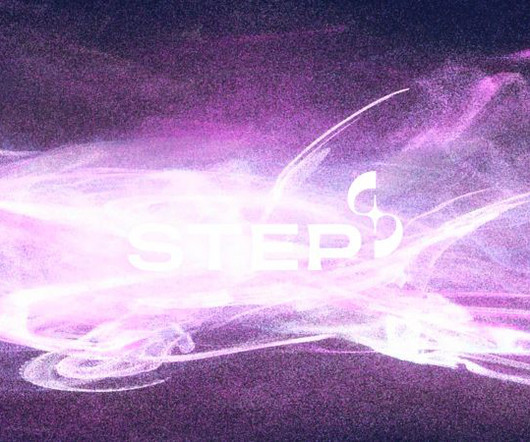
As a brand-new government-backed organisation, STEP (Spherical Tokamak for Energy Production) wants to establish itself as a pioneer in fusion energy a sustainable, low-carbon energy source with far-reaching economic, scientific, and technological benefits. Of course, fusion itself was a huge source of inspiration," says May.
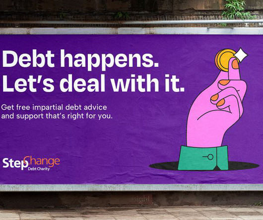
Today, it's become the largest provider of debt management advice in the UK, campaigning for policy change at government level and beyond to "make debt less harmful". Looking closely at the brand, Robot Food discovered that StepChange's funding comes from the government and lenders rather than public donations.
Today, it's become the largest provider of debt management advice in the UK, campaigning for policy change at government level and beyond to "make debt less harmful". Looking closely at the brand, Robot Food discovered that StepChange's funding comes from the government and lenders rather than public donations.
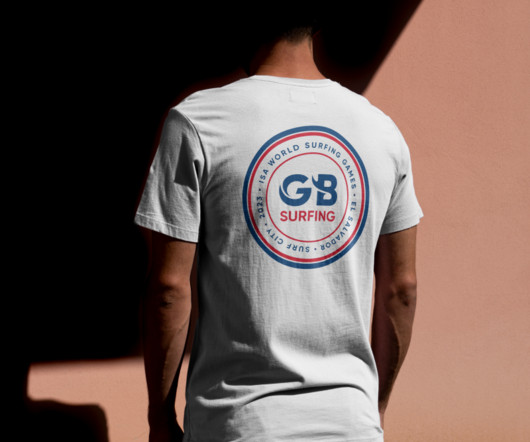
A good logo catches the eye, sums up a brand in seconds, and evokes an atmosphere. Brief and concept FORM worked closely with the GB Surfing team and athletes to create a logo that would resonate with the surfing community while standing strong in the Olympic world. So we loved the idea of getting the perfect wave carved into the logo.
Every detail, from logo design to social media voice, contributes to the story you tell about your brand. Logo Brand Guidelines Templates 16. Look for a template that lets you incorporate your brand colors, logos, and fonts while maintaining the core structure. But how do you ensure consistency across all these touchpoints?
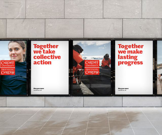
It is the only Welsh member of the Russell Group of research-intensive British universities, and academics and alumni of the university have included three heads of state or government and two Nobel laureates. However, despite its standing, the university has struggled to attract the very best students and staff.
Ultimately, in challenging times like these, you can't rely on other people or even governments to get you through. Many people ignore that and focus on things like the logo or website. But if the 2020s have taught us anything, it's that the future is anything but certain. You have to depend on yourself.
Visual identity design, on the other hand, refers to the visual elements that represent the brand , including the logo, color scheme, typography, imagery, and more. Logo Design The logo is the cornerstone of a brand’s visual identity. They may create several logo variations and present them to the client for feedback.
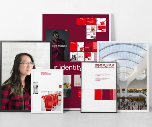
The distinctive red Design Council logo, created by Tayburn McIlroy Coates in 1996, remains unchanged. at the Government Digital Service, audited the new guidelines and provided recommendations about their physical and digital application. It's not a complete redesign, though. Mia Allers, design lead on gov.uk
Have you ever wondered why some logos stick in your mind instantly? A good logo design isn’t just a pretty picture. But what exactly makes a logo “good”? A well-designed logo builds recognition. Think about some of the most iconic logos out there. Its more than just aesthetics, my friend.
With strong relationships at the highest levels of government and the private sector, we shift barriers and catalyse transformative partnerships. Our clients span governments, businesses and public and private capital. Logo animation. The old logo was fine, a little on the literal side but it got the point across.
You're not constrained by the norms and expectations that might govern how things are usually done. When we finally unveiled the brand, it was more than just a logo or a set of guidelines. But there's a certain clarity that comes with distance. We spent the next few weeks in a rhythm that became second nature.
We can all use a good laugh these days, that’s why we prepared you a list of what not to do while designing a logo while working from home. Hopefully, these logos will put a smile on your faces. Bad logos might be quite bad for your brand. Your logo is what the people remember you with after all. Top 31 Bad Logos.
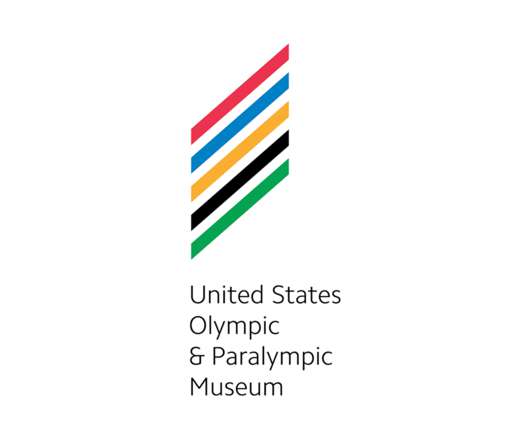
Logo references. "In This was a very difficult challenge with three strong "forces" needing to be portrayed in the logo: The Olympics, the Paralympics, and USA. logo, which is a good thing for the most part as it shifts the focus to the Olympics and it avoids looking like a government entity or political candidate.
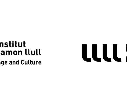
Established in 2002, Institut Ramon Llull is an organization founded by the Catalan Government, the Government of the Balearic Islands, and the Barcelona City Council with the purpose of promoting Catalan language and culture locally and abroad. Logo evolution and new spacing. Logo spacing. Logo extensions.
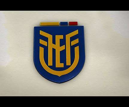
1925) "The Ecuadorian Football Federation (Spanish: Federación Ecuatoriana de Fútbol or FEF) is the governing body of football in Ecuador. Logo explanation. Logo introduction video. Overall, not a great logo by any means but it does have a national-team-crest-like vibe so that’s at least one score. Design by.
Top 10 Best Books for Logo Designers In a world where brands compete for attention, a powerful and memorable logo can make all the difference. As a logo designer, you understand the art of blending creativity, strategy, and technical skill to craft visual identities that resonate with audiences.
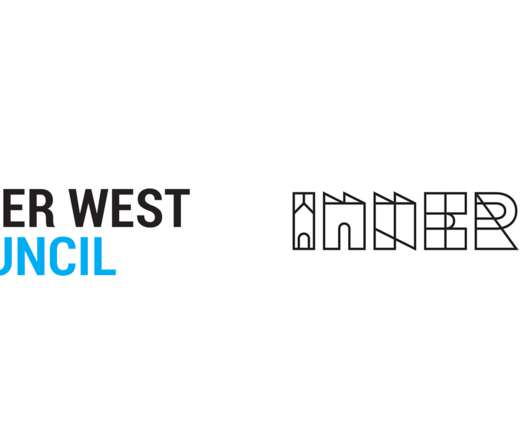
Established in 2016, Inner West Council is a local government area located in, as its name implies, the inner western region of (not implied) Sydney, Australia. The logo and identity system has been constructed around the iconic places, spaces and historic architectural forms of the area. Logo animation. “Join the Inner Circle”.
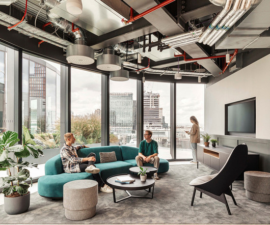
Alongside the new logo, many of Pfizer’s core values are also integrated into the new office design. Newmont by Rezen Studio , Perth, Australia, Best of Australia Winner Photo: Jack Lovel “As the world’s leading gold miner, Newmont is widely recognized for its principled environmental, social, and governance practices. Pfizer, Inc.
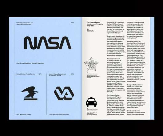
The note addressed what the president called an “increasing awareness” of the arts among the American populus – an observation that kick started a decade of high-profile design improvements made to government departments and agencies, known as the Federal Design Improvement Program (FDIP). The many faces of the FDIP.
Social distancing is fast becoming the new norm for many of us as the coronavirus pandemic continues to unfold, with the UK becoming the latest country to introduce a government enforced lockdown.
2016) " Impossible Aerospace is dedicated to designing and building performance unmanned aircraft for sensitive government and enterprise customers. Logo animation. Logo on drone. Logo on vests. Logo on box. Logo on and in hangar. government organization but maybe that’s not all bad. Stacked version.
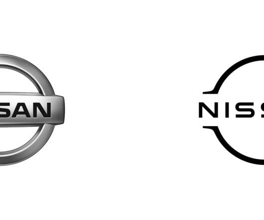
This debut is presented as a milestone and turning point for the company as it " opens a new chapter for the Nissan brand " and with it, introduced -- despite some previous appearances since March of this year when it was filed for trademark -- a new logo designed in-house. New logo introduction video. Logo, large view.
The work includes a new logo based on a series of hemisphere shapes as well as guidelines for data visualisations for CCC’s future reports. It aims to advise the UK and devolved governments on emission targets and to report on the progress being made in any reductions. The logo can also be animated.
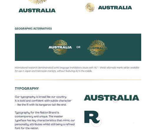
The work has been done by the Sydney-based marketing agency Clemenger BBDO and the results have been published in a government report by the country’s Nation Brand Advisory Council. “We love our kangaroo” The heart of the new identity is a new logo, which takes the form of the wattle, Australia’s national flower. .”
Builds Up Brand Recognition And Loyalty Logos, colour schemes, fonts, etc., Some branding basics to lock down: Visual identity – Logo, colour palette, typography, image styles Brand voice and tone – How do you communicate (funny, casual, trustworthy, knowledgeable, etc.)? Who are you as a brand, and what makes you unique?
Local government offices and non-profit organizations. Present your logo and use a uniform color palette on everything to make it easier for your audience to remember who you are. It can be as simple as a sticker or a pin of your brand logo for lower-level backers. Brand strategy is a big undertaking but here are the basics.
It works with the government, both at the national and state levels, and with NGOs, in the areas of community action for health, urban health, scaling up of successful pilots and social and behaviour change communication. Logo animation. Images (opinion after). Your browser does not support the video tag. Identity introduction.
History of the NASA Logo Design: From Meatball to Worm If you're a fan of NASA, you're probably familiar with the agency's iconic logos. NASA's ambitious mission to send humans back to the Moon by 2024 has its unique logo , featuring a bold “A” and an arrow pointing towards the Moon. And then there's the Worm.
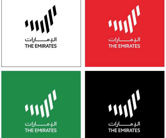
The United Arab Emirates (UAE) has unveiled a new logo and slogan, as part of a wider brand identity for the country. The logo had an unusual journey to development. ” Logo design. The new logo comprises seven curved lines, representing each of the UAE’s sovereign constitutional monarchies.
Logo Design Guide: Crafting an Impactful Brand Identity A logo is often the first impression your brand makes on potential customers. An effective logo conveys what your company stands for and creates an emotional connection with your audience. However, designing an iconic logo takes skill and strategic thinking.
Building Your Brand Guidelines Logos: Create a visually iconic and recognisable logo that represents your brand. Logo Design Your logo is the cornerstone of your visual identity. Logo design tools on the market range from: Canva: User-friendly drag-and-drop templates to customise a logo with images, shapes, and fonts.
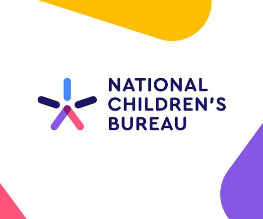
Years of austerity have seen funding for children’s services and education cut by local authorities and central government while the demand for support has increased. From parents and children, to central government and other partners, NCB brings together the people and organisations who bring about the best for our children.
As well as safeguarding and championing the interests of our members, the Music Publishers Association aims to promote the value of publishing to the wider music industry, creative industry, government and the general public. Logo animation. Logo on gradient. The logo animation (plus sound mnemonic) is annoyingly good.
We organize all of the trending information in your field so you don't have to. Join 66,000+ users and stay up to date on the latest articles your peers are reading.
You know about us, now we want to get to know you!
Let's personalize your content
Let's get even more personalized
We recognize your account from another site in our network, please click 'Send Email' below to continue with verifying your account and setting a password.


Let's personalize your content