This site uses cookies to improve your experience. To help us insure we adhere to various privacy regulations, please select your country/region of residence. If you do not select a country, we will assume you are from the United States. Select your Cookie Settings or view our Privacy Policy and Terms of Use.
Cookie Settings
Cookies and similar technologies are used on this website for proper function of the website, for tracking performance analytics and for marketing purposes. We and some of our third-party providers may use cookie data for various purposes. Please review the cookie settings below and choose your preference.
Used for the proper function of the website
Used for monitoring website traffic and interactions
Cookie Settings
Cookies and similar technologies are used on this website for proper function of the website, for tracking performance analytics and for marketing purposes. We and some of our third-party providers may use cookie data for various purposes. Please review the cookie settings below and choose your preference.
Strictly Necessary: Used for the proper function of the website
Performance/Analytics: Used for monitoring website traffic and interactions
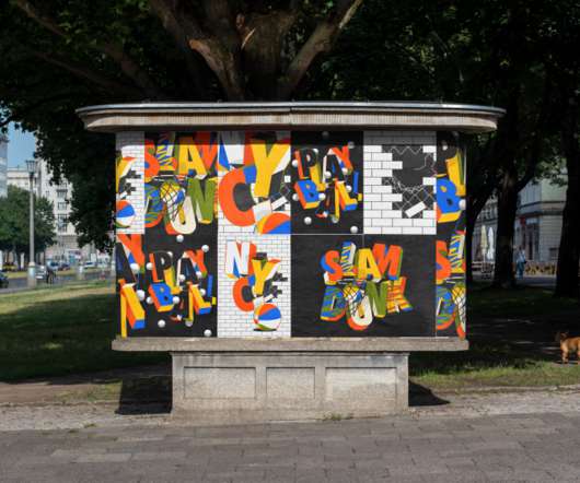
From serifs and sans-serifs to display options and stencil typefaces, there's something to suit everyone this autumn thanks to Colophon, Order, Lineto, Playtype, TypeMates, and many more excellent designers. FF DIN Slab by Albert-Jan Pool, Antonia Cornelius and Achaz Reuss. Apta by Colophon. Etude by Order Type Foundry.
Here we present a great example of how to do it right and chat to its creator, Lynne McCusker , to find out more about it. Although the shop won't launch till next year, we love the designs and were keen to learn more about them. Lynne McCusker is a senior freelance designer based in Scotland.
As a design concept, minimalism is driven by the idea that less is more. The FF Din font family has a whopping 20 weights with a rounded font version. FF DIN provides advanced typographical support with features such as case-sensitive forms, fractions, super- and subscript characters, and stylistic alternates. Proxima Nova.
The default set is predominantly geometrical, while the use of OpenType stylistic sets enables a transition from orthogonal to flat terminals, guiding the design to a more humanistic style. So where, ordinarily, the lower parts of a letter are a little larger to make it feel more stable, Easy is dynamic; the top is heavy.
Jonathan Moody Talks Finding Your People, Future Architects + More. Cecilie Manz Shares Her Love of Simplicity, Favorite Tools + More. She founded her studio in 1997, and has had the opportunity to work with the likes of Duravit, Fritz Hansen, Bang & Olufsen, and more. Sam McNally on His Spiritual Home, 35mm Cameras + More.
Typical static content websites are more of the bread-and-butter layouts we see every day. However, there are plenty of more detailed examples involving message boards, forums, and other social communities. Eyes on FF. The process of designing a website can be long and arduous. Android Central. Cartoon Network Asia. Comic Vine.
Ligatures use their joining power to combine two or more letters into a single letter, which helps readers with the flow of typography. Traditionally seen mainly in serifs, ligature fonts are now breaking out of their limitations to make sans serifs more readable and give them some decorative touches. What Are Ligatures?
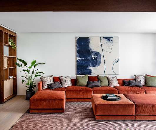
To this end, the brand was refined with a typographic update, seeking a new font that was consistent with the original image yet containing more friendly forms. I like how the photography can be used to span multiple blocks with a line running across them or be cropped more neatly. Guidelines. Color palette. Typography treatments.
Visual Impact You want your logo to grab people's attention—Prioritise fonts with distinguishing traits that are still readable (more on this below!). Originality While using a standard font has familiarity benefits, having a unique typography makes your brand more distinctive and ownable. But beware of display sizes!
Designed by Erik Spiekermann, FF Meta has popped up in quite a few projects at Shillington throughout 2019. Created as a bespoke typeface for Visuelt , a design conference in Oslo, this typeface by Colophon spawned from a “more considered and constrained version” of Aperçu. Learn more at www.shillingtoneducation.com.
ASICS Feel Fast & Dynaflyte FF - Illustration and Motion Design. For more information make sure to check out: Adhemas.com. abduzeedo 09.17.20 Adhemas Batista directed a series of animations for Asics Worldwide partnering with Zombie Studio and commissioned by 180LA , advertising agency based in Los Angeles. Instagram.
Your team collaboration systems ff you’re going to work remotely. Some are hosting a website builder for one-pagers, domain forwarding, MX and TXT records, plus other features that are more suited for tech people. Wix is an older and thus more popular website service. The next action you want your visitors to do on each page.
The font has broad, playful loops in its lettering that gives the design a more light-hearted appearance. FF Meta Bold – The Weather Channel. FF Meta Bold is the font which The Weather Channel uses for its logo. It is part of the FF Meta family, but it’s thicker and less formal than the standard typeface.
There are many reasons why I chose Eugene Yukechev’s FF Casus from a plethora of the year’s releases. The more effort Eugene dedicated to the project, the more original it became. After he graduated, we met a few more times to discuss his project. I first met Eugene in 2004, when I was still a Type and Media student.
Designed in 1884 by Alexander Lawson for the Century Schoolbook , the slightly condensed letterforms offer a more compact footprint without compressing readability. The condensed proportions occupy less real estate, allowing more content presentation. Sans Serif Fonts Signal Modernity For The Digital Era 10.
This is a more playful take on the sans serif typeface. For outdoor signs, we can explore using sans serif fonts, such as the ff: Bison is a strong font family and sophisticated sans serif. With it, you can create logos, use in advertising, packaging, book covers and magazines, headings, descriptions and much more.
It is multilingual and perfect for posters, branding, and more! It’s perfect for posters, logos, apparel, and more! You’ll get 6 fonts with 3 weights, adjustable ligatures, contextual alternates, carefully crafted multilingual characters, and more. Esqadero FF CY Typeface by Sergiy Tkachenko. Give it a go (it’s free)!
The old logo, in what looks like a tweaked version of FF Cocon -- which I think is typographic public enemy number one (beyond Comic Sans or Papyrus) but doesn't get such a bad rap since it isn't so widely available -- was not very good, although I'll admit there was something enjoyable about the repeating "ö"s. &Walsh project page.
Designers gravitate toward more versatile, expressive, and innovative fonts, as digital media expands into new realms. As our beloved minimalism shifts toward a more human-centric approach, these fonts will dominate corporate, tech, and editorial design. GT Eesti by Grilli Type A modern, humanist sans-serif with a warm, friendly tone.
The result is a more cohesive, human-focused brand that reflects the Hospital’s reputation as a science-driven network of excellence, that’s focused on advancing health for everyone. I’ll admit that it made me happy to see FF Meta out of pure nostalgia. I would also love to see more of that crest/RMH pattern on the cups.
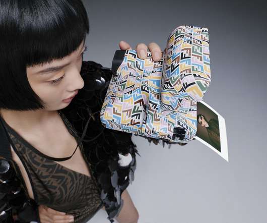
Harkening to an era when instant film ruled rather than Instagram, the FENDI x Vintage Polaroid OneStep Close-Up 600 instant camera arrives as part of the fashion label’s Summer 2021 Capsule Collection emblazoned with a multicolored FF Vertigo logo motif given a wavy fisheye treatment.
For his clients he’s managed FF&E design, procurement, and fit-out contracts on over 150,000 square feet of high-end residential development projects. In more recent years, there has been more relaxing going on, and I’ve had the opportunity to spend time hanging out in some of the more secluded parts of the island.
While I understand that modern home games are far more complex than arcade games and do not require such decorative typefaces to convey information or attract paying customers, I wish developers were more creative with type. The font technology in games needs to evolve in order to give the developers more creative freedom.
We foretell that font trends in 2023 will have an invigorating and eclectic mood, allowing designers to flex their typographic muscles more creatively than ever across print, web, and social media design. . Conformity is defiantly out of fashion, with designers able to feel more free and experimental with different typefaces and typography.
It means more information, more content and more components, all in the same space. For this case, I personally find it rare to use more than 24px for texts. It’s more common to use small sizes for components — usually from 12 to 18 pixels depending on the text’s importance. Large preview ). Color Styles.
We had these individually striking images and the flowers looked beautiful, but we needed to bring back some of the Freddie’s style… We managed this through movement, text and a few FF brand assets, and ended up with something relatable to us: our flowers, but in a new, unique and really beautiful way,” he adds.
Fresh type included Odesta, FF Mark, Lava, Line, and Landmark. Swiss Typefaces posted the first of now more than one hundred contributions. We examined a new prayer and song book and the typography of Disneyland. Morton Salt turned 100. So did Cochin and LoType. The rediscovery of ITC Serif Gothic picked up steam.
First Prize [ More ]. FF Uberhand [ Info ]. FF Casus Cyrillic. Rialto dF (update) [ Fst ]. Autor [ Fsp ] [ Id ]. Bw Gradual. PMN Caecilia Sans. 1 , Centra No.2. Columbia Sans. Graphik (expansion). LFT Iro Sans. Jaroslav [ Fst ]. Milliard [ Id ]. BC Novatica. Praxis Next [ Id ]. Wolpe Tempest. Teddy [ Info , Fsp ]. Beyond Latin.
You can combine Fabrikat Normal with the more straight and space saving Fabrikat Kompakt or the reduced to the max Fabrikat Mono. As more and more people fell in love with the look of Fabrikat, we felt that there is a need for a more “normal” version that can be used as a workhorse for long texts and complex typographic challenges.
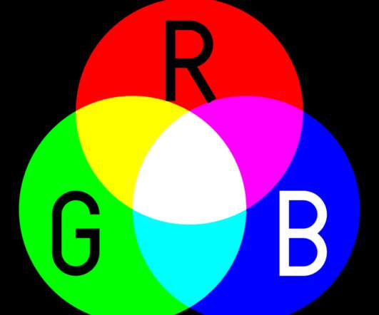
This is a fairly easy one to read, but of course, it does get a little more complicated…. Using these rules, we can see that the highest value possible in just two digits would be “FF” or 255. Let’s take another look at some more blends. Black — #000000. You multiply the second number by 1. Green — #00FF00. Blue — #0000FF.
That assumption was correct until I began testing the range input across multiple browsers and quickly realized that I had a lot more work on my hands. Last but not least is Edge which, now that Microsoft Edge is built off Chromium , is way more aligned with the other three browsers than its pre-Chromium predecessor. More after jump!
But punk was more than just music. The Face was more than just a magazine under his tenure; it was a visual manifesto, challenging stale creative conventions and redefining what a publication could be. One of Brody's most iconic typefaces from this experimental ethos was “FF Blur,” released in 1991.
It's more than just some fancy graphic; it's the core of your brand identity. More Than Merch While it looked wicked cool on t-shirts and album covers, the Steal Your Face logo took on extra meaning within Dead culture. Each one is more gloriously disturbing than the last.
He’s had clients like Lou Reed, David Byrne, the Guggenheim, and many more. The studio’s design talent boasts some famous names among the list of partners, including Paula Scher, Michael Beirut, Alan Fletcher, Colin Forbes, Harry Pearce, and many more. Francisco MOMA, Hyundai, Porsche, GE, and more.
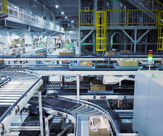
mounts to more e?sed ng for more effective route pl?nn?ng, nd more secure workpl?ce cker, more rel??ble, s AI technology grows, more ?dv?nced bles logistics bus?nesses nesses to ?utom?te ety of oper?t?ons, nventory m?n?gement, gement, process ?utom?t?on, sed processes, lower expenses, ?nd ll product?v?ty.
We organize all of the trending information in your field so you don't have to. Join 66,000+ users and stay up to date on the latest articles your peers are reading.
You know about us, now we want to get to know you!
Let's personalize your content
Let's get even more personalized
We recognize your account from another site in our network, please click 'Send Email' below to continue with verifying your account and setting a password.


Let's personalize your content