This site uses cookies to improve your experience. To help us insure we adhere to various privacy regulations, please select your country/region of residence. If you do not select a country, we will assume you are from the United States. Select your Cookie Settings or view our Privacy Policy and Terms of Use.
Cookie Settings
Cookies and similar technologies are used on this website for proper function of the website, for tracking performance analytics and for marketing purposes. We and some of our third-party providers may use cookie data for various purposes. Please review the cookie settings below and choose your preference.
Used for the proper function of the website
Used for monitoring website traffic and interactions
Cookie Settings
Cookies and similar technologies are used on this website for proper function of the website, for tracking performance analytics and for marketing purposes. We and some of our third-party providers may use cookie data for various purposes. Please review the cookie settings below and choose your preference.
Strictly Necessary: Used for the proper function of the website
Performance/Analytics: Used for monitoring website traffic and interactions
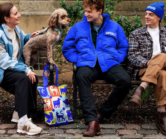
With its new, more distinct logotype, richer colour palette, and suite of iconography, the RSPCA hopes to rally support for tackling the growing global challenges in animal welfare. As the RSPCA celebrates 200 years of working to help animals live fairer and better lives, it has launched a new purpose, positioning, and brand identity designed by Jones Knowles Ritchie (JKR).
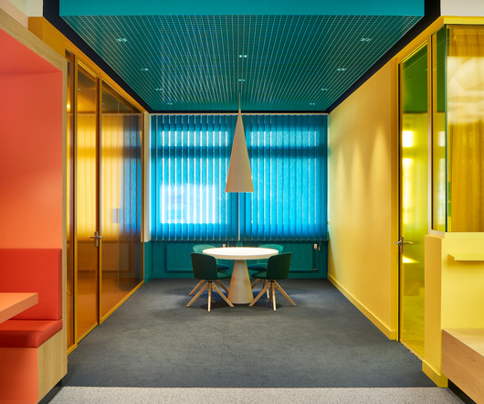
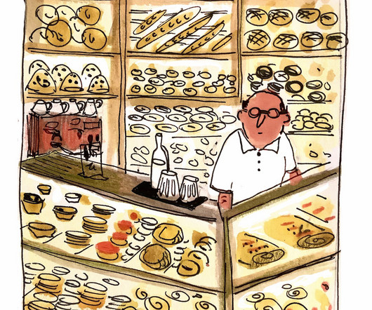
If the eccentric proprietor of the Wonka Chocolate Factory had a headquarters like this, he’d probably think twice about handing over the keys to little Charlie. Designed by Ippolito Fleitz Group (IFG) , the new Ritter Sport Schokozentrale (which translates to Chocolate Central) in Waldenbuch, Germany, is an exemplary model of what an inspiring, joyful, and innovative office in the sweets industry – or any industry, for that matter – should look like.
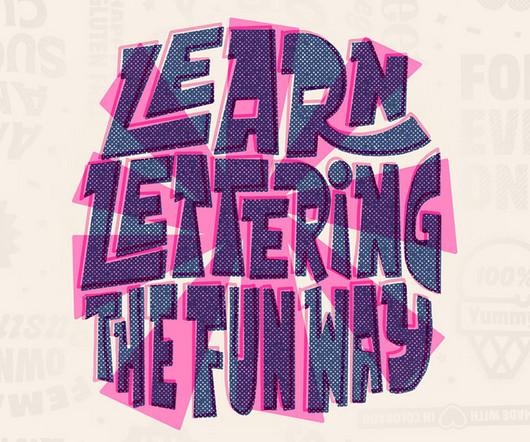
Embark on a journey of futuristic creativity and inspiration with our avant-garde handcrafted and digital hand lettering typography quotes, pulsating with positive energy. As visionary graphic designers and artists pioneer new realms of expression, they fuse watercolor, chalkboard, paper, and opulent gold textures to craft mesmerizing inspirational quotes and lettering typography designs imbued with the essence of goodtype philosophy.
Speaker: Amber Asay, Creative Director and Founder of award-winning design studio Nice People
Understanding what trends are happening and how they’re impacting the competitive landscape is crucial to providing top dollar design strategy to your clients. With so many trends coming and going, it can be overwhelming to determine which ones you should capitalize on and which ones might not be worth the trouble. In this exclusive webinar with Amber Asay, we’ll explore graphic design trends that need to die, trends that are starting to pick up and why, trends that have come and gone, and how t
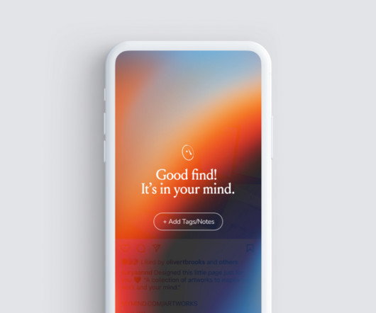
Mymind streamlines the design process, saving you a ton of time and effort. We explain how it all works and how you can get started today. Let's cut to the chase. If you're a designer, and you're not using mymind , then we think you should check it out. Why? Because, in all likelihood, it will save you a huge amount of time faffing around and make the whole process of gathering visual inspiration a more fun and rewarding experience.
While star -chitects bask in the glory of their completed projects, contractors and construction companies responsible for realizing those designs are often overlooked. And at no fault of their own, so too is the general public unaware of the difference between things like interior architecture and interior design – the articulation of functional space through building and the making of interior atmospheres through aesthetics, respectively.
Read the book, Typographic Firsts Steven Heller takes a closer look at the Atol font family. The post Steven Heller’s Font of the Month: Atol appeared first on I Love Typography.
Read the book, Typographic Firsts Steven Heller takes a closer look at the Atol font family. The post Steven Heller’s Font of the Month: Atol appeared first on I Love Typography.
Image licensed via Adobe Stock If networking isn't working for you, it's time to change things up. We gathered advice from the creative community on how to do this. Are you short of work or just looking for new and more interesting opportunities? We all know part of the answer is to get out there more and network. But for many of us, the very idea fills us with horror.
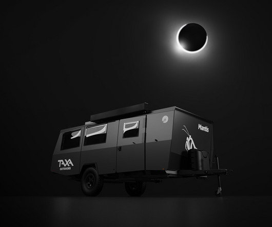
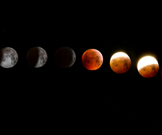
Did you catch that once in a lifetime total solar eclipse? If not, you’ve got a second chance of sorts, in the form of TAXA Outdoors’ The Dark Sky Mantis overlanding trailer. The matte black finish is supposedly inspired by the celestial phenomenon, a claim that seems like a reach amongst the uninitiated until you realize TAXA specializes in NASA-style approach to designing recreational habitats on wheels.
Read the book, Typographic Firsts Steven Heller takes a closer look at the Atol font family. The post Steven Heller’s Font of the Month: Atol appeared first on I Love Typography.
Brands must create and share impactful content to thrive, but they have less people, tighter budgets, and fewer resources to do so. Learn how to publish and market digital content with the same professionalism as organizations with million-dollar budgets.
Image licensed via Adobe Stock In a world that often misunderstands and stigmatises ADHD, a growing community of artists is challenging the status quo. According to a recent report in Men's Health, there has been a staggering 400% increase in the number of adults seeking a diagnosis of ADHD (Attention-deficit/hyperactivity disorder) since 2020, shedding light on the struggles many creatives face.
Stepping onto the grounds of this Bethesda, Maryland home, visitors are greeted by the majestic ginkgo trees that frame the entrance. This newly renovated 1920s center-hall colonial – dubbed the Ginko House – has undergone a major transformation, breathing new life into its historic bones while retaining some of its original charm. The 4,875-square-foot home had a large addition located at the rear, consisting of a kitchen, great room, and primary suite, that was flooded with natural light.
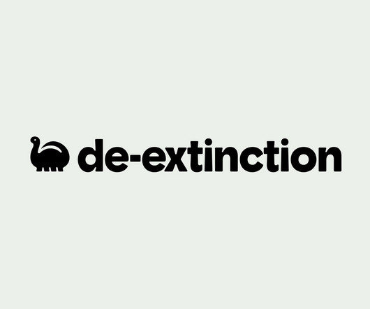
Koto’s new work is undoubtedly gorgeous – after all, what’s not to love about a suite of very cute dinosaurs? Especially when they’re rendered in a charming faux naif sort of style, and the whole colour palette is based around Barney & Friends purpley pink and the effervescently Gen Z-baiting neon of ‘terminal green’. The project in question is Koto’s The post De-Extinction by Koto appeared first on BP&O - Branding, Packaging and Opinion.
As the design industry evolves, teams are facing new challenges and a need to produce more outstanding creative work than ever. Leaders must learn how to adapt their processes to solve today’s—and tomorrow’s—unique design challenges. In this e-book, you’ll learn how to establish your creative workflow and leverage the power of CorelDRAW® Graphics Suite to streamline the entire design process, from start to finish.
Les Planches The collection of paintings is divided into two parts: one dense room that reflects Jullien's relationship with the city and another that portrays his fascination with the outdoors. French artist and graphic designer Jean Jullien is back with a solo exhibition, LOLO, which asks questions about whether cities are the best places for people to live in one of the most famous cities in the world: New York.
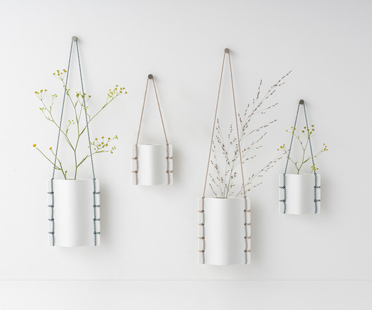
Inspired by the intricate art of bookbinding, product designer Ryosuke Fukusada has created a series of flower vases that seamlessly blend contemporary design with heritage techniques. The collection is named WATOJI , which references Japanese bookbinding, and was manufactured in collaboration with Ceramic Japan , a company based in the city of Seto whose region has a 1,300-year-old history with traditional pottery making.
Where to begin with Thick Pickle? This conceptual brand began in 2023 as a self-initiated ‘studio side project’ for California-based studio Studyhall. As it blew up though, Studyhall began to wonder if the brand had legs – literally, as demonstrated by the disconcertingly buff, aviator-shade-sporting animated pickle (gherkin or pickled cucumber for the Brits) mascot who strides across pop-up windows The post Thick Pickle by Studyhall appeared first on BP&O - Branding, Packaging and Opinion.
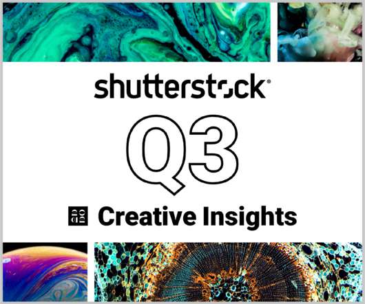
In today’s competitive markets, how do you make sure that your content not only stands out but performs well? How can you predict whether certain design choices will result in clicks, engagement, downloads, and other drivers of ROI? Shutterstock’s Creative Insights Report (Q3) is your window into the hottest trends that are transforming the creative world.
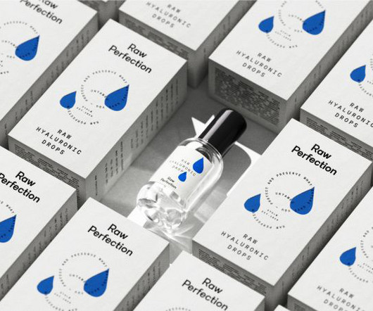
Raw Perfections' identity features a logotype that conveys the rigorous testing process its ingredients undergo, as well as intentionally imperfect illustrations that guide users through the skincare routine. "You deserve to be comfortable and proud in your own skin". That's the message that vegan and cruelty-free skincare brand Raw Perfection drives through its new identity, designed by Scandinavian consumer brand and design agency Everland.
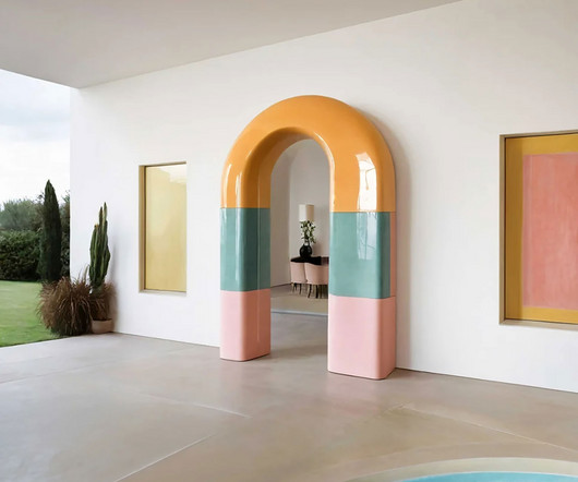
Arguably one of the most iconic architectural forms referenced today, the arch remains resolute in its strength, stability, and visual vibration. While its capability as a construct is inextricably tied to material performance, its broader application as a cultural fixture continues to proliferate. Semicircular, stilted, shouldered, and segmental. Or perhaps pointed, parabolic, basket, and depressed – sometimes even flat.
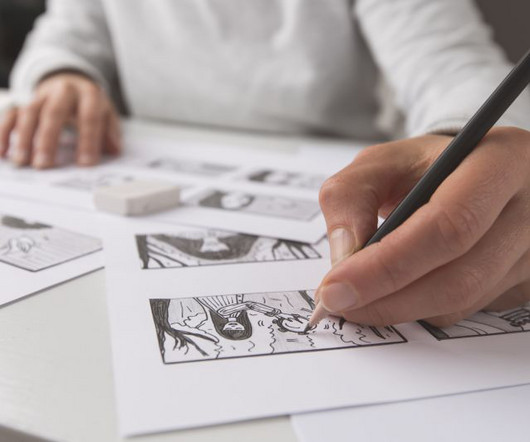
Thomas Edison once said “Vision without execution is hallucination.” This statement applies not just to invention, but to graphic design. One of the greatest strengths of graphic designers is the ability to first develop a concept and then execute it to make it real. From visualization and ideation all the way through to actuation and execution, each step of this process takes skill and expertise.
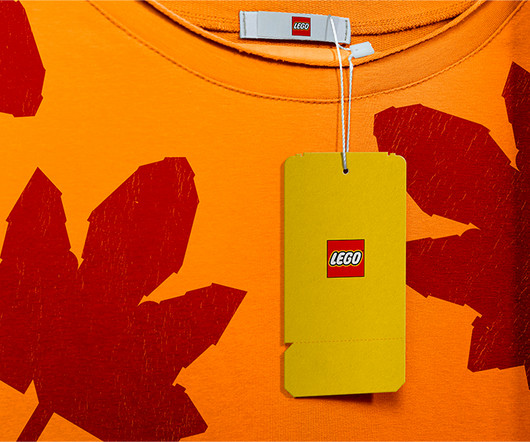
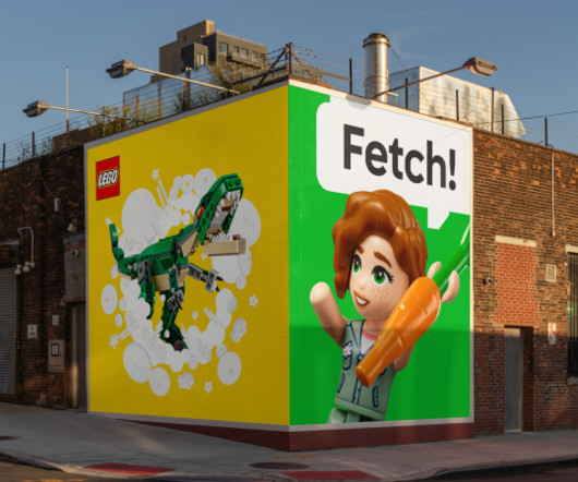
The LEGO Group has unveiled a striking new identity today created in collaboration with brand consultancy Interbrand. Designed to make play more accessible, the updated look reflects what makes the LEGO brand so important. Ever since it was founded in 1932 by Ole Kirk Kristiansen, the LEGO Group has lived up to its name by encouraging generations of children and fans to play well.
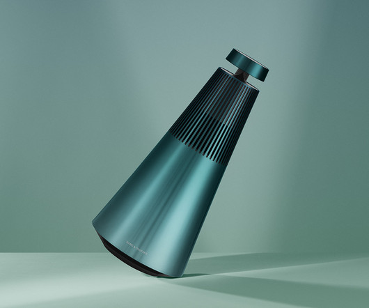
Bang & Olufsen’s Atelier Editions arrives with a new seasonal update, this time looking to the heavens and the mesmerizing atmospheric miracle known as the Northern Lights for inspiration, tinting both the Beoplay EX and Beosound 2 3rd Gen a hue described as Northern Sky Turquoise. The latest limited-edition design from the Danish brand’s bespoke Atelier Editions series wears a sheen of tranquility – an icy gradient inspired by the soothing hues of a winter’s night illuminated by
Edmonton-based artist Gabriel Esteban Molina was the artist selected from our Capture Public Art Open Call this year! Thanks again to everyone who submitted. Gabriel’s images will be installed at the King Edward Canada Line Train Station, here in Vancouver, as part of Capture 2024. The images on display are from Gabriel’s series “The Great Divide” which draws on the connection between photography and nostalgia.
Speaker: Eden Spivak, Design Expert and Editor at Wix & Nir Horesh, Accessibility Lead and Senior Product Manager at Wix
When we design products or websites for people like ourselves, there are many others who are, as a result, left out. From visually impaired users who rely on assistive technology, to people with a temporary injury such as a broken arm, tech users are forever diverse and beautifully unique. The products we design can, and should, reflect the extremely wide range of human experiences and needs.
Based on a 1979 photography exhibition, Janine Wiedel's book offers an eye-opening look back at the West Midlands industry in the late 1970s. Bluecoat Press has announced the publication of Vulcan's Forge , a groundbreaking documentation of West Midlands industry by renowned photographer Janine Wiedel. And it's been a LONG time in the making. Originally exhibited at The Photographers' Gallery in 1979 to critical acclaim, Vulcan's Forge is considered one of the most important photographic works o
With the official arrival of spring, we all start to feel revitalized, energetic, and with a renewed hope drawn from nature permeating our minds, spirits, and homes. It’s a seasonal shift that can feel so powerful and inspiring. No wonder Seoul-based Blue Balcony Design Studio felt called to create its latest designs inspired by nature’s fierce intention and purpose when in bloom.
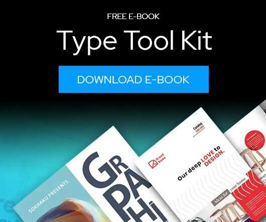
Download this free eBook to learn how you can create stunning typography, using the basics, such as placing text, to advanced controls like ligatures, variable fonts, effects, tracking, range kerning, and everything in between. Learn how to: Use Character Control to add variety to your font styles. Use Paragraph Control to manage spacing, alignment, justification and more.
We organize all of the trending information in your field so you don't have to. Join 66,000+ users and stay up to date on the latest articles your peers are reading.
You know about us, now we want to get to know you!
Let's personalize your content
Let's get even more personalized
We recognize your account from another site in our network, please click 'Send Email' below to continue with verifying your account and setting a password.


Let's personalize your content