This site uses cookies to improve your experience. To help us insure we adhere to various privacy regulations, please select your country/region of residence. If you do not select a country, we will assume you are from the United States. Select your Cookie Settings or view our Privacy Policy and Terms of Use.
Cookie Settings
Cookies and similar technologies are used on this website for proper function of the website, for tracking performance analytics and for marketing purposes. We and some of our third-party providers may use cookie data for various purposes. Please review the cookie settings below and choose your preference.
Used for the proper function of the website
Used for monitoring website traffic and interactions
Cookie Settings
Cookies and similar technologies are used on this website for proper function of the website, for tracking performance analytics and for marketing purposes. We and some of our third-party providers may use cookie data for various purposes. Please review the cookie settings below and choose your preference.
Strictly Necessary: Used for the proper function of the website
Performance/Analytics: Used for monitoring website traffic and interactions
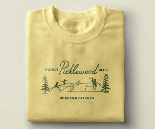
And they turned to local creative website agency People People to define and create a memorable brand and visual identity. From the midcentury script typography to the playful supporting illustrations and colour palette to the custom plaid and argyle patterns, everything is designed with tongue-in-cheek. It's pickleball, after all."
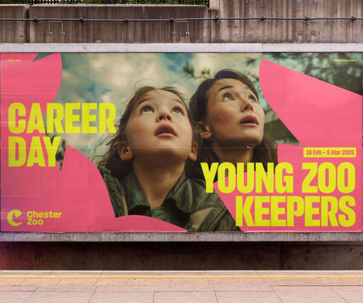
As part of a two-year collaboration with How&How, the conservation charity reinvents itself with a new logo, custom typeface and migration-inspired patterns. At the cutting edge of conservation, Chester Zoo wanted a new brand and website to champion these nature-positive efforts. But behind the scenes, there's a lot more going on.
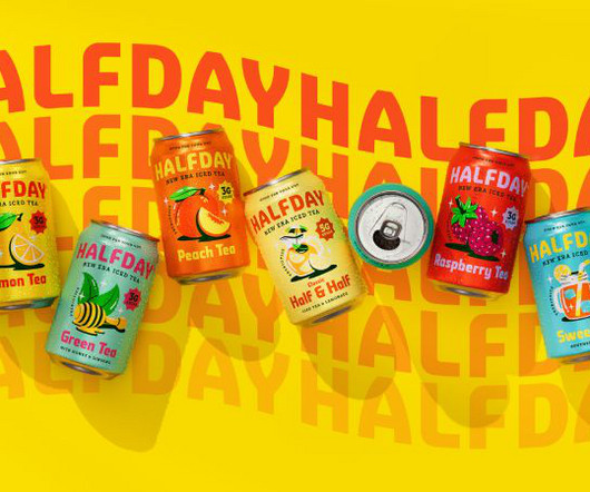
In a drinks market overflowing with kombuchas, seltzers, and adaptogen-laced elixirs, where health-conscious consumers are becoming increasingly selective with their choices, being the go-to brand is no easy feat. Enter Earthling Studio, which was tasked with overhauling HALFDAY's visual identity and brand world.
Mexico City and Los Cabos-based branding studio Bala was given this all-important task by Mexican beer brand Cerveza Cru Cru, who wanted a label design for their new beer where grasshopper - or "chapulín" - is the main ingredient. Though this was an exciting project for Bala to work on, the label's readability was challenged.
At the heart of this redesign is a deep dive into player passion, creating a brand experience that resonates across every game and media platform Riot touches. What emerged was that, while Riot owns many properties across multiple media, there is a unified brand purpose at the heart of everything it does: making the player experience better.
Paula Scher , Michael Bierut, Marina Willer, Samar Maakaroun, Eddie Opara and others have led some of the most iconic branding and design projects of our time, and it's ultimately Pentagram's ability to evolve while maintaining high standards of creativity that's led them to top our list.
"As an exciting and disruptive extension to our line, Refreshers is designed to drive penetration, recruiting new users and boosting our ambition to become the most loved RTD coffee brand in the market." The rebrand brings a sense of freshness and flair that matches the product's personality.
The airline commissioned illustrator and pattern designer Martha Olivia to create a suite of six bespoke illustrations for their High Life magazine. She says: "British Airways is such an iconic name, and it's inspiring to collaborate with a brand that connects people and destinations worldwide." million TikTok posts.
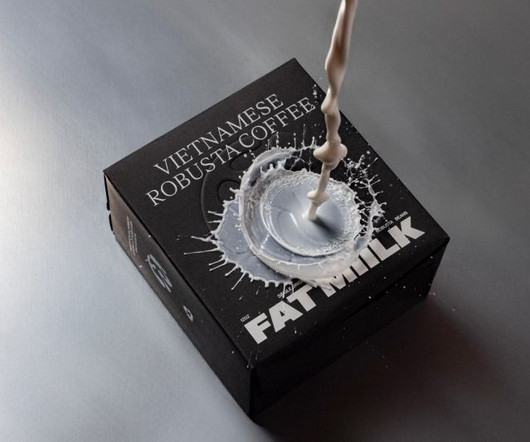
Still, getting attention and conveying the quality of your brand isn't easy. The company was founded by Vietnamese-American Lan Ho, a daughter of immigrant political refugees, but was not the only Vietnamese coffee brand in the US by any means. To do so, they turned to award-winning LA branding agency Truffl.
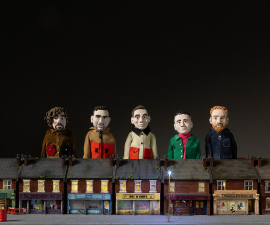
From creating captivating miniature worlds for BBC promos and music videos to crafting immersive experiences for brands like Jongga Kimchi, Scale Model Studios has mastered its field, combining the charm of handcrafted details with cutting-edge technology to deliver authentic, emotionally resonant storytelling.
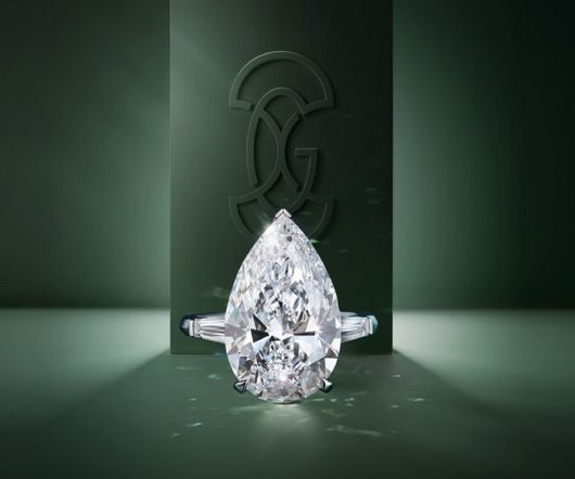
Founded by British jeweller Laurence Graff in 1960, Graff is probably the most prestigious brand in diamond jewellery worldwide today. It was the unique Graff lattice found on the back of most signature pieces which served to inspire the new Graff brandpattern.
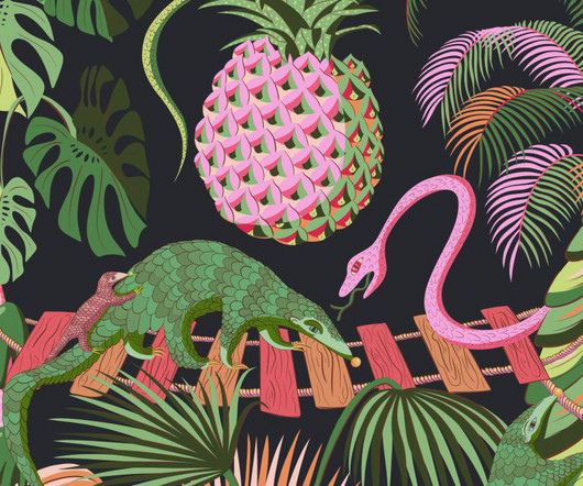
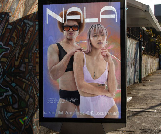
Yet Nala, an Australian-based underwear brand, believes it doesn't have to be that way. And while some brands have made huge steps toward a more inclusive industry, none were flaunting it loudly, proudly, and truly celebrating the diversity of the body. The visual language features unique patterns that are rich and ownable.
Based in Chichester, this full-service branding and packaging design studio describes itself as "a small but mighty design studio dedicated to creating feel-good brands willing to be brave". Its lava lamp-like fluidity became a theme for the brand and a truly ownable device for packaging and beyond.
We're big fans of Belfast branding studio Angel & Anchor ; back in March, we reported on their VHS-inspired identity for speciality coffee roaster Process. But its original branding wasn't up to scratch. With a new, secure sense of self, they wanted the new branding to reflect their story and values holistically.
Influur helps content creators get work with brands for a decent compensation. Influur is a specialist agency that connects these creators, specifically in the areas of music, dance and lifestyle, with brands, helping them form impactful partnerships and reach specific target groups. It's a strange world we live in.
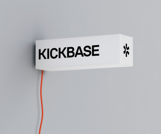
Kickbase, one of Europe's biggest fantasy football manager games, has some big ambitions and needed branding to match. The studio partners with visionaries, businesses and agencies to shape future brands. With this in mind, it was time to revisit their identity to help craft a brand that reflects these ambitions.
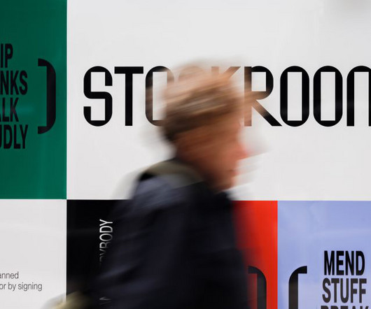
StudioDBD took an original and unusual approach to developing a brand identity for Stockroom, a new cultural hub in Stockport. Therefore, the branding needed to be both accessible and inclusive and adaptable. The best drawings were then selected as the starting point for the brand's illustrative aspect.
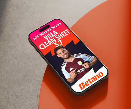
Nomad Studio explains how it crafted an electrifying brand for the online gaming industry—just in time for it to step up to the world stage. Based in Athens, this GameTech company operate two brands, Betano and Stoiximan, in 16 countries and employs more than 2,500 people across three continents.
Developer and digital art director Dan Powell explains how he used custom typography and generative tools to design the brand identity for Frontify Futures, an exciting new platform that explores tomorrow's brand-building landscape. Who knows where branding will go in the future? The system's alive; that's the point.
Next, Fangfang wants to combine her illustration and animation skills to create brand campaigns for clients in travel and culture, illustrate non-fiction books and collaborate with fashion designers to create patterns and prints.
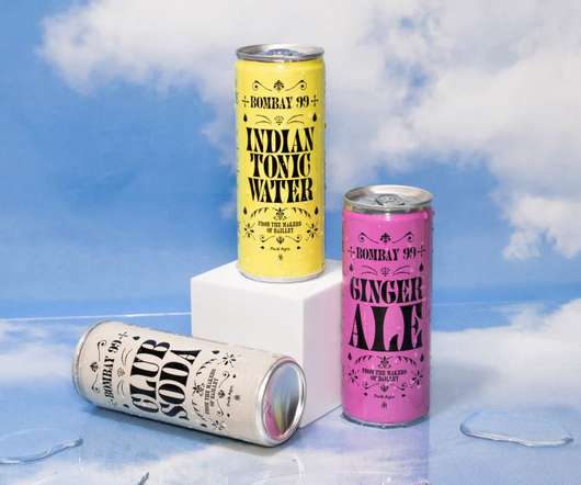
Available in cans of 250ml and 150ml with three key flavours, Walsh and her team were appointed to create the branding and packaging design for the launch of the new product line. The Bombay 99 name is an ode to the brand roots, referring to the pin code of their historic headquarters in Mumba," Jessica tells Creative Boom. "We
Yet Nala, an Australian-based underwear brand, believes it doesn't have to be that way. And while some brands have made huge steps toward a more inclusive industry, none were flaunting it loudly, proudly, and truly celebrating the diversity of the body. The visual language features unique patterns that are rich and ownable.
The garden-to-streetwear comfort shoe just got a head-to-toe print refresh courtesy of Finnish lifestyle design house Marimekko , known for its unapologetically bold patterns and color-happy aesthetic. For this collaboration, the print is refreshed in different scales and vibrant colorways, making each pair feel both timeless and brand new.
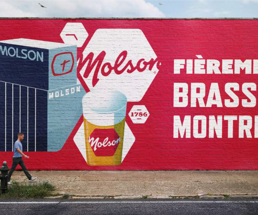
London-based design agency BrandOpus has revived Molson's heritage brand assets and brought the Masterbrand out of the shadows, reasserting its position in the Molson Coors portfolio. BrandOpus has refreshed iconic Canadian beer brand Molson's identity, taking its heritage hexagon asset and giving it a new purpose as a mosaic motif.
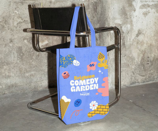
The London-based studio collaborates with renowned illustrator Hedof to create upbeat and engaging branding for the Comedy Garden Festival. The closest reference we found was music festivals, which helps set the design and branding of the 57 Festivals events apart from anything in the same category."
Whether you’re a designer, marketer, or brand strategist, staying ahead of these trends is essential to creating relevant, impactful designs. Staying informed on these trends is crucial for designers, marketers, and brands looking to stay ahead in a rapidly changing visual landscape. What is Maximalism?
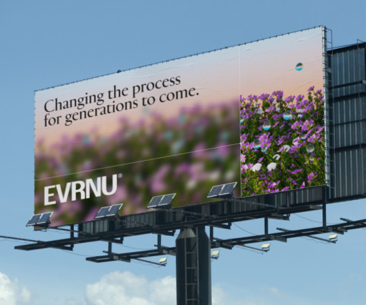
With a track record of producing pioneering work that looks to the future, it was felt that DEPT was a perfect fit for a brand which wants to reshape how people interact with and re-use their clothes and textiles. As for the NuCycl logo, this contains a nod to the brand's circular mission in its letter shapes.
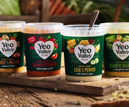
New illustrations are a key part of the brand's new identity, designed to help its new Greek and Kefir products stand out on the shelf. Most people will have seen the brand on supermarket shelves or had it in their homes, but what you might not know is that Yeo Valley is a real place in the heart of Somerset, owned by the Mead family.
This approach ensured the typography seamlessly integrated with the film's visual narrative while maintaining a strong, recognisable brand presence across digital and print applications. The hero film also actively shaped the overall brand identity. Colt echoes this sentiment, emphasising the shift towards more flexible systems.
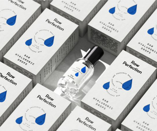
That's the message that vegan and cruelty-free skincare brand Raw Perfection drives through its new identity, designed by Scandinavian consumer brand and design agency Everland. The studio had collaborated with the brand's founder, Peter Ternström, on a previous project.
After winning the creative pitch against 270 agencies, they worked to interpret the brand strategy developed by Heavenly. Central concept "We used the brand strategy developed by Heavenly as a starting point, alongside the museum's business strategy," recalls Pentagram partner Marina Willer. "We
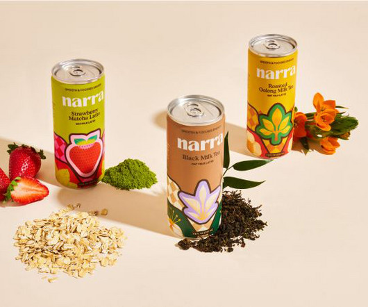
This summer sees the launch of Narra , a new Asian-inspired tea brand that brings the Filipino tradition of midday caffeine hit to a wider audience. As well as being unique in the tea category, this approach also provided a powerful contrast to the nods to Filipino tradition, which were woven into the brand identity. "We
Retro-futurism reflects a playful yet sophisticated look, making it popular across branding, website design, and digital art. Branded Content and Advertising: Companies like Apple and Nike have incorporated retro-futuristic elements in their marketing, creating ads that nod to vintage designs but with a high-tech edge.
From haute couture to leisure wear, big brands want to make their launch events and retail activations memorable and emphasise the artistry and individuality of their products. They also want to give their guests something tangible and meaningful, strengthening their connection with their most valued customers. For the Mayor of London.
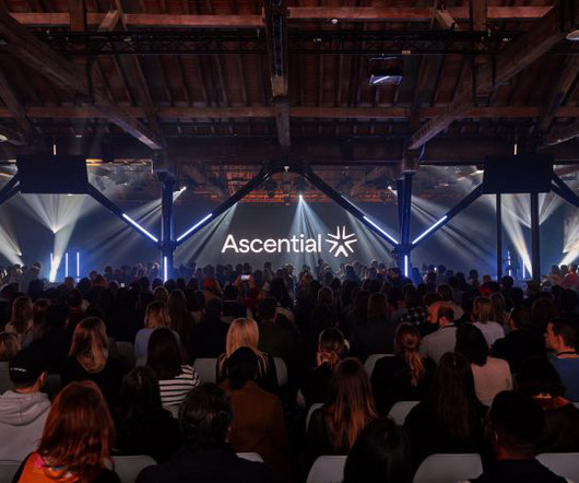
In light of this transformation, Ascential needed new branding to represent this new, focused offering. So it teamed up with DesignStudio , the global brand agency with studios in London, New York, Shanghai and Sydney whose clients include Airbnb, Premier League, Panasonic, British Airways, Logitech, AT&T and Riot Games.
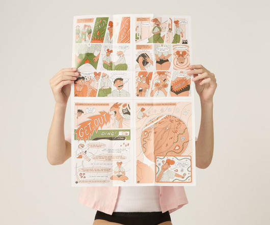
Modibodi is a feminine hygiene underwear brand founded in 2013 by Kristy Chong, a self-described "mum on a mission" who'd previously worked in PR. Her work, which includes her award-winning comic Living with Endometriosis for WePresent and her zine RAW , is bold and filled with colour, pattern and optimism.
Frive – formerly known as Lions Prep – was originally targeted at gym goers, while its new brand looks to open the menu to a variety of people needing speedy, nutritious meals. Among Equals has collaborated with ready-to-eat meal brand Frive on its new identity as it moves to improve how we eat in the UK.
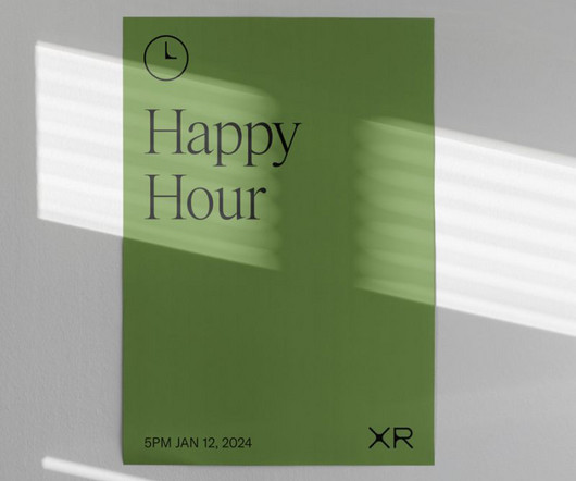
The fresh brand identity reflects the power of a new global unified creative and delivery platform to entertainment industry brands. Brand agency Athletics has unveiled a new identity for the entertainment industry business Extreme Reach. More than half a billion creative brand assets are managed in XR's enterprise platform.
Elections in the UK and the US led many big brands to put off their decision-making and budgeting – they want to see the lie of the land economically before investing in creative. Brands are more and more focused on not only telling relevant stories but also on counting on the right people to tell those stories.
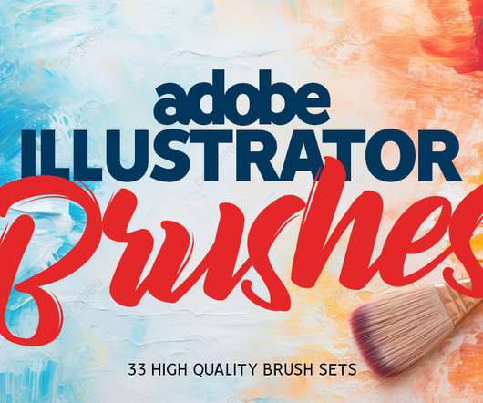
Pattern Border Brushes for AI Vector Pattern Brushes is a set of floral, abstract and celestial brushes. By using any of the 12 brushes included you can create beautiful backgrounds, compositions, patterns, and any other graphics you can use in your digital creations. available in 2 versions, blunt and sharp on the brush tip.
A strong sense of nostalgia and authentic enjoyment comes through in the Beachside Hotel's identity, reinforced by an eclectic mix of typefaces and imperfect patterns. This image and the wider brand idea were underpinned by four core pillars: understated, unexpected, comfortable and fun.
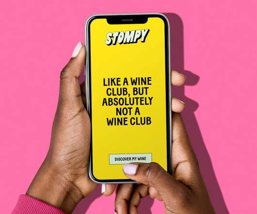
Playful in its manner, the extruded type is transformed into repetitive patterns throughout the identity, alluding to the brand's different categories of wine. The Stompy brand is about breaking down those expectations and letting people feel free to enjoy wine your way – whether in a solo cup or a fancy wine glass.". &Walsh's
These are three principles that underpin the institutions brand identity, which was created to reimagine the visual language of sound while giving the organisation a voice of its own. Rooted in the science of overtones, the modular letterforms mirror the harmonic patterns found in nature and music, subtly nodding to the rhythms of both.
We organize all of the trending information in your field so you don't have to. Join 66,000+ users and stay up to date on the latest articles your peers are reading.
You know about us, now we want to get to know you!
Let's personalize your content
Let's get even more personalized
We recognize your account from another site in our network, please click 'Send Email' below to continue with verifying your account and setting a password.


Let's personalize your content