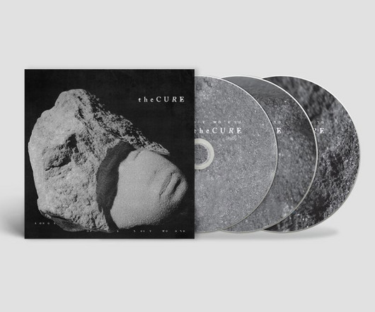
The triple-CD release. When The Cure released Songs of a Lost World in November 2024, it topped the charts in 10 countries and was praised effusively by fans around the world. Designer and long-time Cure collaborator Andy Vella joins us with an overview of his creative approach to the visual concept, sleeve, campaign, and the impact it's had. When Robert Smith first mentioned this album to me three, four, five years ago, even longer I was very keen to work on it because I felt that it would be MORE
This site uses cookies to improve your experience. To help us insure we adhere to various privacy regulations, please select your country/region of residence. If you do not select a country, we will assume you are from the United States. Select your Cookie Settings or view our Privacy Policy and Terms of Use.
Cookie Settings
Cookies and similar technologies are used on this website for proper function of the website, for tracking performance analytics and for marketing purposes. We and some of our third-party providers may use cookie data for various purposes. Please review the cookie settings below and choose your preference.
Used for the proper function of the website
Used for monitoring website traffic and interactions
Cookie Settings
Cookies and similar technologies are used on this website for proper function of the website, for tracking performance analytics and for marketing purposes. We and some of our third-party providers may use cookie data for various purposes. Please review the cookie settings below and choose your preference.
Strictly Necessary: Used for the proper function of the website
Performance/Analytics: Used for monitoring website traffic and interactions
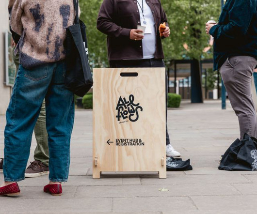
The boutique design festival's third edition proved its growing reputation with intimate talks, fresh perspectives and meaningful connections. The third edition of All Flows Festival has cemented its position as one of the UK's most vital creative gatherings, delivering three days of inspiration, innovation and genuine connection in Milton Keynes last month.
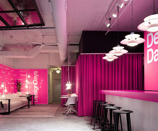
Chicago’s West Loop has always buzzed with creative energy – post-industrial warehouses turned restaurants, hidden galleries, and a distinct pulse that makes it one of the country’s most forward-thinking, up-and-coming design districts. But for three days in June, it transforms into something even more electric. From June 9–11, Fulton Market DesignDays turns the area into a dynamic, walkable playground of immersive installations, spirited activations, and rigorous dialogue that blur the line bet
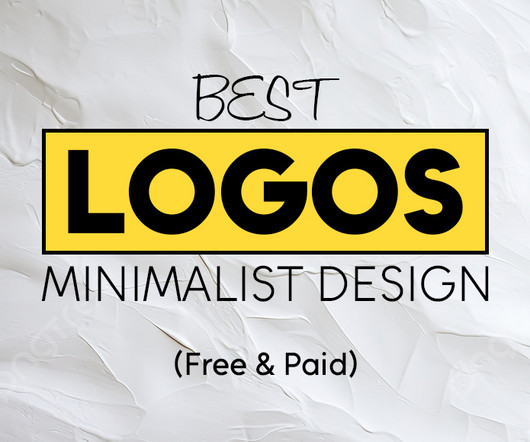
A minimalist style best logos are here. A simple logo communicates more with fewer elements. Clean shapes, precise spacing, and intentional typography create a strong visual identity. The post 35+ Best Logos in Minimalist Design (Free & Paid) first appeared on Graphic Design Junction.
Speaker: Amber Asay, Creative Director and Founder of award-winning design studio Nice People
Understanding what trends are happening and how they’re impacting the competitive landscape is crucial to providing top dollar design strategy to your clients. With so many trends coming and going, it can be overwhelming to determine which ones you should capitalize on and which ones might not be worth the trouble. In this exclusive webinar with Amber Asay, we’ll explore graphic design trends that need to die, trends that are starting to pick up and why, trends that have come and gone, and how t
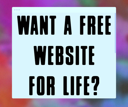
Become a Member Submit BOOOOOOOM Log In / Profile Submit LINKS Membership Open Calls Newsletter Submissions Shop Contact Categories Art Film Photo Design ART PHOTO Shop Open Calls Membership Submissions Giveaway Booooooom x Format: Free Website for Life Giveaway 09.06.25 — Jeff Hamada We’ve teamed up with our friends at Format to celebrate a major update to their platform—flex block, a brand new way to build your dream site with total creative control and zero hassle.
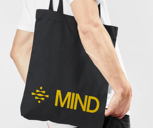
Led by Eddie Opara at Pentagram, this new dynamic branding system for security platform MIND uses swirling motion and parametric brainwaves to visualise the platform's machine-speed threat detection capabilities. In an industry where technical complexity often translates into visual confusion, Eddie Opara and his team at Pentagram have crafted something remarkable for MIND—a data security platform that operates at machine speed.
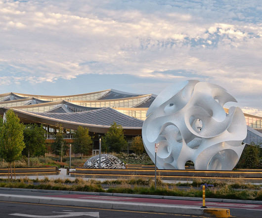
Installations on corporate campuses are often more than just eye candy. They’re a preview of the company’s ethos, a physical expression of how they think and create. So it’s no surprise that Google’s latest architectural addition doesn’t just stand out – it computes. The Orb designed by Marc Fornes , founder of art and architecture studio THEVERYMANY , is a jaw-dropping pavilion that lives on the tech giant’s Charleston East Campus.
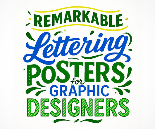
Hand lettering posters challenge you to think beyond fonts. Unlike standard typefaces , these designs reflect the personality and style of the designer. Each stroke, curve, and composition requires intention. The post Remarkbale Hand Lettering Posters for Graphic Designers first appeared on Graphic Design Junction.
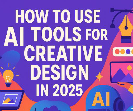
Remember when we thought robots would take over the world by flying around in metallic suits? Well, they’re here alright, but instead of conquering cities, they’re sitting quietly in our design software, helping us create things we never imagined possible. Welcome to creative design in 2025, where your biggest collaborator might just be an algorithm.
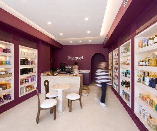
With Gharib Studio, architectural designer Nora Gharib is helping digital-first brands, such as Little Words Project and Basquet, move beyond the screen, creating immersive third spaces that invite people to linger, connect, and experience brands on a deeper level. The word on the street lately is that digital-first brands dominate, so the idea of opening a physical storefront might seem like a throwback.
Brands must create and share impactful content to thrive, but they have less people, tighter budgets, and fewer resources to do so. Learn how to publish and market digital content with the same professionalism as organizations with million-dollar budgets.
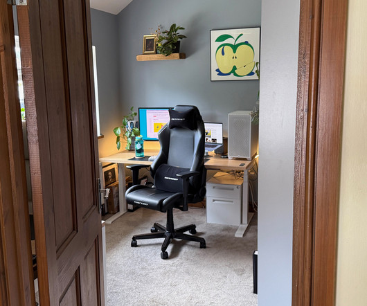
When Neil Ferrier was in college he began to envision his future work. He created a make-believe company called N1 Industries and built a lounge chair out of a race car seat. Yet it was a different era then, and the notion that he could actually build and sell a product didn’t seem accessible at the time. Ferrier earned a mechanical engineering degree and moved to California.
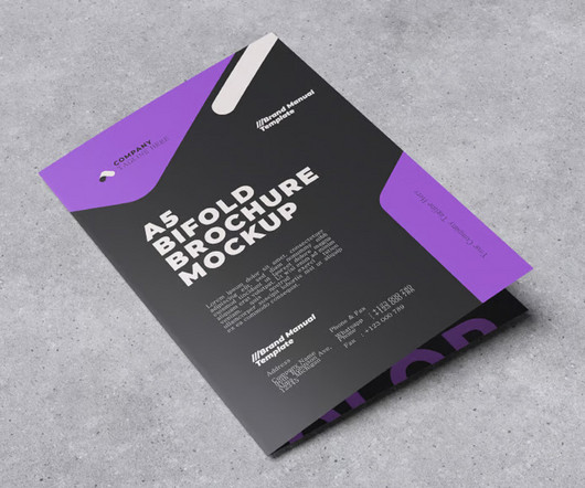
Your product presentation is as important as your design. Strong brochure lookbook mockups help show how a brochure, magazine, book cover, or catalog design will look in real life. They turn flat layouts into polished visuals. The post 25 Best Brochure Lookbook Mockups For Designers first appeared on Graphic Design Junction.
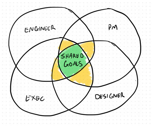
Why building trust matters more than building components. There’s a scene in Field of Dreams that regularly comes to mind. Ray Kinsella (Kevin Costner) is standing at the edge of his cornfield ballpark, full of doubt about his ball field project. And then Terrence Mann (James Earl Jones) delivers this quiet but powerful monologue… James Earl Jones as Terrence Mann gives an inspiring speech “People will come, Ray.
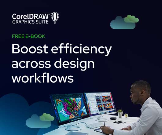
As the design industry evolves, teams are facing new challenges and a need to produce more outstanding creative work than ever. Leaders must learn how to adapt their processes to solve today’s—and tomorrow’s—unique design challenges. In this e-book, you’ll learn how to establish your creative workflow and leverage the power of CorelDRAW® Graphics Suite to streamline the entire design process, from start to finish.
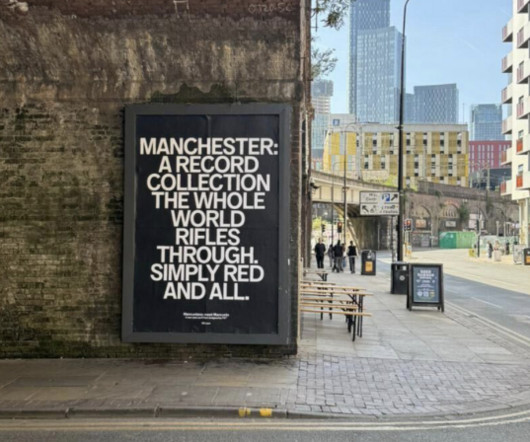
Campaign lead Ellen Ling explains why the launch of new font Mancunio avoided Factory Records nostalgia in favour of hyperlocal sarcasm. At Creative Boom, we're passionate about Manchester. It's where we were born, where we continue to thrive, and somewhere we'd encourage anyone and everyone to visit. But we'll be the first to admit that Manchester has a problem with its own mythology.
Reading "Andrés Higueros avoids coffee." More from Work Search Search Events Next Generation Showcase Creative Jobs Board Home Menu Disciplines Advertising Animation Architecture Art Creative Industry Digital Event Fashion Film Graphic Design Illustration Photography Product Design Publication Popular Tags 3D Book Branding Collage Comic Exhibition Font Food & Drink Identity Logo Magazine Music Politics Portrait Poster Sport Sustainability Technology Typography Web Design Zine It’s
An InDesign Magazine Layout to Create Stunning A4 Publications. Are you on the hunt for an exceptional InDesign magazine layout that can elevate your A4 publication from good to absolutely captivating? Imagine having the power to craft visually rich pages that draw readers in and keep them engaged, all with remarkable ease. This isn’t a far-fetched dream; it’s a reality made possible by a thoughtfully designed template from the creative minds at PixWork.
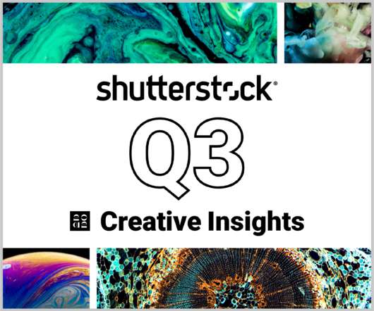
In today’s competitive markets, how do you make sure that your content not only stands out but performs well? How can you predict whether certain design choices will result in clicks, engagement, downloads, and other drivers of ROI? Shutterstock’s Creative Insights Report (Q3) is your window into the hottest trends that are transforming the creative world.
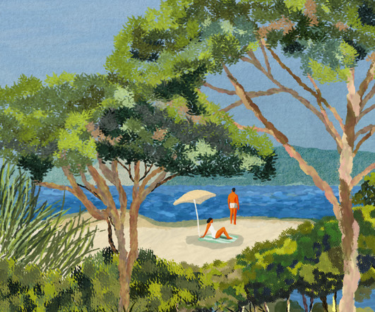
Catherine Cordasco is an illustrator and visual storyteller whose career has been shaped by work across culture, tourism, events, publishing, and the press. Her strong foundation in artistic creation is complemented by a recently earned degree in Social Media Management, expanding her creative toolkit and communication expertise. Her life journey continues to inspire her workafter living between Venice and Paris, an extended trip through Asia broadened her perspective.
This is our daily Free Font Of The Day post. Rinter is A new sans-serif typeface, blending the clean precision of Swiss modernism with a subtle tech-inspired edge. Its name comes from Rint , meaning to work hard or to toila nod to its purpose as a dependable, go-to font for web and graphic designers. Drawing inspiration from classic grotesques like Helvetica and Akzidenz-Grotesk, Rinter honors the legacy of Swiss design while adding a contemporary twist with sharp corners and distinctive inktr
Skip to main content Open menu Close menu Creative Bloq Creative Bloq Where creativity meets technology Search Search Creative Bloq Sign in View Profile Sign out Subscribe Design Art 3D Tech Entertainment Buying guides Magazines Imagine FX 3D World Events Vertex Brand Impact Awards More Creative Inspiration Professional Development AI Web Design Photography Reviews About Us Newsletters Design Magazine Subscriptions Why subscribe?
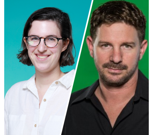
Speaker: Eden Spivak, Design Expert and Editor at Wix & Nir Horesh, Accessibility Lead and Senior Product Manager at Wix
When we design products or websites for people like ourselves, there are many others who are, as a result, left out. From visually impaired users who rely on assistive technology, to people with a temporary injury such as a broken arm, tech users are forever diverse and beautifully unique. The products we design can, and should, reflect the extremely wide range of human experiences and needs.
If you look at a brand visual and you instantly feel a sense of trust and history, that logo probably has a vintage feel. There is a certain magic in designs that echo the past. They feel authentic. They feel handcrafted. But creating that look from scratch? That can be a huge challenge. It requires a deep understanding of typography, illustration, and historical design trends.
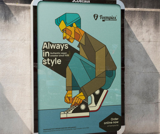
Artist Bart De Keyzer developed a personal project featuring Foempies, a vegan and sustainable shoe brand. Bart’s goal was to create something that puts honesty and simplicity first. Through clean layouts, bold typography and minimalist illustrations, the visuals echo the brands core values: transparency, ethics, and a lighter footprint both literally and visually.
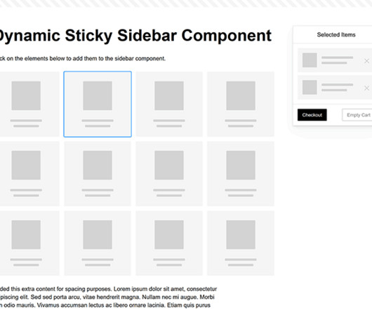
Modern websites often feature extensive scrolling. Long pages are common on desktop devices, but are even more frequent on mobile screens. The practice creates usability challenges for tasks like navigation and referencing important information. That’s where “sticky” design elements come in handy. They allow users to scroll without losing access to your site’s menu.
Thomas Edison once said “Vision without execution is hallucination.” This statement applies not just to invention, but to graphic design. One of the greatest strengths of graphic designers is the ability to first develop a concept and then execute it to make it real. From visualization and ideation all the way through to actuation and execution, each step of this process takes skill and expertise.
There’s something magical about incorporating love and romance into digital artwork. Whether you’re designing wedding invitations , creating Valentine’s Day graphics, or simply wanting to add a touch of warmth to your projects, love-themed Photoshop brushes can transform ordinary designs into something truly special. Why Love Brushes Matter in Design Love-themed brushes aren’t just for February 14th.
Discover The DRIPHAUS Typeface: Your Secret Ingredient for a Brand That Feels Real Have you ever searched for the perfect font? You scroll for hours. You are looking for something that just feels right. It needs to be clean but not cold. It must be bold but not overbearing. You want a font that has a story. A font with a soul. This search often ends in compromise.
Folk Tale® is a natural wine written in the Canary Islands to the world, where each bottle pays tribute to myths and stories passed down through generations, brought to life with every pour. The brief was to create a visual identity system and packaging design for Folk Tale® that is able to cultivate the untamed spirit of nature, culture, and heritage through wine, making it adaptable and appealing to all audiences across international markets.
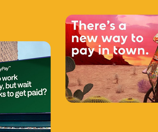
Finance brands dont lookor behavethe way they used to. A new generation of fintech players like Klarna, Chime, Venmo, Monzo, and others are leading the charge, showing that finance doesnt have to look formal, distant, or traditional anymore. The fresh face of finance is bright, bold, and refreshingly human , with design leading the way. Out goes the stuffy jargon and grayscale branding; in comes playful visuals, radical transparency, and a genuine focus on customer experience.
This session will answer business law questions that people are asking most during the pandemic. If my business can’t pay its bills, can my creditors come after my personal assets? Do I have to pay the rent on my co-working space or office? Can my clients cancel signed contracts? Can I cancel contracts for things I no longer need because my business has slowed down?
The triple-CD release. When The Cure released Songs of a Lost World in November 2024, it topped the charts in 10 countries and was praised effusively by fans around the world. Designer and long-time Cure collaborator Andy Vella joins us with an overview of his creative approach to the visual concept, sleeve, campaign, and the impact it's had. When Robert Smith first mentioned this album to me three, four, five years ago, even longer I was very keen to work on it because I felt that it would be
We organize all of the trending information in your field so you don't have to. Join 66,000+ users and stay up to date on the latest articles your peers are reading.
You know about us, now we want to get to know you!
Let's personalize your content
Let's get even more personalized
We recognize your account from another site in our network, please click 'Send Email' below to continue with verifying your account and setting a password.
 535
535 


Let's personalize your content