This site uses cookies to improve your experience. To help us insure we adhere to various privacy regulations, please select your country/region of residence. If you do not select a country, we will assume you are from the United States. Select your Cookie Settings or view our Privacy Policy and Terms of Use.
Cookie Settings
Cookies and similar technologies are used on this website for proper function of the website, for tracking performance analytics and for marketing purposes. We and some of our third-party providers may use cookie data for various purposes. Please review the cookie settings below and choose your preference.
Used for the proper function of the website
Used for monitoring website traffic and interactions
Cookie Settings
Cookies and similar technologies are used on this website for proper function of the website, for tracking performance analytics and for marketing purposes. We and some of our third-party providers may use cookie data for various purposes. Please review the cookie settings below and choose your preference.
Strictly Necessary: Used for the proper function of the website
Performance/Analytics: Used for monitoring website traffic and interactions
The studio also led the redesign that was carried out back in 2013. As the long-term brand agency partner of McCain Foods, BrandOpus had recently worked on the McCain global identity in a bid to make the McCain brand more iconic and build a more consistent visual identity system globally.
Yet, we are washed with Gen Z insight reports and briefs that request us to target those who happened to be born between the years of 1997 and 2013. "In the UK, people over 50 make up 40% of the population but control a massive 80% of the wealth. Sometimes it feels like we are reflecting marketers' tastes rather than those of consumers."
I purchased my first drawing display in 2013, and without it, True Grit Texture Supply wouldn’t exist. This article was originally published on True Grit Texture Supply and has been published here with permission. All words and illustrations by Andrew Fairclough.
Its called Upstate NY 2013 and is reminiscent of the light and color in a forest on a specific day in early autumn while I was on a hike.It Photo: Katherine Duclos This piece was my first large-scale bubble wrap piece. took over 100 hours to make. Photos: Katherine Duclos Every day, outside of the hot months, I have coffee with a stranger.
The Cloud Pivot: 2013-Present 2013 Adobe made its most controversial business move: shifting from perpetual licenses to subscription-based Creative Cloud. When Adobe pivoted to the subscription-based Creative Cloud in 2013, its logo evolved to reflect this business transformation.
Image source: Apple.com / WWDC 2025 presentation Apple made its boldest UI move since iOS 7 (presented in 2013), when the company abandoned skeuomorphism and buried textures in favor of flat design. In 2013, Tim Cook said, “When we work on making our devices accessible, the ROI is not the important thing. It’s bold… and controversial.
This legacy now extends to the museum's brand, which has evolved from the original 1982 identity by Massimo Vignelli and later versions by Abbot Miller in 2013. From Frank Lloyd Wright's spiral marvel in New York to Frank Gehry's bold Bilbao structure, the Guggenheim museums are celebrated as much for their architecture as for their art.
What began in 2013 as a local showcase for Scandi brands has skyrocketed in popularity, evolving into a destination with serious international draw (last year’s event alone attracted over 100,000 visitors to the Danish capital). In our May/June issue, we took stock of how design fairs have evolved over the last half-decade.
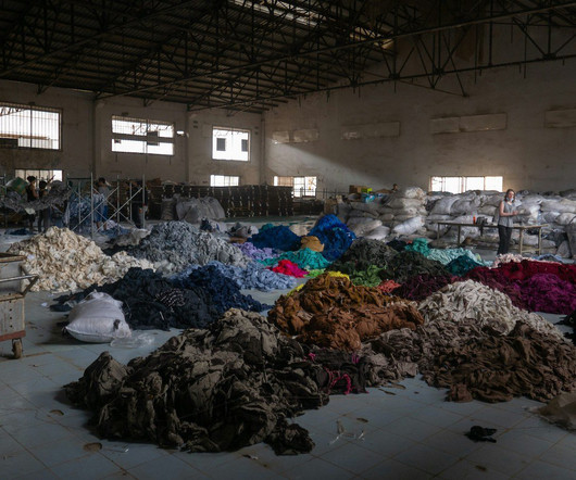
DON’T RUN – BETA, project with Juan Montero Valdez, 2013. In other words, the future is a state of mind one’s that’s always in the process of being negotiated in the present. What does that mean for textiles? We can’t wait to find out. Future Continuous. Materials before being cut into shoes.
It’s been around since 2013, helping new businesses and professionals from around the world create logos on a budget. Once you finish designing the logo, you can download all the files, including the vector files, for a one-time price. Logogenie is not a new platform.
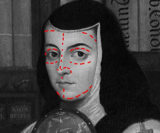
Nip and Tuck for Sor Juana Ins de la Cruz (Intervention of Miguel Cabreras painting[1750]) In 2013, the Bank of Mexico launched an eight-year program to comprehensively replace the family of banknotes in circulation, aiming to make counterfeiting more difficult and increase their durability. The politics of design (1st ed.,
Along with some 120,000 Japanese Americans living in the western part of the country, Ruth Asawa (1926-2013) and her familyseparated from their father, who was sent to a camp in New Mexicowere uprooted in 1942 and sent to another internment camp hastily organized at the Santa Anita race track in Arcadia, California.
Vladimir Motsar is a Ukrainian concept artist and illustrator who has been active in the field since 2013. He skillfully blends classical painting styles and motifs with modern design elements to craft unique atmospheres and narratives in his work.
Our Story: A Decade on Pinterest Wiped Out in Months As the online art and design publication WE AND THE COLOR , we have been active on Pinterest since 2013 ( [link] ). This isn’t a cyclical downturn; it is a direct consequence of Pinterest’s calculated evolution, forcing an urgent re-evaluation of content syndication strategies.
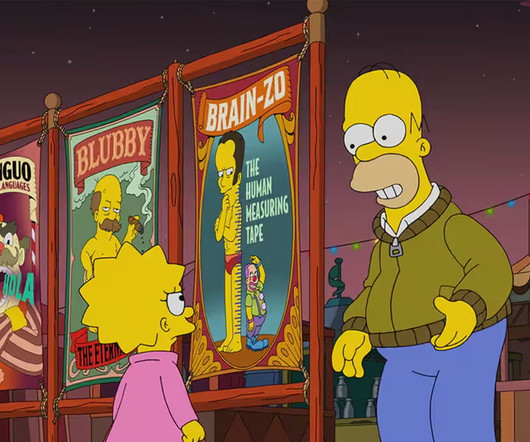
Edna Krabappel was retired from the show in 2013 as a tribute following the death of her voice actress, Marcia Wallace. However, I dont think we need to worry. The episode was set 35 years in the future, and its a different situation to previous major departures.
Titled Flower Planet which references a sign that hangs outside Ohtsubo’s Tokorozawa home and studiothe show presents various sculptures and installations that invite viewers to consider fragility, decay, and the elusive qualities of beauty and control.
The quirky striped banana motif, first created in 1985, went unnoticed for decades before resurfacing in a 2013 limited collection, where it quickly became a cult favorite. A prime example is the now-iconic ‘RANDIG BANAN’ by Inez Svensson. More recent designs have carried that same spirit forward.
By 2013, BP had sold off most of its solar business, contradicting the brand promise implied by the Helios symbol. While BP acquired solar company Solarex and increased renewable investments around this time, the scale was minimal compared to their fossil fuel operations. How has digital media influenced the evolution of BP's logo?
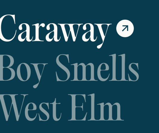
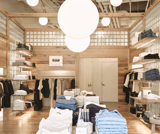
in 2013, Buck Mason began with a plan to create the perfect T-shirt. Sure enough, the clothing brand’s latest retail location (designed by Chicago firm Norman Kelley , working alongside architect Spencer McNeil ) in Oak Brook, Illinois, appeals directly to a rugged, architecturally savvy clientele. Launched in L.A.
The System Rebrand (2013) In 2013, Cisco unveiled “The Bridge to Possible” – maintaining the vertical line motif but arranging them to create a more dynamic visual rhythm. The 2013-2014 “Bridge to Possible” refinement maintained the vertical line motif with improved spacing.
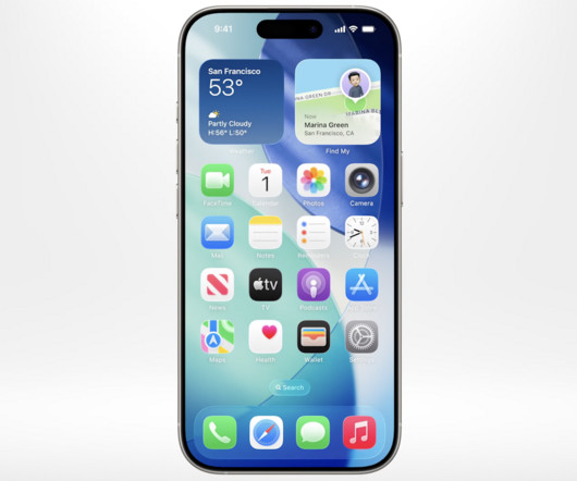
2025-06-09T15:00:09.099Z (Image credit: Apple) With a brand new design language rumoured to be launching today, were wondering if the next generation of iOS could be the biggest visual refresh since 2013. That was when iOS 7, which heralded Apples wholehearted embrace of flat design, hit the iPhone.
The Minimalist Turn (2013): The Xbox One and the Flat Design “Correction” The world changed between 2005 and 2013. The Current Era (2019-Present): The Xbox Series X/S and the Refined Glyph After the major surgery of 2013, the following change was far more subtle. The iPhone happened. Apps happened.
D 10/01/2013 A @ Filip C Project P Viktor Jan T Arduino , MIDI , Pure Data Graphic Narratives: Generative Book Covers by Ligia Duro Created by Ligia Duro, these generative book covers were created using Processing representing the book contents by visualising each chapter on the book cover.
Genevieve Cohn, “We Sow a Softness” (2024), acrylic on canvas, 36 x 24 inches The Jaunt was founded in 2013 by Jeroen Smeets, who curates the project and facilitates travel for artists to destinations worldwide.
Masters Chair by Kartell (Red Dot 2013) Masters is a tribute to three classic chairs: Series 7 by Arne Jacobsen, the Tulip Armchair by Eero Saarinen and the Eiffel Chair by Charles Eames. It looks as good as it performs, designed to age beautifully with each use. Cooking outdoors is one of my favorite things.
We're talking about a design that converts, communicates, and doesn't feel like it was built in 2013. You need clarity—specifically, a no-nonsense look at the top Shopify web design agencies in US that consistently deliver. It's not some fluff piece pulled from a sales deck.
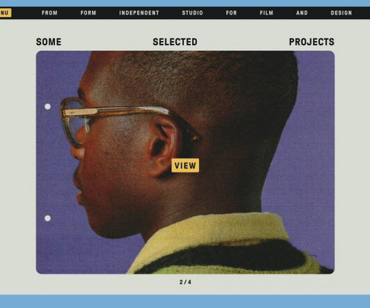
From Form was founded in 2013 by married couple Ashley Govers and Jurjen Versteeg “to offer a playful and cinematic approach to film and design,” says the duo.
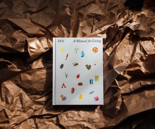
Founded in 2013 by Miranda West, The Do Book Company publishes authors who have spoken at the event to create how-to titles as far-ranging as Do Beekeeping : The Secret to Happy Honeybees, Do Open : How a simple newsletter can transform your business, and Do Design : Why beauty is key to everything.
However, his move to Leeds in 2013 to study illustration marked a pivotal moment in his career. Growing up in the serene landscapes of Cumbria, at just 16, he enrolled in art college in Carlisle. This early exposure to art sowed the seeds of his passion for visual storytelling.
Past Logo Design Trend Reports: Logo Lounge: 2020 , 2019 , 2018 , 2017 , 2016 , 2015 , 2014 , 2013 , 2012 , 2011. On Just Creative: 2019 , 2018 , 2017 | 2016 | 2015 | 2014 | 2013 | 2011 | 2010 | 2009. You can find Pinterest pins at the end of the article. What are the Logo Trends of 2020? Bevel Tips. Petri-Dish.
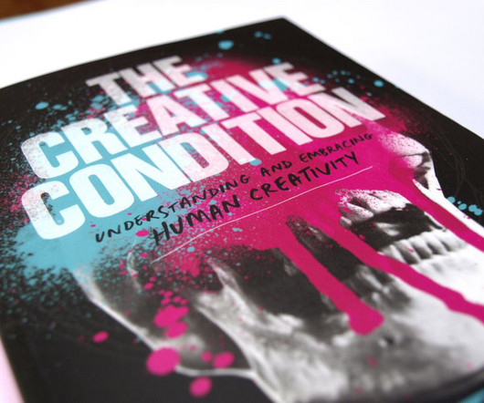
Consequently, in 2013, he began conducting a series of conversations to better understand how creativity behaves from person to person and its value in broader society and business.
D 11/10/2013 A @ greg C Project P Benedikt Groß T Processing Cube with Magic Ribbons by Simon Katan – oF and SuperCollider The following clip is a preview Simon Katan’s new composition tool for live performance Cube with Magic Ribbons created using openFrameworks and SuperCollider.
Founded in 2013 by two former Apple engineers, Matt Ronge and Giovanni Donelli, Astropad Studio has been used by leading animation studios and is trusted by millions of artists around the world. This next season has been made possible by our sponsor, Astropad Studio.
The art fair Art Basel launched its Hong Kong edition in 2013, and a swathe of blue chip galleries, undeterred by shrinking democratic rights – largely avoidable for the internationally wealthy, have opened outposts in the years since.
Scott: Our first experience working with Dalio was in 2013. Read on to hear their insights, and if you haven't seen the video yet, you can watch it below. We highly recommend it. How did this epic project come about? It was all done remotely, wasn't it? It, too, is on YouTube and is titled How The Economic Machine Works.
Elena’s projects have been included in several events, including the The New Italian Design traveling exhibition, the collective exhibition The New Aesthetic Design, at the Shanghai Biennale in 2013, and the Gwangju Biennale in South Korea. In 2017, she won the Salone del Mobile Milano Award as “Best Emerging Designer.”
8 mins read Design is a very large field. It ranges from illustration and other types of graphic design, to web design and to product design. Product design is, possibly, the most challenging aspect of design. It combines art, technology and usability in order to create new products that people can actually use and that they will find useful.
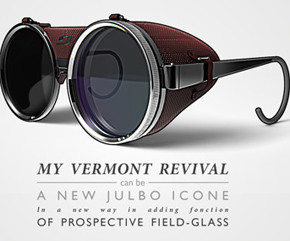
2013 marked the beginning of a distinctively retro, rugged aesthetic. Realism was the look to aim for, which is why this icon set’s popularity comes as absolutely no surprise: However, not all is flat in 2021. Grainy textures and handcrafted typefaces came together in worn out badges. Hipster swag reigned supreme.
It's among the premium typefaces offered by Weltkern , a Swiss foundry established in 2013. As Nolan developed the typeface, it quickly became more personal and evolved into the designer's own take on the grotesque genre. It was finally launched to the public in March 2021.
Harvard Design Magazine 2013-2021 Launched at the Venice Architecture Biennale 2014, with Jennifer Sigler at the helm as Editor-in-Chief and Leah Whitman-Salkin as Deputy Editor. Due to South Korean censorship, nudity was not permitted in the publication.
We organize all of the trending information in your field so you don't have to. Join 66,000+ users and stay up to date on the latest articles your peers are reading.
You know about us, now we want to get to know you!
Let's personalize your content
Let's get even more personalized
We recognize your account from another site in our network, please click 'Send Email' below to continue with verifying your account and setting a password.


Let's personalize your content