This site uses cookies to improve your experience. To help us insure we adhere to various privacy regulations, please select your country/region of residence. If you do not select a country, we will assume you are from the United States. Select your Cookie Settings or view our Privacy Policy and Terms of Use.
Cookie Settings
Cookies and similar technologies are used on this website for proper function of the website, for tracking performance analytics and for marketing purposes. We and some of our third-party providers may use cookie data for various purposes. Please review the cookie settings below and choose your preference.
Used for the proper function of the website
Used for monitoring website traffic and interactions
Cookie Settings
Cookies and similar technologies are used on this website for proper function of the website, for tracking performance analytics and for marketing purposes. We and some of our third-party providers may use cookie data for various purposes. Please review the cookie settings below and choose your preference.
Strictly Necessary: Used for the proper function of the website
Performance/Analytics: Used for monitoring website traffic and interactions
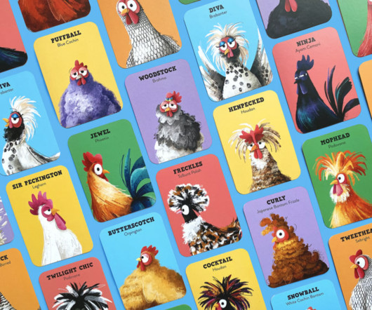
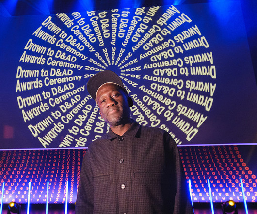
Tim Claeys, a judge in the Exploration and Science & Technology categories, echoed the excitement: "The standard of illustrations we were presented with was really high and stylistically diverse. Quantum reference frames: an insight by Michele Sclafani (Science & Technology) Good luck to all those involved.
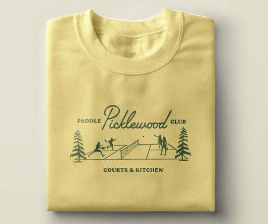
People People presented visual identity concepts that played with the 'anti-country club' vibe, and Nathan and Ethan were fully supportive of leaning into our team's creative instincts as we struck a balance between classic, edgy and playful. The studio created a full branding package, serving up retro aesthetics courtside and beyond.
Reference: Autodesk Fusion 360 and Generative Design shows how AI can optimize and enhance design in various fields, demonstrating the collaboration between AI and human designers. Reference: Adobe Sensei showcases examples of how AI tools can enhance workflows for designers and videographers, significantly speeding up the creative process.
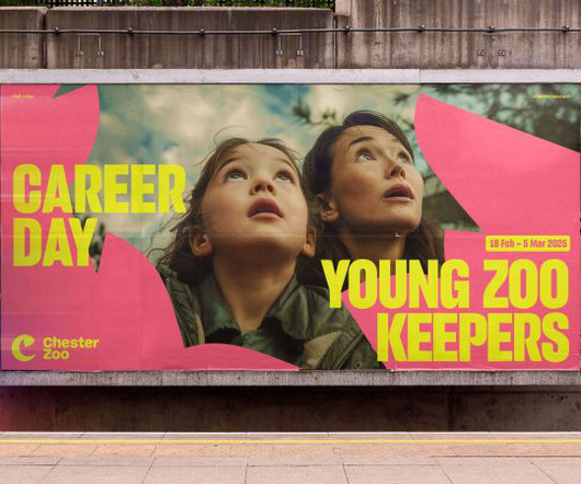
It references the zoo's history of supporting critically endangered Eastern Black Rhinos, which dates back to 1999, and helped to breed a rare calf. In general, the new visual identity is crafted to be flexible for use in various contexts, from presentations and materials to signage and socials.
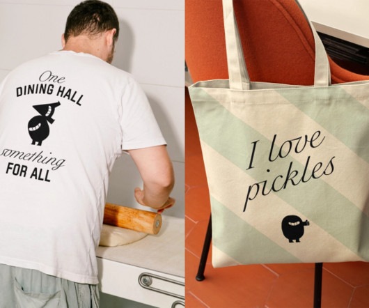
Without co-developed a full implementation system with Sodexo's in-house teams, including operational playbooks, training resources, signage systems, and toolkits for food presentation, service tone, and interior touchpoints. "We We built what we call 'operational translations'," says Philip. "It
Referring to web projects, product designer Stan Potra suggests that: "if the font is for UI and masses of text, aim for readability and variability for hierarchy and accents. That said, the relative importance of readability will vary on the use case. But if it's for decorative purposes, go wild." Explore alternatives if necessary.
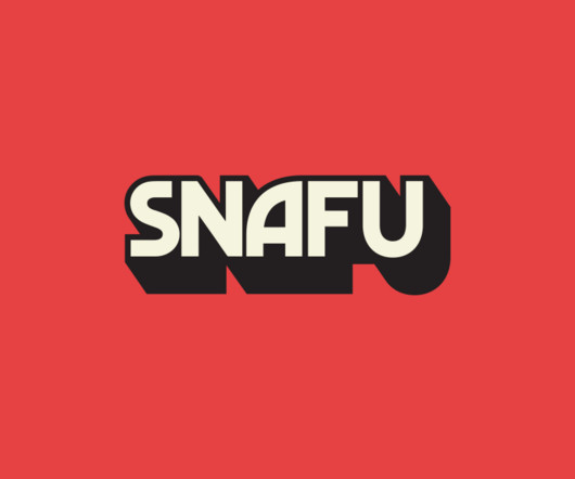
SNAFU presented a fresh challenge in that it blends humour with historical critique and, at the end of the day, is all about storytelling," says Fresneda. While the studio has worked in audio spaces before, it has often been music-oriented, with artists like The National or designing systems for music festivals.
Studio Morfar's Creative Director Torsten Power explains: "The AI space is often about efficiency or optimisation, whereas Kin is about something different: pausing, rehearsing, and being present." The central visual motif – the Kinprint – presents an abstract representation of a fingerprint, embodying the individuality of each user.
Recent highlights include their work with Gamma , an AI platform that lets you quickly get ideas out of your head and into a presentation deck or onto a website. The resulting brand identity uses linear forms that subtly reference York's famous railway hub, symbolising the long-standing connections the city has fostered.
Challenges and Ethical Considerations While AI-powered generative design offers numerous benefits, it also presents challenges: Creative Control: There is a concern that as AI takes over more design tasks, designers may feel a loss of creative control. Balancing the use of AI while maintaining a designer’s personal touch will be crucial.
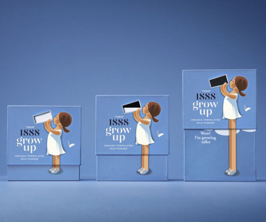
The brand is named after the dairy's hometown, Them, a small town in central Denmark with a population of 2,431, while 1888 references the year of its opening. Danish brand Them 1888 has set out to satisfy this demand with a fresh look for its powdered milk product Grow Up, designed by the Danish agency Simply.
At the heart of the new brand is a custom coin illustration that references both the silversmith and banking heritage. In doing so, they've helped coin a new narrative for Birmingham that's proud, present, and ready to be made. These discoveries became the conceptual backbone of the identity.
Palm Springs presents itself as the perfect place where residential architecture may dare to defy convention with steel expanses juxtaposed against natural stone, angular planes, and volumetric spaces that embrace their vistas. A vision lovingly referred to as Casa Sand Dune.
Whether you need a spark for your next concept, wish to study new styles, or plan to present your portfolio, Behance provides a streamlined, visually rich experience that keeps creativity alive on the go. Brand specialists gain a pocket-sized reference for client discussions and colour approvals wherever work occurs.
Observing artwork, collecting references, and reviewing past pieces all support growth. Layout refers to how parts are placed. Learn to present your work confidently, manage client expectations, and articulate design decisions in business terms. In many design courses, students ask what knowledge supports a career in design.
It's how your brand presents itself, moves, and connects in real-time. Swirling lines reference drawing tools, expanding shapes mimic selections, free-flowing forms suggest collaboration. It's overlooked, misused, or worse, ignored completely – when it should be doing the heavy lifting. Without motion, that whole story falls flat.
Usability: Usability in typography refers to how easily users can read and interact with text within a digital product According to abhishek , this is a key consideration in design systems [5]. A design showcasing clear typography, demonstrating principles of readability and usability in presenting information. 2025, February 5).
This horizontal format is especially advantageous for creative roles where a visual presentation of skills and achievements is key. References and Skills: The references section is presented simply, while a sidebar showcases language and technical skills in a clear, graphical format.
This ensures every social media post, presentation, or newsletter looks like it came from the same brand. Documents & Presentations: Create branded templates in Microsoft Word or Google Docs for invoices and reports. Documents & Presentations: Create branded templates in Microsoft Word or Google Docs for invoices and reports.
A3 (297 x 420 mm): Frequently used for presentations, charts, and drawings. This logical system eliminates guesswork and ensures a professional presentation. in Flip charts, maps, window displays, presentation materials. in Drawings, charts, presentations, newsletters, brochures. Many office printers can handle this size.
Bold geometry, striking forms, and inky hues all help to bridge the gap between past and present visual languages while leaving room for dialogue into the future. Here, a distinct heritage is infused with modern ingenuity for a Victorian-era informed domicile contemporized through Art Deco detailing.
The platform is known for its high-quality products and aesthetic presentation, attracting customers willing to pay premium prices for unique artistic items. TeePublic’s audience actively searches for trending, pop culture, and niche designs, making it perfect for artists who create timely or reference-based artwork.
Image source: Apple.com / WWDC 2025 presentation Apple made its boldest UI move since iOS 7 (presented in 2013), when the company abandoned skeuomorphism and buried textures in favor of flat design. In general design, eye candy refers to visuals or objects that instantly grab attention and deliver aesthetic pleasure.
Support Independent Type II provides a crucial platform for these often smaller players, presenting a vibrant and necessary alternative to the sometimes predictable offerings of large, corporate font distributors. Support Independent Type II makes a conscious effort to present the full spectrum of modern typographic expression.
This mission presented a unique branding challenge. The answer was not to hide its purpose but to elevate its presentation. It serves as an inspiring reference for any brand looking to connect with consumers on a deeper, more personal level. They encourage making bitters a simple, daily ritual.
The Cloud Pivot: 2013-Present 2013 Adobe made its most controversial business move: shifting from perpetual licenses to subscription-based Creative Cloud. Adobe's current logo doesn't explicitly reference AI. Their visual identity communicated an entire creative universe under one roof.
Whether you’re mapping a customer journey, hosting a team retrospective, or outlining a presentation, Canva Whiteboards make it easy to structure and visualize complex ideas without needing any extra software. Plus, you can export your board as a presentation or PDF for quick sharing.
This A4 Adobe InDesign brand guidelines template, designed by DesignCoach , offers a professional and efficient solution for presenting branding elements with clarity and sophistication. Mood Boards: Visual references to define the brand’s creative tone. Download at Adobe Stock Please note that this file requires Adobe InDesign.
Features of the PixWork Template Two Customizable Pages: The template includes a resume and matching cover letter, offering a cohesive presentation of your application materials. Its modern, readable layout ensures your qualifications are presented effectively.
The font link is provided in the readme file for your reference. The font link is provided in the readme file for easy reference. Font link is described in readme file. Download Greyhound Dog Logo The logo is vector-based, fully editable, and scalable without any loss of resolution.
Stopher, Fass, Verhoeven, and Revell do not just present a theory; they ground it in the real world. It presents international examples, showing how these issues manifest across different cultures and contexts. Here, aesthetics refers to the entire sensory and emotional experience of an interface.
Each flag’s color refers to the five elements and states of mind in Tibetan Buddhism. Yellow, for example, denotes earth and wisdom, while green references water and equanimity. White is air and purity, blue is space and endurance, and red refers to fire and compassion.
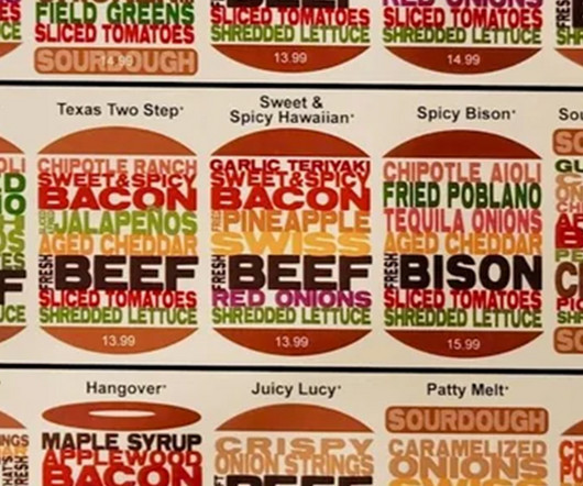
The design presents burgers in a variety of shapes, with sourdough, bagel or traditional buns, and the ingredients listed in text that approximately matches their colour. For more of the weeks graphic design controversies, dont miss the debate going on over the tendency for designers to put circles over logo designs in presentations.
So when you see her on the red carpet accepting an Emmy for one of her TV shows, its because shes failing at being a mom at that moment in time, because shes not there and shes not present. So I sort of embraced that. It made me feel a lot better about quite a few things that I do. concat(l,"-").concat(d()):l}return"".concat(u).concat(a).concat(d())}}(),jss:h,sheetsCache:null,sheetsManager:new
The Great Flattening: Chasing the “Modern” Trap (2018-Present) And then, in 2018, they threw most of it away. This was a literal reference to the company's origin story, which involved a famous “best buy” sale after a tornado damaged one of its original ‘Sound of Music' stores.
The first official Instagram logo, the one that launched with the app in October 2010, was a direct visual reference to a Polaroid OneStep camera. Subtle Tweaks and Building a System (2022-Present) The 2016 redesign wasn't the end of the story. The current logo is referred to as the “glyph.”
The 2025 furniture collection reflects this philosophy by merging contemporary styles with rich historical references, creating pieces that feel fresh yet familiar, effortlessly fitting into a range of environments and appealing to diverse but refined tastes. Another key influence is Lemieux’s tribute to classic French design.
Greek Freak Roman Font features dramatic letterforms with classical references, perfect for restaurants, entertainment venues, and cultural events. Romans Rexamples Roman Font combines traditional serif with contemporary elements, perfect for educational materials, design portfolios, and professional presentations.
It’s a tool designed not just to list your qualifications but to present them in a way that captures attention and invites a closer look. Because of this, you immediately signal to recruiters that you value quality and understand the power of a strong presentation. A clean reference area that is easy to find.
Drawing is just as important as deciding what to preserve, what to adapt and how to reinterpret historical references in a way that feels relevant today. That interplay between old and new became central to my approach, aiming to honor the past while speaking in a present-day voice.
When I work with clients, I often reference Gap's original logo as a masterclass in minimalist branding. Rebrand specialists I've worked with still reference this case as a prime example of why you shouldn't fix what isn't broken. For instance, clients often reference the Gap logo incident as a cautionary tale.
Rather than using overt national or cultural motifs, TEMPLO wove in subtle references to Kenya, an intentional move given that the British Pavilion is part of the British Council's Year of Kenya season. Colour also plays a quiet but powerful role. Movement was something that emerged organically early in the process," says Pali.
These typefaces lack the decorative strokes (or “serifs”) found at the ends of letterforms, leading to a clean and modern presentation. Uses : Websites, infographics, and presentations. In design, consistency refers to using a set of defined styles throughout your work. What Does Consistency in Design Mean?
We organize all of the trending information in your field so you don't have to. Join 66,000+ users and stay up to date on the latest articles your peers are reading.
You know about us, now we want to get to know you!
Let's personalize your content
Let's get even more personalized
We recognize your account from another site in our network, please click 'Send Email' below to continue with verifying your account and setting a password.


Let's personalize your content