This site uses cookies to improve your experience. To help us insure we adhere to various privacy regulations, please select your country/region of residence. If you do not select a country, we will assume you are from the United States. Select your Cookie Settings or view our Privacy Policy and Terms of Use.
Cookie Settings
Cookies and similar technologies are used on this website for proper function of the website, for tracking performance analytics and for marketing purposes. We and some of our third-party providers may use cookie data for various purposes. Please review the cookie settings below and choose your preference.
Used for the proper function of the website
Used for monitoring website traffic and interactions
Cookie Settings
Cookies and similar technologies are used on this website for proper function of the website, for tracking performance analytics and for marketing purposes. We and some of our third-party providers may use cookie data for various purposes. Please review the cookie settings below and choose your preference.
Strictly Necessary: Used for the proper function of the website
Performance/Analytics: Used for monitoring website traffic and interactions
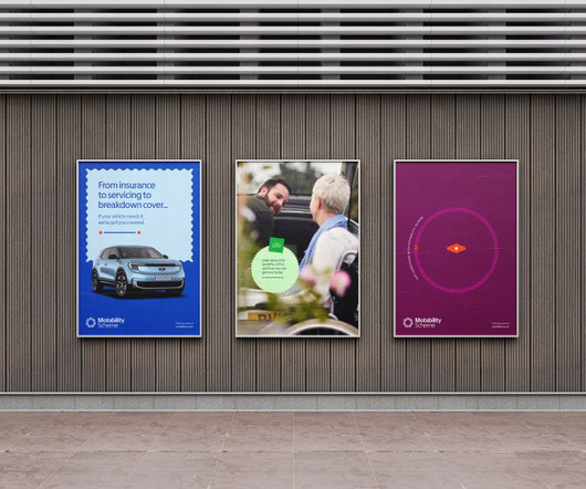
Equally, there's no reason to 'play it safe' and compromise on visual appeal. But, Manchipp believes that "while black and white offers maximum readability, it's not always visually engaging". With this in mind, SomeOne sought to achieve high levels of accessibility with high levels of visual interest for the Motability Scheme.
OptimisingVisualElements: Designing for Social Sharing To succeed at social sharing, you must optimisevisualelements to maximise reach and engagement. With attention spans dwindling and competition escalating, crafting visually compelling content has become indispensable!
That's just what Pentagram has achieved by crafting a fresh visual identity for Stereolabs. Graphic elements To support the brand story, Pentagram created a visual identity that adapts to real and virtual environments. The identity includes a dynamic symbol, visual toolbox, modular diagram language, icons and data visualisation.
Because often, the craziest ideas lead to groundbreaking work and visually stunning designs. So try to capture these elements through photography, sketches or mood boards, and incorporate them into your design work, adding a refreshing and organic touch to your creations. If you succeed in doing so, the rewards are potentially great.
With one simple click, this remarkable tool utilises AI to analyse the surrounding scene and generate realistic textures and elements to fill in the gaps, effectively eliminating distractions and enhancing the overall visual impact of the photo. That's where Luminar Neo's Enhance tool comes in. Creative Boom readers get 10% off!
According to Giles, working with a brand as iconic as Tropicana was a no-brainer, although he admits that the notorious and highly publicised redesign failure in 2009 added "an element of design-press jeopardy that ignited the creative team". The studio also added new visualelements to the identity, such as Anthony T.
Recently, Havas turned to the London-headquartered strategic branding agency Conran Design Group to optimise its brand architecture and develop a new visual identity for the 188-year-old comms brand. The first to improve client-centricity by integrating the brand architecture system and optimising the navigation of services.
America's most important music festival makes everyone up their game, both musically and visually. Consequently, she turned to COUR Design and asked them to craft a visual design that would grab the world's attention by bringing an enchanted forest to life on stage.
It balances a good-natured yet mischievous brand attitude – one that is loved for its playful intention to test boundaries; with the most iconic visual feature of the product: the love heart." This is all held together as a standalone sticker, ensuring the brandmark stays consistent across the portfolio and other elements," he adds.
In this article, we will discuss the most important elements that you need to consider when developing your website to ensure that it converts. Leave Plenty Of White Space Between Elements. White space — sometimes called negative space — enhances important elements, while preventing the site from becoming overly crowded.
First, you'll need to check if it's suitable for the design elements you're using. Originally designed by Florian Karsten in 2018, it retains the monospace's idiosyncratic details while optimising for improved readability at non-display sizes. Libre Baskerville is a web font optimised for body text, typically 16px.
Colour palette and logo Much like the core brand logo, The Click applied gentle and sympathetic modernisation to the existing brand colours, retaining but optimising both purple and blue. This detail is paramount in fusing the two elements, creating perfect harmony and balance across all logo variations.
The powerful Theme Options Panel paired with intuitive page options panels, a widgetable areas manager and a custom tailored Visual Composer , drag and drop page builder, provide you the tools you need to create complex websites without touching a line of code. You may be interested in the following articles as well.
It's your brand's complete visual and emotional DNA. When I work with clients, I explain it as the collection of all elements – from typography and colour schemes to voice and values – that make your brand uniquely recognisable. Logo Design Principles Visual impact is everything in logo design.
It has a similarly daring and progressive visual design heritage, and the new masterbrand draws strongly on that tradition. A consistent logo with parametric possibilities One of the key elements of the rebrand is bringing Channel 4's logo at the heart of the brand, alongside introducing a singular masterbrand colour.
Optimising your meta description to be relevant to your target keywords (something we will cover later in our look at ‘Content SEO’) may mean that the relevance of your website to those keywords is higher than some of your competitors. Using alt text improves how search engines index and understand the images included in your content.
Octamag Theme has a clean design, a fully responsive framework and gives you the power to create a unique-looking blog with an easy-to-use drag and drop page builder Visual Composer that’s fully responsive, retina-ready, and SEO-optimised. Porto provides plenty elements and powerful features that can configure all you want.
However, in this rapidly evolving technological landscape, even the most visually stunning websites can swiftly fall behind the times and fail to provide the optimal user experiences that people now expect. It involves a comprehensive approach incorporating strategic planning, user-centric design principles , and performance optimisation.
Its regular upright weights are optimised for long text, with vertical contrast creating rhythm and texture for comfortable reading. The back slants are an unexpected and energetic addition, providing an element of surprise while following similar design choices as the italics, which pack a real punch. Cyclops by HVD 10.
The powerful Theme Options Panel paired with intuitive page options panels, a widgetable areas manager and a custom tailored Visual Composer , drag and drop page builder, provide you the tools you need to create complex websites without touching a line of code. 5,191 items. Download Now. WordPress Blog Themes.
I just find visual decisions come much easier, my choices look better, and I have the energy to keep working for longer." "I Timing, though, is only one element of a healthy sleep routine. Allow boredom because it's the best way to process all the visual content you see daily." Then it's time to make more active efforts.
With insights into Google's algorithm, shifts in paid advertising, voice search optimisation, and leveraging artificial intelligence, this guide aims to get your SEM strategy ahead of the pack. On the one hand, optimising voice search can help brands reach new audiences and increase visibility.
But with high-quality visuals comes essential data and, unfortunately, an unwanted side effect—slower web performance. How can you retain the rich visual experience and the engagement that imagery and video bring without slowing down your site? The answer lies in effective file size reduction. Stay tuned!
This is an era where online visuals hold power. Today, it's all about engaging visuals that drive user engagement, conversions, and brand success. Buckle up—it's going to be a visually stunning journey! It's all about creating a visual masterpiece that grabs attention, tells a story, and leaves a lasting impression.
Did you know that well-optimised pricing pages can boost conversions by as much as 25%? One key element that sets Dropbox's pricing page apart is its simplicity. Conversely, a company that experiences a temporary downturn can temporarily downgrade its strategy to optimise cost savings without sacrificing essential functionality.
Optimising Page Layout Design for Better UX Creating a practical page layout is crucial for any website or publication. Optimising your page design requires considering multiple factors, from typography and whitespace to grid systems and responsive design. Map key elements – Determine what elements must fit within the grid (e.g.
The principles I'll be covering address visual design , user experience, accessibility, content, and more. This gives visual feedback and enhances the user experience. Loading Time: Optimised code and compressed images will load web pages faster. Compress photos, optimise code and avoid large media files. Avoid redirects.
We'll guide you through the key elements that will make your website shine without overwhelming visitors. Essential Elements Only In web design, a principle known as the 80-20 Rule holds significant relevance. Essential Elements Only In web design, a principle known as the 80-20 Rule holds significant relevance.
A website redesign can help you optimise the user flow, strategically place call-to-action buttons, and create a visually appealing design that captivates your audience. A redesign can involve simplifying navigation, streamlining content, and optimising loading speed, all of which contribute to a positive user experience.
And did you know that 93% of consumers claim that visual appearance is the primary influencing factor in their purchasing decisions? This article explores the critical elements that make marketing materials genuinely effective. Every great story has certain elements that make it unforgettable. The same goes for your brand story.
Our blog post will showcase the latest innovations, cutting-edge features, and future-proof design elements that will keep your website ahead of the competition and inspire envy among peers. This combination empowers designers to create visually stunning and highly functional websites without extensive coding knowledge.
From logo design and visual identity to content marketing and social media, we'll delve into the key elements contributing to a successful branding strategy. A well-defined brand identity sets the stage for consistent messaging and visual representation across all branding tools.
In this blog post, we dive deep into the future of the graphic design industry and explore the trends and innovations that will revolutionise how we create and consume visual content. The design language emphasises using 3D effects, animation features and lighting to create a visually immersive graphical user interface.
5 Essential Design Features for eCommerce Sites A well-designed eCommerce website is no longer just an online brochure for showcasing products – it is a crucial element influencing customer decisions and ensuring seamless online shopping experiences. Iterating based on actual user data can profoundly optimise the navigation experience.
Strategic Layout Design: Making Every Element Count Whether you're working on a website, an app, or even a physical space, strategic layout is the backbone that holds everything together. Simply put, elements are arranged to enhance usability while achieving business goals. Visual Hierarchy: This is where your layout shines.
It means visually savvy consumers can now create their own personal brands while also curating the brands they purchase," she explains. I'm starting to see a number of projects using funky, bold, custom typefaces as a primary element in the brand identity," he tells us and points to Colour Mill by Universal Favourite as a good example.
You'll discover how this iconic Mexican beer brand has maintained its visual integrity while evolving. The initial design featured essential elements that would later become iconic – the crown and the distinctive typeface that I've seen influence countless other brands.
Providing alt text for images makes content accessible to users with visual impairments. The aesthetics and visual appeal of your product are also important. A study conducted by Google found that visually complex websites are consistently rated as less beautiful than simpler ones. Employ whitespace to prevent visual clutter.
They're a crucial element that can make or break a website's visual appeal and user experience. Imagine a website without images – it would be like a sandwich without the filling, a movie without the visuals, or a book without pictures (okay, maybe not the best analogy for that last one). Why, you ask?
However, despite its popularity and versatility, many WordPress site owners need help optimising their website speed challenges. Improved Search Engine Optimisation (SEO): Google and other search engines factor website speed into their ranking algorithms.
During 2022, there was a shift toward interactive 3D elements, minimalism, or behavioural design. Especially for eCommerce sites, customisation elements like product recommendations or abandoned cart contents are crucial to driving conversions and turning one-time visitors into returning customers.
This article will explore key web design elements and best practices that can help substantially boost your website traffic when executed properly. At a basic level, the design of a website includes its layout, visual hierarchy, typography, colour scheme, imagery, and more. Optimising page speed should be a top priority.
The Visual Language of Branding In branding, communication is not solely limited to words and slogans. Visualelements have an extraordinary capacity to convey messages, evoke emotions, and forge lasting connections. These logos have transcended their visual form, becoming beacons of brand recognition and recall.
The grids act as a framework to align visualelements in a logical, ordered way. Grid systems create cohesive, balanced, and visually pleasing logos when used effectively. By the end, you'll understand how to elevate logo designs beyond visual appeal to highly functional brand assets.
We organize all of the trending information in your field so you don't have to. Join 66,000+ users and stay up to date on the latest articles your peers are reading.
You know about us, now we want to get to know you!
Let's personalize your content
Let's get even more personalized
We recognize your account from another site in our network, please click 'Send Email' below to continue with verifying your account and setting a password.
Let's personalize your content