This site uses cookies to improve your experience. To help us insure we adhere to various privacy regulations, please select your country/region of residence. If you do not select a country, we will assume you are from the United States. Select your Cookie Settings or view our Privacy Policy and Terms of Use.
Cookie Settings
Cookies and similar technologies are used on this website for proper function of the website, for tracking performance analytics and for marketing purposes. We and some of our third-party providers may use cookie data for various purposes. Please review the cookie settings below and choose your preference.
Used for the proper function of the website
Used for monitoring website traffic and interactions
Cookie Settings
Cookies and similar technologies are used on this website for proper function of the website, for tracking performance analytics and for marketing purposes. We and some of our third-party providers may use cookie data for various purposes. Please review the cookie settings below and choose your preference.
Strictly Necessary: Used for the proper function of the website
Performance/Analytics: Used for monitoring website traffic and interactions
Paula Scher , Michael Bierut, Marina Willer, Samar Maakaroun, Eddie Opara and others have led some of the most iconic branding and design projects of our time, and it's ultimately Pentagram's ability to evolve while maintaining high standards of creativity that's led them to top our list. The results are now in, and here they are.
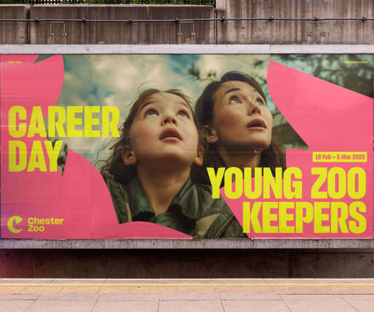
At the cutting edge of conservation, Chester Zoo wanted a new brand and website to champion these nature-positive efforts. The branding agency soon got to work repositioning Chester Zoo's look and feel in a way that represented both the experience within the zoo gates and its greater purpose of serving nature as a whole.
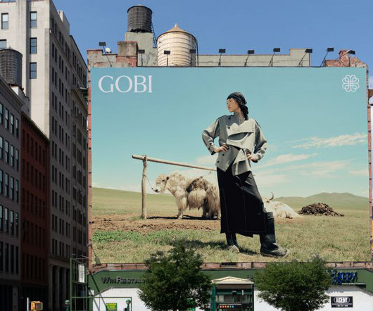
Creative director Rob Duncan explains how a new visualidentity crafted by Mucho has helped that effort. It has a great deal of equity and recognition in Mongolia, but wanted help in growing the brand outside the country. Gobi is well-known in its native Morocco but needed an extra push to expand its global presence.
Montreal hosted the summit for the first time in 2025, so it was important that both the consultancy behind the identity and the collaborating artist be local. The FMJF was looking to define a brand that would support the summit's growing national notoriety and be a representation of Montreal's unique perspective."
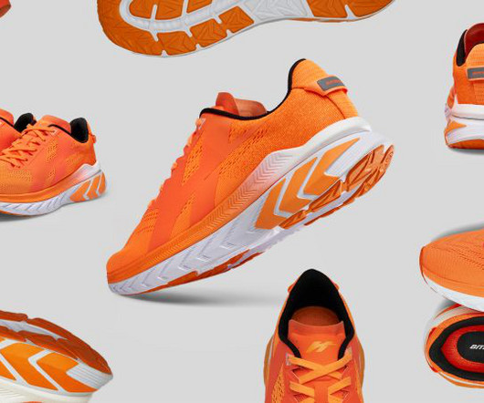
Now, it has an identity that competes with global brands without compromising on its roots in the country's culture. Known for its unconventional campaigns and innovative designs over the last nine years, the brand contributes approximately 74% to the company's total revenue, selling millions of pairs globally.
Often, the key to a visualidentity is a clear concept developed thoughtfully. And the new designs for National Landscapes by Nice and Serious fall straight into that category. Never heard of National Landscape? Don't feel dumb: neither had we.
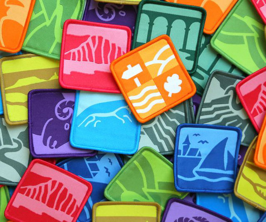
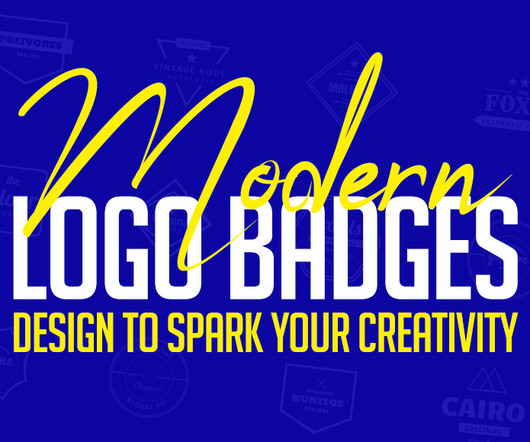
In today’s design world, logo badge designs are a popular trend that continues to inspire both designers and brands. These small yet powerful designs go beyond simple visuals—they share stories, build identities, and create connections. Each design showcases unique styles, innovative elements, and artistic flair. Editable text.
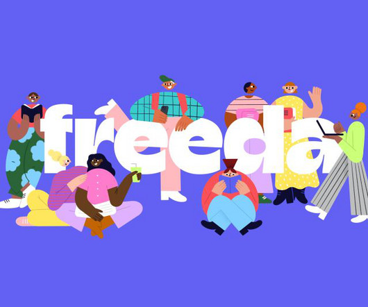
Barcelona-based graphic designer Ilia Tuma has refreshed the school's decade-old identity with a new logotype and vibrant colour palette, as well as bespoke illustrations by Anastasia Sheremeteva. Renowned Barcelona-based language school Freeda has a new identity created by graphic designer Ilia Tuma.
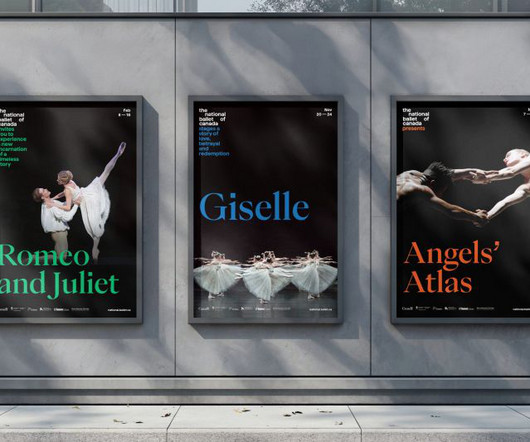
A fresh visualidentity crafted by Bruce Mau Design is helping Canada's most esteemed ballet company pirouette past stereotypes and leap into the future of performing arts. But its branding looked a little tired, having not been refreshed for almost two decades. So, type needs to flow seamlessly from the logo.
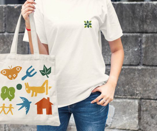
The National Education Nature Park is a scheme to help educate kids about nature. Design agency Out of Place Studio explains how it crafted its visualidentity. To help square this circle, the Natural History Museum has created the National Education Nature Park. Well, that may be true, but is that really surprising?
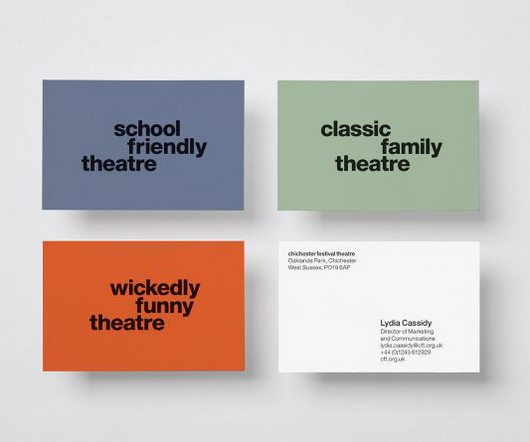
Credit: Chichester Festival Theatre / Rose London-based design agency Rose has given one of Britain's most beloved arts institutions a fresh visualidentity that shows off the theatre's legacy and ongoing relevancy with modern flair. The first challenge for Rose was reinstilling a strong sense of brand equity in the theatre's name.
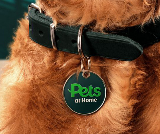
Now boasting more than 450 UK stores, Pets at Home's evolution has seen it become the nation's biggest pet care brand. The previous Pets at Home was made from a group of sub-brands, sister companies and services. Nomad worked closely with Pets at Home head of brand Cath Ryan throughout the project. "As
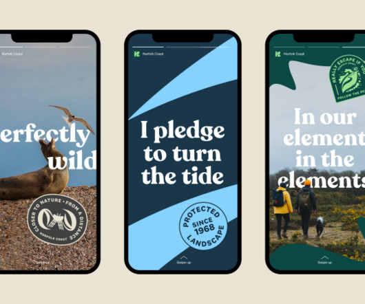
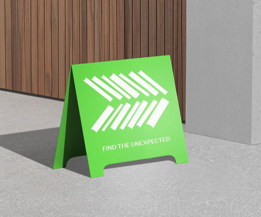
This new identity for the Norfolk coast by Lantern is a masterclass in place branding. Most of the work in branding is about either creating entirely new brands or refreshing existing ones. One of the most intriguing challenges in branding is bringing together several discrete entities and making them sing as one.
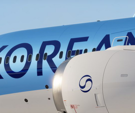
Korean Air has unveiled a refined new brandidentity, marking the first major refresh in four decades. Designed by global brand consultancy Lippincott, the rebrand is a pivotal step in the airlines transformation from a national carrier to a premium global airline.
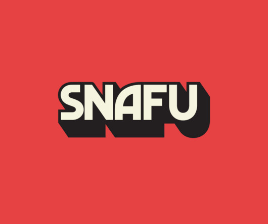
In the new and improved brand, expect graphics inspired by art books on Cold War propaganda, spy movie posters from the 1950s and '60s, and vintage adventure and educational book covers. FilmNation described the SNAFU brand as "not afraid of the messy mishaps" and, while messiness can be fun, it can be hard to get right.
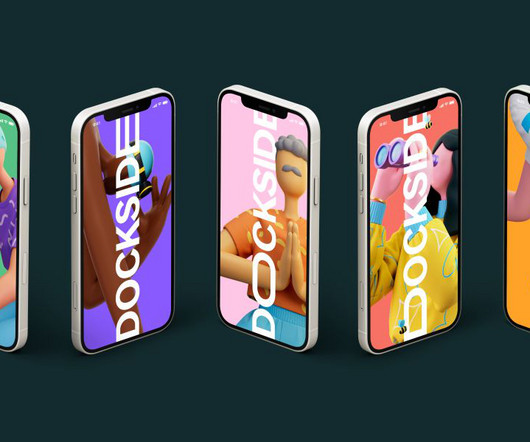
Peace, beauty and self-discovery are at the heart of SomeOne's visualidentity for London's newest district and working quarter, Canada Water Dockside. acre green site and the dock itself, SomeOne created a visual botanical playground for Dockside, that "constantly adapts and showcases the very best of what the area has to offer."
One of the nation's oldest theatres celebrates its recent restoration with a full rebrand, courtesy of Brighton agency Good Noise. In the wake of this restoration, the theatre decided to launch a comprehensive rebrand and refreshed brandidentity. These visuals are rooted in the theatre's illustrious past.
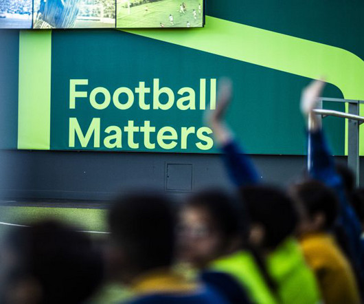
Ahead of the 2024 Euros, creative agency Poke Marketing has rebranded Manchester's National Football Museum to emphasise the importance of football in English culture. The rebrand comes at a time of transformation for the museum, which will look very different by 2030, so it needed an identity reflective of this new direction.
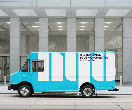
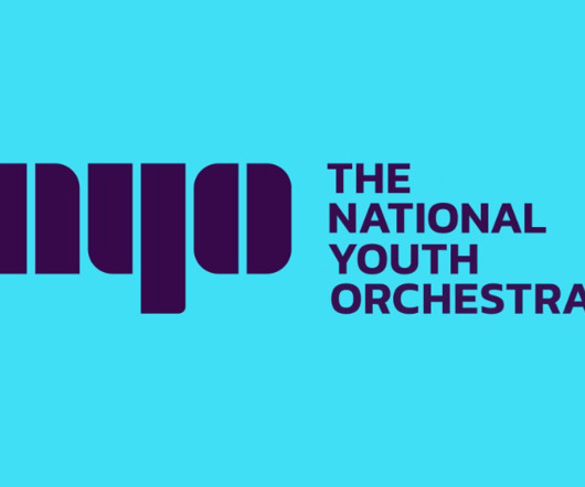
Branding for young people is full of pitfalls, from appearing patronising to engaging in cliches. The new visualidentity for the National Youth Orchestra by SomeOne avoids these traps and helps the organisation on its mission to change lives. As a young person, joining The National Youth Orchestra (NYO) opens doors.
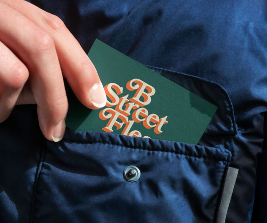
based designer about how he created a cohesive visualidentity for a new seasonal flea market. Traditionally, city centre markets didn't really need much in the way of branding other than maybe a sign at the entrance. his iconography is still prevalent at the National Zoo. We speak to the Washington, D.C.-based
Raised in an innately creative household his father was a doctor with a passion for woodworking, and his mother was naturally crafty Tonge spent much of his childhood drawing, exploring, and immersing himself in visual culture. Luke Tonge's journey into design was anything but conventional. I kind of lost myself in that world."
Simple, smart and modern designed corporate brandingvisualidentity and logo design examples great for your inspiration. Business visualidentity can be the most valuable asset for any company or brand. BrandingVisualIdentity Designs. Aristo BrandingIdentity by Marcelo Kimura.
Founded in 1948, the National Youth Orchestra is an institution in the UK with generations of musicians who have learned to practice their craft there. Beyond a simple logo design and visualidentity creation, the organization and the agency went for a full rebranding that goes with a new strategy for communication.
Illustration by Mia Angioy for Creative Boom In the second of our special six-part series, we look at how music can elevate your visual storytelling and enhance its emotional power. In the realm of visual storytelling, the power of sound often goes underappreciated.
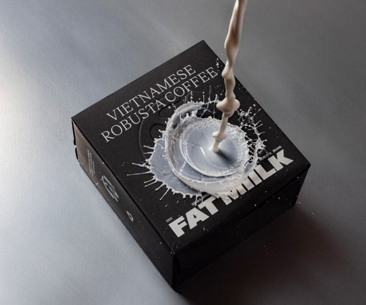
Still, getting attention and conveying the quality of your brand isn't easy. And even having a point of difference like your national origins isn't always enough to be distinctive. To do so, they turned to award-winning LA branding agency Truffl. That was certainly the case for Fat Miilk.
Strategy and copy agency Opening Line has released a new publication, Between the Lines, which explores the vast and often misunderstood world of brand language through the lens of the creative industries. Generally, the branding industry is more guilty than advertisers when it comes to skipping over the verbal identity.
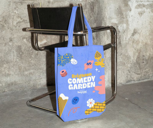
The London-based studio collaborates with renowned illustrator Hedof to create upbeat and engaging branding for the Comedy Garden Festival. 57 Festivals is a London-based company specialising in live comedy. Since 2005, it has delivered comedy shows and festivals to select cities across the UK.
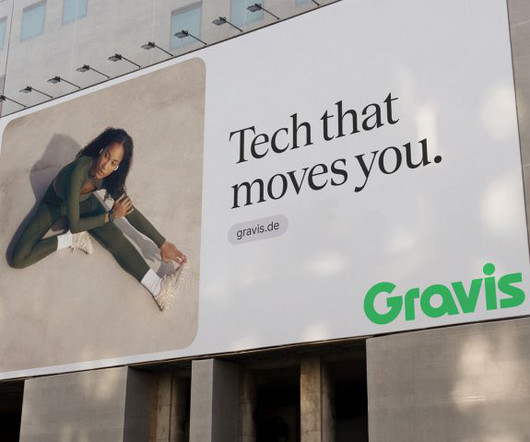
LIT's new visualidentity for Gravis aims to make it cool and relevant to a new generation of tech shoppers. Gravis is Germany's premier tech retailer and one of the nation's largest Apple resellers. Beyond the logo, the new brandidentity extends to every aspect of Gravis' visual language.
The Bath-based branding agency explains how they helped transform British Swimming into Aquatics GB ahead of the Paris Olympics. Thisaway was responsible for naming, brand strategy, brandidentity, event branding, tone of voice, animation, brand guidelines and brand rollout.
How do you retain the best of a brand's heritage while making something new? It's a common challenge when embarking on redesigning a much-loved brand. On the other hand, you don't want to jettison all the brand value they've built up over the years and risk upsetting a loyal customer base. Yet we felt we were being overlooked.
She's well known for working with big brands, writing human interest pieces, and promoting the value of diverse thinking. Olivia Christian has worked as a brand strategist for more than 15 years. Her work has been featured on National Public Radio (NPR), ESPN and ESPN Radio, and NBC Sports California. Charlotte Adorjan.
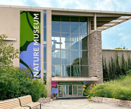
The identity features a typeface called TP Atten (the original drawing of New Atten), which is based on the voice of naturalist Sir David Attenborough. Span has designed a new identity for Chicago's Nature Museum, taking inspiration from Illinois's native prairies.
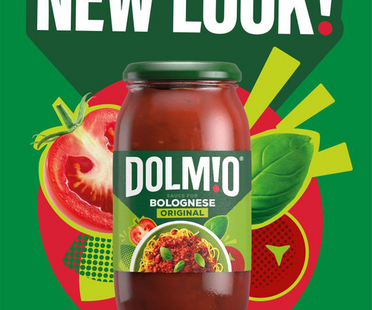
Global brand and design consultancy Elmwood has today unveiled its bold new identity for Dolmio, which aims to attract a younger audience and celebrate the generous spirit of Italian cuisine. And thanks to the help of an accompanying puppet family, the brand has effectively managed to maintain its place in the nation's heart.
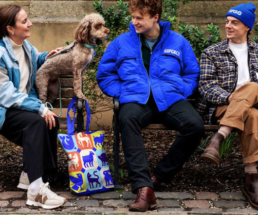
As the RSPCA celebrates 200 years of working to help animals live fairer and better lives, it has launched a new purpose, positioning, and brandidentity designed by Jones Knowles Ritchie (JKR). Animal iconography also features across the new brands, with an animal reflective of the regional wildlife matched up to each location.
Inspired by the beauty of the underwater world, GOOD's new identity for the National Oceanography Centre is helping it spread its message to a wider audience. That's where the National Oceanography Centre (NOC) comes in. And this purpose has been brought to life through a new brand idea: 'Go Deeper'.
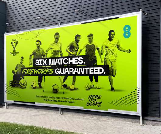
has unveiled a new identity for the tournament. Running under the campaign title "Here For Glory", the new identity from Fire Dept. aims to ensure that players within impairment-specific football have a national FA competition to call their own, complete with dreams of reaching St George's Park for finals weekend.
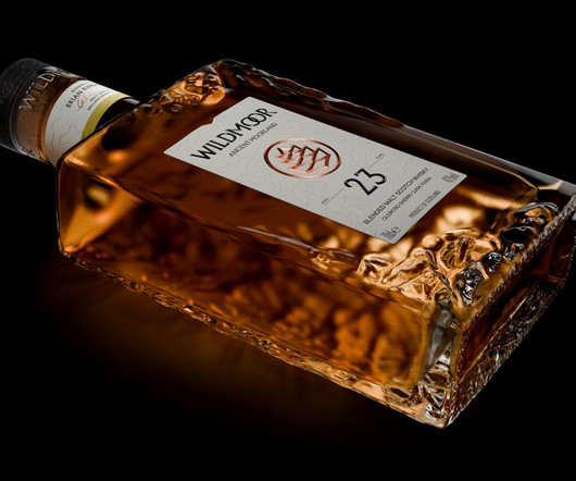
Amid the rising popularity of Japanese whiskeys, LOVE has designed a new brand that combines two cultures while staying true to the category's time-honoured codes. Manchester-based creative agency LOVE has designed a new luxury whiskey brand from scratch in collaboration with William Grant & Sons (WG&S).
Welsh publisher Atebol planned to expand its operations and needed to revitalise its branding accordingly. Award-winning Carfiff-based agency Clout was tasked with helping them launch the imprint at the recent National Eisteddfod of Wales, the largest music and literary festival in Europe.
Cardiff-based branding and design agency Bluegg has overhauled its identity as part of its 20th-anniversary celebrations. But with two decades under its belt, the founders decided it was time to turn their carefully-crafted branding skills on themselves. The story of our name no longer fitted our ambitions or attitude.
From pioneering entrepreneurs to innovative brand leaders and multidisciplinary creative forces, these are the movers and shakers propelling their respective fields forward. To answer that question, we turned to Frontify , our favourite cloud-based, brand-building platform. and Europe through their remarkable work. In the U.K.,
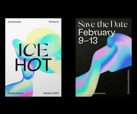
The Finnish creative director explains the thinking behind her visualidentity for the festival, Ice Hot Nordic Dance. Based between London and Helsinki, Sofia is an independent, multi-disciplinary creative director, designer and illustrator specialised in branding in the lifestyle, arts and culture, fashion and music industries.
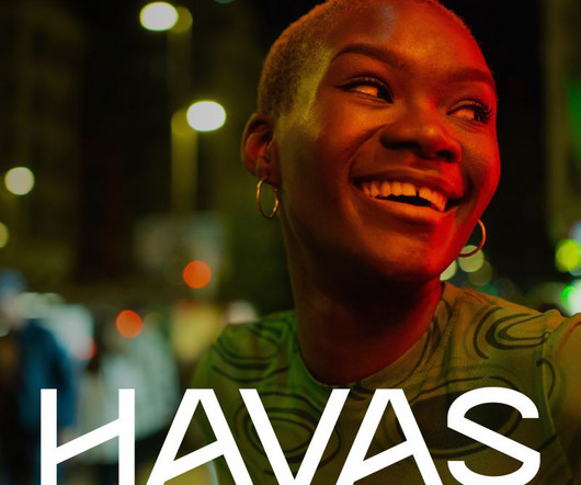
This all makes for great global business, but with so many diverse operations, Havas needs a strong and unified identity for people to make sense of it all. And like all brandidentities, that occasionally needs reinventing to bring it up-to-date for the modern world.
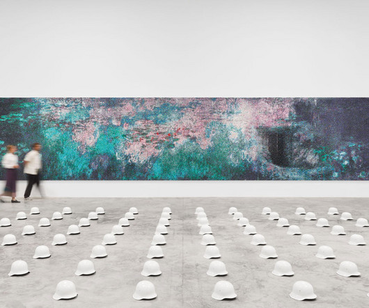
Here, Ai Weiweis exhibition What You See Is What You See showcases 12 massive toy brick works, made from either LEGO or WOMA blocks (the Chinese equivalent to LEGO, that can be distinguished by the lack of LEGO branding on the top of each peg). Here’s a quick breakdown of each show and information on how to visit.
So, it feels like a moment for brands to capitalise on demonstrating a level of altruism whilst showing their identities in a fresh way. We've all got our favourite fonts, but it's good to mix things up now and again and stop your design work from becoming stale. And the start of a new year is the perfect time to do so. Naughty Roll.
We organize all of the trending information in your field so you don't have to. Join 66,000+ users and stay up to date on the latest articles your peers are reading.
You know about us, now we want to get to know you!
Let's personalize your content
Let's get even more personalized
We recognize your account from another site in our network, please click 'Send Email' below to continue with verifying your account and setting a password.


Let's personalize your content