This site uses cookies to improve your experience. To help us insure we adhere to various privacy regulations, please select your country/region of residence. If you do not select a country, we will assume you are from the United States. Select your Cookie Settings or view our Privacy Policy and Terms of Use.
Cookie Settings
Cookies and similar technologies are used on this website for proper function of the website, for tracking performance analytics and for marketing purposes. We and some of our third-party providers may use cookie data for various purposes. Please review the cookie settings below and choose your preference.
Used for the proper function of the website
Used for monitoring website traffic and interactions
Cookie Settings
Cookies and similar technologies are used on this website for proper function of the website, for tracking performance analytics and for marketing purposes. We and some of our third-party providers may use cookie data for various purposes. Please review the cookie settings below and choose your preference.
Strictly Necessary: Used for the proper function of the website
Performance/Analytics: Used for monitoring website traffic and interactions
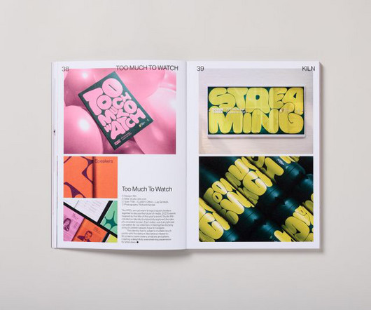
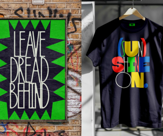
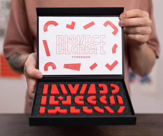
In an era when attention spans are dwindling and visual overload has become the norm, Counter-Print's new book celebrates the transformative power of expressive typography. It led to a book that considers the challenges of visual clutter by showcasing typography as a bold and innovative medium.
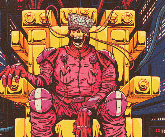
Matt Griffin, a celebrated multimedia artist known for his imaginative fantasy and sci-fi art, has unveiled a stunning new collection of digital posters titled Amazing 70s Sci-Fi Art. The collection incorporates the vivid color palettes, dramatic typography , and imaginative world-building that defined the era.
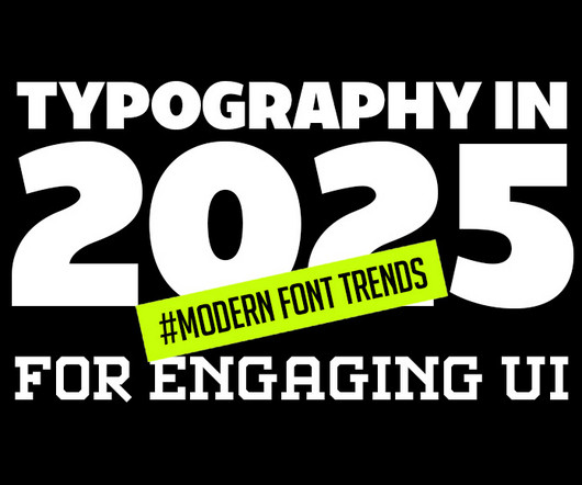
Typography is evolving rapidly, reshaping how we perceive and interact with digital designs. This article delves into the latest typography innovations that promise to make digital interfaces more engaging, accessible, and visually appealing. Designers are adopting these fonts to create more inclusive digital experiences.
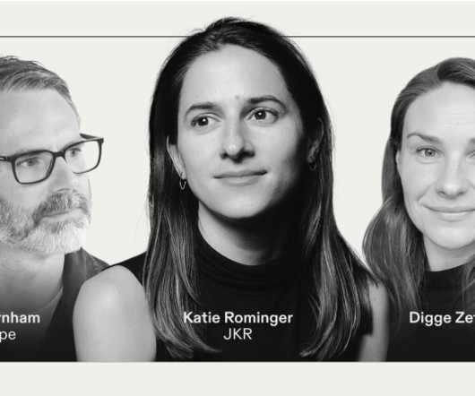
In the design world of 2025, typography is becoming increasingly important. In a discussion chaired by Frontify's Digge Zetterberg, design experts Katie Rominger from Jones Knowles Ritchie (JKR) and Phil Garnham from Monotype peeled back the layers of contemporary typography, and looked to where it's currently heading.
These sessions revealed the need for nuance and flexibility in online readability and accessibility and how disabled people should be depicted in photography, and they influenced the studio's approach to typography, iconography, and illustration.
The awards' new visual identity embodies organic growth as a metaphor for creativity, blending generative design and dynamic typography. Typography played a fundamental role in ensuring the identity remained cohesive across all touchpoints. Townsend believes that digital-first, dynamic identities are becoming the new standard. "As
As we delve into graphic design trends 2025 , web design trends 2025 , and logo design trends 2025 , we’ll also highlight the influence of AI, typography innovations, and sustainable practices. Whether you’re a designer, marketer, or brand strategist, staying ahead of these trends is essential to creating relevant, impactful designs.
UK-based content creator Robert McCombe explains, "Digital precision with a tactile quality creates a unique balance. It feels like a fusion of pre-tech and modern design, digital and physical, leaving a more lasting impression." JPEG Artifacting While noise is out, intentional digital artefacts are in.
” A spectacular digital illustration can make your brand’s merchandise as iconic as the Apple logo or the Nike swoosh. Well, strap yourself in, because we’re about to journey through the vibrant cosmos of digital art and explore the elements that will make your merchandise pop. Where do you start?
From neo-grotesques with a modern edge to culturally significant designs preserving endangered languages, these typefaces reflect the diversity and depth of contemporary typography. With low stroke contrast and two full sets of capitalsLatin and BlackletterPlace shines as a display face and a workhorse for complex typography.
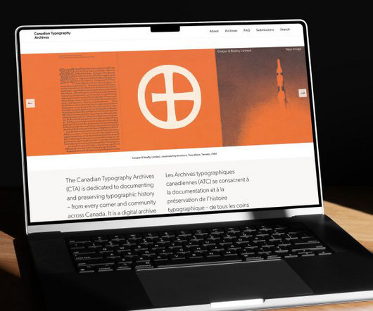
Even if you love typography, your view of it may be blinkered by geographic and historical filters. From the screens we tap on, the movies we clap for, the transit system we navigate or the books we cosy up with, typography is around us all the time. This new project provides a glimpse into Canadian type history from 1752-1985.
The studio is widely celebrated for its bold use of colour, form and typography, pushing the boundaries of what branding and design can achieve. This year, they've also launched a sister agency focused on typography and type design, called Type of Feeling. Founded by Gert Dumbar in 1977 in the Hague, they later moved to Rotterdam.
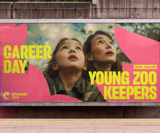
Brand idea "A two-year project with so many moving parts was always going to be a challenge; which is probably why we've loved working on this rebrand and digital overhaul with Chester Zoo so much," recalls Cat How, founder and ECD of How&How. The sheer scale of their ambition, determination and vision inspired us every day," she adds.
This trend takes inspiration from the past’s vision of the future, often characterized by neon colors, metallic accents, bold geometric shapes, and vintage typography. Retro-futurism reflects a playful yet sophisticated look, making it popular across branding, website design, and digital art.
Since then, this New Zealand foundry has carved out its niche in the competitive world of typography through a combination of accessible design and creative merchandising. Economic pressures Looking ahead to 2025, Daniel sees the typography landscape evolving in response to economic pressures. "I
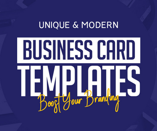
In today’s digital age, standing out in business means blending traditional professionalism with modern innovation. While the popularity of digital communication continues to rise, business cards remain a powerful tool for face-to-face networking and branding.
Traditionally, brand identity focused on static elements: logos, colour palettes, typography and tone of voice. That might seem like a simple concept, but it required careful consideration of how people interact with digital interfaces. In this article, I'll explore how to build motion successfully into your work.
Typography is a funny thing because while it's largely based on fundamental, eternal principles, it nonetheless continues to evolve year after year. This year's selection showcases a diverse range of styles, from timeless classics reimagined for the digital age to cutting-edge designs that push the boundaries of legibility and aesthetics.
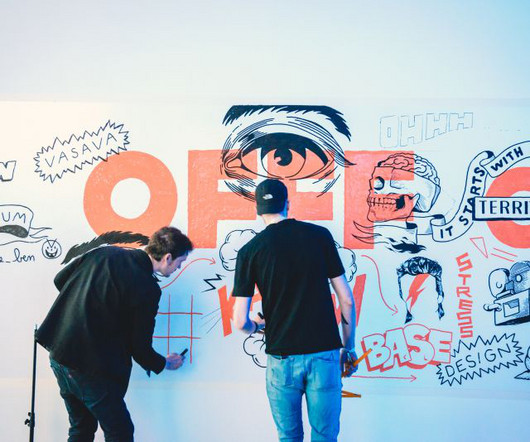
From a digital playground to a global phenomenon OFFF was conceived at a time when the internet was just beginning to reshape creative work. There were big challenges: connecting with the community, being curious about what is going on in digital and visual design, and, of course, management." Could be fun." Salazar recalls. "It
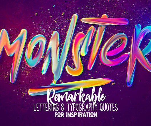
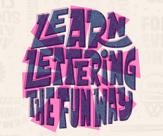
In a digital world dominated by impersonal fonts and robotic typing, hand lettering typography quotes are making a comeback – and it’s cooler than ever. This modern art form seamlessly blends the timeless elegance of hand-drawn letters with the precision and flexibility of digital tools.
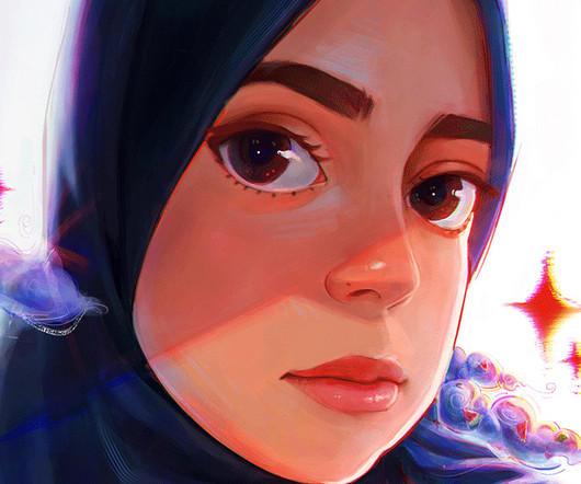
Hala Mohamed is a distinguished graphic designer and digital illustrations artist from Egypt, whose work embodies the vibrancy and complexity of contemporary Egyptian culture. Explore Hala Mohamed Graphics and Digital Illustrations: Hala Mohamed stands as a testament to the power of art in bridging the past and the present.
The second month of 2025 brings us a rich harvest of new typefaces that perfectly illustrate typography's dual nature: serving designers' practical needs while pushing creative boundaries. marks a significant evolution in accessible typography. million API serves in a single week, its impact on everyday typography is already profound.
Nurom Next by The Northern Block Ten years in the making, Nurom Next represents a significant evolution in multilingual typography. Airport by Lukas Schneider Airport is a digital reinterpretation of Matthew Carter's 1961 alphabet, originally designed for London's Heathrow Terminal 3.
In the ever-changing world of digital content creation, your brand's identity is no longer confined to visual elements alone. Typography to rhythm The style of your brand's typography can also inform the rhythm and pacing of your music.
So, every year, we gather intelligence from creative leaders to inform you about the latest typography trends bubbling up within the industry. Read on to discover how designers and brands alike are set to navigate the complex terrain of typography in 2025, balancing functionality with flair and tradition with innovation.
Users can create digital mood boards and collaborate with others in a distraction-free environment, making it a favourite for in-depth creative exploration. Whether you're working on branding, typography or photography, this platform is an excellent resource. is a minimalist, ad-free platform for creative research and idea sharing.
Typography is a vital element in any creative project, setting the tone and conveying the message with style. Typography trends are constantly evolving, and staying ahead of the curve means experimenting with new styles that can elevate your work. Every letter has a christmas design theme. This font comes in 2 font combination.
If you're a digital native, you may have grown up without ever interacting with physical type. We spend so much time working in digital nowadays it's hard to remember that for hundreds of years, typography was a purely physical medium. BlockFace is a stamp kit designed to help you explore typography and more.
A key addition to the visual identity is DNEG Script, a custom typeface developed in collaboration with French digital type foundry Lift Type. "We A flexible typography toolkit allows for adjustments depending on the context, simultaneously offering versatility and maintaining the brand's impact.
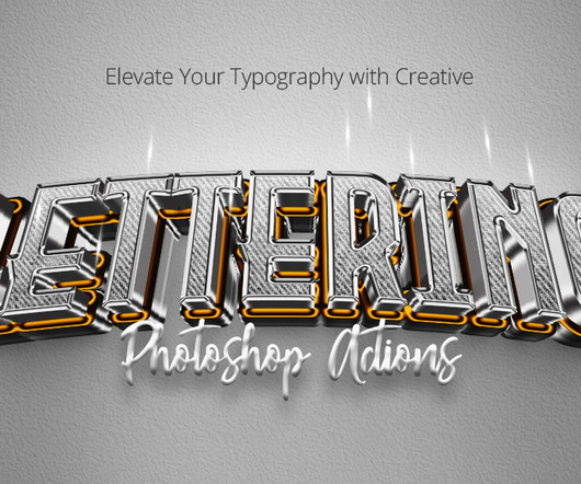
Lettering Photoshop Actions: Typography has always been the cornerstone of visual communication. These actions can further enhance the impact of your typography by adding creative effects and styles to your text. This is where the future of typography – creative lettering actions – steps in. Back to the 80s!
Half-Greek and half-German, and based in London, Tina's work spans digital and print design, typography, branding, graphics, animation, and more, blending analogue and digital worlds by mixing various materials and techniques into her distinctive outcome. Adobe x David Bowie Digital Assets "It's easy to get lost.
Embark on a journey of futuristic creativity and inspiration with our avant-garde handcrafted and digital hand lettering typography quotes, pulsating with positive energy. You may be interested in the following articles as well.
Whether you’re creating logos, advertisements, or digital content, ZUKASA adapts seamlessly to suit any design need. Japan Bento Japanese Style Display Font Japan Bento, Inspired by Japanese Kanji Typography. Embrace the beauty of Japanese typography with “Japan Daisuki.” Download 8. Download 15. Download 16.
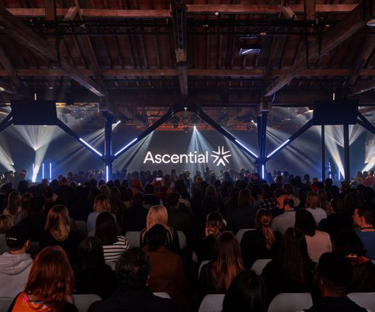
Following the recent sale of its digital commerce and product design businesses, Ascential has become more streamlined and focused on events serving the marketing and fintech industries. The lead brand colour, Ascential Yellow, acts as a spotlight highlighting UI, typography, and data to tell stories.
Digital illustration is made so much easier and more enjoyable with the right tools, and Procreate has quickly become a favorite among illustrators for this reason. In this article, we’ll explore what makes Procreate brushes unique and why they’re an invaluable asset to your digital toolkit.
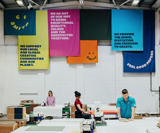
The new identity is designed not just for longevity but also for adaptabilitya vital shift in an industry where brands compete to thrive in both digital and physical spaces. The typography also underwent a transformation. Initially, there was uncertainty about whether TEMPLO's cause-led approach would align with GF Smith's heritage.
M N Associates has rebranded Vietnam's national sneaker brand Biti's Hunter, introducing a completely new trademark, logotype, custom typeface, and holistic branding system designed to seamlessly bridge the physical and digital experience.
In the dynamic realm of web design and digital marketing, grasping the newest font trends is akin to possessing a magical key for engaging your audience. By the conclusion of this article, you’ll have gained valuable knowledge about the most impactful typography styles of 2023. This exemplifies the impact of current font trends.
Best of all, this is a flexible degree that can be tailored to your interestsfor example, in app development, animation, visual identity and branding, illustration, photography, typography and publishing, or graphic design in general.
Creating efficient, consistent, and flexible typography for digital platforms using modern design system principles. At the heart of this approach is typography , which is how we make text look and feel. When typography is well-designed, users can engage with content smoothly without distraction.
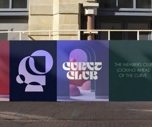
"Curve Club is a place where digital technologies, physical materials and living things meet," explains Sam Fresco, founder of Wildish & Co. "It s brief for the branding was centred on the idea of 'physical meets digital'. It thinks about tech in the most romantic sense: as a means to connect with one another." Wildish & Co.
We organize all of the trending information in your field so you don't have to. Join 66,000+ users and stay up to date on the latest articles your peers are reading.
You know about us, now we want to get to know you!
Let's personalize your content
Let's get even more personalized
We recognize your account from another site in our network, please click 'Send Email' below to continue with verifying your account and setting a password.


Let's personalize your content