This site uses cookies to improve your experience. To help us insure we adhere to various privacy regulations, please select your country/region of residence. If you do not select a country, we will assume you are from the United States. Select your Cookie Settings or view our Privacy Policy and Terms of Use.
Cookie Settings
Cookies and similar technologies are used on this website for proper function of the website, for tracking performance analytics and for marketing purposes. We and some of our third-party providers may use cookie data for various purposes. Please review the cookie settings below and choose your preference.
Used for the proper function of the website
Used for monitoring website traffic and interactions
Cookie Settings
Cookies and similar technologies are used on this website for proper function of the website, for tracking performance analytics and for marketing purposes. We and some of our third-party providers may use cookie data for various purposes. Please review the cookie settings below and choose your preference.
Strictly Necessary: Used for the proper function of the website
Performance/Analytics: Used for monitoring website traffic and interactions
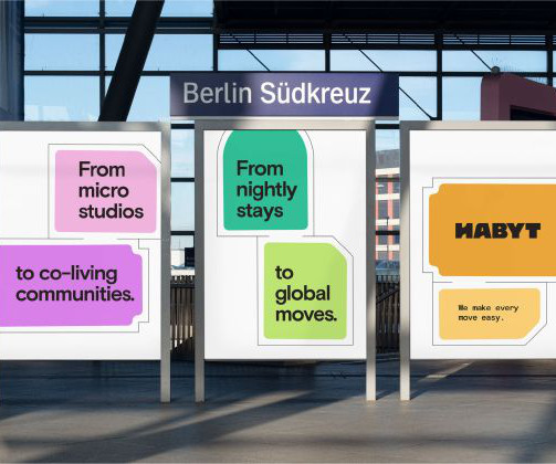
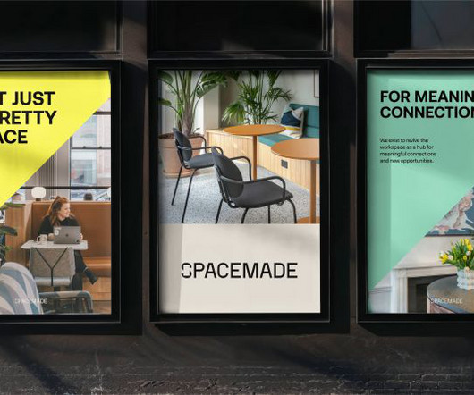
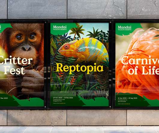
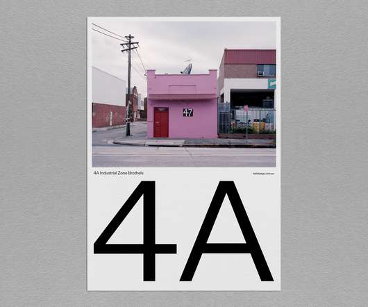
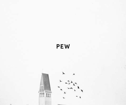
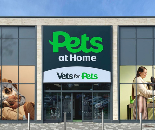
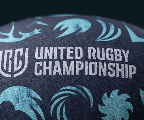
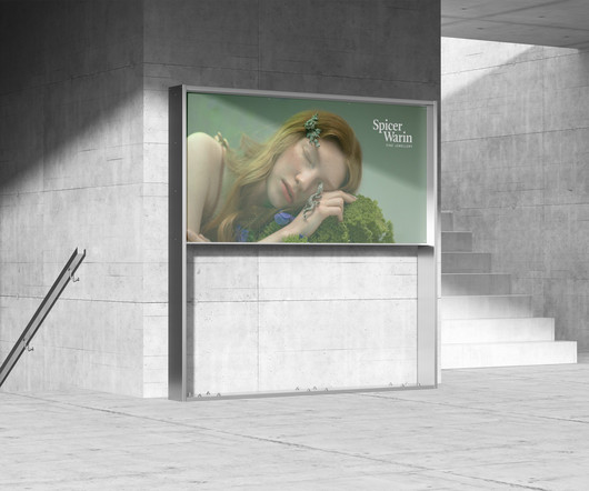
Again, the typography selection is superb, using Hal Four Grotesk by Studio HanLi, GT America by Grilli Type, and Burgess Pro by Colophon. Vanderbrand doesn't just work on place-related brands; it also works with Together Design Lab (TDL), a team of planners, designers, and architects at Toronto Metropolitan University.
The new wordmark uses a specially commissioned typeface, Pets Headline, which Nomad developed with font foundry Colophon. Colophon also created another typeface which is used for the sub-branding logos and shares many of the same design properties as the Pets logo so that the two typefaces can work side by side.
Colophon foundry's Raisonne Pro (used in Bold, DemiBold and Book) is the primary typeface used throughout—contemporary and straightforward, it represents a voice that can be used across Woodgreen's different styles of communication.
Burger King, for example, worked with Colophon on a typeface that felt juicy and delicious," she explained. Workhorses vs brand personality When it comes to big brands, there's no single approach to type choice, and neither does Katie believe there should be. The choice depends on the brand's needs and that of its target audience.
From serifs and sans-serifs to display options and stencil typefaces, there's something to suit everyone this autumn thanks to Colophon, Order, Lineto, Playtype, TypeMates, and many more excellent designers. Apta by Colophon.
When it came to typography, Dave opted for Grenette by Colophon for headlines, Cadiz by Luzi Type for body copy, and a customised form of Spezia for the wordmark. These assets depict all manner of boats, destinations, experiences and everything in between," says Dave.
Sunset Gothic by Colophon – the chosen typeface – strikes a balance between character and legibility, while the new colour palette mirrors the punchy and emotive essence of Italy: red terracottas, the sea and the warmth of the sun.
It was only December last year when Monotype acquired the award-winning Colophon Foundry and its library of 85 fonts. The company will continue to develop historically conscious, deliberately original typefaces that are used globally by renowned designers and world-class brands such as Dropbox and Samsung.
DM Sans by Colophon. It was designed by Colophon as an evolution of the Latin portion of ITF Poppins by Jonny Pinhorn. Space Grotesk is a proportional sans-serif based on Colophon's fixed-width Space Mono family (2016). They're free and fast to download, with absolutely no commitment, so why not give them all try?
This bespoke logo is supported by Basis Grotesque , a clean, straightforward and highly legible typeface from Colophon Foundry. Design elements At the centre of the system, the new logo builds on the idea of 'unlocking opportunities' through the symbol for opening doors, which is located in the negative space of the 'H'.
And industrial-inspired Apercu Mono by Colophon Foundry in all-caps is used for supporting copy such as addresses and signage to establish a strong yet approachable tone. When it comes to typography, headlines are cast in the neo-grotesk font Aeonik, with bold weight in all caps; this "exudes a direct and simple tone of voice," says Jack.
Lay Grotesk by Colophon Lay Grotesk is a contemporary sans-serif that reinterprets the style of the classics such as Helvetica, Neue Haas Grotesk and Folio, running with their Swiss neutrality but smoothing out their rigidity. Lay Grotesk by Colophon 16. Kibitz by Colophon Foundry 45.
Weave by Colophon Foundry Weave is a refined sans-serif that explores the movement and relationship between angular and smooth outlines via moments of high contrast paired with loose, soft curves. Touvlo by Emilios Theofanous via Monotype Touvlo by Emilios Theofanous via Monotype 4.
What was an exercise both in reduction of complexity and amplification of character resulted in a much simpler owl, and a complementary custom typeface by Colophon Foundry which could carry the weight of the real, global, human connection the brand believes in. Custom type family by Colophon Foundry. Rating icons.
Anak has worked with type foundry Colophon on a new typeface Mandai Value Serif. Colophon’s Value Serif was the inspiration thanks to its warmth and clarity, they explain. According to Chua and Tan, the typeface needed to suit many needs – from corporate governance to a children’s book.
Perhaps the most prominent part of the new identity is the mermaid emblem, which is used in a range of lock-ups including the colophon seen on all book spines. “Future-facing” In order to maintain a “future-facing” identity, a modern colour palette was picked to balance with the traditional illustrated colophon.
The refresh also includes a new bespoke type family, Cadillac Gothic, which was developed with Colophon. Plus, there’s always the heritage element: you could argue the black and white design harks back to the brand’s earliest logos at the beginning of the 20th century.
We enhance narratives by translating concepts into strategic visual systems that transit between digital, printed, spatial and audiovisual. Our production has versatility and tooling knowledge of the team as fundamental points. Typography: Universal Sans. Format: 420×594 mm. Paper: Coated Matte 150g / m2. Printing: Offset.
Colophon: Opposit. The interior design continues the visual language of a Shokudo, translated into a casual bar with cosy lighting and tongue-in-cheek graphics in various corners. The lights and canvas at the bar counter are both inspired by the intricate folds of dumplings. Riso printing: Knuckles & Notch. Paper: Recypal.
A bespoke typeface has been created with type foundry Colophon. FutureBrand has also created a ‘Brand Hub’ which stores all the brand guidelines and assets in one place. This will be updated as new challenges arise for the brand. Currys Sans.
Created as a bespoke typeface for Visuelt , a design conference in Oslo, this typeface by Colophon spawned from a “more considered and constrained version” of Aperçu. Colophon revised and revisited the font and produced additional weights – the lightest of which has thin, precise curves.
It was chosen as the Spicer Warin brand font thanks to its classic, delicate feel; and is paired with UK foundry Colophon's geometric sans-serif Relative.
Colophon Foundry's Mabry does a great job as the " straight man " that helps the handwritten typeface, scribbles, and illustrations stand out. We want to steer away from staged photography and move towards something more realistic and unscripted. MagicLab Design project page. Out of home advertising.
It was chosen as the Spicer Warin brand font thanks to its classic, delicate feel; and is paired with UK foundry Colophon's geometric sans-serif Relative.
The fonts have been designed by the Cardiff office of design studio Smörgåsbord, in collaboration with the Colophon Foundry. A typeface has been created for the Welsh language which celebrate the country’s heritage. Graphic designer Joseph Burrin also consulted.
The studio has worked with London-based foundry Colophon on developing a bespoke typeface for the project, called 1906. Greenspace had already developed a logotype for the new name with an overlapping ‘W’ letter, and Colophon created a full font family with three different weights. ” [link].
Grilli Type’s G America and Colophon’s Nib accompany Pentagram’s custom type. This extends to a custom alphabet built using similarly changeable shapes, allowing people to use different glyphs as “personal icons”, or “typographic accents” to be deployed across the Serif network.
I also like the supporting serif, a customized version of Colophon Foundry’s Brick. To their credit, the one cool thing the identity does is take the patterns from the clothing in the illustrations as a significant design element that gets funneled through large crops of bits and pieces of the wordmark. That’s nice.
Colophon then developed and released the font, three years later, for commercial use. This font’s four weights have a nearly constant hairline weight, offering several degrees of drama and impact, as the stems thicken from regular to black. Basis Grotesque.
Typeset in Colophon Foundry's Transcript , the boxes and tubes have a striking simplicity thanks to a lack of any distractions and some really bold and intense colors -- even the off-white, tan-ish color has a real depth to it.
Fortescue – from the Colophon foundry – and Albertus black have a good balance of contemporary cleanliness and razor-sharp edges. I ended up using another Colophon font – Aperçu – for the typography.
Space Mono by Colophon Foundry A retro-inspired monospace font with futuristic undertones, Space Mono brings a playful touch to tech branding and experimental design projects. Decorative and Custom Fonts Grenette Font by Colophon Foundry As brands seek to stand out in a crowded marketplace, custom fonts are becoming more popular.
Nomad collaborated with Colophon, a font foundry, to create a unique typeface called ‘Pets Headline’ for the new wordmark.This is carried through every channel in the Pets brand world, again bringing the separate entities together to create one tight visual system.
Space mono: Colophon Foundry. Art direction & graphic design: Lina Forsgren. Development: Sam Skogh. Fonts in use: happy times at the ikob new game plus edition by Lucas le Bihan / Velvetyne foundry. Epilogue: Tyler Finck.
“Rounded, bold, yummy” The rebrand features a redrawn logo and a bespoke typeface – a bold serif called Flame – designed by Colophon Foundry. Burger King has said it expects the roll out of the visual identity to be completed “over the next few years” [link].
The bespoke type work – designed in collaboration with Colophon foundry – had to complement the logo. While this was not a guiding principle, Cook points out that it’s made up on five solid parts, one for each nation involved. Designing a “dynamic” typeface.
” Colophon Foundry’s Castledown was used as the primary typeface. Hudson-Powell says: “We paid attention to who the primary audience was at each moment. Packaging is equally parent and child, the app and web is parent, whereas the physical product had to appeal to parents but be delightful for kids.”
Released by Colophon in 2010, the original concept behind Aperçu was to create a synopsis or amalgamation of classic realist typefaces: Johnston, Gill Sans, Neuzeit, and Franklin Gothic. Released in 2014 by Colophon Foundry, this sans-serif has a distinctive tone of voice and is particularly striking when used in headlines.
It features a new logotype and typeface, using Quadraat, a classic and delicate highcontrast serif typeface designed by Fred Smeijers, paired with Relative, a wellproportioned, geometric sansserif typeface designed by UKbased type foundry Colophon. The post Spicer Warin Brand Identity appeared first on Mindsparkle Mag.
Photo via Type Punch Matrix The colophon states that 750 copies were printed in December 1930, with 650 copies for sale. He designed for book publishers such as Encyclopedia Britannica, Vanguard Press, and the Book League of America.
We organize all of the trending information in your field so you don't have to. Join 66,000+ users and stay up to date on the latest articles your peers are reading.
You know about us, now we want to get to know you!
Let's personalize your content
Let's get even more personalized
We recognize your account from another site in our network, please click 'Send Email' below to continue with verifying your account and setting a password.
Let's personalize your content