This site uses cookies to improve your experience. To help us insure we adhere to various privacy regulations, please select your country/region of residence. If you do not select a country, we will assume you are from the United States. Select your Cookie Settings or view our Privacy Policy and Terms of Use.
Cookie Settings
Cookies and similar technologies are used on this website for proper function of the website, for tracking performance analytics and for marketing purposes. We and some of our third-party providers may use cookie data for various purposes. Please review the cookie settings below and choose your preference.
Used for the proper function of the website
Used for monitoring website traffic and interactions
Cookie Settings
Cookies and similar technologies are used on this website for proper function of the website, for tracking performance analytics and for marketing purposes. We and some of our third-party providers may use cookie data for various purposes. Please review the cookie settings below and choose your preference.
Strictly Necessary: Used for the proper function of the website
Performance/Analytics: Used for monitoring website traffic and interactions
Officially launched earlier this year, PDIA will undoubtedly be an invaluable resource for designers, artists, and researchers. Catalogue View lets users search and browse by theme, style, date, and more, while Infinite View offers a visually immersive, 360 scrollable experience.
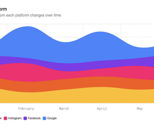
From monitoring financial results and app usage to mapping academic research, they are an essential tool. Subtle animations and dynamic updates should respond to user engagement. Hovering reveals detailed data, sliders adjust time frames, and tooltips should present comparisons across categories for easy analysis.
The opportunity is clear, with research showing that storytelling can increase product value by up to 2706%. In contrast, categories like sports broadcasting rely on distilled mechanics, like strong typographic systems and symbolic behaviours that scale. Wistia's latest State of Video confirms it. Static assets just can't compete.
📖 Reading Time: 5 minutes 🏷️ Categories: Design, Branding, Marketing 📅 Published: [DATE] Top 8 Free iPhone Apps Every Designer Should Know About The iPhone isn’t just a communication device; it’s one of the most underrated tools in a designer’s arsenal. Speed, safety, and accuracy define Clever Cleaner.
You need to do your research. Accessibility Matters: Beyond the Average User Accessibility is paramount. Do some research. If so, feel free to browse through our Graphic Design category or become a part of our Reddit design community to discuss current trends, ask questions, or just find inspiration.
Here's what you need to know: User Engagement : These allow viewers to interact with the content directly, whether clicking on elements, answering polls, or making choices that affect the video's outcome. Personalised and engaging user experience. This allows users to engage with your content when they're already in a viewing mindset.
📖 Reading Time: 5 minutes 🏷️ Categories: Design, Branding, Marketing 📅 Published: [DATE] Top 10 Best SaaS Design Agencies to Work With You've got a great SaaS idea, product-market fit, and some early traction. Users expect an easy, intuitive experience — and they aren't going to hang around.
POV Forward Thinking Review of the Year Editorial Team Jenny Brewer Olivia Hingley Ellis Tree Elizabeth Goodspeed Liz Gorny Extra nice Extra Search Account Social Seth Steinman merges the internet with ancient technologies Preconceptions of what modern technology looks and feels like are challenged in these post-postmodern sculptures.
The truth is most brands and users merely focus on creativity and the content aspects of a social media strategy. Users experience also states that reduced mental processing when interacting with familiar brands makes the interaction feel natural and comfortable. Theres a psychology behind why consistency appeals to audiences.
I collaborated with fellow designer and dear friend Marc Clancy (now a co-founder of the creative project organizing app Milanote) on this one, where we’d first sketch and then pass a Photoshop file back and forth to trick things out and play with varied user interactions. So I began to research and do my homework. Problem- solving.
Product Design: We design with the user in mind. For example, you might say, Jan-Feb: Research and ideation. Download from Adobe Stock If you like those graphic design assets, feel free to browse WE AND THE COLOR’s Templates category. Use bullet points to keep it readable. Branding: We create identities that last.
Including clear calls to action; Guiding users to the website pages full of Christmas goodies and gift ideas will help ensure they promptly find what they seek. This idea has created a fun-filled Christmas environment instead of a transactional one, enticing website users to explore the site.
Organize Components and Variants Logically Within your Components page, group assets by category and state: Buttons / Primary / Default, Hover, Disabled Form Fields / Input / Filled, Focus, Error Icons / Navigation / Home, Search, Settings Use Variants for related states, rather than separate frames.
📖 Reading Time: 5 minutes 🏷️ Categories: Design, Branding, Marketing 📅 Published: [DATE] Human-Centred Website Design: Create Empathy-Led Experiences Most websites treat visitors like data points rather than real people. They bombard users with pop-ups, confusing navigation, and content that feels like it was written by robots for robots.
Think about the sheer volume: over three trillion PDFs exist, and users open 400 billion of them in Acrobat each year. Imagine assigning specific roles to these Intelligent Agents AI perhaps a research assistant agent that can sift through lengthy documents, extract key findings, and even suggest related topics for further exploration.
Designing for everyone, not just the average When design treats users as identical, experience suffers. That test helped shape my view of how modern digital experiences fall short — not because the design was bad, but because it only served the average user. That realization started a deeper inquiry.
📖 Reading Time: 5 minutes 🏷️ Categories: Design, Branding, Marketing 📅 Published: [DATE] Your Brand is Lying: 12 Signs You Need a Rebrand Now Nobody wakes up thrilled at the prospect of a rebrand. According to a study by Stanford, 75% of users judge a company's credibility based on its website design. ” It’s useless.
Here, we will explore why digital design, specifically user experience (UX) and user interface (UI), isnt just a supporting element but a crucial foundation for building and perceiving a modern brand. Thats precisely where user experience (UX) and user interface (UI) design become crucial. Frustrating, right?
They ended up recreating the same old chatbot that traps users in an endless loop of generic responses, offering no real solution. Netflix and Spotify have years of experience using machine learning to optimize recommendations and personalize user experiences. Unbelievable! This was the motivation behind writing thisarticle.
📖 Reading Time: 5 minutes 🏷️ Categories: Design, Branding, Marketing 📅 Published: [DATE] 5 Website Design and Content Strategies To Connect With Customers How do you use website design and content to connect with your ideal customers? If you consult the latest research, you'll find it's the norm for effective brand communication.
📖 Reading Time: 5 minutes 🏷️ Categories: Design, Branding, Marketing 📅 Published: [DATE] The Value of Intern Programs and Digital Product Strategy In any growing creative agency, fresh ideas matter. Mentors guide them through userresearch and craft sessions where fundamental ideas grow.
📖 Reading Time: 5 minutes 🏷️ Categories: Design, Branding, Marketing 📅 Published: [DATE] Competitive Positioning for Small Business: Beyond “Better and Cheaper” If you vanished tomorrow, would a specific group of customers genuinely miss you? ” Lever 3: The Category Creator This is the boldest move of all.
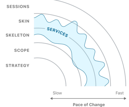
For instance, designers used to map out and user-test precise, predictable end-to-end screen flows. Jesse James Garretts 5 layers from The Elements of User Experience Design(2002) This framework doesnt focus on time, or on tension points resulting from conflicting velocities. Example actions/decisions/artifacts : User/AI dialogue.
On | Soft Wins with Elmo - YouTube Watch On And Puma decided to Go Wild and revitalised an old banger that is far from the adrenaline high rectification we had gotten accustomed to in the running category. YouTube Watch On Apart from some great high-value advertising, what can other brands learn from the development in the running category?
📖 Reading Time: 5 minutes 🏷️ Categories: Design, Branding, Marketing 📅 Published: [DATE] How AI Video Creation is Revolutionising Marketing Today, visibility is currency, and video is the gold standard. Users can acquire perfect voiceovers in minutes through the system without microphones or audio engineers. The result?
📖 Reading Time: 5 minutes 🏷️ Categories: Design, Branding, Marketing 📅 Published: [DATE] The 10 Trust Signals Your Website Is Missing Right Now You can pour all the money you want into Facebook ads, SEO, and fancy marketing funnels, but if your website looks even slightly dodgy, you’re just paying to send potential customers to a dead end.
CAN is also known for uncovering and contextualising noteworthy work featured on the festival and gallery circuit, executed within the commercial realm or developed as academic research.
📖 Reading Time: 5 minutes 🏷️ Categories: Design, Branding, Marketing 📅 Published: [DATE] User Feedback: How to Collect and Find the Gold The advice to “listen to your customers” is, on its own, spectacularly bad. Most of the user feedback you receive is noise. It’s well-meaning, perhaps, but it’s ultimately junk.
Other researchers have argued that it is the lack of meaningful choice that affects satisfaction. I analysed the relationship between the number of distinct products in a category (choices) and the average customer review (satisfaction). Furthermore, categories with fewer than 200 products tend to have average review scores between 4.0
📖 Reading Time: 5 minutes 🏷️ Categories: Design, Branding, Marketing 📅 Published: [DATE] Top 10 Best Shopify Web Design Agencies in the US Let’s Be Honest: Picking the Right Design Partner Is Tough Launching an eCommerce brand? But does the layout guide users? ” Yeah, not helpful. That’s fine.
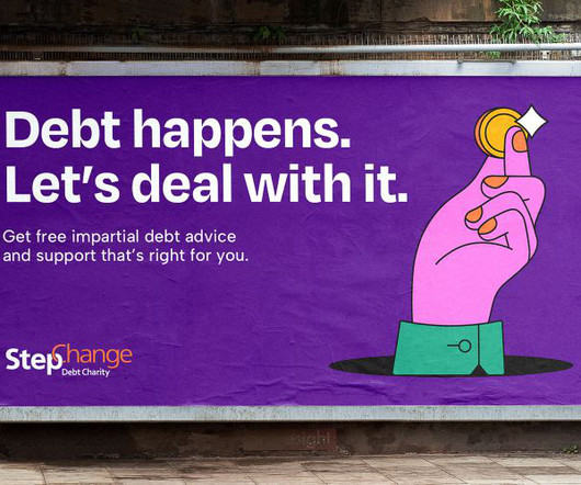
The market has also seen an increase in competitors, with more commercial providers of debt who charge users for their services, and crucially, the emergence of digital-first financial platforms has led to a massive shift in how StepChange's audiences interact with financial institutions. That's quite the design dilemma.
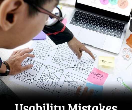
Minor usability mistakes may annoy users, but major usability mistakes make it impossible to complete a task, giving your competitors an upper hand. An example of web usability is the seamless user experience of the mobile app development company that guarantees smooth usability across different gadgets and browsers.
The market has also seen an increase in competitors, with more commercial providers of debt who charge users for their services, and crucially, the emergence of digital-first financial platforms has led to a massive shift in how StepChange's audiences interact with financial institutions. That's quite the design dilemma.
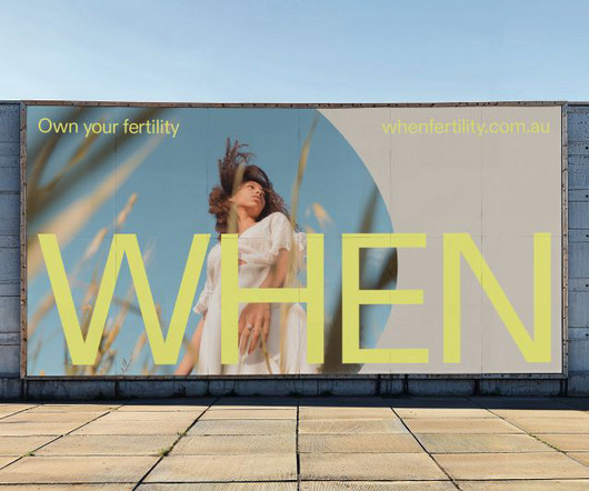
The startup's approach is twofold: offering a user-friendly, at-home testing kit and creating a platform for open dialogue about fertility. But this narrow focus has resulted in a category that feels overly clinical and sometimes cold," says Kate, "losing sight of the real people at the heart of it all."
Using the theme’s features, you can quickly create an eye-catching, user-friendly corporate business website for visitors. Klinixer is also highly suitable for other companies and corporate categories. This WP theme is built having in analyzed real profiles and needs of laboratory and research businesses.
Mital as part of his ongoing research. The app invites the user to “collaborate” with the machine in the discovery of randomly placed obstacles created by the machine. v2.2.2025.03 D 04/04/2012 A @ Filip C Project P Ben Porter , James Wetter , Jon McCormack T MacOS , Windows Untitled No. Together you play to create images.
Some themes offer extensive customization options, while others prioritize user-friendliness with pre-designed layouts. Many themes are designed with user-friendliness in mind, while others might require some coding knowledge to unlock their full potential. Klinixer is also highly suitable for other companies and corporate categories.
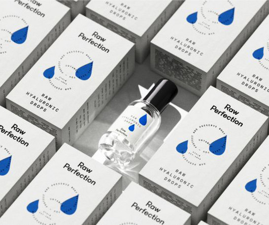
Raw Perfections' identity features a logotype that conveys the rigorous testing process its ingredients undergo, as well as intentionally imperfect illustrations that guide users through the skincare routine. For example, all formulations are free from silicones, which research has shown to be bioaccumulative.
Tania Boler Tania Boler is the founder and president of Elvie, a London-based company that develops innovative technology products to improve women's lives in overlooked categories such as breast pumps and pelvic floor health. Founded in 2013, Elvie has grown into a global market leader for premium breast pumps in the U.K.
Intentional storytelling involves creating content based on users’ search intent and relevant keywords. Keyword Research. Now that you have a list of possible keywords, it’s time to categorize them according to searcher intent categories. Intentional Storytelling. Here’s how to do it. Determine Your Niche and Gather Inspiration.
We have some great inspiration to share with you in all of these categories. If you choose a reliable vendor, they will be cheap,real and every like or follower will be active users. Use your research for new ideas and maybe even to figure out how to build up. Top Designer Channels to Consider: We love design. But don’t copy it.
When balancing flexibility versus usability, consider how well the needs of the users are understood, and how likely they are to evolve or change. With every new version of the Photoshop feature set was expanding to accommodate a larger set of use cases, this resulted in a highly flexible but complex user interface. Mistakes ?—?due
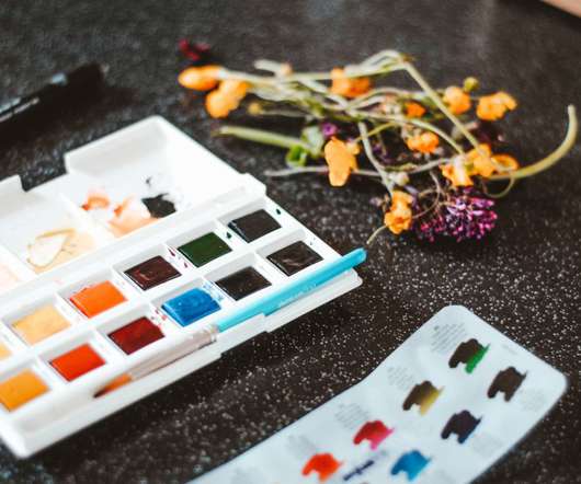
Digital painting cuts out the ‘middleman’ of having to take a photograph or scan and spend time editing the painting to reflect its former glory and Procreate seems to have really thought about the needs of its users. Think about how your artwork can be used, check out online resources, and research current trends. The Procreate App.
Let's explore some of the critical tools in this category. Research shows that colour can increase brand recognition by up to 80%, highlighting the importance of thoughtful colour selection in branding. Visual Branding Tools Visual branding tools capture attention, convey brand personality , and create a lasting impression.
We organize all of the trending information in your field so you don't have to. Join 66,000+ users and stay up to date on the latest articles your peers are reading.
You know about us, now we want to get to know you!
Let's personalize your content
Let's get even more personalized
We recognize your account from another site in our network, please click 'Send Email' below to continue with verifying your account and setting a password.


Let's personalize your content