This site uses cookies to improve your experience. To help us insure we adhere to various privacy regulations, please select your country/region of residence. If you do not select a country, we will assume you are from the United States. Select your Cookie Settings or view our Privacy Policy and Terms of Use.
Cookie Settings
Cookies and similar technologies are used on this website for proper function of the website, for tracking performance analytics and for marketing purposes. We and some of our third-party providers may use cookie data for various purposes. Please review the cookie settings below and choose your preference.
Used for the proper function of the website
Used for monitoring website traffic and interactions
Cookie Settings
Cookies and similar technologies are used on this website for proper function of the website, for tracking performance analytics and for marketing purposes. We and some of our third-party providers may use cookie data for various purposes. Please review the cookie settings below and choose your preference.
Strictly Necessary: Used for the proper function of the website
Performance/Analytics: Used for monitoring website traffic and interactions
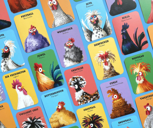
An Egg-cellent Card Game: Can You Find the Missing by Paperface (Design Product & Packaging) The AOI has unveiled those in the running for this year's World Illustration Awards, featuring 200 standout projects from over 4,700 entries worldwide. We're impressed by all of the work on display. Who Flew The Coop?
D&AD held its 63rd awards ceremony last night (Thursday 22 May) at London's Southbank Centre and handed out a record-breaking 668 Pencils across all categories. With no quota system for Pencil awards, D&AD maintains its reputation for uncompromising standards. The Black Pencil winners perfectly embodied this philosophy.
Porto Rocha Porto Rocha is a New York-based agency that unites strategy and design to create work that evolves with the world we live in. Founders Felipe Rocha and Leo Porto have built something truly special—a studio that not only creates visually stunning work but also actively celebrates and amplifies diverse voices in design.
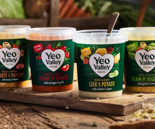
New illustrations are a key part of the brand's new identity, designed to help its new Greek and Kefir products stand out on the shelf. In light of this, the Yeo Valley Organic brand needed a more flexible designsystem to effectively differentiate its growing portfolio.
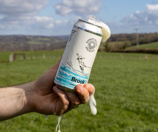
Supple Studio and Studio Spilsbury came together to lead a refresh of the brand and packaging system that puts the farm at the heart of the brewery's visual and verbal identity. The design team tested early concepts against competitors, lining up Somer Valley Brewing's potential packaging alongside other craft beer cans.
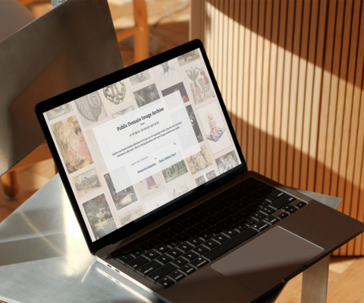
Officially launched earlier this year, PDIA will undoubtedly be an invaluable resource for designers, artists, and researchers. Green envisions that PDIA will serve a diverse range of users, particularly designers, artists, researchers, and picture editors.
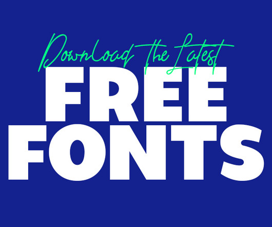
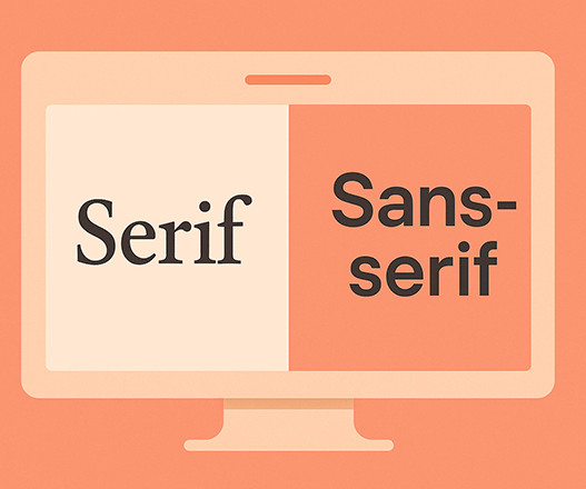
If you are a graphic designer, staying updated with trends is key to staying ahead. Using the latest free fonts and fresh typography styles can instantly improve your work and keep your designs looking modern and creative. In past years, fresh font styles have emerged, catering to a wide range of design needs. The good news?
"A strong relationship is mutually collaborative, never dictatorial, where solutions come with strategic rationales, thinking is shared, and curious questions are asked," says Wedge founder and chief design officer Justin Lortie. After multiple rounds of testing, the design team got to the desired result.
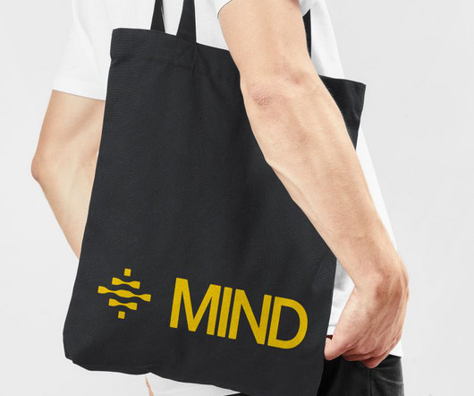
Led by Eddie Opara at Pentagram, this new dynamic branding system for security platform MIND uses swirling motion and parametric brainwaves to visualise the platform's machine-speed threat detection capabilities. The approach reflects Eddie's understanding that clarity is a competitive advantage in complex technical categories.
Dropped into a brand film, a product demo, or a one-off social post, rather than built into the system. But too many brands still fail to effectively integrate motion into their identity systems. It's been part of branding for decades – from broadcast design to animated logos – but it's rarely been treated systematically.
Fortunately, the world of type design seems to be sticking fast to the twin values of innovation and craftsmanship. From the first superfamily from Order Type Foundry to a groundbreaking system offering exclusive ownership of typographic variants, these fonts represent the cutting edge of contemporary type design.
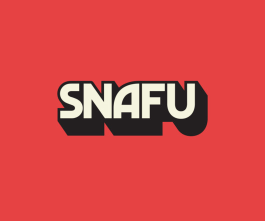
New York City and New Orleans-based design studio The Collected Works has developed the branding and overarching designsystem for SNAFU Media and the cover art for season two of their flagship podcast. Hosted by American actor and comedian Ed Helms, the SNAFU podcast delves into history's greatest screw-ups.
Every issue is packed with art and design inspiration Delivered to your IOS or Android device Never miss an issue From £9.99 Every issue is packed with art and design inspiration Delivered to your IOS or Android device Never miss an issue From £9.99 For more inspiration, see our pro tips for logo design.
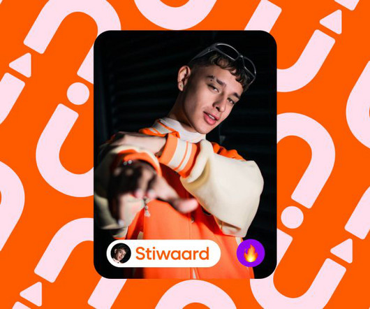
Influur was already a successful enterprise, hosting a diverse community of over 30,000 creators across various categories for branded events and social media collaborations. So they turned to Austrian design agency Studio Herrström. This led us to choose the round Duplet Open typeface from Indian Type Foundry.
Creating efficient, consistent, and flexible typography for digital platforms using modern designsystem principles. When designers no longer have to reinvent the wheel for every project, the entire process becomes much smoother and more efficient.
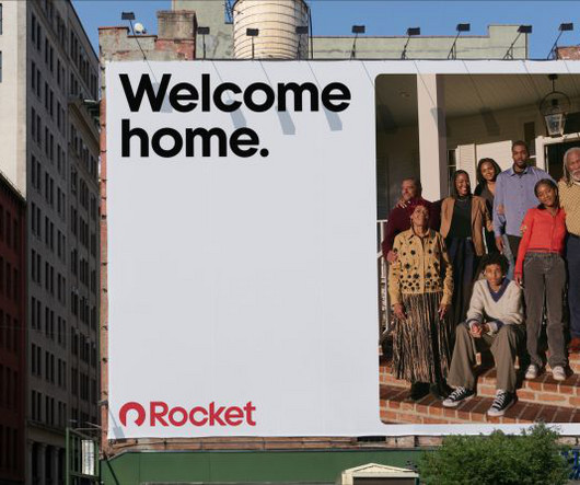
Detroit-based fintech platform Rocket recently revealed a new identity designed by Otherway. With no true category leaders from which to draw inspiration, Otherway instead looked beyond the sector for inspiration. "As Holt explains how the new identity prioritises real stories, featuring genuine Rocket clients in candid photography.
Over time, even the most thoughtfully designed brand or product can start to drift. What starts as a polished, cohesive system can slowly turn into a patchwork of mismatched styles. That’s where a visual design audit comes in. Why Conduct a Visual Design Audit? “Every dollar invested in UX brings 100 in return.
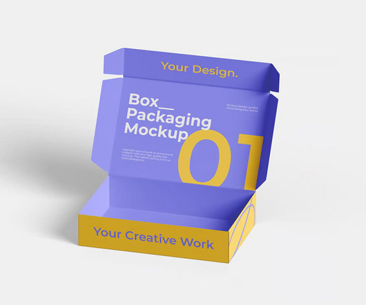
Whether you’re working on branding projects or showcasing your design skills, having high-quality mockups can make all the difference. Here, we present 50+ box packaging mockups , divided into premium and free categories, to help you elevate your designs.
Seoul Illustration Fair: Redefining Logo Design and Visual Identity abduzeedo 1030—24 Discover the Seoul Illustration Fair’s dynamic logo design and visual identity that celebrates creative expression. The updated logo of the Seoul Illustration Fair integrates design and illustration to reflect the fair’s creative roots.
Here’s a fresh look at what’s coming up in design for 2025! We’ll go on a hunt for bold, abstract, and naturalist designs, cutting-edge AI tools, and so much more, all pushing boundaries and rethinking what we already know about design. Here are the Top 10 Graphic Design Trends in 2025: 1. Personalization Design 7.
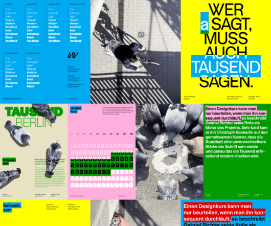
This typographic system is the brilliant result of a collaboration between two pioneers in type design, Christoph Koeberlin and Gabriel Richter. Tausend is more than just a collection of letters; it is a comprehensive and stunningly versatile systemdesigned to push the boundaries of modern typography.
Designing for multiple platforms, like iOS, Android, and web, can be challenging when each system has its own guidelines, user expectations, and interface patterns. This is where cross-platform UI kits come in to help streamline the design process, create consistency, and speed up development.
Stepping into the world of digital design presents a big question right away. It’s designed to help you align your learning with your personal and professional goals. We will also look at how these tools are designed to work together, creating a seamless workflow for almost any creative project. They all look powerful.
POV Forward Thinking Review of the Year Editorial Team Jenny Brewer Olivia Hingley Ellis Tree Elizabeth Goodspeed Liz Gorny Extra nice Extra Search Account Social Geometric mischief: Elya Akateva’s posters prove how much you can do with the default Challenging system settings, these forward-thinking graphics show a refusal of control.
POV Forward Thinking Review of the Year Editorial Team Jenny Brewer Olivia Hingley Ellis Tree Elizabeth Goodspeed Liz Gorny Extra nice Extra Search Account Social How small studios stay independent in Korea Our Seoul correspondent finds links between small business and design innovation. Words James Chae — Date 8 July 2025 Tags The View From.
This collection of graphics is bold, modern, and versatile, offering a distinct, high-impact approach to design that is equally captivating and functional. Greydient 3 is like an extensive toolbox of outstanding graphics for designers working on print, web, branding, social media, and other visual projects.
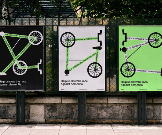
Every so often, a design project comes along that truly resonates. The "Bike For Brain Health" conceptual system is one such example. Its visual identity, crafted by designers Zo Boudreau and Jesse Shaw, offers a masterclass in thoughtful art direction and branding. A Dynamic Visual Concept The core of this system is a bike.
The TOMO Ratio Font is a Bauhaus-inspired Typeface, Redefining Modern Design Some typefaces simply display words. The Ratio font family from TOMO Fonts falls decisively into that second category. It is a masterclass in design, a thoughtful conversation between the past and the future. What does this mean for your designs?
Less a luxury and more of a non-negotiable, this sense of trust in a brand and what it stands for is simply the only way to make “the kind of design I want to make”, she says. As many of us have discovered the hard way, creativity can’t be forced – and Laura has learnt she has to feel a “yes” somewhere in her gut at the outset of the project.
Most designers have their own curated stock graphic libraries, custom collections of ready-to-use assets that match their style, speed up their process, and keep projects moving smoothly. Most designers already use stock graphics from time to time, but downloading assets on the fly can be time-consuming and disorganized.
Every issue is packed with art and design inspiration Delivered to your IOS or Android device Never miss an issue From £9.99 Every issue is packed with art and design inspiration Delivered to your IOS or Android device Never miss an issue From £9.99 designed by Porsche? designed by Porsche?
If you’re new to graphic design, and/or typography, fonts, editing, etc, then you really have a great resource here at your finger tips, and all you need to get going learning about typography. Even for those seasoned designers and self proclaimed typographers, this is a good resource book to have close by.
Whether you’re building a designsystem, creating social content, or launching a responsive website, strong font pairing gives your visuals clarity and consistency. Geometric + Humanist: Mixing a precise, structured font with a softer, more organic one brings balance and personality to your design.
Reading "Designer Gabrielle Adam is." Words Ellis Tree — Date 16 July 2025 Work Graphic Design Typography Packaging Logo Rebrand Identity Branding Process The inspiration behind Gabrielle Adam’s bold branding work is usually anything “cheesy, kitsch or fun”, she says.
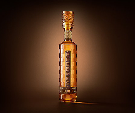
Exhibit Bebemos Tequila packaging Bebemos Tequila combines 1970s nostalgia with modern design, crafted by Chad Michael Studio. Responses by Chad Makerson Michael, designer, Chad Michael Studio. Bebemos was designed for the confident coastal soul: laid-back, liberated and driven by experience over status. All rights Reserved.
While AI tools can generate images and text at an astonishing speed, they often lack the foundational structure and narrative flow that define professional design. A superior design framework doesn’t just present information; it tells a story, builds trust, and transforms a simple concept into a compelling experience.
Black Friday is known for its blockbuster discounts across a wide range of products, including tools and resources for designers and developers. With a large and comprehensive selection of prebuilt websites supported by an impressive array of design and build features, BeTheme could claim to be the most extensive WordPress theme available.
Products designed for our internal health are starting to look as sophisticated as the luxury cosmetics on our vanities. Their focus is on bitters—a category of herbs known for stimulating digestive functions. It’s a design that feels both soft and strong. On the shelf, the product is designed to speak directly to you.
Lithuania’s International Movie Festival needed a visual system that felt cohesive and clear, no matter where people encountered it. Their task went far beyond designing a new logo. They were asked to build a comprehensive, durable visual system. It gets tricky.
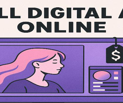
Best Websites To Sell Digital Art Online Digital Downloads & Marketplace Platforms These platforms specialize in selling digital art directly to customers, perfect for printable art, digital illustrations, templates, and design assets. This includes graphics, templates, stock photos, and illustrations created by contributing artists.
But plenty of artists and designers are still breaking boundaries with little more than grit, talent, and a cramped corner to work in. And in the world of graphic design, 25-year-old designer Katrina Romulo has built an impressive portfolio of polished branding projects from her own bedroom studio, often using free fonts and textures.
This guide is for the entrepreneur, the marketer, and the creator who understands this power but doesn’t have a design background. A visual identity designed for a 22-year-old tech entrepreneur will look very different from one for a 55-year-old gardening enthusiast. These words will become your creative compass. Get specific.
Some design projects simply create a logo. The ASTRE Collective visual identity , masterfully crafted by Istanbul-based Parcour Studio , falls firmly into the second category. It serves as a powerful reference for anyone interested in branding, graphic design, and the intersection of art and technology.
We organize all of the trending information in your field so you don't have to. Join 66,000+ users and stay up to date on the latest articles your peers are reading.
You know about us, now we want to get to know you!
Let's personalize your content
Let's get even more personalized
We recognize your account from another site in our network, please click 'Send Email' below to continue with verifying your account and setting a password.


Let's personalize your content