This site uses cookies to improve your experience. To help us insure we adhere to various privacy regulations, please select your country/region of residence. If you do not select a country, we will assume you are from the United States. Select your Cookie Settings or view our Privacy Policy and Terms of Use.
Cookie Settings
Cookies and similar technologies are used on this website for proper function of the website, for tracking performance analytics and for marketing purposes. We and some of our third-party providers may use cookie data for various purposes. Please review the cookie settings below and choose your preference.
Used for the proper function of the website
Used for monitoring website traffic and interactions
Cookie Settings
Cookies and similar technologies are used on this website for proper function of the website, for tracking performance analytics and for marketing purposes. We and some of our third-party providers may use cookie data for various purposes. Please review the cookie settings below and choose your preference.
Strictly Necessary: Used for the proper function of the website
Performance/Analytics: Used for monitoring website traffic and interactions
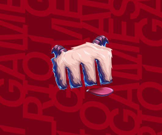
The new visual identity unites Riot's diverse gaming worlds with a cohesive system prioritising player experience. They recently partnered with global creative agency Stink Studios to create an evolved and expanded design system that unifies Riot's growing portfolio of games and media.
Andrew Vucko, founder and ECD of Vucko, explains how motion can transform static identities into living ones fit for the 21st century. A few years ago, the question was: should your brandidentity include motion? In 2025, though, that's losing its relevance; the idea that static identities aren't enough is widely accepted.
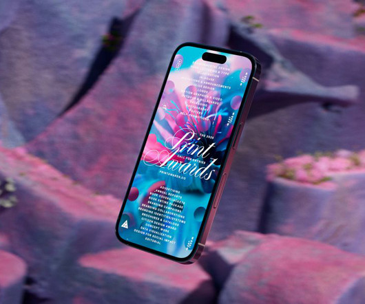
The awards' new visual identity embodies organic growth as a metaphor for creativity, blending generative design and dynamic typography. For the 2025 edition, PRINT Magazine enlisted The Collected Works to craft a dynamic visual identity and hero film that embodies the theme of "cultivating creativity."
The Canadian agency is all about smart, strategic branding that breathes life into real estate, cultural, and hospitality spaces. With a collaborative vibe and a knack for timeless design, its team creates brands that don't just look great—they feel like they truly belong.
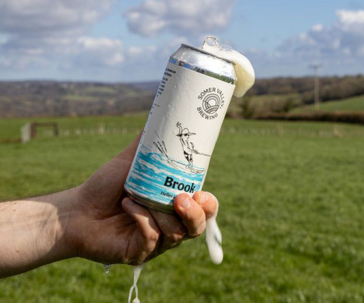
With such a distinctive farm-to-pint approach, the brewery needed an identity that told its story with the same care and craft that goes into every batch of beer. Supple Studio and Studio Spilsbury came together to lead a refresh of the brand and packaging system that puts the farm at the heart of the brewery's visual and verbal identity.
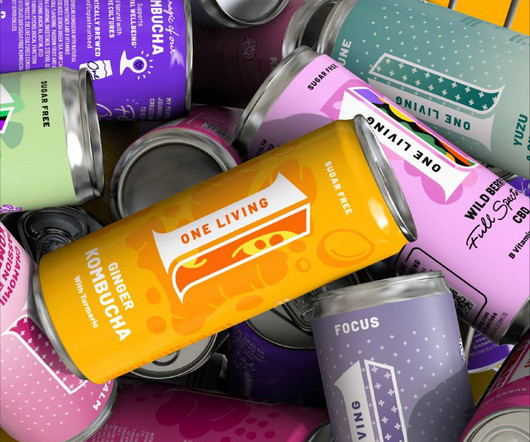
One Living by Derek&Eric From simplified skincare to tech-infused cosmetics, these cutting-edge branding initiatives are reshaping the health and beauty landscape worldwide. This pressure has sparked a wave of innovation in health and beauty branding. Today, that sentiment extends far beyond just facial care. Want examples?
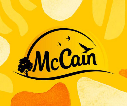
BrandOpus has refreshed the design of McCain Foods' whole GB and EU packaging portfolio, which now includes a new bespoke typeface and printed brand assets. This latest project has seen the new brand assets introduced on pack across all products, from croquettes and chips to wedges and fries.
Influur helps content creators get work with brands for a decent compensation. Studio Herrström explains how they crafted a fresh visual identity for the agency that can help boost their mission. But they needed a new identity that fully reflected their role as a disruptor in this fast-evolving space.
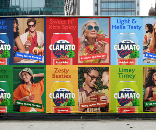
Mott's Clamato Caesar is a legacy brand that has barely changed for decades, but its new identity has found a way of reinforcing its heritage with a modern and desirable touch. Montreal and LA-based studio Wedge has been behind the brand evolution of Mott's Clamato Caesar, "Canada's Cocktail", since 1969.
With big, industrial-era typography, a "straight-talking" tone of voice and a vibrant colour palette, the new identity marks a fresh chapter for the arts centre. It is marking this milestone with a bold brand refresh by EDIT Brand Studio. It is marking this milestone with a bold brand refresh by EDIT Brand Studio.
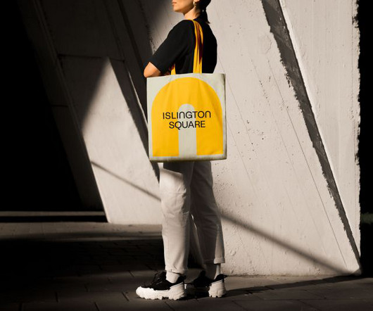
Campbell Hay has developed a new identity for Islington Square, establishing it as a new London retail destination that brings energy and life to the area. While Islington Square's original brand focused on residential sales, this new iteration aims to capture its transformation.
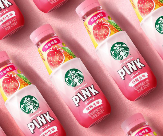
Starbucks is reintroducing its much-loved Refreshers drink to Chinese consumers with a major glow-up, including an innovative bottle design and bold graphic identity crafted by global design agency Marks. The change aims to carve out fresh space in China's fiercely competitive ready-to-drink (RTD) market.
How can branding help to communicate urgency and the dire state of the planet while still inspiring hope and optimism? Global environmental action NGO WRAP has a new informative yet striking identity, designed by the London-based studio Among Equals. Among Equals' Nick May explains how to strike the balance.
With a bespoke typographic system inspired by overtones and Alpine landscapes, the new identity for Klangwelt Toggenburg balances precision and poetry, transforming a niche cultural site into an international destination. However, for creative director Marcus Kraft, the identity had to extend far beyond architecture.
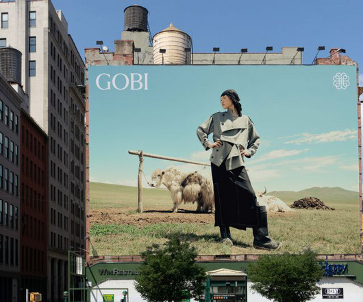
Creative director Rob Duncan explains how a new visual identity crafted by Mucho has helped that effort. It has a great deal of equity and recognition in Mongolia, but wanted help in growing the brand outside the country. This makes them unique, and it's the story we needed to tell and build the Gobi brand around."
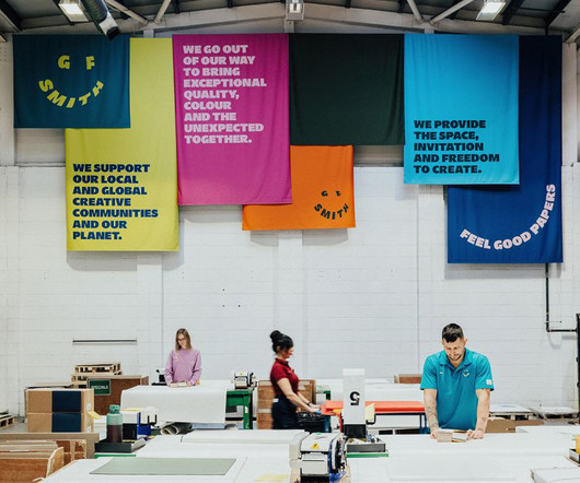
A deep dive into how design studio TEMPLO reimagined GF Smith's brandidentity, balancing heritage with a bold, dynamic vision that embraces colour, movement, and a global creative community. But even the most established brands must evolve. It was static in an era that demands dynamism.
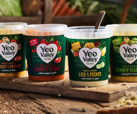
New illustrations are a key part of the brand's new identity, designed to help its new Greek and Kefir products stand out on the shelf. London-based B&B studio has revamped Yeo Valley Organic's entire visual identity and product range architecture through a combination of small tweaks and more dramatic overhauls.
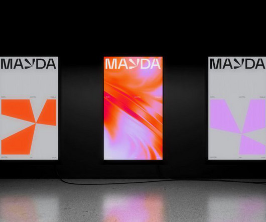
Creative studio Mayda has unveiled a dynamic brandidentity, drawing inspiration from its namesake – a mysterious island that appeared and disappeared from historical maps. The agency needed a new visual identity to unify the team's vision and set a course for the future. When is an island, not an island?
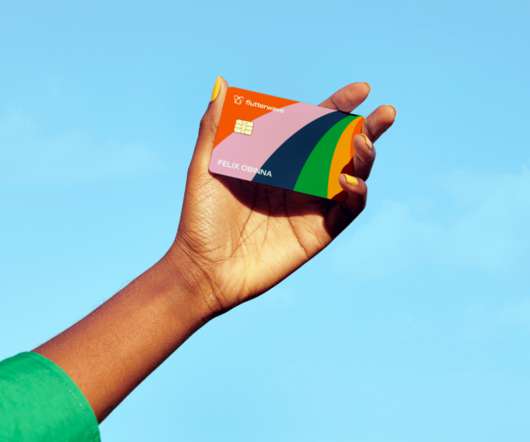
Dutch agency Verve has launched its new brandidentity for African fintech Flutterwave , which has just been valued at over $3 billion, currently making it the highest valued African startup on the continent. The fresh visual system is based on 'LabaLaba', meaning 'butterfly' in Yoruba, one of the main languages spoken in Nigeria.
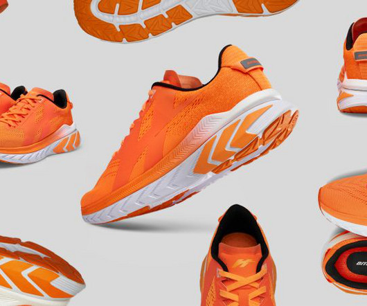
Now, it has an identity that competes with global brands without compromising on its roots in the country's culture. Known for its unconventional campaigns and innovative designs over the last nine years, the brand contributes approximately 74% to the company's total revenue, selling millions of pairs globally.
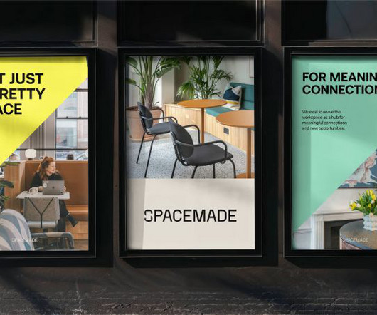
Spacemade is a co-working brand with a difference. its new visual identitysystem is based on the concept of 'meaningful connections'. This January, they decided it was time for a new visual identity. The original Spacemade identity was designed with solely B2B audiences in mind. Crafted by Wildish & Co.,
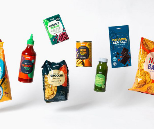
Swedish studio Bercow is helping the Nordic retailer reimagine 3,500 products across four countries, harmonising diverse market identities through clever use of a superellipse. Until now, that brandidentity has been very much fragmented. The result is a design system that can be as versatile as it is recognisable.
Whether you’re a designer, marketer, or brand strategist, staying ahead of these trends is essential to creating relevant, impactful designs. Staying informed on these trends is crucial for designers, marketers, and brands looking to stay ahead in a rapidly changing visual landscape.
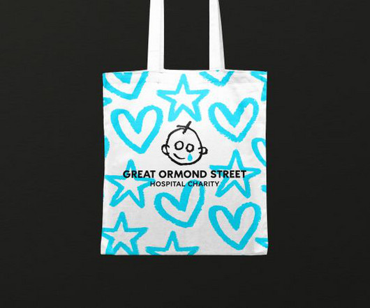
Working in collaboration with Stuart Gough, Pentagram, JKR, and Impero, the charity launches its refreshed brand and positioning today. Global branding agency Jones Knowles Ritchie (JKR) brought the brand to life through motion. There's a new tone of voice, too, along with a core brand language. So what has changed?
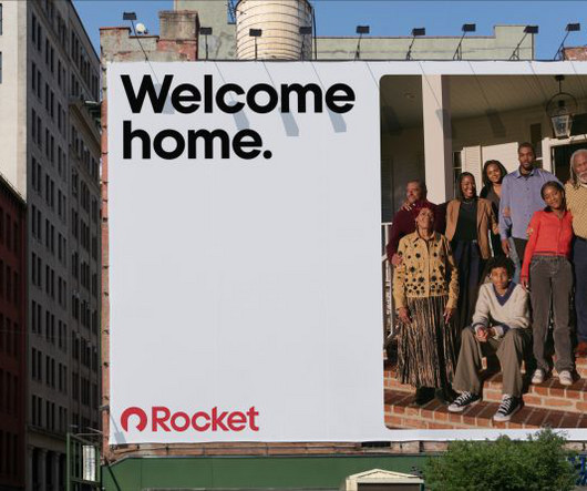
Detroit-based fintech platform Rocket recently revealed a new identity designed by Otherway. It was launched as part of the first phase of the company's brand re-stage, which is set to be fully revealed during its return to the Super Bowl.
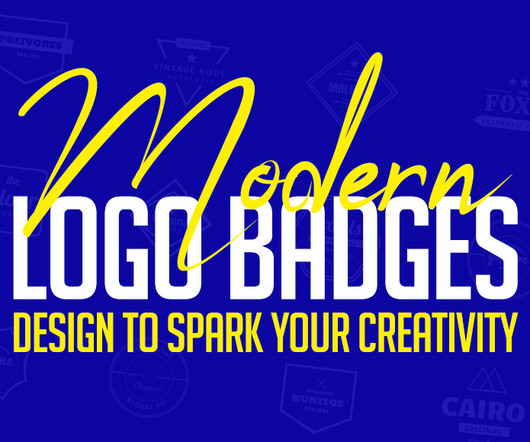
In today’s design world, logo badge designs are a popular trend that continues to inspire both designers and brands. These small yet powerful designs go beyond simple visuals—they share stories, build identities, and create connections. Our carefully curated collection of 40+ modern logo badge designs is here to inspire and excite.
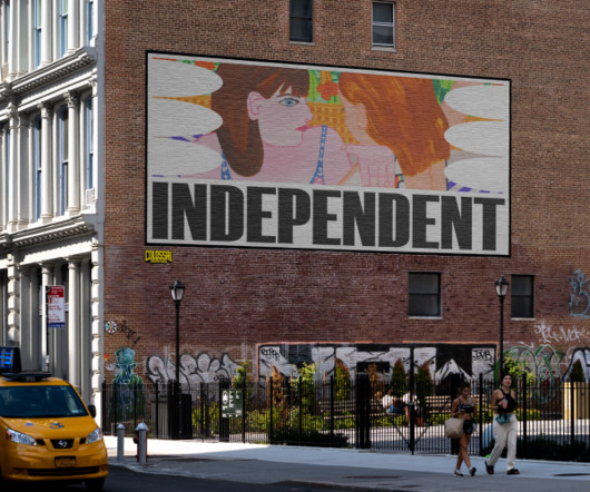
The new identity by Team was devised to bring the fair into a new era, reflect its significant growth, and stay true to its roots and values. New York-based studio Team has created a new brandidentity for Independent, an organisation known for showcasing amazing art. These serve as graphic elements or frames for artwork.
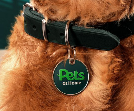
Now boasting more than 450 UK stores, Pets at Home's evolution has seen it become the nation's biggest pet care brand. But in doing so, through its numerous sub-brands across veterinary care, grooming, insurance, a foundation that helps pets in need, and a host of services, the overall identity had become muddied and slightly confusing.
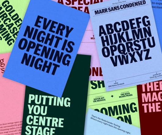
Fiasco Design ensured that each theatre could retain its own unique identity while communicating the unified message of the wider group. Bristol-based agency Fiasco Design has partnered with leading West End theatre group Nederlander Theatre to spotlight their own story through a new brand and website.
The global studio has unveiled a new brand for Microsoft's latest generation of Windows laptops and PCs, all featuring built-in AI hardware. It sounds very impressive, but how did Koto develop the identity for the new Surface Pro, Surface Laptop, and other Copilot+ PCs from Dell, Lenovo, and more?
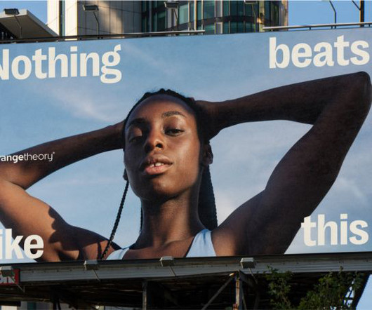
DesignStudio has unveiled a new visual identity for the global fitness franchise, focusing on its energising benefits for members. So they turned to DesignStudio , a branding and design agency based in London, New York and Sydney, to help focus their positioning, evolve their identity and energise their community.
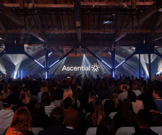
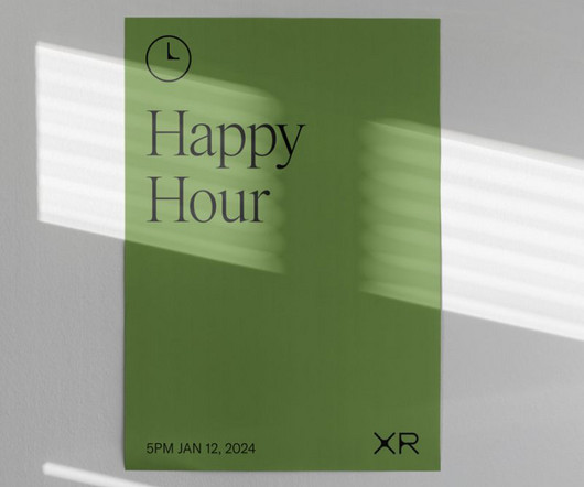
The organiser of events for the marketing and fintech industries has a new dynamic identity, conveying the power of convergence. In light of this transformation, Ascential needed new branding to represent this new, focused offering. This concept of coming together became our lens for the entire brand. 'Be
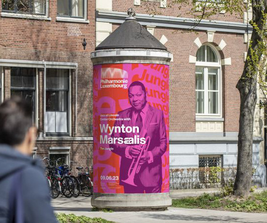
The iconic concert hall's new branding evokes the emotion and eclecticism of its music by majoring in motion and interactivity. Read on to find out how they developed this wide-ranging and radical identity. The new system places music at the very heart of the brand, whether it's electro, opera, jazz or classical.
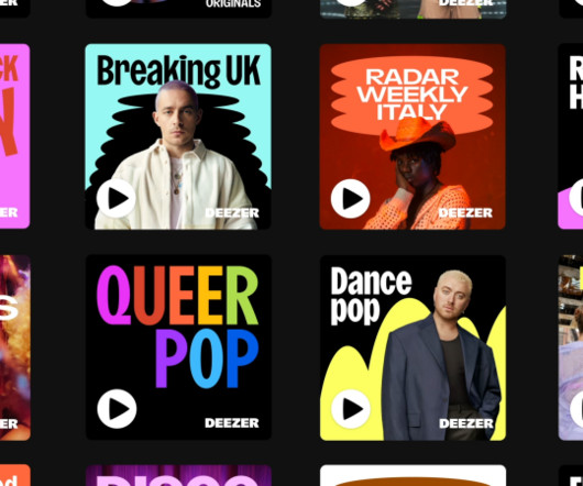
Well, a beating heart might just do it, and it forms the basis of a new identity for Deezer , an independent music streaming service that's just had an overhaul thanks to Koto. At the core of the new identity, then, lies a logo of a beating heart. "In How does one instantly communicate a love of music and beats? We find out more.
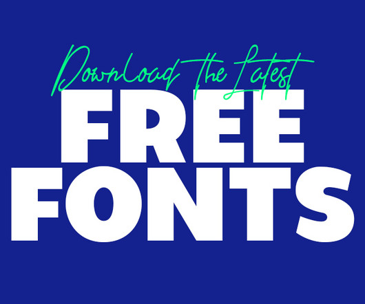
Whether you’re working on advertisement posters, brand guidelines , or even designing a logo, fonts play a pivotal role in creating visual impact. Why Fonts Matter Fonts are more than just letters on a screen; they help communicate the tone, personality, and message of a brand or project. The good news?
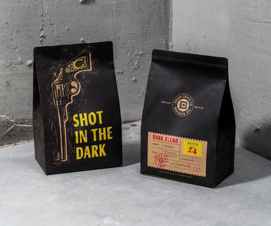
But for one founder of a coffee brand headquartered in the Big Apple, it's the exact opposite. And so when it came to branding Bruhn Coffee co, a boutique coffee brand in Brooklyn, this was a story that London-based Intertype Studio leaned into in full effect. And the graphic elements of the identity go all-in on this concept.
Leeds International Festival of Ideas covers some tricky topics, so the branding and visual assets needed to be sensitive. Credit: Tom Martin When it came to branding, the event organisers turned once again to Leeds and Glasgow-based design studio Rabbithole. Rabbithole explains how it developed it.
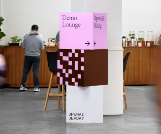
Play Studio was on hand to give the event a unique visual identity. The OpenAI team worked closely with Play Studio to develop branding for the event, including a logo, visual identitysystem, art direction, signage, environmental design, motion design, advertising, photography and UX/UI design.
Geometric shapes are used across the identity to house imagery and represent the diverse businesses that use Storey. DixonBaxi is behind the new identity for co-working space Storey, which uses overlapping tangrams to represent the diverse businesses that use it.
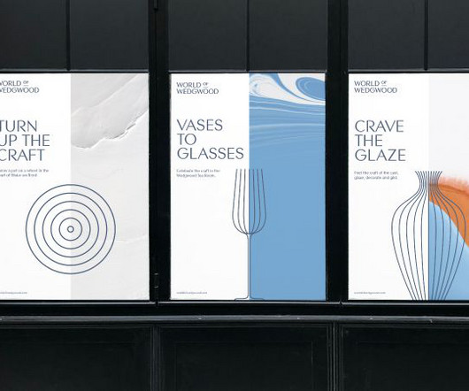
Brand design agency SomeOne has recently unveiled its new identity for the World of Wedgwood , which draws on the pottery company's rich history and craft-based skills to create a stunning yet respectful new look. When it comes to rebrands, some identities are more delicate than others.
The fresh brandidentity reflects the power of a new global unified creative and delivery platform to entertainment industry brands. Brand agency Athletics has unveiled a new identity for the entertainment industry business Extreme Reach.
From the first superfamily from Order Type Foundry to a groundbreaking system offering exclusive ownership of typographic variants, these fonts represent the cutting edge of contemporary type design. The system generates nine new variants daily, each featuring a different combination of characteristics from the extensive design space.
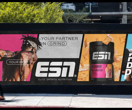
Brand studio Robot Food has collaborated with Germany's biggest sports nutrition company ESN to create a new look that refines what had gone before and creates a stronger evolution of its identity. But just like any big-range brand, ESN has lost its way over time. The need for a new identity came at a pivotal time.
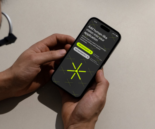
That's just what Pentagram has achieved by crafting a fresh visual identity for Stereolabs. To help reframe its narrative, Stereolabs turned to global design consultancy Pentagram to craft a new brandidentity for them. Typography and demos The Pentagram team designed a type system using Neubau's NB Akademie.
We organize all of the trending information in your field so you don't have to. Join 66,000+ users and stay up to date on the latest articles your peers are reading.
You know about us, now we want to get to know you!
Let's personalize your content
Let's get even more personalized
We recognize your account from another site in our network, please click 'Send Email' below to continue with verifying your account and setting a password.


Let's personalize your content