This site uses cookies to improve your experience. To help us insure we adhere to various privacy regulations, please select your country/region of residence. If you do not select a country, we will assume you are from the United States. Select your Cookie Settings or view our Privacy Policy and Terms of Use.
Cookie Settings
Cookies and similar technologies are used on this website for proper function of the website, for tracking performance analytics and for marketing purposes. We and some of our third-party providers may use cookie data for various purposes. Please review the cookie settings below and choose your preference.
Used for the proper function of the website
Used for monitoring website traffic and interactions
Cookie Settings
Cookies and similar technologies are used on this website for proper function of the website, for tracking performance analytics and for marketing purposes. We and some of our third-party providers may use cookie data for various purposes. Please review the cookie settings below and choose your preference.
Strictly Necessary: Used for the proper function of the website
Performance/Analytics: Used for monitoring website traffic and interactions
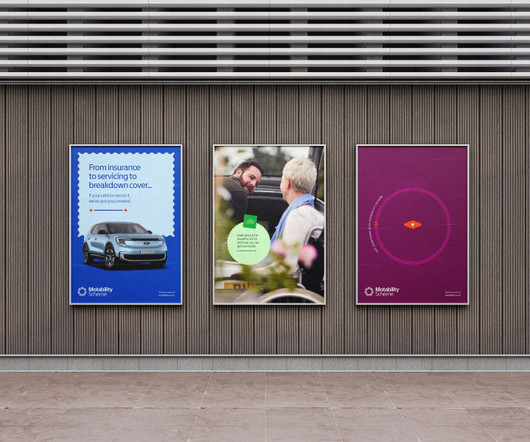
When trying to follow the Web Content Accessibility Guidance (WCAG) AAA standards, many brands default to high-contrast colour systems in a bid to improve readability and legibility. The colour palette has also been optimised for accessibility by retaining the Motability Scheme blue but introducing more combinations, hues, and saturations.
GEO stands for Generative Engine Optimisation, which sounds properly techy and intimidating, but it's actually quite straightforward. It's about making your content so darned good and well-structured that when someone asks an AI chatbot for advice in your area of expertise, the AI cites you as the go-to source. But here's the thing.
More specifically, we're seeing a resurgence of elegant serifs, now optimised for screen readability, alongside bold, expressive sans serifs perfect for making a statement in branding and editorial design. It offers clarity at small sizes and multiplexed fonts for easy content hierarchisation without affecting layout.
Creative acceleration and algorithmically optimisedcontent are all the rage these days, but Made By Practice is determined to go against the grain and keep some of the analogues in its methodology. There are original stories in development, an early-stage stop-motion feature in the works, and an ongoing interest in episodic content.
This could be because it’s optimised for phones, and indeed it has plenty in common with the Photoshop iPhone app, which is again different to the one you can get for iPad. You can find it right now on the Google Play Store, but I found it could be a little picky about which devices it would install on.
Marsam Text by Typonym Marsam Text represents a thoughtful evolution of designer Evan Deterling's Marsam slab serif, meticulously optimised for editorial applications. For designers seeking distinctive typography that no one else can use, Only Yours offers an intriguing new possibility.
Accessibility: It ensures your content is reachable for everyone, including those with disabilities. Content Alignment: Proper alignment of text and images can drive flow throughout your layout. Optimising your layout to load quickly keeps users engaged. This tag controls how your content is displayed on different devices. <meta
And remember to optimise your portfolio for the digital age. Leverage your network, optimise your online profiles, and focus on building long-term relationships with clients who value quality work. Remember, your portfolio isn't just a showcase of your technical skills; it reflects your style and creative vision.
7 – Libre Franklin – Multilingual and Digitally-Optimised Are you looking for a font that speaks multiple languages? It's digitally optimised, bringing elegance to every character. It's designed with readability in mind, making it easier for everyone to engage with your content. Libre Franklin has you covered!
They create content that's about as exciting as watching paint dry, then wonder why their audience scrolls past faster than a teenager ghosting a bad Tinder match. It's about understanding that every second of your content makes or loses money. This versatility allows you to maximise your reach with one piece of content.
Ideal for Designers who need quick layout tools while on the move Marketers who prepare brand kits and presentations Freelancers who send visuals to clients from any location Creatives who juggle design and content production on mobile 5. Tayasui Sketches Tayasui Sketches ranks among the most fluid, intuitive drawing apps on iPhone.
I use a systematic approach: analysing their social media presence, content strategy, and customer feedback. I recommend maintaining uniformity with a content calendar and brand asset management system. I've tracked vital performance metrics , brand messaging, and market positioning of similar businesses in other sectors.
Programs like DaVinci Resolve and Photoshop are optimised to take advantage of hardware acceleration advances provided by NVIDIA GeForce RTX GPUs. The graphics processing unit (GPU, or graphics card) is massively important for creative work since it’s responsible for rendering images, videos, animations, and transitions.
Also, pay special attention to how your competitors communicate with their prospective clients , what tones of voice they use, and what kind of content works for them. Lastly, when you deeply understand your target audience, you want to revise your portfolio's design and content to ensure it aligns with your potential customers' needs.
Its unique "Chat Canvas" is optimised for creative collaboration between man and machine, while business is taken care of by specialised AI agents that each manage a distinct creative task. Image credit: Lovart) “At Lovart, we dont have product managers.
A well-designed site guides users intuitively, encouraging them to explore content, whether reviewing casino bonuses or trying out free slots. Search engine optimisation (SEO), content marketing, social media engagement, and targeted advertising are all tools that can help brands stand out. Master one platform, then expand.
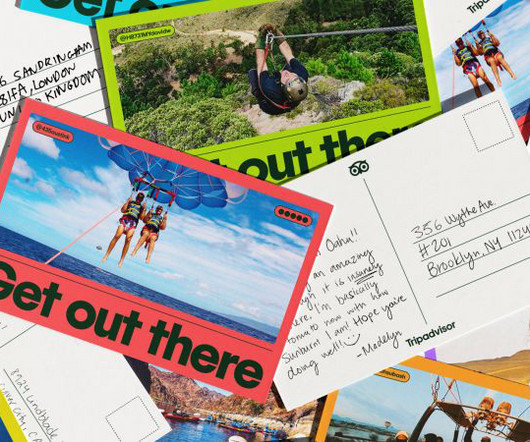
Once ornamental and static, he’s now freed from his circular perch, becoming a more curious and dynamic companion whose gaze follows the traveller's content. “We Graphic devices borrow from the world of travel ephemera – rounded corners, green dots, and postcard-like frames – to gently structure content without overwhelming it.
Their focus is on design-driven innovation, particularly for products mainly in the creative, marketing, and content automation SaaS space. Fewer resources for ongoing optimisation At times, it heavily focuses on style over clarity. Verve also runs stakeholder workshops, brand discovery, and content alignment strategies.
According to a 2023 HubSpot report , 56% of marketers said website optimisation is their top inbound marketing priority. You're still John Smith, but you might be “John Smith | E-commerce Specialist” for one client and “John Smith | Content Strategy” for another.
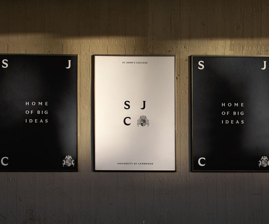
Re-crafting and optimising the crest was a must, but establishing a more cinematic and inviting tone was key to appealing to today’s audience. New intimate content app gets a sophisticated brand Polaroid just dropped the most iconic anti-AI ad of the year How well do you know the NBA logos?
Time to first byte Page load time Server response time First contentful paint Largest contentful paint First input delay Round trips User engagement metrics Time required to parse HTML into a DOM First input delay The website load speed monitoring metrics determine web performance, and then required actions are taken.
” The shift to UE5 brought more than graphical polish; it changed how content is made. “We’re adding new content, tweaking lighting, and remaking assets from scratch where needed. “A huge part of going to console was optimisation,” says Mark. So we had to ask: What can we do? What should we do?”
Content Sharing: Great content is easily shareable, allowing brands to go viral and reach audiences far beyond their direct followers. Short, Engaging Videos: The platform thrives on creativity, allowing brands to showcase products through interactive and entertaining content. Instagram (2.5 billion+ users) Next up is Instagram.
The Slow Burn vs. The Quick Hit: Content/SEO vs. Paid Ads There are fundamentally two ways to get in front of people online. Content & SEO is the slow burn. You write helpful articles, create useful guides, and optimise your site so that when people search for a solution on Google, they find you. Lean into content.
📖 Reading Time: 5 minutes 🏷️ Categories: Design, Branding, Marketing 📅 Published: [DATE] 5 Website Design and Content Strategies To Connect With Customers How do you use website design and content to connect with your ideal customers? The answer is (seemingly) simple. But let's face it. Let's get into it.
Shazam’s ability to deliver song results in a matter of seconds is a testament to its technical efficiency and design optimisation. Beyond just concert discovery, Shazam integrates features like saving events, setting reminders for upcoming performances, and accessing exclusive content.
Video content dominates how brands earn attention and drive action, from product demos and customer testimonials to viral shorts and onboarding walkthroughs. Anyone with a script and a strategy can now create studio-quality content in just a few minutes. The content format audiences consume most, trust most and act on the fastest.
Many of their episodes answer submitted questions or pose their own, and this is where the genuinely useful content can be found. It can be hard to know where to start, what the latest changes are and how to adapt to them, and why your content might not be resonating with your target audience.
The past decade's gold rush of content creation, hyper-growth startups, and influencer-driven everything wasn't sustainable. Show them GEO (Generative Engine Optimisation) and why they need to pivot. But there are still good things happening—if you know where to look. Attention spans got shorter. Workloads got bigger.
Visual SEO: Optimising Images for Better Search Engine Visibility With the growing popularity of visual search, it's more important than ever to optimise your search strategy to ensure you reach the right people. Optimising your visuals correctly is critical to boosting conversions and rankings. What is Visual Search?
Imagine you're nurturing a lead through thoughtful, informative content. By clarifying your objectives, you can tailor your content accordingly. Focusing on leads shapes the entire campaign's design and content. Each group will respond to different messages, so tailor your content accordingly! Keep your content concise.
Running Android 14, the Idea Tab Pro also benefits from the latest privacy tools, UI improvements, and performance optimisations. The 256GB of internal storage is generous for a tablet in this price range, giving you plenty of room for apps, files, photos, and downloads without needing to rely on cloud storage or constant cleanouts.
Use Design to Your Advantage It’s understandable for a musical person to mainly focus on optimising the audio side of their persona and presentation. This remains a possibility, given the ease with which content can be shared and sold digitally. Aligning your content with current or upcoming events is a good option here.
Content: You stop writing generic blog posts and start answering the specific, burning questions of your ICP. Precise positioning is the ultimate budget optimiser. How Positioning Stops You Wasting Money on Marketing Without precise positioning, marketing is just guesswork.
Everything’s been considered and optimised for gaming. i.read(e.xsrfCookieName):void 0;E&&(m[e.xsrfHeaderName]=E)}"setRequestHeader"in y&&r.forEach(m,(function(e,t){void 0 h&&"content-type" t.toLowerCase()?delete r.isUndefined(e)&&r.isUndefined(e["Content-Type"])&&(e["Content-Type"]=t)}var s,u={transitional:{silentJSONParsing:!0,forcedJSONParsing:!0,clarifyTimeoutError:!1},adapter:(("undefined"!
One of the most common issues is a lack of clarity in your metadata: No title tags or meta descriptions Confusing page structure or headings Inconsistent business name, address, and phone number Even with great content, Google's bots need clear signals to match your site with relevant search queries. How do they compare their services?
They specialise in custom Shopify development that's optimised for search engines and conversions, not just Instagram-worthy screenshots. They specialise in Shopify theme development, custom ERP integration, and conversion rate optimisation. Ask them about their conversion rate optimisation process.
But recent algorithm changes and a push for more video content have left many artists and designers struggling to enjoy the same likes and reach. If you've not yet considered Search Engine Optimisation, it's time to roll up your sleeves and get stuck in. Compelling content that answers the searcher's query. Nor can they keep up.
Here you can order a unique design, optimise it, create additional materials, etc. A £5,000 website is built with your specific customers in mind, optimised for conversions, mobile-responsive, fast-loading, and designed to turn visitors into paying customers. What content must I provide, and what should the designer handle?
But to make money from your website, you need web traffic – and the key to generating traffic is successful search engine optimisation (SEO). You start working hard – publishing 5-6 quality pieces of content per week, building backlinks and auditing your website. Think about what types of content people search on Google.
With insights into Google's algorithm, shifts in paid advertising, voice search optimisation, and leveraging artificial intelligence, this guide aims to get your SEM strategy ahead of the pack. On the one hand, optimising voice search can help brands reach new audiences and increase visibility.
Topics covered include building clean project templates, optimising your file structure, treating email like an artform, understanding the building blocks of a strong invoice and staying above the law. This course features 19 lessons, with a total of four hours and 49 minutes of class content.
It involves a comprehensive approach incorporating strategic planning, user-centric design principles , and performance optimisation. Lastly, performance optimisation plays a vital role in the success of your redesigned website. We're not referring to a superficial facelift when discussing a website redesign.
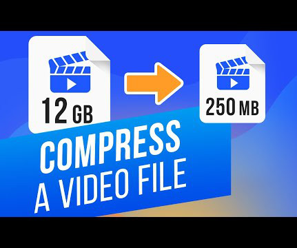
Our comprehensive guide explores the best techniques to compress and optimise your images and videos. From the basics of understanding file formats and resolution to advanced strategies for compression and optimisation, we'll provide you with a roadmap to faster, more efficient web performance. Stay tuned!
We organize all of the trending information in your field so you don't have to. Join 66,000+ users and stay up to date on the latest articles your peers are reading.
You know about us, now we want to get to know you!
Let's personalize your content
Let's get even more personalized
We recognize your account from another site in our network, please click 'Send Email' below to continue with verifying your account and setting a password.


Let's personalize your content