This site uses cookies to improve your experience. To help us insure we adhere to various privacy regulations, please select your country/region of residence. If you do not select a country, we will assume you are from the United States. Select your Cookie Settings or view our Privacy Policy and Terms of Use.
Cookie Settings
Cookies and similar technologies are used on this website for proper function of the website, for tracking performance analytics and for marketing purposes. We and some of our third-party providers may use cookie data for various purposes. Please review the cookie settings below and choose your preference.
Used for the proper function of the website
Used for monitoring website traffic and interactions
Cookie Settings
Cookies and similar technologies are used on this website for proper function of the website, for tracking performance analytics and for marketing purposes. We and some of our third-party providers may use cookie data for various purposes. Please review the cookie settings below and choose your preference.
Strictly Necessary: Used for the proper function of the website
Performance/Analytics: Used for monitoring website traffic and interactions
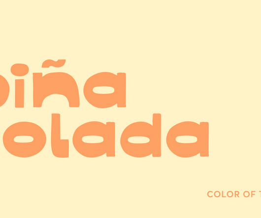
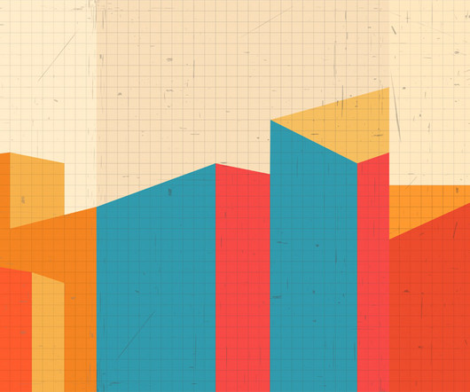
This hue is a gentle reminder that the most fulfilling itinerary is simply being present. This creamy yellow evokes summer in all of its sunlit glory: poolside calm, barefoot afternoons, and the carefree rhythm of conversations that linger well past golden hour. No checklists, just savoring the moment with a maraschino cherry on top.
Image source: Apple.com / WWDC 2025 presentation Apple made its boldest UI move since iOS 7 (presented in 2013), when the company abandoned skeuomorphism and buried textures in favor of flat design. Image source: Apple.com / WWDC 2025 presentation This same principle is now woven into the interface. It’s glossy.
This conceptual thinking is present in the naming, meaning that (1)by3 Firstbythree is the first of many from the three-sided studio. This explains an ambition for (1)by3 Firstbythree to be a place that’s an “aesthetic space for creators that encourages creative exploration and reflection”.
Illustrator Shariyah Moore presents an autobiographical comic with the knowingly blunt title A Comic That No One But Me Is Going To Care About. Since its inception 40 years ago, New Designers has provided a platform for over 3,000 graduates every year to present their visionary ideas to industry professionals and the public.
Traditional musical genres such as rock, rap or classical oversimplify the spectrum of musical experience, even in our “post-genre” present. Each style of the typeface shares the same DNA but presents different personalities through musically inspired details.
POV Forward Thinking Review of the Year Editorial Team Jenny Brewer Olivia Hingley Ellis Tree Elizabeth Goodspeed Liz Gorny Extra nice Extra Search Account Social Inspiring Creativity Since 2007 It’s Nice That About Contact Advertising Opportunities Newsletters Categories Insights + Opinion Projects + Creatives Advice + Resources Culture + Lifestyle (..)
His highly designed videos appear more like set pieces than the typical archival page, with a ton of thought put into the construction of the image and the relation between the presented media.
Trobar is the kind of identity you begin without knowing how it will end, or without having a clear graphic idea from the moment the project and its needs are first presented,” says the studio’s founder Paula de Álvaro. It’s a path that gradually forms, solid and coherent, allowing ideas and processes to unfold through design.”
Upon first glance, the group seems caught between time – taking inspiration from the collisions of past and present. “If Maxxing was born out of that urgency and refusal to wait for permission,” says Ralf. If we’re surface-level nostalgia-baiting, we always want it to have something seedier behind the image or show some hypocrisy.”
Unpublished Photo Contest (International) Open to photographers born between 1995 and 2007, this contest is seeking 10 unpublished images with stylistic and thematic unity. Applicants should have a foundation in book arts. Mentees receive a $,3000 stipend. Deadline: March 2, 2025. Prizes reach 3,500 CHF. Deadline: March 3, 2025.
Always taut, the binds emanate directly from Jane when present in the scene or act as her omnipresent control when she’s just off camera.” The ability to suggest and entice is key in WMH&I’s arsenal of text based playfulness. The ‘binds’ are a visual representation of Jane Grey’s psychological control,” says Mark.
Although political allegories are present through the indie rock aesthetics of androgyny in the 80s and Thatcher’s northern England, Victoria uses these photos to offer an alternative vision of the past, one of female friendships and hope for the future.
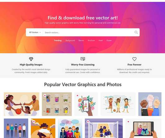
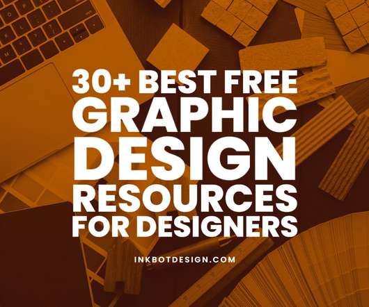
VectorStock is a fantastic resource with nearly thirty-nine thousand free vectors, and although it lacks a search option based on the category, it still does possess a collection of keywords for finding desired vectors and a separate section presenting similar graphics. FreeVectors.net.
At the same time, I’m unsure what other path might offer both the flexibility to be present for my child and the creativity of actually doing the work I love without going freelance. I’m stuck between wanting the flexibility to be present for my child and craving the hands-on creative work that I love.
Founded in 2007, it offers a comprehensive range of design services, from strategic branding to digital solutions, all crafted in its own studio. The stem is presented as a solid white block, which is said to symbolise simplicity with its clean and minimalistic design.
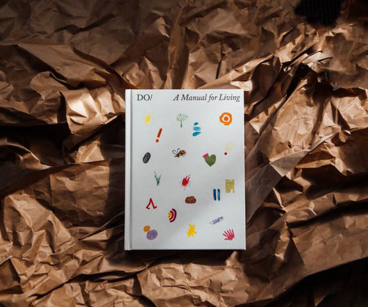
The Do Book Company is an independent publishing house in London that grew out of the Do Lectures, which has been gathering together the world's doers, disruptors and pioneers to share their stories since 2007. Recently, he's been super excited to work on The Book of Do, the publisher's anniversary publication.
In 2007, I studied Design and Visual Communications at a university in Tel Aviv. There was a time when I'd use web design tools like this to create sites, but they didn't give you many creative options on how to present the site. When I was growing up in Israel, I was always doing art and figured this was what I was going to do.
It's a great opportunity to reflect on how much has changed for creatives since we launched in 2007. Reflecting on the past 10-15 years, I think about the weird ideas I've presented and those I now wish I had," she says. However, these challenges also present opportunities for creatives willing to adapt and evolve.
And more broadly, its blend of mechanical construction with geometric clarity and a swift stroke fuses the best of past and present into one elegant design. The first was Galaxie Copernicus (2007) with Chester Jenkins. It's my third official bite at the Plantin cherry," Sowersby explains.
As in the previous year, we would like to start this list with the presentation of our own publication—hence, this is kind of outside the ranking. Dieline was launched in 2007 by Andrew Gibbs with the aim to showcase stunning packaging design concepts. WE AND THE COLOR. Today it’s an online platform with multiple channels.
It helps to increase productivity, helps in enhancing the appearance of the produced documents, reduces the cost of production, can customize all kinds of projects, and also helps you to manage the presentation as well as the content in it. You can create content for books, magazines, marketing materials, and social media content.
The company has proliferated since its launch in 2007, adding hundreds of thousands of new images weekly. The collection includes more than 1 million icons and stickers in all formats: for presentations, applications, websites, catalogues, infographics and so on. A presentation is an excellent tool for learning as well.
The term was also presented in the paper of Austin Henderson, Donald Norman, and Jim Miller. Website Design In Mobile Era (2007-2010). Websites stepped into the world of ‘mobile-friendly' web world when the first iPhone launched in 2007. The Shift in Website Design Trends (2010 To Present). Web developers.
The concept of a pattern library in interaction design/human-computer interaction began to gain recognition in 1997, when Jennifer Tidwell presented her scientific article on the topic at the annual conference on human factors in computing systems (ACM/SIGCHI). Guidelines are primarily presented without explanations or logic.
In 1995, the start of 50 Books |50 Covers — co-chaired by designers William Drenttel and Paul Davis — was the organisation’s attempt to “recognize excellence in both areas of design” Pablo Neruda’s Love Poems, a 2007 winner. Love Poems, by Pablo Neruda (2007). Courtesy of the AIGA Design Archives.
ZenDesk is a global customer relationship software company that launched in 2007. Founded in 2007, the brand kept the same identity for 10 years before deciding its branding no longer communicated the capabilities of the platform. The heart symbol encapsulates this message , and brings communities together. And, they didn’t stop there.
After some initial success, BioWare was acquired by Electronic Arts in 2007 and continued its rise with multiple franchise titles that did very well, leading to the opening of two additional offices, one in Austin, TX, and another in Montréal, Québec. Electronic Arts provided text. Logo, before and after reminder.
Calibri was chosen as the default font for Microsoft programmes like Office, Powerpoint and Outlook in 2007. It adds: “A default font is often the first impression we make; it’s the visual identity we present to other people via our resumes, documents, or emails. At the time it replaced Times New Roman. ” Tenorite.
Inspiration Grid A daily haven for design enthusiasts, Inspiration Grid is a graphic design blog that presents a stunning array of artwork, illustrations, typography, photography, architecture, and fashion projects. Mindsparkle Mag Mindsparkle Mag is a prime destination for pure graphic design inspiration.
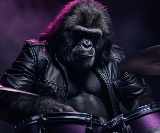
The Cadbury Drumming Gorilla (2007) Cadbury’s drumming Gorilla is an ad that clearly showcases creative connection. Currently, when asked whether we want to reply, we’re presented with yes/no options. One of the best ads ever. For those that haven’t seen it, check it out. Human truth: You feel joy, you don’t think it.
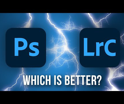
Lightroom: Optimised for Photographers First released in 2007, Adobe Lightroom was designed from the ground up to address the unique needs of photographers. Print and slideshow modules – Take your photos from screen to print or presentation with customisable templates.
They simulated frosted glass ( glassmorphism ) in 2007! Not to mention Windows Vista, with its horrible performance and functionality, but for sure the interface was ahead of its time. This was really impressive for the time being. The form was there, but well… of course it lacked function pretty much entirely.
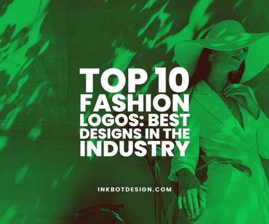
The creatively combined HH fashion logos split at the diagonal to present a unique and memorable mark for the brand. The current logo was introduced in 2007 to evoke the brand’s retro roots. Today they are recognised for outdoor sports gear, waterproof fishing gear and apparel for the sailing and snow sports community.
It’s contemporary yet retro, and has combined past and present design elements. Founded in 2007, the website allows users to store and share files on the cloud rather than saving them to a computer. It new design presents users with the information they need quickly and easily. Credit to digg.com. Dunkin Donuts.
Having always been interested in human behavior in the context of technology, he has been instrumental in creating some of the ideas that shape the internet today In 2007, he championed the idea of the hashtag, eventually changing social media forever and galvanizing popular social revolutions. Follow him on Twitter and Facebook.
In other words, Aesthetics, a concept which at the time did not exist, is then presented as the basic pleasure of the senses. The interface of the Gran Turismo 4 game had met with great success by presenting a menu in the form of a map of a city whose interactive elements are in 3 dimensions ( [link] ).
Calibri was chosen as the default font for Microsoft programmes like Office, Powerpoint and Outlook in 2007. It adds: “A default font is often the first impression we make; it’s the visual identity we present to other people via our resumes, documents, or emails. At the time it replaced Times New Roman. ” Tenorite.
I’m old enough to remember similar pro-democracy movements from 1988 and 2007, before they were viciously suppressed by the military. In 2007 I was a young mum when the short-lived ‘Saffron Revolution’ took place. In 1988 I was too young, and in 2007 I didn’t have a platform as I wasn’t even working as an illustrator.
Melanie presents her work in a unique and enlightening manner. He co-founded the YouTube channel Vlog Brothers with his brother in 2007. In particular, the website presents the work professionally. Targeting your ideal clients With a portfolio website, you can control the content and messaging you present.
Made by Folk Founded in 2007 by a group of young designers and vagabonds eager to collect and share the best design work they came across, FormFiftyFive soon became an international showcase of creative work. Its blog looks at tech in general, UX in particular, and their impact on psychology, mental health and society.
As simple as it sounds, the Slack Channel where we celebrate each new presentation is a constant source of collective pride. Tell us a short story from your studio that you kept in your memories… We ran a day on how to present our work and one of the exercises was to tell a personal story. Everyone in the studio has a favourite.
The neural basis of romantic love , 2000 ; Gold, Shadlen The Neural Basis of Decision Making , 2007) So, our brain isn’t just observing beauty; it’s creating a full, rich experience that’s tied to our emotions and personal tastes. They make sure our emotional response fits with the beauty we’re seeing, making the experience even stronger.
Janoff presented the rainbow-striped apple to represent human's biblical pursuit of knowledge and the company's use of technology to spark new ideas. The origins of the Apple logo stretch back to 1977 when Steve Jobs and Steve Wozniak were starting their computer company in a California garage.
We organize all of the trending information in your field so you don't have to. Join 66,000+ users and stay up to date on the latest articles your peers are reading.
You know about us, now we want to get to know you!
Let's personalize your content
Let's get even more personalized
We recognize your account from another site in our network, please click 'Send Email' below to continue with verifying your account and setting a password.


Let's personalize your content