This site uses cookies to improve your experience. To help us insure we adhere to various privacy regulations, please select your country/region of residence. If you do not select a country, we will assume you are from the United States. Select your Cookie Settings or view our Privacy Policy and Terms of Use.
Cookie Settings
Cookies and similar technologies are used on this website for proper function of the website, for tracking performance analytics and for marketing purposes. We and some of our third-party providers may use cookie data for various purposes. Please review the cookie settings below and choose your preference.
Used for the proper function of the website
Used for monitoring website traffic and interactions
Cookie Settings
Cookies and similar technologies are used on this website for proper function of the website, for tracking performance analytics and for marketing purposes. We and some of our third-party providers may use cookie data for various purposes. Please review the cookie settings below and choose your preference.
Strictly Necessary: Used for the proper function of the website
Performance/Analytics: Used for monitoring website traffic and interactions
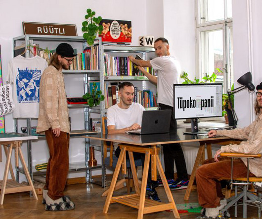
Sometimes, that might mean referring that client to one of the foundry's existing fonts; at others, it's about a bespoke solution. Tüpokompanii sees the interplay between historical reference points and contemporary design practices as crucial to creating typefaces that "resonate on multiple levels".
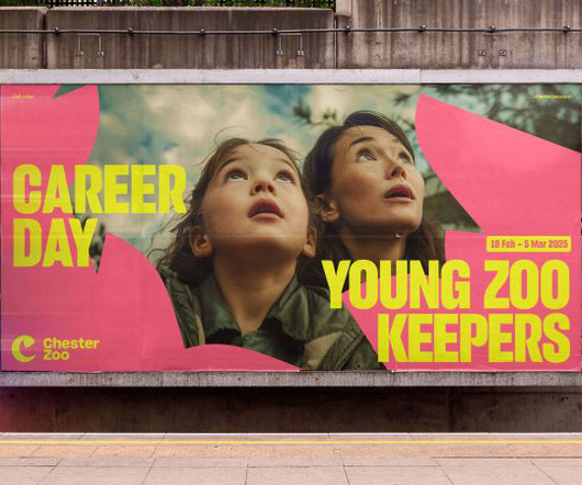
The sheer scale of their ambition, determination and vision inspired us every day," she adds. "We It references the zoo's history of supporting critically endangered Eastern Black Rhinos, which dates back to 1999, and helped to breed a rare calf. From the moment we met How&How, we knew they were the perfect partners for us.
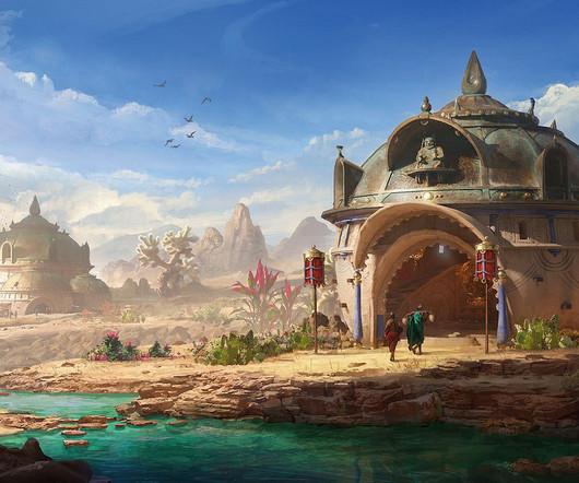
The first is to establish the overall direction I want for the painting, which will require finding references that match up with the style I have in mind. Out of everything, I find the most important aspect is to have realistic references to make sure I’m creating a world that people can believe is real.
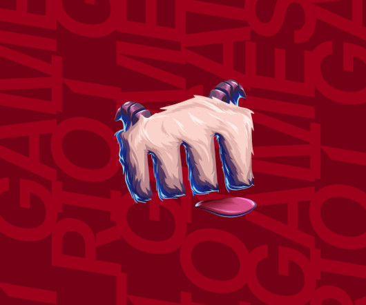
Every aspect of the design system is infused with references and, in some cases, literal moments from Riot's games and gaming worlds. This includes a range of patterns that can be used throughout brand assets such as graphics, frames, masks, dividers, and animated textures, instantly bringing a recognisably Riot vibe to any layout.
But I continue to love this book for its power to inspire us to reimagine the way the world works. The book helps us understand that we have actively designed the many destructive systems that we live in and identifies the designers out there challenging those systems. MC24 is the next generation.
To help you get the most out of Procreate’s tools and workflows, we’ve teamed up with game artist Antony Ward (via our friends at ImagineFX ) to unlock 10 secret Procreate tips and tricks that everyone can make use of. Go to Actions>Canvas and you’ll see a Reference option. Here’s another reference trick!
While the works can be appreciated as art objects, they are designed to be used, transforming the way we interact with the objects around us and the spaces we inhabit. Muller Van Severen shows us that objects, particularly functional objects, can elevate and shape our experiences of space.
This kaleidoscope of 1970s references was cooked up by Kitchen, the animation team comprised of Rachinta Platts and George Coffey at the London production studio Jelly. The Great Frog came to us with a really cool idea of going through four different lands or worlds that represent the jewellery in their new collection.
Based in Berlin but working with clients from across the US, UK and EU, the studio sits at the intersection of branding, campaigns and digital experiences, fusing design precision with emotional resonance. It is always a good starting point and generates an interesting mix of references."
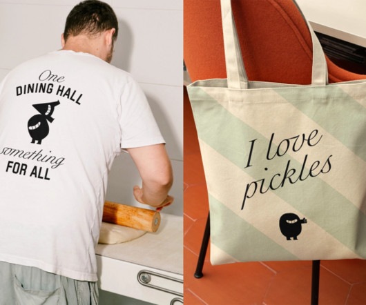
Independent London agency Without has unveiled a major branding project for Sodexo's US college dining offer, now called One&All, championing diversity through flexible design and a collegiate spirit. How do you create a brand that appeals to everyone without becoming generic? It's become a benchmark for how we build brands."
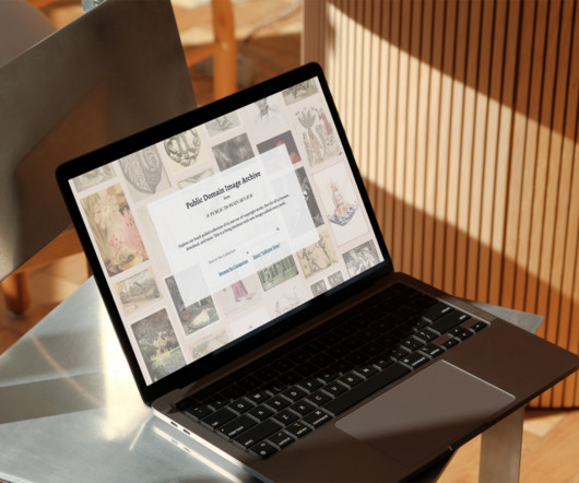
It's really important for us that the resource is free for people to access and available to all, so we are really relying on people donating if they find the site useful," Green shares. Another challenge moving forward will be securing sustainable funding. Hopefully, it will work!"
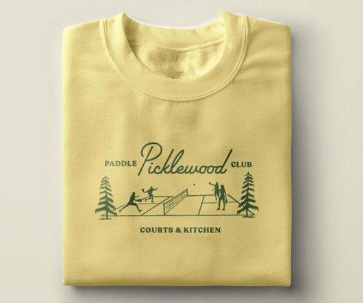
With pickleball being the fastest-growing sport in the US, all parties wanted to ensure that the brand stood out among the crowd. Visual identity The primary logos, paddle designs, and supporting graphics all work together to define the brand's vintage identity with nods to classic court colours and sports references.
It references my very popular cupcake and my passion for patisserie." While we often focus on beauty, colour and the clever combination of forms in a pattern – they excite us, perhaps – the calming effect of repetition has always attracted Patricia. They also inspire her online handle, Design Confections. "I
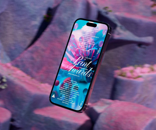
Colt explains: "Each year, PRINT comes to us with the beginnings of an idea they'd like us to develop. A key visual reference was sculpture, particularly work that merges organic rock textures with geometric forms. "We
Image credit: Edward Barons) Everything around us tells a story, from the scuffs left on a house wall when someone was moving in, to the worn-away sections on famous statues that everyone touches as they walk past. Why not try a subscription? Comments ( 0 ) ( ) When you purchase through links on our site, we may earn an affiliate commission.
It's a space to share the thinking and ethos that drive us. COLLINS Founded by Brian Collins, COLLINS is an independent branding and design consultancy based in the US, celebrated for its playful visual language, expressive storytelling and culturally rich identity systems. As Simon explains: "It's not a shop window.
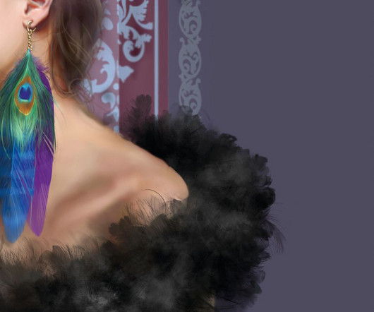
If you’re unsure of how the fabric will overlap to create folds, check out some reference photos while you paint. Engravings and patterns using different coloured metals are an extra touch that will ensure your character stands out from the crowd. Why not try a subscription? Visit our corporate site. All rights reserved.
That's what helped us stay sharp." These references gave the team a graphic language that was both high-impact and full of attitude, while avoiding the overdone tropes of the RTD world. "We kept stripping it back until every element was doing one clear job – no more, no less," says Glen. "If
"So the site needed to be minimal and unobtrusive, no clutter, no distractions, but still feel like us." Matt references Dieter Rams' philosophy of "as little design as possible" as an anchor for the creative approach. Interestingly, the redesign also draws from unexpected sources beyond pure digital design.
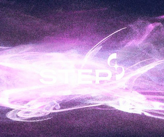
However, May believes this to be "an oversimplification, since fusion also happens at the heart of all stars - the sun is just the star closest to us. May explains how the star at the core references how fusion power works: "Fusion is the process that powers stars, and the STEP reactor will be recreating that process".
2024 was a year of real transition for both of us. Big agencies taught us a lot, and we'll forever be thankful to them," Vini says. But they also taught us what we want to avoid: politics, a pyramid structure, spending all day in meetings, turning down creatively brilliant projects because they didn't 'fit the model.'
We expect to see continued iterations on the 'undesigned' trend, more chaos, more maximalism to counter the crisp, clean, blandness the algorithm will inevitably continue to serve us." Craft sentences and use the words as a guide rather than visual references. Articulate what you do before you do it.
It is a company that believed in us and taught us how to be professional designers. Today, Draga & Aurel join us for Friday Five ! This way of conceiving art was particularly encouraging and inspirational for us, it really changed our approach to painting. Its a collaboration that has shaped their own approach.
Dynamic Branding: Adaptive and Responsive Logos Dynamic branding refers to the ability of a brand’s visual identity, including its logo, to change and adapt across different mediums, contexts, and audience segments. Sustainable design refers to the creation of products, environments, and services that prioritize environmental stewardship.
The chance to collaborate with FilmNation, whose projects we're big fans of, and have our stamp on a popular podcast hosted by Ed Helms, was an easy 'yes' for us," says The Collected Works partner Jose Fresneda.
The tools helping us discover new fonts are evolving, too. Fonts Ninja , the browser extension used by more than 900,000 people, recently launched a major upgrade with smarter font detection powered by their own algorithm. It's a foundry in v1, which will expand over time and grow with our research and feedback."
As well as those Renaissance references, the work is constructed on the precise foundations of Cartesian geometry, the mathematical premise that marries the proportional canons of classical architecture and the laws of physics.
At its core, it refers to using some form of visuals to depict architecture, usually before its been built. But in the end it’s about using visualisation in a compelling way to sell, promote or aid the design of architecture and real-estate. "One Why not try a subscription? What is archviz? Visit our corporate site.
As ever, Sparrow's felt world disarms with its charm, drawing us into familiar territory while gently asking us to look again. Based in a converted ambulance station in Suffolk – lovingly referred to as the 'Felt Cave' – Lucy now leads a small team of expert felters who help cut, sew, and assemble her thousands of creations.
For us, that means getting that first phase right," she clarifies. But what unites us is a sense of curiosity and the stubbornness to keep following our noses, keep going down rabbit holes with our clients." The studio describes itself as 'foundational'. Your visual brand world with a conceptual mark or custom wordmark.
Drawing from editorial cues and cinematic references, such as Her, the visual world sits somewhere between analogue memory and modern clarity. Studio Morfar helped us bring that to life – from the visual story to the growth strategy." Studio Morfar's role didn't end with identity.
View example View example Another noticeable change is the use of more muted, earthy color palettes. Also, let us not forget the AI-assisted tools that will have an even bigger impact on abstract design in 2025. Localizes content like language or cultural references. View example 7.
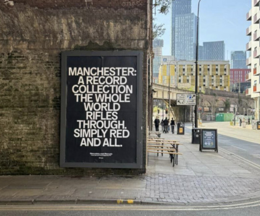
Endless references to Tony Wilson's Factory Records era. The brief came to us with a lot of stuff of what they didn't want," recalls Ellen, who collaborated with designer Craig Oldham on the project. "It We don't want to lean into the established Tony Wilson references." Worker bees. Yellow and black colour schemes.
Usability: Usability in typography refers to how easily users can read and interact with text within a digital product According to abhishek , this is a key consideration in design systems [5]. Readability refers to how easily words and sentences can be understood, while legibility focuses on the clarity of individual letterforms.
The AI uses the selected area as a strict boundary and a contextual reference point. For best results, use tools like the Lasso Tool for organic shapes, the Object Selection Tool for isolating specific items, or the Marquee Tool for geometric precision.
London-based animator Sofia Negri created her animated documentary The Skatebook using a combination of archival live action footage and hand-drawn elements from her sketchbook. Using found footage is a fantastic way to tell animated stories with little to no budget. Plus, you can also use it to animate frame by frame.
It serves as a powerful reference for anyone interested in branding, graphic design, and the intersection of art and technology. It shows us how deep strategic thinking, coupled with a respect for history, can produce something truly groundbreaking. This became a key reference point. You see it once, and you remember it.
This documentation is a valuable reference for future iterations and helps you see long-term trends. In conclusion, examining successful layout designs allows us to learn from the best, helping pave the way to our success. Keep an eye on industry trends and be prepared to adapt your layout accordingly. Don't be afraid to iterate!
We organize all of the trending information in your field so you don't have to. Join 66,000+ users and stay up to date on the latest articles your peers are reading.
You know about us, now we want to get to know you!
Let's personalize your content
Let's get even more personalized
We recognize your account from another site in our network, please click 'Send Email' below to continue with verifying your account and setting a password.


Let's personalize your content