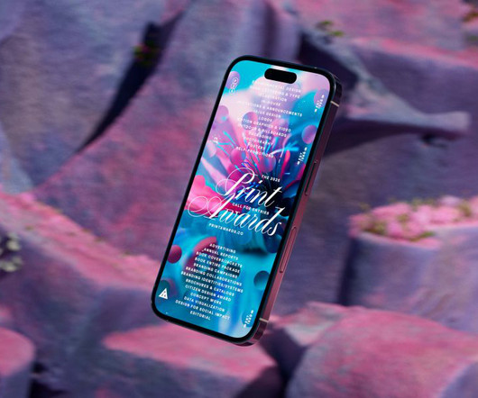
This site uses cookies to improve your experience. To help us insure we adhere to various privacy regulations, please select your country/region of residence. If you do not select a country, we will assume you are from the United States. Select your Cookie Settings or view our Privacy Policy and Terms of Use.
Cookie Settings
Cookies and similar technologies are used on this website for proper function of the website, for tracking performance analytics and for marketing purposes. We and some of our third-party providers may use cookie data for various purposes. Please review the cookie settings below and choose your preference.
Used for the proper function of the website
Used for monitoring website traffic and interactions
Cookie Settings
Cookies and similar technologies are used on this website for proper function of the website, for tracking performance analytics and for marketing purposes. We and some of our third-party providers may use cookie data for various purposes. Please review the cookie settings below and choose your preference.
Strictly Necessary: Used for the proper function of the website
Performance/Analytics: Used for monitoring website traffic and interactions
Since then, this New Zealand foundry has carved out its niche in the competitive world of typography through a combination of accessible design and creative merchandising. Economic pressures Looking ahead to 2025, Daniel sees the typography landscape evolving in response to economic pressures. "I
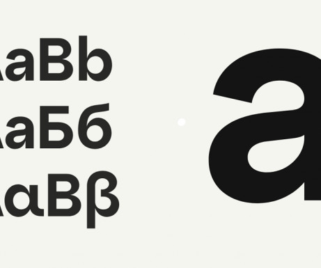
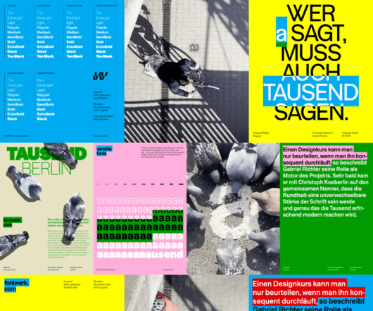
The awards' new visual identity embodies organic growth as a metaphor for creativity, blending generative design and dynamic typography. Typography played a fundamental role in ensuring the identity remained cohesive across all touchpoints. Townsend describes the creative process as an exercise in controlled randomness.
It sounds like the brief for a luxury champagne or a high-end single malt, but the Eindhoven branding agency Tte de la Course has introduced a premium-level presentation to the beer market in the form of Three Rules of Authentica special edition dubbel with a story behind it that feeds right into a narrative of quality and craftsmanship.
Taking inspiration from luxury fashion houses like Louis Vuitton, Gucci and Fear of God, this trend amplifies visual impact and creates strikingly modern aesthetics, especially when paired with clean typography. Collage Breaking the rules and layering elements create the organised chaos that defines this resurgent trend. "In
As we delve into graphic design trends 2025 , web design trends 2025 , and logo design trends 2025 , we’ll also highlight the influence of AI, typography innovations, and sustainable practices. Whether you’re a designer, marketer, or brand strategist, staying ahead of these trends is essential to creating relevant, impactful designs.
Using the latest free fonts and fresh typography styles can instantly improve your work and keep your designs looking modern and creative. Whether you’re designing a logo, creating typography for brochures, or working on brand guidelines, the latest free fonts can be a game-changer.
Typography is a vital element in any creative project, setting the tone and conveying the message with style. Typography trends are constantly evolving, and staying ahead of the curve means experimenting with new styles that can elevate your work. So here it is Thirsty Dog.
A good design style guide should include guidelines on logo usage, color palettes, typographyrules, image styles, and quality standards, as well as user experience principles. Foster Logo Rules for Use Across All Stages With regard to planning an item or brand, consistency is vital.
Typography has a huge part to play when it comes to graphic design. As a general rule, you need to avoid pairing two different typefaces if they have subtle differences. Contrast is such an important factor when it comes to graphic design, and this is especially the case where typography is concerned.
Despite its textbook structure, I read it through at least twice (minus the type specimens) and gained confidence from knowing best practices in a "knowing the rules before you break them" kind of way. No RulesRules: Netflix and the Culture of Reinvention by Erin Meyer & Reed Hastings.
20 TypographyRules Every Designer Needs to Know Good typography is the foundation of great design. Luckily, you don't need a PhD to uplevel your typography game. Following these 20 essential typographyrules, your designs look slicer than an expertly kerned ampersand. Let's dive in! Avoid that.
The studio's founders, Johan Debit and Jean-Rémi, talk us through their latest identity, where typography, graphics and structure collide in harmony. Since founding the studio in 2010, the team have worked with nearly 200 clients to develop visual identities, focusing largely on typography and experimentation.
Typography is a fundamental aspect of graphic design that profoundly influences how your message is perceived and understood. Here are five essential typographyrules that every graphic designer should keep in mind to create visually appealing and effective designs. Subscribe to our newsletter!
So I design the typography for all the books first in that way. The length of the title and the subtitle dictates how big the typography will be. With strict rules laid down for the typography, then, the image comes second. "But on the other, as a designer, I'm very traditional; a flush left, Swiss guy.
There's no point in just being wacky just for the sake of it, though: there has to be an underlying, original idea or goal if you want to push typography forward. Hubsch follows its own set of rules with logic, organised with absolute values to make the aesthetic modern and fit for purpose.
If I'm working on an illustration project that includes text elements, it's super helpful to have an understanding of typography, design rules, and so on. "At "In my opinion, illustration and graphic design go hand-in-hand together," she explains.
Royal Television Society's annual two-day event by Studio Kiln We canvas a selection of design industry experts to learn what will be big in typography over the next 12 months. Whether you work as a type designer, graphic designer or any other form of creative, you probably find typography central to your work, at least occasionally.
Therefore, the one rule that you should always abide by, is never to mess with the selection of fonts for your logo , period! like simplicity, color, typography and imagination. Every logo design concept need perfect typography for modern and clean look. Pick the right typography for your logo.
You see, typography is more than just picking pretty letters. Before we jump into the rules, let’s talk about the underlying ideas. The Golden Rules of Font Pairing: What to Do and What to Avoid Now, lets get to the nitty-gritty. Its about understanding the nuances of typography. It’s a common design pitfall.
These elements encompass visual components such as logos, color palettes, typography, and imagery, as well as messaging and communication guidelines. The purpose of these templates is to provide a clear and unified set of rules that ensure consistency in how a brand is presented across various channels, both online and offline.
As a rule, the graphic motif travels through all creative and has a range of behaviours, including usage as a frame, a house for typography and motion. The Rooute, therefore, acts as a visual reminder of Deliveroo's brand codes: the colour teal and the angles of the Roo Head.
On digital platforms, storytelling, unique illustrations, dark mode, ethical design and bold typography are always the defining elements. #1 Typography is given center stage in the UI trend known as ancient typography or rule-breaking typography. A similar thing was chunky typography on their pages.
Design professionals create templates that encompass all the essential elements of a brand’s identity, from logo usage and color palette to typography and imagery. Typography: Guidelines include the preferred typefaces, font sizes, and formatting rules for headings and body text.
In the world of graphic design, typography plays a pivotal role in creating visually appealing and effective designs. In this article, we’ll explore how you can boost your typography with some of the freshest free fonts available today. List of Fresh Typography Free Fonts 1. Summer Free Font 2. Nost Sans Free Font 3.
The colors, the typography or the concept? Therefore, the one rule that you should always abide by, is never to mess with the selection of fonts for your logo , period! like simplicity, color, typography and imagination. Every logo design concept need perfect typography for modern and clean look. So choose wisely!
Discover Some Experimental Bold Typography in Anahit Lyudvigian’s Visionary Poster Series Armenian graphic designer Anahit Lyudvigian has created a series of bold, conceptual poster designs as personal design studies. Each poster feels like a living entity, where typography interacts with its environment.
Inventive Typography. Inventive Typography. If you have a text-based logo, feel free to use creative typography solutions to emphasize your company’s personality. As for your audience, they will surely appreciate your inventive typography! There are no rules. Check it out! Logo Design Trends 2021. Simplicity.
A tech startup might need a template that emphasizes clean lines and modern typography, while a bakery might benefit from a template with warmer tones and vintage-inspired fonts. Easy to replace typography and brand colors with your own. Level of Detail: Templates come with varying levels of detail.
Therefore, the one rule that you should always abide by, is never to mess with the selection of fonts for your logo , period! like simplicity, color, typography and imagination. Every logo design concept need perfect typography for modern and clean look. Pick the right typography for your logo. Leafy Logo Font.
It heroes individuality and captures the wonder of being free from rigid rules." Typography on the project was created in collaboration with Luke Prowse of Nan.xyx. Visual elements The custom logo is an elegant, balanced and crafted wordmark that captures the ethos and principles of the brand.
Our loveable eyes icon has been softened a little, with the Os becoming more rounded to evoke more personality and match the new typography. Type leads the way, and imagery rules, allowing the content to maintain the starring role. And so we refined our logo, changing the type ever so slightly to better reflect Creative Boom today.
This newfound freedom encourages experimentation, enabling designers to push the boundaries of traditional typography and infuse their projects with unique personality and flair. These fonts come with special rules so you can use them freely. You may be interested in the following articles as well. List of New Free Fonts: 1.
Typography will always be a key element of graphic design. The use of typography can make or break a design, determine the readability of app contents and directly impact business conversion. When it comes to typography, there are certain ground rules that remain constant. Typography and App Design.
The new identity positions it clearly as the insurance brand that backs the exceptions to the rule. Together, the language and typography set out to be inclusive even to those with varying English proficiency levels. The company specialises in insuring people whose circumstances are hard to price.
As a rule, we tend to go for less commercial books — ones you won't necessarily see on a supermarket shelf. We rarely post covers with faces on unless the face is framed really well with graphics or supported by strong typography. "If We look at various things when considering which cookbooks to post on the account," he says. "As
Exploring the Rise of Asymmetry: Breaking the Rules: Symmetrical designs can be seen as safe and predictable. Clean layouts, clear typography, and well-chosen visuals create a sense of focus and elegance. Bold & Beautiful Typography: Words as Art Typography is no longer just about conveying information.
Vaqoeng Modern Magazine Font Logo Font You may also like: 100 Best Free Fonts For 2025 10 Top Visual Trends for 2025 Typography in 2025: Modern Font Trends for Engaging UI 70+ Best Japanese-Style Fonts for Modern Design and Branding Explore 50+ Best Fonts For Logos One of the most effective approaches to logo design is to keep it simple.
Visual identity design, on the other hand, refers to the visual elements that represent the brand , including the logo, color scheme, typography, imagery, and more. In the logo design process , designers experiment with shapes, symbols, typography, and colors to create a unique and impactful logo.
Communicate through image-making and typography. Broken into five courses including Fundamentals of Graphic Design, Introduction to Typography, Introduction to Imagemaking, Ideas from the History of Graphic Design, and Brand New Brand. Typography. Introduction to Typography. What you will learn. Learn More. Communication.
Typography : Logos that rely on custom lettering and creative typography to make a statement. Here’s where the real rule breakers come out to play: Metamorphosis Magic: Logos that morph and transform, hinting at a brand’s adaptability and growth.
Typography That Works: Typographic Composition and Fonts. When you’re starting out as a graphic designer, you may spend a lot of time perfecting the logo that portrays your brand to prospective clients, but what about the typography on your website or business card? Introduction to Typography.
We organize all of the trending information in your field so you don't have to. Join 66,000+ users and stay up to date on the latest articles your peers are reading.
You know about us, now we want to get to know you!
Let's personalize your content
Let's get even more personalized
We recognize your account from another site in our network, please click 'Send Email' below to continue with verifying your account and setting a password.
Let's personalize your content