This site uses cookies to improve your experience. To help us insure we adhere to various privacy regulations, please select your country/region of residence. If you do not select a country, we will assume you are from the United States. Select your Cookie Settings or view our Privacy Policy and Terms of Use.
Cookie Settings
Cookies and similar technologies are used on this website for proper function of the website, for tracking performance analytics and for marketing purposes. We and some of our third-party providers may use cookie data for various purposes. Please review the cookie settings below and choose your preference.
Used for the proper function of the website
Used for monitoring website traffic and interactions
Cookie Settings
Cookies and similar technologies are used on this website for proper function of the website, for tracking performance analytics and for marketing purposes. We and some of our third-party providers may use cookie data for various purposes. Please review the cookie settings below and choose your preference.
Strictly Necessary: Used for the proper function of the website
Performance/Analytics: Used for monitoring website traffic and interactions
This trend takes inspiration from the past’s vision of the future, often characterized by neon colors, metallic accents, bold geometric shapes, and vintage typography. This can include using old-school fonts and neon colorpalettes in ad visuals for a nostalgic, tech-forward look.
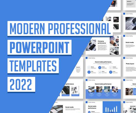
Here are the main recommendations: State the topic clearly. Careful choice of colorpalette. If you look at a few popular & clean professional PowerPoint templates, you will ensure that they only contain 1 or 2 primary colors (for background, text, and icons). So, always use contrasting colors. Definitely yes!
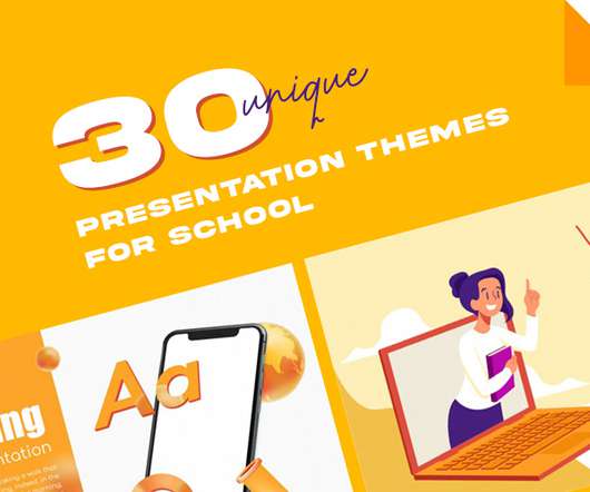
If you need to choose a free Google Slides theme and template to create a presentation on school educational topics, we recommend that you read this collection, among others. The background of this presentation theme perfectly corresponds to the mentioned topic. The beautiful, deep plum-colored background is very pleasant.
They give a pleasant approach to learning more about a specific topic without having to read a lot. Whether you are selling anything or simply talking about ordinary topics, including an infographic on your site now and then would only help you. It can: provide a summary of a topic visualize a process. Choose colors.
On the writing front, you could also use the AI writer to brainstorm, translate text from other languages, or research a topic. Khroma The perfect companion to find and work on colors for your design projects. Khroma is an AI that learns your color preferences and uses it to generate unlimited colorpalettes to pick from.
Experiment with different tools , techniques, colorpalettes and fonts. Courses like Skillshare and Udemy offer a wide range of topics, from basics to advanced techniques. Practice The first and most important tip to becoming a better graphic designer is simple: practice!
It’s the portal through which your ideas take shape, where colors dance, and where meticulous details come to life. It can lead to frustrating color mismatches, blurry details that sabotage your precision, and simply an inefficient workspace that hinders your creativity. Is it color accuracy? The wrong monitor?
Think about saving hours searching for the perfect image or colorpalette. More specifically, this is where following WE AND THE COLOR’s Pinterest account can transform your creative process. WE AND THE COLOR understands the needs of creative professionals. This is where Pinterest comes in.
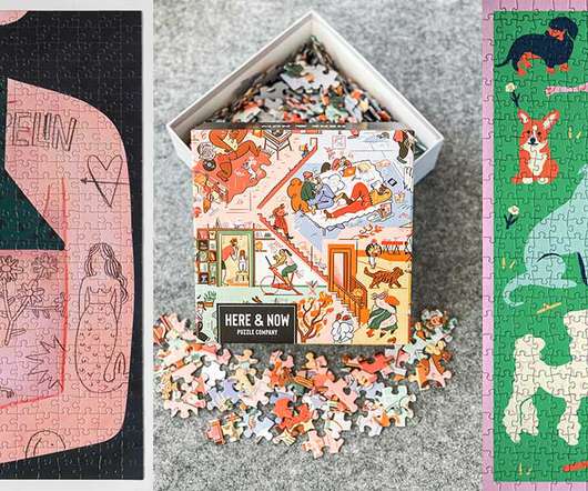
With a colorpalette that screams summer, this puzzle features the artwork of Maggie Stephenson with palm trees, umbrellas, succulents and fruit that will make you wish you were there. The 500-piece puzzle is printed with non-toxic, water-based colors and given a matte finish that’s easy on the eyes. >>>
Nappy Nappy provides free stock images that showcase diversity and representation, with a focus on people of color. Free Color Tools: 24. Coolors Coolors is a color scheme generator that allows users to create and customize colorpalettes for various design projects. Free Mockup Tools: 30.
Candid Book: A Human-Centered Approach to Editorial Design abduzeedo 02/18 2025 Explore the Candid Book project, a human-centered approach to editorial design and web design, tackling the sensitive topic of dual diagnosis with thoughtful illustrations and accessible UX/UI.
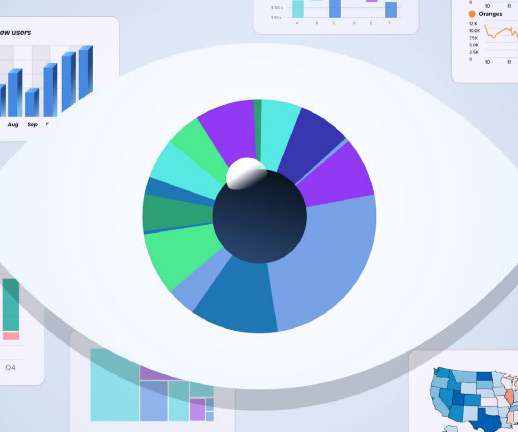
Anyone who has seen corporate reports will be accustomed to multicolor pie charts and graphs, which frequently employ whatever colors are selected by default in a template or even in a website’s colorpalette. The reason why people choose to watch a video on a topic rather than read about it. Take Advantage of Imagery.
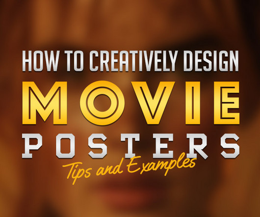
This includes layout, typography, color schemes, and imagery. Color Schemes Color is another powerful tool in movie poster design. For a futuristic film, designers might opt for bold, neon colors reminiscent of cyberpunk aesthetics, or they could choose a monochromatic palette to convey a more dystopian or minimalist vibe.
The result is a visual language that breaks down barriers, ensuring health topics remain approachable and free from stigma. Every aspect, from the colorpalette to the web layout, was chosen to convey warmth and accessibility. Every aspect, from the colorpalette to the web layout, was chosen to convey warmth and accessibility.
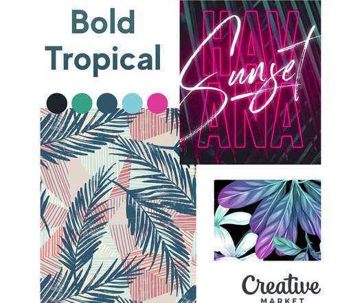
The coastal design trend makes use of neutral, muted, light colors and combines them with earthy tones and textures to capture the more laidback nature of the beach. ColorPalette: #5f84bf, #e5cfaf, #333651, #8eb9e1. ColorPalette: #d27c8b, #456487, #ffea5d, #d96853. Retro Beach. Bold Tropical. Summer Peach.
In these templates color schemes to typography choices, designers can easily reference the guidelines to maintain visual consistency while exploring creative variations. Boasting over 50 unique slides, the template covers essential topics such as core values, typography, color schemes, and media guidelines.
Brief Overview of the Topic Desktop wallpapers have evolved significantly over the years, from basic, pixelated images to breathtaking digital art. These initial designs were limited by technological constraints, providing users with a choice of a few solid colors or simple geometric patterns.
How to Color the Lines on Imported Art in Procreate. Advanced Comic Coloring in Procreate. Either way, the How to Draw Comics in Procreate tutorial by Brad Colbow shows you how to create a comic in Procreate from start to final coloring. How to Color the Lines on Imported Art in Procreate. How to Draw Comics in Procreate.
Our Color of the Season for Winter 2022, Velvet Jade , is an example of this preference for lush, opulent look. Try our Color of the Season. Download colorpalettes using Velvet Jade. Download our set of colorpalettes in SVG and start using them in your favorite design app. Download the palettes.
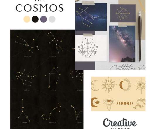
The topic of space exploration is certainly back in the spotlight, and we wanted to put together some space age moodboards to help inspire you and highlight some wonderful space age products from here on the marketplace that fit with each theme. ColorPalette: #dcaf38, #342e41, #88a28b, #d55b1c. Modern Futuristic. The Cosmos.
You should avoid: 3D elements, shading Shadows, gradients, and other color distortion Zebra patterns, excessive gridlines Highly decorative, italic, bold, or serif fonts 15. Colors assigned should be distinct to ensure accessibility. A Sequential colorpalette works best for numeric variables that need to be placed in a specific order.
It is about repeating shapes, typography, style, colors, and design elements to be recognizable and not confuse viewers. Color is the tool to use to enhance an already well-created design with the right emotions , set the correct tone and attract the viewer. A colorpalette is the range of colors used by a designer in their project.
Many designers with a background in writing keep this important design principle in mind.fee Color and Contrast Smart use of color and contrast can draw the attention of the reader or viewer to the most important elements on the page , create visual interest within the layout, and evoke specific reactions or emotions from the viewer.
Chances are, a big part of that feeling came from its colors. Colors arent just pretty; theyre powerful. Finding the right colors for a brand is not about picking your favorites. Are you ready to explore this colorful path with me? Let’s break down what it takes to nail that perfect brand colorpalette.
It is made in dark shades and colors including black, dark green, and light green. It has two parts: the left one is made in nude minimalistic colors while the right one is made in saturated orange. It has an extremely stylish design as it is made in black with some neon colors. Edit Template. Edit Template. Edit Template.
Halloween graphics usually include: Dark colors always help to get into the Halloween spirit. A black and white colorpalette inspires many web designers. They use his color combination for creating diverse Halloween ghost graphics with a hair-rising illustration. Topic-related animations. Little Witches.
Video and music producer Brandon received in-depth suggestions for colorpalette selection and even coding additions when he shared his creative portfolio. Other forums run the gamut of the site creation process, with topics ranging from Coding and Customization to handling images and videos to SEO and Marketing.
This is where you briefly explain the topic or problem you’re addressing. ” Design Tips for Effective Swipeable Content Keep It Visually Consistent Use a unified colorpalette, typography, and visual style across the entire story. Example: “90% of people fail at this simple habit—are you one of them?”
Design tip: Double-check that all of your logo’s color tones print properly. As previously said, it is a divisive topic, therefore it is important to examine the target demographic that will be exposed to the logo. Printing anything in black and white is less expensive than printing in color. Retro Logos.
Now that we're on the same page, let's dive into the five-step process for creating a timeline infographic: Step 1: Conduct Research and Topic Brainstorming. To brainstorm your topic ideas, you can ask yourself some questions: What is the goal or desired result of your timeline infographic? What's your general approach to the topic?
The Playground of Perception: It’s Not What You See, It’s How You See It Color isn’t some fixed, objective entity. The Playground of Perception: It’s Not What You See, It’s How You See It Color isn’t some fixed, objective entity. This means that the color you perceive is, to an extent, unique to you.
Image Credit/ KHROMA Khroma is an AI-based tool that is used by graphic designers for creating colorpalettes. You can create limitless palettes and try new combinations as often as possible. Khroma’s AI algorithm can be trained by choosing up to 50 colors. Khroma’s customer intelligence is renowned.
Before you make your viewers listen to what you have to say, you must first capture their interest, and you can do that by choosing the right combination of fonts, shapes, colors, and images that draw attention. You can communicate a lot of things with the simple use of colors. Display a clear message or idea.
There’s just something about its minimalistic style that makes it easier for our brains to follow and retain their message – especially when it involves complex topics. Use Your Brand Colors Effectively. Therefore, you should be looking for opportunities to use the colors that represent your company or brand.
This cover is so striking and hits all the marks from typography to illustration to colors that absolutely vibrate with that oh-so-subtle background texture. The one pop of color in the subtitle is also a nice touch. UGA Press Design/Art Direction: Erin Kirk New These colors are so lovely!
Take for example these pillows, designed by Studio Flétta for FÓLK , a clever use of airbags reclaimed from junkyard cars across Denmark, Iceland, and Poland and transformed into colorful cushions. Made or woven locally from reclaimed materials in Stustustudio in Hafnar, Ashley’s mushroom-inspired designs are playful and whimsical.
Color Tools And Resources. Color Tools And Resources. Today, we’re shining the spotlight on color tools and resources for all kinds of projects, from all types of colorpalettes and generators to getting contrast and gradients just right for your projects. How do you usually define colors in CSS?
It covers important topics such as foundations, design tokens, and other resources. Alphredo A color-generating app that creates translucent versions of colors that appear identical to their opaque counterparts when placed against the same background. Even better, this course is taught by Jack, the creator of Statamic.
Comic book art can be filled with bright colors and amazing textures. The wide-ranging course covers topics such as layouts, color theory, and the Procreate interface. With 27 brushes to choose from, adding light is as easy as choosing a brush and a color. Learn More. Vintage Comic Procreate Brushes – $14.
Typography and Color: The Foundations of Visual Identity Drawing inspiration from contemporary Japanese design, the selected sans serif typeface adds strength and sophistication to the overall visual identity. Digital elements, like the animated marquee, further enhance the design by creating a dynamic space for current topics.
This guide covers essential topics that we need to know to make high-quality designs that are consistent with Apple’s guidelines. Example of a mobile grid Colors iOS has a defined set of system and semantic colors that automatically adapts to vibrancy, accessibility settings, and appearance mode.
But over the years, changing notions of how specific comic characters should be perceived, his logo has taken on a darker colorpalette. Therefore the choice of a brighter color combination was made. Sporting the colors of the US flag, Captain America’s logo features a big and bright white star in the middle of the shield.
What topics will the courses cover? You will also learn about choosing an effective colorpalette and creating a background that pops. Don’t think twice about finding more recommended online courses on WE AND THE COLOR. Take the course at Domestika. Take the course at Domestika. Subscribe to our newsletter!
We organize all of the trending information in your field so you don't have to. Join 66,000+ users and stay up to date on the latest articles your peers are reading.
You know about us, now we want to get to know you!
Let's personalize your content
Let's get even more personalized
We recognize your account from another site in our network, please click 'Send Email' below to continue with verifying your account and setting a password.


Let's personalize your content