Remove rebranding-trends
article thumbnail

The 25 creative studios inspiring us the most in 2025

Creative Boom

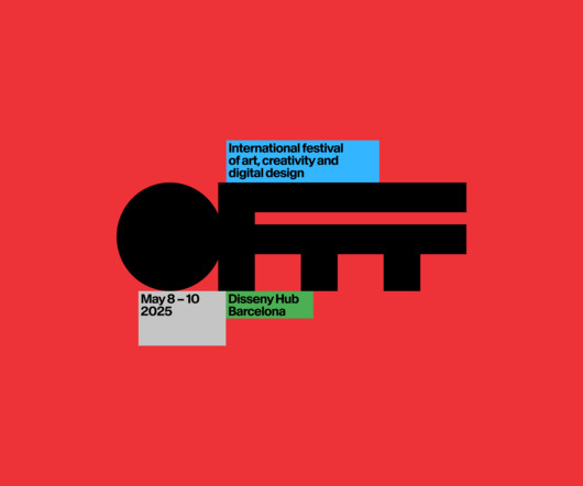
In short, these studios aren't just following trends; they're setting them. The rebrand draws heavily on the museum's iconic modernist architecture by Lina Bo Bardi, using a red-and-black colour palette and strong typography to reflect the building's striking visual presence.

article thumbnail

Building visual worlds: Inside the cross-cultural craft of Studio Gruhl

Creative Boom

There is no rebrand anymore without delivering content and motion. Rather than chasing trends or growth for growth's sake, the studio has found strength in staying small. On the subject of trends, Malte is refreshingly clear-eyed. "We We are past the point of chasing trends.

Insiders

Sign Up for our Newsletter

This site is protected by reCAPTCHA and the Google Privacy Policy and Terms of Service apply.

article thumbnail

40+ Modern Logo Badge Designs to Spark Your Creativity

Graphic Design Junction

In today’s design world, logo badge designs are a popular trend that continues to inspire both designers and brands. Whether you’re rebranding your business, starting a new venture, or simply looking for design inspiration , logo badges offer endless possibilities.

article thumbnail

10 Top Visual Trends for 2025

Graphic Design Junction

In this article, we explore the top visual trends for 2025 , giving you a glimpse into what will shape the creative landscape across industries. Whether you’re a designer, marketer, or brand strategist, staying ahead of these trends is essential to creating relevant, impactful designs.

article thumbnail

Why the Jaguar rebrand is a total disaster

Designer Daily

Following a global trend, it takes a much more minimalist approach, going as far as removing the jaguar drawing. The post Why the Jaguar rebrand is a total disaster appeared first on Designer Daily: graphic and web design blog. So, will there be a massive backlash about this ad?

article thumbnail

Starbucks turns up the personality on Refreshers in China with a bold redesign by Marks

Creative Boom

The rebrand brings a sense of freshness and flair that matches the product's personality. The team drew on emerging design trends like expressive abstract patterns, playful illustrations, and vibrant colour cues to build a system that feels premium yet personal.

article thumbnail

The best ambigram logos (and two controversial designs that didn't work)

Creative Bloq

You may like These iconic logo rebrands ditch design briefs to embrace the joy of creativity The best rebrands of all time "A logo is a kaleidoscope of meaning": why logos are more important than you think 01. Id say that the 2011 rebrand was a downgrade, opting for a much more generic-looking all caps serif font.