This site uses cookies to improve your experience. To help us insure we adhere to various privacy regulations, please select your country/region of residence. If you do not select a country, we will assume you are from the United States. Select your Cookie Settings or view our Privacy Policy and Terms of Use.
Cookie Settings
Cookies and similar technologies are used on this website for proper function of the website, for tracking performance analytics and for marketing purposes. We and some of our third-party providers may use cookie data for various purposes. Please review the cookie settings below and choose your preference.
Used for the proper function of the website
Used for monitoring website traffic and interactions
Cookie Settings
Cookies and similar technologies are used on this website for proper function of the website, for tracking performance analytics and for marketing purposes. We and some of our third-party providers may use cookie data for various purposes. Please review the cookie settings below and choose your preference.
Strictly Necessary: Used for the proper function of the website
Performance/Analytics: Used for monitoring website traffic and interactions
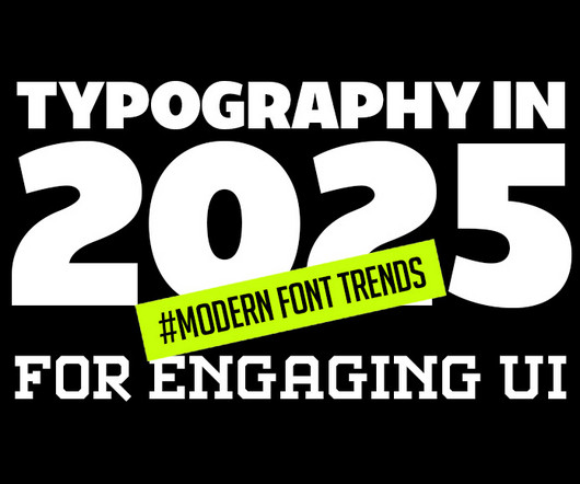
Typography is evolving rapidly, reshaping how we perceive and interact with digital designs. This article delves into the latest typography innovations that promise to make digital interfaces more engaging, accessible, and visually appealing. Minimalist and Clean Typography The “less is more” approach remains popular.
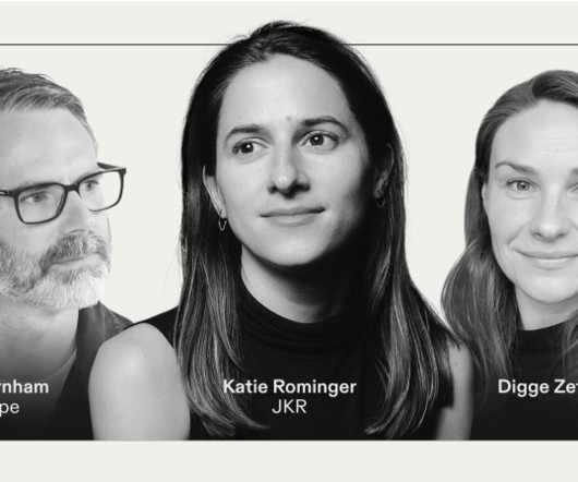
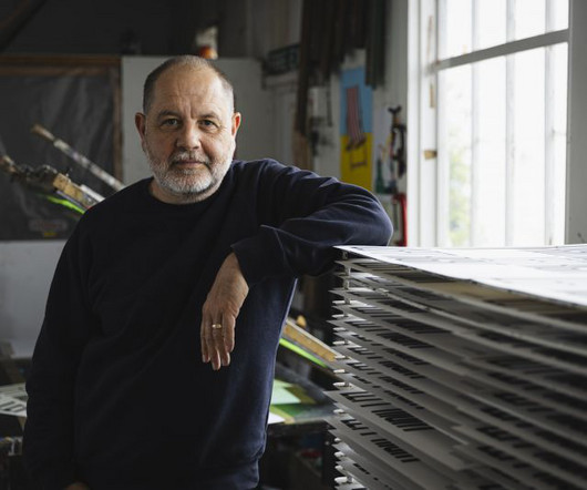
In the design world of 2025, typography is becoming increasingly important. In a discussion chaired by Frontify's Digge Zetterberg, design experts Katie Rominger from Jones Knowles Ritchie (JKR) and Phil Garnham from Monotype peeled back the layers of contemporary typography, and looked to where it's currently heading.
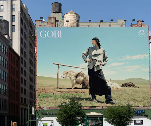
This creates a higher-quality, noticeably softer product. The symbol, created by interlocking four heart shapes, represents a virtuous cycle in which everything from the raw product to the garments is produced in Mongolia by Mongolians. Rob immediately fell in love with the people and the landscape of Mongolia. "We
As we delve into graphic design trends 2025 , web design trends 2025 , and logo design trends 2025 , we’ll also highlight the influence of AI, typography innovations, and sustainable practices. Whether you’re a designer, marketer, or brand strategist, staying ahead of these trends is essential to creating relevant, impactful designs.
But with that comes a million products, all vying for attention – against both each other and knock-off versions on sites like Teemu. From New York to Seoul, they demonstrate how great branding can elevate health and beauty products from mere commodities to transformative experiences that resonate with people's values.
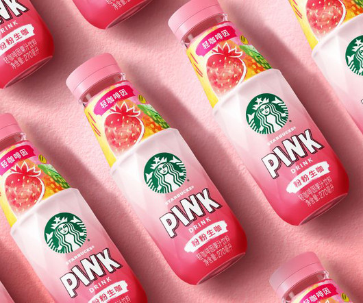
The rebrand brings a sense of freshness and flair that matches the product's personality. Key Starbucks RTD equities remain intact, anchoring the product within the broader brand portfolio, but fresh elements elevate the experience. Design-wise, the label balances familiarity with flair.
This trend takes inspiration from the past’s vision of the future, often characterized by neon colors, metallic accents, bold geometric shapes, and vintage typography. Graphic Design Elements: Designers use retro-futuristic color schemes and typography to create posters and social media graphics.
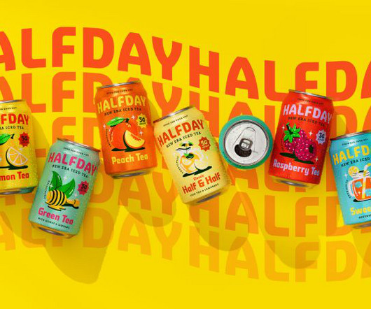
HALFDAY, known for its prebiotic iced teas with all-natural ingredients and reduced sugar, already had a product that ticked all the functional boxes. The classic taste sitting at the heart of HALFDAY's product was inspired by those '90s brands," Bruce says, "so it felt natural to capture that spirit but modernise it for today's audience."
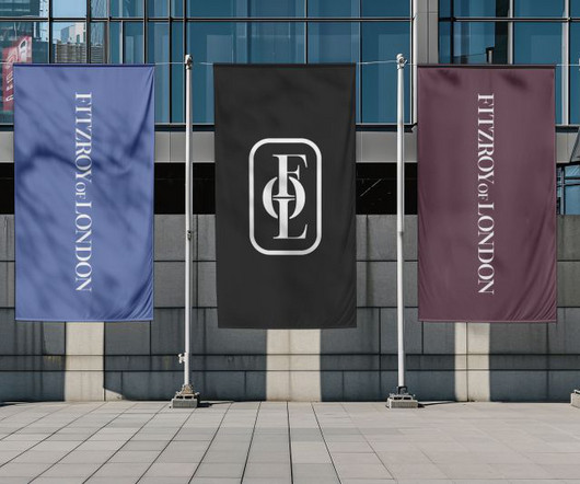
Studio Up North (SUN) has rebranded accessible bathroom designer and manufacturer Fitzroy of London, giving it an identity that reflects the craft and quality of its products while unifying its portfolio under one name. It conveys the emotional appeal of the products to win a lasting place in customers' minds.
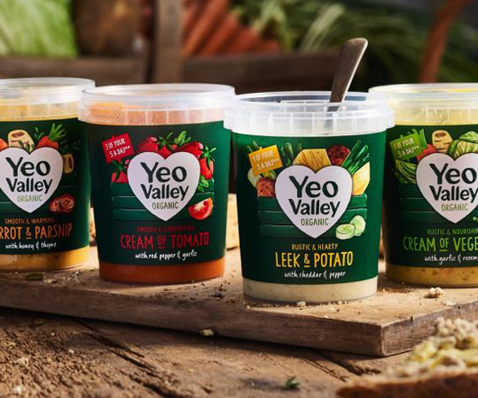
New illustrations are a key part of the brand's new identity, designed to help its new Greek and Kefir products stand out on the shelf. London-based B&B studio has revamped Yeo Valley Organic's entire visual identity and product range architecture through a combination of small tweaks and more dramatic overhauls.
Typography is a funny thing because while it's largely based on fundamental, eternal principles, it nonetheless continues to evolve year after year. RST Thermal by Reset RST Thermal is a variable font that blends classical typography with modern design, focusing on balance and contrast.
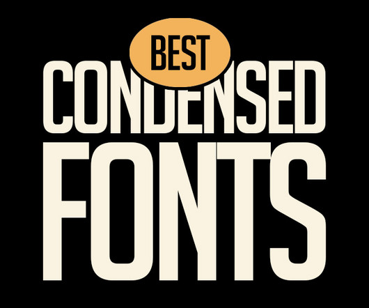
Homura Condensed Font Homura is a sans-serif display font that is inspired by newspaper headlines and modern typography. Perfect for Logos, greeting cards, quotes, posters, branding, business cards, postcards, movie titles, blog headers, art quotes, typography, magazines and more.
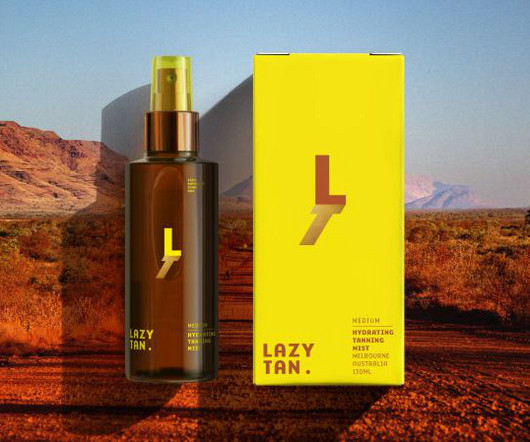
Through its identity, Lazy Tan wanted to spotlight its hassle-free product and celebrate sun avoidance as a smart, modern choice. Ultimately, it positions sun avoidance as a smart, stylish choice rather than a limitation and visually represents the product's promise of achieving a natural glow without damage or worry.
These sessions revealed the need for nuance and flexibility in online readability and accessibility and how disabled people should be depicted in photography, and they influenced the studio's approach to typography, iconography, and illustration. Not only this, but Manchipp says, "it's far easier to apply across all media".
Its unique flow and style makes it perfect to use for prints, logos, logos & branding, invitations, stationery, wedding designs, social media posts, advertisements, product packaging, product designs, labels, photography, watermarks, special events or anything. Download Corza Brush Font Hi Ladies and Gentleman !
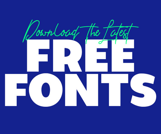
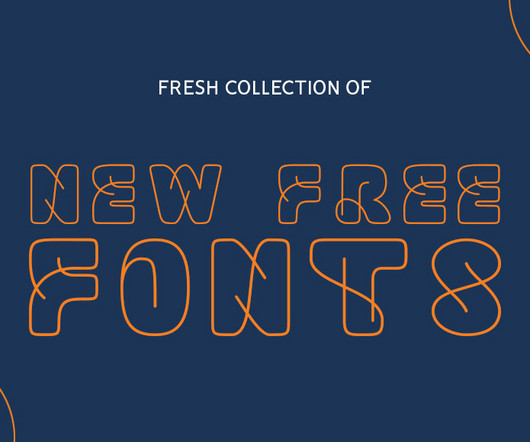
Using the latest free fonts and fresh typography styles can instantly improve your work and keep your designs looking modern and creative. Whether you’re designing a logo, creating typography for brochures, or working on brand guidelines, the latest free fonts can be a game-changer.
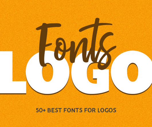
Vaqoeng Modern Magazine Font Logo Font You may also like: 100 Best Free Fonts For 2025 10 Top Visual Trends for 2025 Typography in 2025: Modern Font Trends for Engaging UI 70+ Best Japanese-Style Fonts for Modern Design and Branding Explore 50+ Best Fonts For Logos One of the most effective approaches to logo design is to keep it simple.
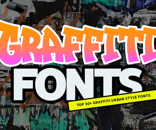
From street to screen, top graffiti fonts for stunning typography and lettering. Whether youre looking for the best typography fonts for logos, eye-catching titles, or dynamic backgrounds, this list has you covered. The beauty of graffiti fonts lies in their ability to combine artistry and functionality.
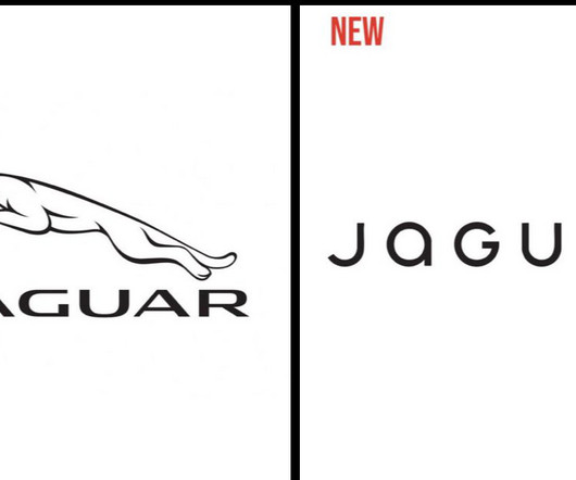
The typography is less “agressive”, with rounded lower-case letters and much bigger letter-spacing. Although inclusivity is a noble cause, it should not take over the main product in the company’s ads. Following a global trend, it takes a much more minimalist approach, going as far as removing the jaguar drawing.
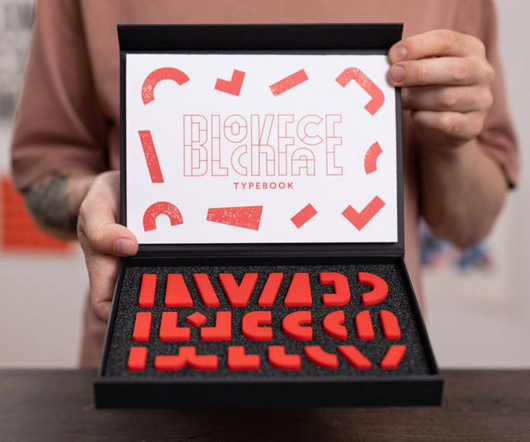
We spend so much time working in digital nowadays it's hard to remember that for hundreds of years, typography was a purely physical medium. BlockFace is a stamp kit designed to help you explore typography and more. Designed by graphic artist Will Mower, it's essentially a modular typography printing kit that's very easy to use.
Creating efficient, consistent, and flexible typography for digital platforms using modern design system principles. At the heart of this approach is typography , which is how we make text look and feel. A strong typographic framework simplifies development and makes products easier to maintain.
Keitaro Japanese Font Style Perfect for your design projects like logos, branding, advertising, product designs, stationery, magazine designs, book/cover title designs, photography, art quotes, special events, labels, product packaging, and more. Embrace the beauty of Japanese typography with “Japan Daisuki.”
The goal of the rebrand was to better communicate the urgency of WRAP's ambition to reform unsustainable 'take-make-dispose' production systems in favour of more sustainable and circular ones. Global environmental action NGO WRAP has a new informative yet striking identity, designed by the London-based studio Among Equals.
Today's audiences are craving authenticity, with brands shifting from selling products to experiences and human connections. Taking inspiration from luxury fashion houses like Louis Vuitton, Gucci and Fear of God, this trend amplifies visual impact and creates strikingly modern aesthetics, especially when paired with clean typography.
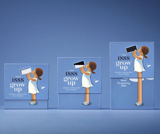
From soft, retro-inspired illustrations to packaging that demonstrates the product's effects, Them 1888's new milk powder brand is set to stand out among competitors. Milk powder isn't exactly a staple product in Western countries and I don't mean baby formula; I mean a powder alternative to the pints of milk we have in our fridge.
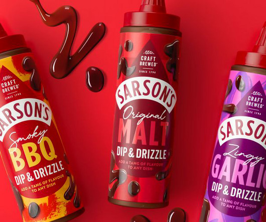
Robot Food has partnered with Sarson's on a new omnichannel advertising campaign, brand world toolkit and packaging design coinciding with the vinegar brand's first piece of new product development in 230 years. Robot Food took a simple approach to typography and didn't want to overcomplicate the identity with unnecessary additional fonts.
Their recent rebrand for Wise brought the idea of ’The World’s Money’ to life across every part of the brand experience, their new identity for Papier showcased the magical power of stationery, and their transformation of pet product brand Omlet included a charmingly tactile illustration style.
Originally from Denmark, Julie Solvstrom has become a leading light in Vancouver's creative community with her beautiful, organic approach to illustration and typography. This led to a collection of beer labels for Silverstream Brewing, a vegan cookbook titled Plant-Based Banquet, and a series of skincare products I named DANSK," she says.
As a result, the approach shifted from a fashion expansion to a brand evolution, with M N Associates focusing on designing bold, ownable assets to ensure instant recognition across products, packaging, and campaigns. From analysing both global sneaker brands and Vietnam's growing streetwear scene, M N Associates noticed two key points.
This unique product stands out on the shelves thanks to a vibrant and bold visual identity created in-house. This reinforces the product's plant-based nature. The typography, in turn, is bold and playful, using friendly sans-serif fonts that keep the design approachable while still feeling premium.
Micky England, senior product manager at Teenage Cancer Trust, praised the collaboration, saying, "It's been an absolute pleasure to work with Anthony Burrill, Mike Dolbear, and the outstanding drummers on these incredible pieces for our online shop.
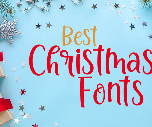
Be it a hand-lettered Christmas card or a stunning holiday menu design, your work could inspire others to embrace the magic of typography this season. Download Jolystmas Font Jolystmas is perfect for any titles, logo, product packaging, branding project, megazine, social media, wedding, or just used to express words above the background.
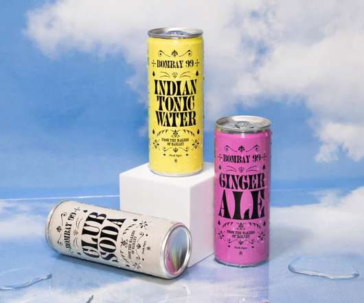
Available in cans of 250ml and 150ml with three key flavours, Walsh and her team were appointed to create the branding and packaging design for the launch of the new product line. Considered a pioneer in the Indian beverage industry, the company has created innovative products and iconic brands since 1985.
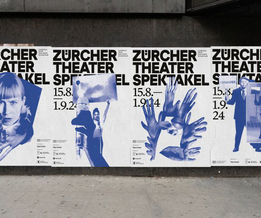
Studio Marcus Kraft has collaborated with renowned illustrator Bráulio Amado on the Zürcher Theater Spektakel 2024 campaign, which uses expressive, photocopied collages with images from the invited international productions. The source material for the campaign collages consists of images from the invited productions.
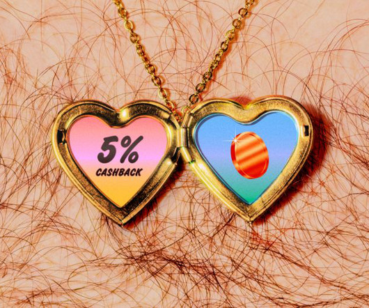
The new brand extends across marketing initiatives, website, and product interactions and revolves around the core concept, 'Fluz empowers you to maximise your money'. Typography and colours At the centre of the new identity is a bold and confident wordmark.
So, every year, we gather intelligence from creative leaders to inform you about the latest typography trends bubbling up within the industry. Read on to discover how designers and brands alike are set to navigate the complex terrain of typography in 2025, balancing functionality with flair and tradition with innovation.
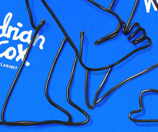
And he's teamed up with rising star illustrator Con McHugh to create a visual world that's as fresh and vibrant as the music itself, including album artwork, typography and an animated event poster. Internationally acclaimed jazz clarinettist Adrian Cox is set to release a new EP. It needed to feel timeless but contemporary."
In other words, Influur are on a mission to solve a bigger problem within the creator industry: brands using creators to promote their products, but not compensating them fairly. "If The studio developed an adaptable identity system that includes a round wordmark that helps inform brand shapes, patterns, product design and motion.
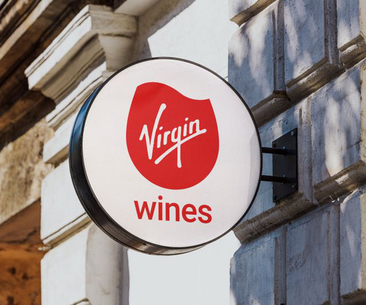
Virgin Wines has introduced its first major rebrand in two decades, including a fresh logo, colour palette, and typography. This choice not only ties back to the product itself but also helps maintain a connection to the broader Virgin brand's identity.
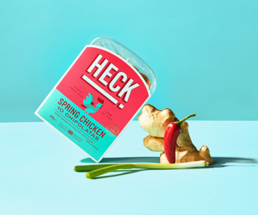
Developed in partnership with global design consultancy Elmwood , it's all designed to appeal to a younger audience by tapping into new trends and create a basis for long-term product development. products are being in UK supermarkets, titled the Sausage Bomb and Sausage Rashers. sausages, burgers, mince and meat-free products.
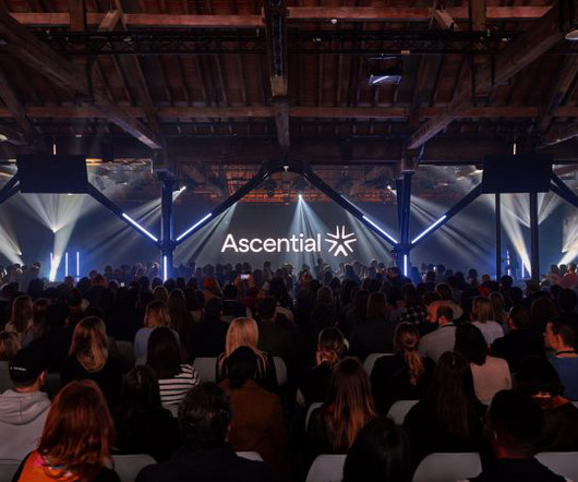
Following the recent sale of its digital commerce and product design businesses, Ascential has become more streamlined and focused on events serving the marketing and fintech industries. The lead brand colour, Ascential Yellow, acts as a spotlight highlighting UI, typography, and data to tell stories.
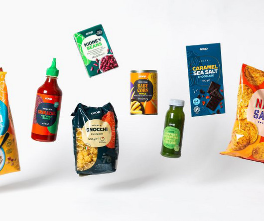
Swedish studio Bercow is helping the Nordic retailer reimagine 3,500 products across four countries, harmonising diverse market identities through clever use of a superellipse. The project began in spring 2022 and is now coming to fruition as the first products featuring the new designs hit shelves in Sweden, Denmark, Norway and Finland.
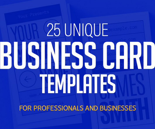
Download Professional And Minimalist Business Cards Download Big Bold Typography Business Card Template This business card is perfect for your personal or business information, such as your name, job title, contact details, and logo. Design is clean and professional. Download Why Choose These Business Card Templates?
Free fonts are essential in design, as typography shapes the overall look and feel of any project. These new fonts come from all popular categories, including serif, sans-serif, script, display, and more, ensuring that you always have the perfect typography for any project. Vertiger Font Opening 2025 with a new free font.
We organize all of the trending information in your field so you don't have to. Join 66,000+ users and stay up to date on the latest articles your peers are reading.
You know about us, now we want to get to know you!
Let's personalize your content
Let's get even more personalized
We recognize your account from another site in our network, please click 'Send Email' below to continue with verifying your account and setting a password.


Let's personalize your content