This site uses cookies to improve your experience. To help us insure we adhere to various privacy regulations, please select your country/region of residence. If you do not select a country, we will assume you are from the United States. Select your Cookie Settings or view our Privacy Policy and Terms of Use.
Cookie Settings
Cookies and similar technologies are used on this website for proper function of the website, for tracking performance analytics and for marketing purposes. We and some of our third-party providers may use cookie data for various purposes. Please review the cookie settings below and choose your preference.
Used for the proper function of the website
Used for monitoring website traffic and interactions
Cookie Settings
Cookies and similar technologies are used on this website for proper function of the website, for tracking performance analytics and for marketing purposes. We and some of our third-party providers may use cookie data for various purposes. Please review the cookie settings below and choose your preference.
Strictly Necessary: Used for the proper function of the website
Performance/Analytics: Used for monitoring website traffic and interactions
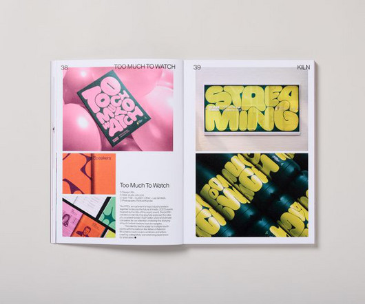
In an era when attention spans are dwindling and visual overload has become the norm, Counter-Print's new book celebrates the transformative power of expressive typography. It led to a book that considers the challenges of visual clutter by showcasing typography as a bold and innovative medium.
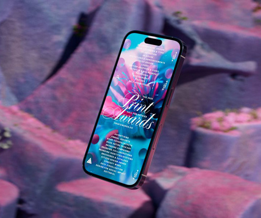
The awards' new visual identity embodies organic growth as a metaphor for creativity, blending generative design and dynamic typography. The PRINT Awards have long stood as a beacon of excellence in design, celebrating bold creatives pushing the boundaries across all mediums.
Typography is evolving rapidly, reshaping how we perceive and interact with digital designs. This article delves into the latest typography innovations that promise to make digital interfaces more engaging, accessible, and visually appealing. Minimalist and Clean Typography The “less is more” approach remains popular.
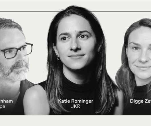
In the design world of 2025, typography is becoming increasingly important. In a discussion chaired by Frontify's Digge Zetterberg, design experts Katie Rominger from Jones Knowles Ritchie (JKR) and Phil Garnham from Monotype peeled back the layers of contemporary typography, and looked to where it's currently heading. What material?
Pro tip: Work with a professional designer to avoid post-print regrets. Optimize Typography for Readability Fonts should be: Limited (2–3 max). Test for Clarity Before printing: Can the message be understood at a glance ? Consider: Bus stop ads vs. window posters vs. large billboards Placement constraints (e.g.,
It's clear that typography is a primary consideration throughout the characteristically understated, smart, timeless aesthetic of Vanderbrand's work. Again, the typography selection is superb, using Hal Four Grotesk by Studio HanLi, GT America by Grilli Type, and Burgess Pro by Colophon.
The rebrand draws heavily on the museum's iconic modernist architecture by Lina Bo Bardi, using a red-and-black colour palette and strong typography to reflect the building's striking visual presence. HONDO Based between Palma de Mallorca, Spain and London, HONDO specialises in branding, editorial, typography and product design.
These sessions revealed the need for nuance and flexibility in online readability and accessibility and how disabled people should be depicted in photography, and they influenced the studio's approach to typography, iconography, and illustration.
As we delve into graphic design trends 2025 , web design trends 2025 , and logo design trends 2025 , we’ll also highlight the influence of AI, typography innovations, and sustainable practices. Whether you’re a designer, marketer, or brand strategist, staying ahead of these trends is essential to creating relevant, impactful designs.
Typography is a funny thing because while it's largely based on fundamental, eternal principles, it nonetheless continues to evolve year after year. RST Thermal by Reset RST Thermal is a variable font that blends classical typography with modern design, focusing on balance and contrast.
Verònica Fuerte, Founder & Creative Directress of Hey Print by Hey Studio Sweatshirts by Hey Studio Work by Hey Studio for Arrels 6. The studio is widely celebrated for its bold use of colour, form and typography, pushing the boundaries of what branding and design can achieve. KALW by COLLINS KALW by COLLINS KALW by COLLINS 25.
The Power of Fonts in Modern Design Typography is more than just arranging letters; its about evoking emotions and communicating messages effectively. Modern designers often seek typefaces that combine aesthetic appeal with functionality, ensuring their designs look great on everything from mobile screens to print materials.
Homura Condensed Font Homura is a sans-serif display font that is inspired by newspaper headlines and modern typography. Perfect for Logos, greeting cards, quotes, posters, branding, business cards, postcards, movie titles, blog headers, art quotes, typography, magazines and more.
Japan Bento Japanese Style Display Font Japan Bento, Inspired by Japanese Kanji Typography. This makes Japanese fonts popular in written communication, both in print and digital media, with the ability to create a unique and captivating impression. Embrace the beauty of Japanese typography with “Japan Daisuki.”
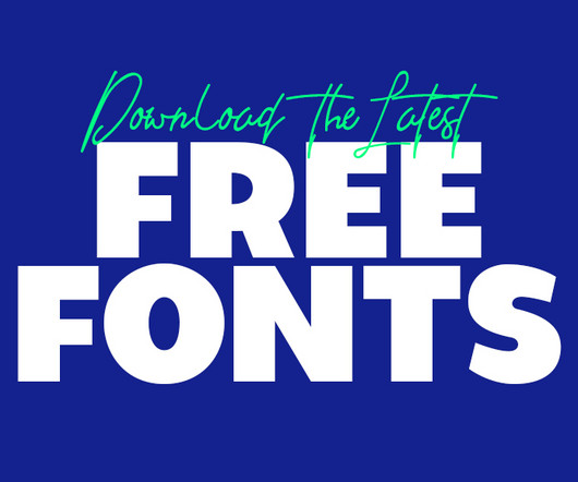
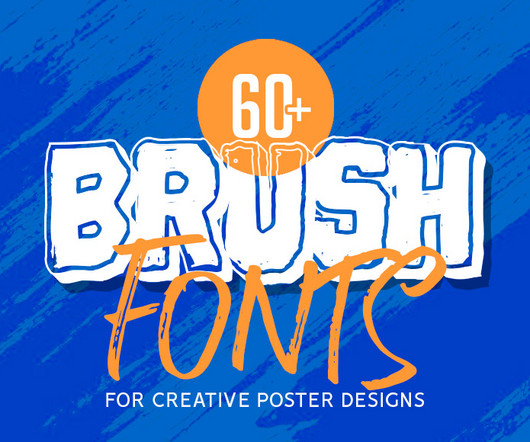
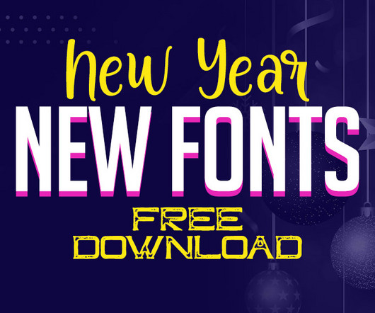
Using the latest free fonts and fresh typography styles can instantly improve your work and keep your designs looking modern and creative. Whether you’re designing a logo, creating typography for brochures, or working on brand guidelines, the latest free fonts can be a game-changer.
The second month of 2025 brings us a rich harvest of new typefaces that perfectly illustrate typography's dual nature: serving designers' practical needs while pushing creative boundaries. marks a significant evolution in accessible typography. million API serves in a single week, its impact on everyday typography is already profound.
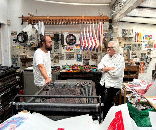
Alan Kitching, one of the most celebrated letterpress printers of our time, is bringing his work to Madrid for a new exhibition that explores heritage, craftsmanship, and the evolving role of print in a digital world. Yet, despite his accolades, his passion remains rooted in the hands-on craft of printing.
Its unique flow and style makes it perfect to use for prints, logos, logos & branding, invitations, stationery, wedding designs, social media posts, advertisements, product packaging, product designs, labels, photography, watermarks, special events or anything. Every letter has a unique and beautiful touch.
Typography is a vital element in any creative project, setting the tone and conveying the message with style. Typography trends are constantly evolving, and staying ahead of the curve means experimenting with new styles that can elevate your work.
This trend takes inspiration from the past’s vision of the future, often characterized by neon colors, metallic accents, bold geometric shapes, and vintage typography. Graphic Design Elements: Designers use retro-futuristic color schemes and typography to create posters and social media graphics.
They are a creative playground where typography, shapes, and symbolism converge. Their flexibility allows designers to adapt them for any medium—be it digital platforms or print materials. Ideal for packaging, merchandise, or branding, they offer a dynamic way to communicate values and aesthetics.
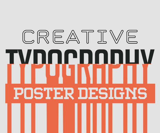
Typography can make or break a poster. Great poster typography is about more than picking a good-looking font. There’s no single “right” size, but trust your eye and test your design by zooming out or printing a sample at scale. Well-spaced typography feels easier to read and more professional. Is the key message clear?
Print-on-demand websites like Printful are a great place to start. Unique TypographyTypography breathes life into a brand’s presence, infusing character into a logo or ad. Crafted mindfully, typography becomes more than words—it narrates a tale. Where do you start? Your brand is worth it!
Her approach to lettering demonstrates a deep understanding of how typography can carry cultural meaning and emotional weight. Describing her work as "textural, playful, wobbly, offbeat and fun", she likes to combine hand-drawing and mark-making with digital colours and print-making techniques.
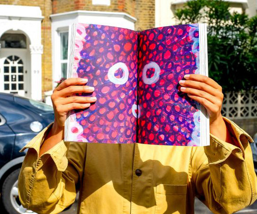
With just 100 signed copies, the artist's book blends playful illustrations with bold typography and bespoke craft details, marking a new chapter in editorial design and creative collaboration. Typography also plays a crucial role in the book's design language.
As AI tools generate polished, predictable content, the role of typography has fundamentally shifted. Consequently, understanding the key typography trends in 2025 is not just an aesthetic exercise—it is a strategic necessity for anyone looking to communicate with clarity and impact. These fonts feel crafted and personal.
Typography has always been a powerful tool in design, blending the art of arranging text with creativity to convey a message. With the advent of printing presses and later, digital technology, typography began to evolve rapidly. Timeless Appeal Unlike other design trends, typography is timeless.
Designed by Blackcatstudio for Adobe Illustrator, this Swiss Graphic Design-inspired poster template embraces the hallmarks of Swiss typography with precision and elegance. Typography takes center stage here, with the typefaces beautifully echoing the classic, clean-cut Swiss tradition, particularly the iconic Neue Haas Grotesk font.
Whether you’re creating a print publication or a simple mockup, they offer a professional look. From there, typography helps to inform readers and create a mood. Combine bold typography with product shots or illustrations to catch the reader’s eye. Use big, bold photos and typography to style your product.
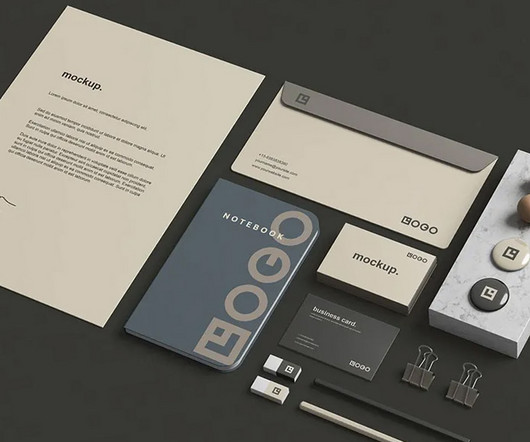
Many free stationery mockups are created with high-quality resolution, ensuring that even the most intricate details, such as logo placement and typography, appear crisp and professional. These resources come in a variety of styles and formats, allowing for a personalized and versatile approach to design.
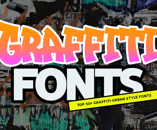
From street to screen, top graffiti fonts for stunning typography and lettering. Whether youre looking for the best typography fonts for logos, eye-catching titles, or dynamic backgrounds, this list has you covered. Print or digital, Graff Burner will catch the attention of your audience. Give it a go and see your brand grow.
With its 16 pre-designed pages, this template offers a versatile, customizable solution for both digital and print portfolios. With a few clicks, you can modify elements like color schemes, typography, and images. The template is A4-sized, making it suitable for both print and digital formats.
Opening with personal journeys The festival's opening set the tone perfectly, with Astrid Stavro, president of the International Society of Typographic Designers and a former Pentagram partner, taking audiences on an intimate journey from her childhood growing up around a printing press in Italy to her studies under Alan Kitching.
Typography is a cornerstone of design, shaping the way people perceive messages and ideas. Lets unravel some of the fascinating tales behind the names of iconic typefaces and see how they shape the way we view typography today. Renner envisioned it as the future of typography. ” But why the name “Futura”?
30 Best Modern Fonts for Web and Print Design You know that moment when you see a beautifully designed poster or website, and you can't entirely focus on why it looks so good? Characteristics of Modern Fonts Minimalist Fonts As we dive deeper into the typography universe, let's discuss minimalist fonts.
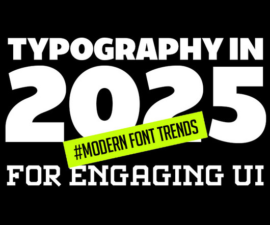
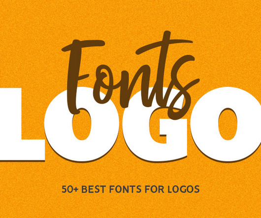
Vaqoeng Modern Magazine Font Logo Font You may also like: 100 Best Free Fonts For 2025 10 Top Visual Trends for 2025 Typography in 2025: Modern Font Trends for Engaging UI 70+ Best Japanese-Style Fonts for Modern Design and Branding Explore 50+ Best Fonts For Logos One of the most effective approaches to logo design is to keep it simple.
As new pages, features, and marketing materials are added, inconsistencies in colors, typography , imagery, and layout can sneak in. A visual design audit is a structured review of your product’s visual language, everything from your logo and typography to UI components, imagery, and spacing. Be thorough, but don’t sweat every pixel.
Vector files ensure that logos maintain their quality and sharpness across various mediums, from digital screens to large-scale print applications. Creative and Media Services For companies in creative fields, several logos showcase playful shapes, bold colors, and unique typography.
Learning about Typography: The Typography Primer Book was actually first published waaaay back in the day, circa 2000, but the contents are still very relevant over a decade later, and includes Glossary of Typographic Terms. I’ve printed mine out, and actually had it spiral bounded and laminated. Serif & Sans Serif 3.
Designed for modern creatives, this collection taps into typography and geometric shapes, embracing bold, trend-oriented aesthetics that appeal to the needs of today’s designers. High-Resolution PNGs: The PNG files, with the same high resolution as the shapes, ensure crisp and clear typography for any screen or print project.
The perfect balance of striking images, crisp typography, and clean columns doesn’t happen by accident. A high-quality print magazine layout can be the foundation you need, and this particular Adobe InDesign template, crafted by graphic designer Tom Sarraipo , is a remarkable starting point for any creative project.
Typography does much of the heavy lifting, with a single font used only in regular weight serving as the backbone of the entire identity. Across wayfinding, digital touchpoints, printed materials and even animation, the tone remains consistent, coherent, and confident without being showy. This gave us time to let things mature.
The minimal yet dynamic typography enhances the overall composition. This makes them practical for printing and mailing. Print-Ready Excellence Designed in CMYK color mode, these templates are optimized for high-quality printing. Standard Size for Convenience Each template is perfectly sized at 4.25
You can combine it to make a perfect typography design. This font is great for your next creative project such as logos, printed quotes, invitations, cards, product packaging, headers, Logotype, Letterhead, Poster, Apparel Design, Label, and etc. This font is one of our best product ever, carefully made to make sure its quality.
We organize all of the trending information in your field so you don't have to. Join 66,000+ users and stay up to date on the latest articles your peers are reading.
You know about us, now we want to get to know you!
Let's personalize your content
Let's get even more personalized
We recognize your account from another site in our network, please click 'Send Email' below to continue with verifying your account and setting a password.


Let's personalize your content