Remove inter
article thumbnail

50 fonts that will be popular with designers in 2025

Creative Boom

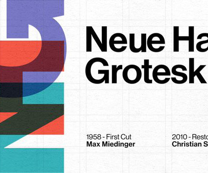
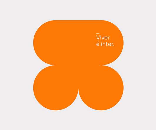
Inter by Rasmus Andersson Designed by Swedish designer and programmer Rasmus Andersson, Inter is a popular sans serif with a large x-height designed for optimal legibility across digital platforms. It features smooth curves, moderate contrast and slightly unusual anatomy.

article thumbnail

The Best Helvetica Alternatives: Top 10 Superior Fonts for Modern Design

We And The Color

Inter: The Ultimate Digital-First Helvetica Alternative Inter Font by Rasmus Andersson Designed specifically for computer screens by Rasmus Andersson, Inter is a free, open-source powerhouse available on Google Fonts. What makes Inter one of the best Helvetica alternatives for web and app design? Purchase from MyFonts 4.

Insiders

Sign Up for our Newsletter

This site is protected by reCAPTCHA and the Google Privacy Policy and Terms of Service apply.

article thumbnail

30 Best Modern Fonts for Web and Print Design

Inkbot Design

3 – Inter – Excellent for Web Design Then there's Inter. I've often chosen Inter for my app designs, and it felt like a match made in heaven! It made my text pop, and visitors commented on how easy it was to read! User-Centric: Great for modern applications and websites.

article thumbnail

Mastering typography in design systems with semantic tokens and responsive scaling

UX Collective

For instance, a token might define INTER or OJUJU as the chosen typeface. Examples of different typefaces, such as INTER, OJUJU, and others, showcasing the options for a font name token in a designsystem. Freepik Font Name (Typeface): This specifies the font family to be used, ensuring consistency throughout the design system.

article thumbnail

Font Pairing Techniques for Digital-First Brands

Design Shack

Fonts like Inter, IBM Plex, Roboto, and Source Sans offer enough range to create hierarchy without introducing a second font. Use Font Families That Offer Versatility If you want a more cohesive look, using different weights and styles within the same font family can be just as effective as mixing two separate fonts.

article thumbnail

30 Free Minimalist Fonts: Less is More in Design

Inkbot Design

Inter Inter is like that friend who adapts to every situation. I wanted it to look clean but approachable, so I selected Poppins for the headings and Inter for the body text. Its rounded edges differentiate it from other sans-serifs, offering a softer overall appearance. Uses : Branding, websites, and corporate materials.

article thumbnail

Pentagram unveils a unified global identity for the Guggenheim

Creative Boom

Guggenheim Sans, a refined adaptation of the Open Source font Inter by Rasmus Andersson, is joined by a sophisticated secondary font, Playfair. The symbol also draws on the museums' architectural forms, evoking their common geometric design while providing strong brand recognition across digital and physical spaces.