This site uses cookies to improve your experience. To help us insure we adhere to various privacy regulations, please select your country/region of residence. If you do not select a country, we will assume you are from the United States. Select your Cookie Settings or view our Privacy Policy and Terms of Use.
Cookie Settings
Cookies and similar technologies are used on this website for proper function of the website, for tracking performance analytics and for marketing purposes. We and some of our third-party providers may use cookie data for various purposes. Please review the cookie settings below and choose your preference.
Used for the proper function of the website
Used for monitoring website traffic and interactions
Cookie Settings
Cookies and similar technologies are used on this website for proper function of the website, for tracking performance analytics and for marketing purposes. We and some of our third-party providers may use cookie data for various purposes. Please review the cookie settings below and choose your preference.
Strictly Necessary: Used for the proper function of the website
Performance/Analytics: Used for monitoring website traffic and interactions
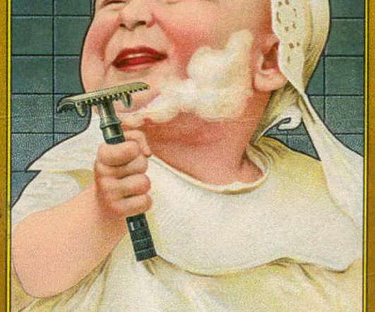
The Gillette Logo: Razor-Sharp Beginnings to Smooth Modern Design Attention business owners struggling with branding: Your logo might cost you millions of lost sales. In the next few minutes, I will show you how Gillette's logo evolution can teach you more about effective branding than any design school ever could. Yes, it's true.
Gillette The sharp, diagonal cut in the ‘G' and ‘i” mimics a razor blade's clean cut. Gap The classic, simple slab serif has been a retail icon for decades (despite a disastrous redesign attempt). Clever Wordmarks 41. London Symphony Orchestra The “LSO” letters flow together to suggest a conductor's movement.
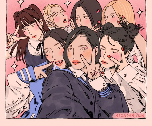
XG by Alxndra Cook We talk to Yvette Earl, Tatyana Alanis, Kyle Platts, Alxndra Cook, and Ryan Gillett – five talented illustrators who draw people convincingly and in unique styles that engage the viewer. As many an artist will tell you, illustrating people is one of the hardest skills to learn.
Artists on their books include Laurie Avon, Melissa Mathieson, Emmanuelle Walker, Parapaboom and Ryan Gillett. Headed up by director Hannah Shilland and agent and producer Sam Walker, they have expertise in commercial campaigns and communications, exhibitions, and traditional and digital media.
Ben Eliass Ben Eliass is the co-founder of Estrid, a razor brand that is challenging market leaders such as Gillette. "You also need to understand your vulnerability and actually grow and respect the opinions of others, which makes for more rounded leaders."
Over 500 corporations, including prominent names like Nike, Gillette, Omega, Nestle and Paypal, use Futura in their brand identities. Today, Futura remains a trendy font. Its clean efficiency makes it versatile for display use in logos, headlines, and small text settings. It conveys modernity, innovation and efficiency.
83 – The Gillette logo shows sharpness and precision by cutting the G and I in its brand logos. As the company strives to bring a smile to the faces of the disadvantaged. It has a smile depicting its purpose and the G depicting its name. The Goodwill logo is simple yet effective. It depicts its goodwill and purpose.
Gillette: Cutting-Edge Design One thing about Gillette’s logo is its sharpness. Did you see those angles on the “G” and “i”? It’s a small representation of how exact their razors are.
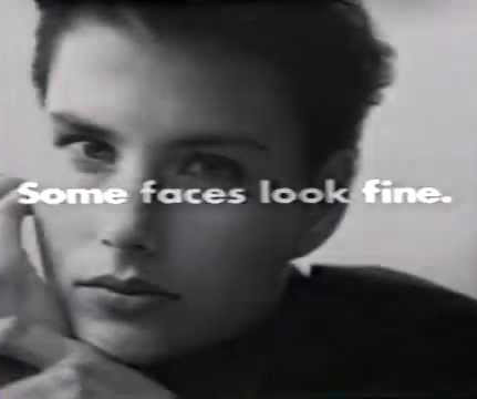
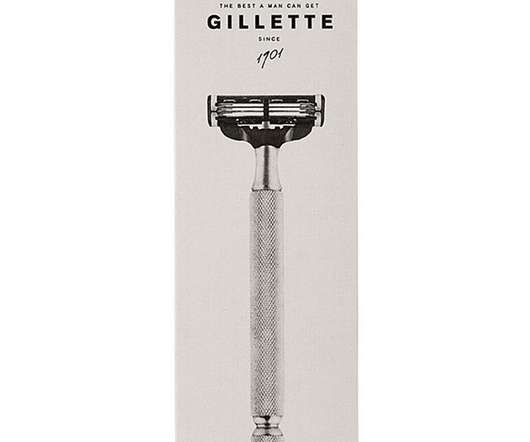
1: Gillette, “The Best a Man Can Get” (1989) Launching a Mantra That Redefined Masculinity for Generations In 1989, Gillette wanted to increase razor sales by linking daily grooming rituals to aspirational male confidence. The Silk Cut campaign demonstrated that ambiguity could be vital in carving out distinctive brand identities. #1:
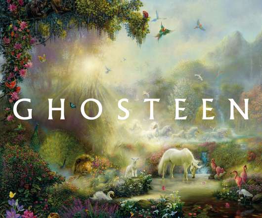
After years of working on illustrations for household names – including Quaker Oats, McDonalds, Nintendo and Gillette – duBois turned his hand to making paintings inspired by his Christian faith. The cover of Ghosteen presents a lush paradise dreamt up by Tom duBois, an American commercial illustrator turned Gospel artist.
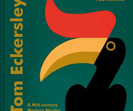
Instantly recognisable for his flat and humorous graphic style – combined with expressive eyes and bold colour choices – Eckersley worked with clients from the BBC to British Rail and Gillette to Shell.
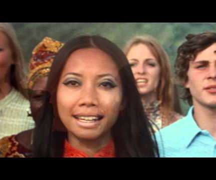
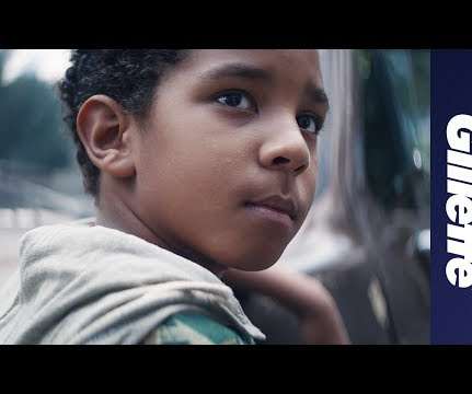
20 – Gillette: The Best Men Can Be Many memorable marketing campaigns have emerged in recent years. Gillette's campaign takes a unique approach by highlighting men's strengths and weaknesses and encouraging them to stand up for what is right.
He’s worked for world-famous clients like Mercedes Benz, Audi, Johnsons and Johnsons, Philips, Gillette, Sobieski vodka and many more. Lubo Sergeev, who works at SergeevStudio, is a super successful fine art photographer and a digital artist.
Interstate 90 and Tracks, Gillette, Wyoming. New York & Atlantic Grade, Maspeth, Queens. Studebaker Plant, South Bend, Indiana. Steelways Shipyard, Newburgh, New York. Coaling Tower, Marion, Ohio. SS American Victory, Port of Superior, Wisconsin. John Sanderson is a winner of Feature Shoot’s Reader Submission Spotlight.
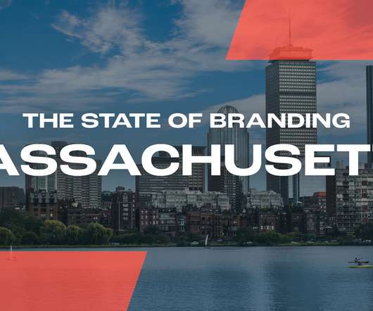
Health brand Gillette is headquartered in Boston, Massachusetts. Massachusetts revolutionized the frozen fruit industry, with Clarence Birdseye developing the first freezer to quick-freeze fish and other foods including meat, vegetables etc. The population rank of Massachusetts puts it 14th out of all 50 states. American Tower.
This includes Tide, Pampers, and Gillette. Procter & Gamble (P&G) is a well-known parent brand that oversees a range of consumer goods, each with its own distinct brand identity. While P&G is the parent brand, it doesn’t have its own product.
Gillette’s The Best a Man Can Be, for example “kicks off with it being a negative, but in a fairly short period of time it became a distinct positive” How far does a campaign go? The following year, the advert won a Creative Arts Emmy for outstanding commercial.
Examples: Gillette razors and razor blades, Xbox video game consoles and individual games, Printers and ink/toner cartridges. Cons: This model requires lots of capital to start out. Competitors selling replacement consumables that fit with your business’s base product can easily steal sales away from you. Customers might feel conned.
It showcases his signature style of bold, bright colours and flat graphic shapes, as seen in designs for clients such as the BBC, British Rail and Gillette. Over 200 designs from throughout Eckersley’s career are featured in the book.
One brand that has used their deep understanding of their avatar customer well is Gillette. On Animal Crossing, Gillette saw an opportunity to help gamers create avatars that fully reflected their ethnic identity through a ‘ skinsclusive summer line ’.
Procter & Gamble is the huge corporation behind many household brands, from Pampers and Gillette to Head & Shoulders and Tide. In a world where customers are increasingly selective about which brands they shop with, this is really important for future sales. Procter & Gamble. Massive corporation + TikTok = silly dance videos?
That’s exactly what Gillette did in their strategic sticker marketing campaign around Manhattan. Alex Powis, the co-founder of Stickerarchive , says, “Slapping a sticker up … is instant, whereas graffiti takes time and guts. It’s like coded messaging.” Instead of splashing the cash on flashy billboards, the brand used what was already there.
65 – The Best a Man Can Get – (Gillette) This phrase creates a memorable association with the brand and emphasises the quality and effectiveness of Gillette's shaving products. . – (DiGiorno's) Uses a memorable phrase to promote the superiority and convenience of a frozen pizza product.
I used to sell fake boxes of Gillette blades with a piece of wood inside. Born in the southern region of Puglia in 1932, Mari moved as a child with his family to the north, where they struggled to make ends meet, and he had to rely on his precocious resourcefulness. “I 1997, Federico Motta Editore) As a college student, he studied art.
The community successfully sets them apart from incumbent competitors like Gillette. Harry’s built an online club for subscribers with access to podcasts and content around men’s issues beyond shaving gear pitch.
It correlates with Wilkinson Sword's desire to cement its role as challenger to sector leader Gillette in the face of new market entrants and direct-to-consumer offerings. Now, 200 years later, the razor brand is embracing and re-telling its story in a contemporary way, taking its heritage beyond its name with the help of B&B Studio.
It correlates with Wilkinson Sword's desire to cement its role as challenger to sector leader Gillette in the face of new market entrants and direct-to-consumer offerings. Now, 200 years later, the razor brand is embracing and re-telling its story in a contemporary way, taking its heritage beyond its name with the help of B&B Studio.
Over two decades ago, the site, a former parking lot now known as Gillett Square, underwent a drastic transformation courtesy of another London firm, HawkinsBrown. Dubbed Bradbury Works, the office and retail hub in the borough of Hackney is a paragon of the studio’s less-is-more design philosophy.
Category: FMCG Personal care & beauty – shaving & depilatories, body care, hair care, oral care, face care, fragrances Owner of the brand: Unilever Key competitors: Gillette, Wilkinson Sword / Schick, BIC, Harry’s Artyku? Dollar Shave Club pochodzi z serwisu BrandStruck.
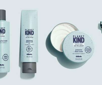
GilletteGillette’s logo features a simple but striking design that incorporates the company name in blue lettering with a sharp razor cut on the dot of the ‘I’’s, symbolizing the high precision of their blades. Pinterest The Pinterest logo is pretty straightforward. A ‘P’ inside a red circle, right?
The conglomerate House of Brands features many famous products, including Tide, Crest, Pampers, Ariel, Charmin, Always, Oral-B, Vicks, and Gillette. With global market success for over 180 years, the corporate brand has scaled its operations yet deliberately gives all the accolades to the individual brands. Even though all of Yum!’
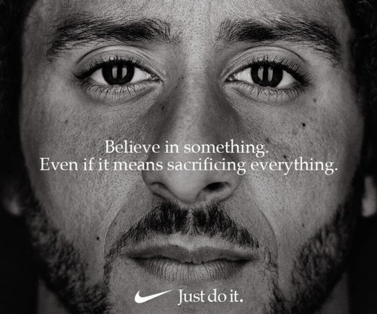
The year in advertising kicked off with some hand-wringing around brand purpose, as Gillette got out of the traps early with an advertising storm, when it released its Best A Man Can Be ad , which addressed the idea of toxic masculine behaviour.
We organize all of the trending information in your field so you don't have to. Join 66,000+ users and stay up to date on the latest articles your peers are reading.
You know about us, now we want to get to know you!
Let's personalize your content
Let's get even more personalized
We recognize your account from another site in our network, please click 'Send Email' below to continue with verifying your account and setting a password.


Let's personalize your content