This site uses cookies to improve your experience. To help us insure we adhere to various privacy regulations, please select your country/region of residence. If you do not select a country, we will assume you are from the United States. Select your Cookie Settings or view our Privacy Policy and Terms of Use.
Cookie Settings
Cookies and similar technologies are used on this website for proper function of the website, for tracking performance analytics and for marketing purposes. We and some of our third-party providers may use cookie data for various purposes. Please review the cookie settings below and choose your preference.
Used for the proper function of the website
Used for monitoring website traffic and interactions
Cookie Settings
Cookies and similar technologies are used on this website for proper function of the website, for tracking performance analytics and for marketing purposes. We and some of our third-party providers may use cookie data for various purposes. Please review the cookie settings below and choose your preference.
Strictly Necessary: Used for the proper function of the website
Performance/Analytics: Used for monitoring website traffic and interactions
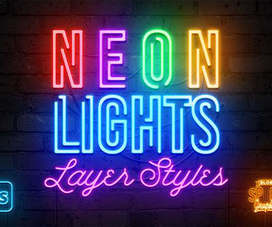
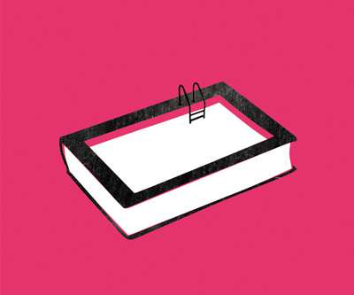
Easily create colourful neon signs with this collection of ready-made neon lights layer styles for Adobe Photoshop. A combination of effects produces a realistic neon tube with a glossy appearance that can be illuminated with a bright glow in a variety of colours. Choose from 15 vivid hues and apply the effect with a single click to transform basic linework into a vibrant neon sign, then finish off your artwork with a choice of 4 backgrounds, ‘broken’ or ‘off’ tube styles, plus a useful ‘cable’
You’re probably familiar with Athena Calderone , or at least her name, if you have a foot in the design world. The multi-hyphenate is an interior designer, author, entertaining expert, and EyeSwoon founder, that just partnered with Crate & Barrel to launch her first-ever whole home collection. The 137-piece collaboration covers everything from large furniture pieces to dinnerware, and everything in between, meaning you could decorate your entire place top to bottom with her collection.
Adobe Photoshop is a powerful platform for designers, but sometimes it may seem lacking of features that can help improve productivity and workflow and make life just that much easier. Luckily for us, Photoshop supports using an extension or a plugin, which help extend its capabilities. And lucky for you, we have collected some of the best and free Photoshop plugins available out there.
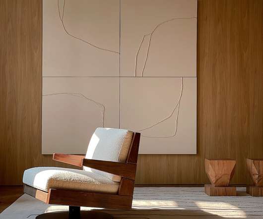
One look at the new T4 furniture series and you’ll probably feel a sense of nostalgia coming on. The collection , designed in collaboration with creative studio Holloway Li and furniture brand Uma , draws upon several familiar design inspiration, including the golden age of Cool Britannia and 90s television iconography (namely, the era of chat show sofas).
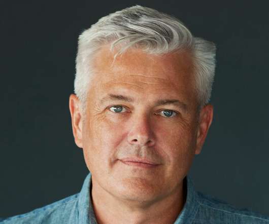
Speaker: Amber Asay, Creative Director and Founder of award-winning design studio Nice People
Understanding what trends are happening and how they’re impacting the competitive landscape is crucial to providing top dollar design strategy to your clients. With so many trends coming and going, it can be overwhelming to determine which ones you should capitalize on and which ones might not be worth the trouble. In this exclusive webinar with Amber Asay, we’ll explore graphic design trends that need to die, trends that are starting to pick up and why, trends that have come and gone, and how t
The further we get into the 21st century, the more contradictory the web seems to become. We have a plethora of no-code tools aimed to make things easier for novices and professionals alike. On the other hand, we see service providers that are increasingly complicated to work with. This tug-of-war is most evident when it comes to eCommerce. Yes, it’s now possible to get a basic shopping cart up and running without too much trouble.
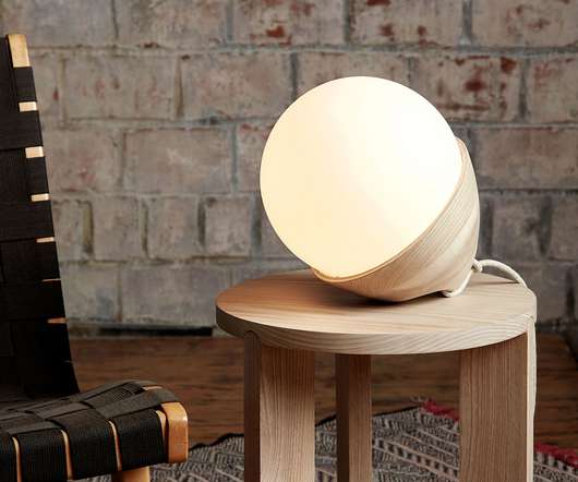
Graypants may moor their efforts across two studios based in Seattle and Amsterdam, but they’ve been adept at bridging distances and articulating a warmly cohesive crafted expression of forms across their portfolio. Their designs feel comfortable and immediately recognizable, yet delivered with modernized detailing that steer the designs toward refreshment rather than retro.
If you create videos in Adobe After Effects, you’re sure to need a lower thirds overlay. You’ll see these overlays covering the bottom third of a video and are used to add more detail. Here are three popular ways that you’ll see lower thirds used in video productions: Introducing a speaker by showing their name and title while being interviewed.
If you create videos in Adobe After Effects, you’re sure to need a lower thirds overlay. You’ll see these overlays covering the bottom third of a video and are used to add more detail. Here are three popular ways that you’ll see lower thirds used in video productions: Introducing a speaker by showing their name and title while being interviewed.
Calling all designers looking to showcase your designs on an international platform: the deadline for the A’ Design Award & Competition is fast approaching! September 30th marks the regular deadline of the competition, after which late entry fees become effective and the free preliminary evaluations on how your design would fare in the competition will no longer be provided.
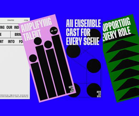
Sid Lee collaborated with Quebec’s audiovisual union AQTIS 514 IATSE to launch their rebrand. In collaboration with creative agency Sid Lee , AQTIS 514 IATSE rebrands with a bold and evocative visual universe to help propel Quebec’s audiovisual industry and its artisans to the forefront, both locally and internationally. Below you can see a few images of the branding project.
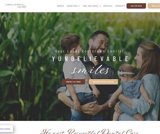
These real-world dental websites serve as inspiration if you're creating a dentist site for your own practice or for a client. The post 25 of the Best Dental Websites appeared first on Vandelay Design.
Wild Oaklands, a handwriting script font designed by Nicky Laatz. Today we want to introduce you to ‘Wild Oaklands’, an inky, imperfect script font that looks like real handwritten notes. It comes with 84 OpenType ligatures which give your typographic work an even more natural style. The Wild Oaklands font is available in two versions, regular and oblique.
Brands must create and share impactful content to thrive, but they have less people, tighter budgets, and fewer resources to do so. Learn how to publish and market digital content with the same professionalism as organizations with million-dollar budgets.
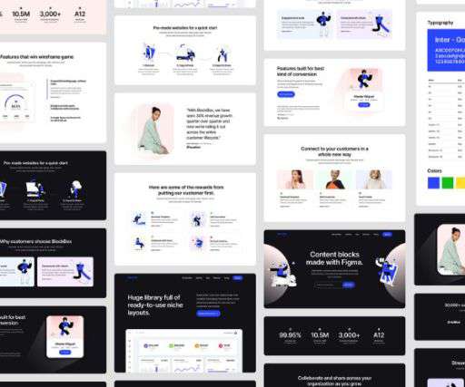
Figma is a great tool for user interface designing. It can be very time consuming to design components and layouts from scratch. This a post is a great compilation of free UI kits, which includes a range of various elements for web design or app interface. I hope you enjoy this post and exploring the […]. The post Figma free UI kits for your next design project first appeared on Creative Nerds.
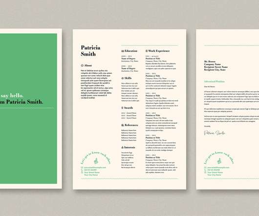
This easy-to-use InDesign resume layout is available for download on Adobe Stock. Created by graphic designer and Adobe Stock contributor @orangeberry , this fully customizable resume layout is equipped with three predesigned templates in two standard sizes, A4 and US Letter. All pages are completely print-ready. With just a few simple clicks, you can add your own image and text to the pages.
Branding, digital design and strategy for Veriff by How & How. abduzeedo 0919—22 Veriff Creating a trust movement for a freshly-minted Unicorn. How & How shared a branding, digital design and strategy project for Veriff — the company has seen near exponential growth making them the latest Unicorn to rise from Estonia’s thriving tech scene. Their ascent has been, so far, down to one thing: excellent technology that solves the very real — and very expensive — problem of identity fraud online.
Thomas Edison once said “Vision without execution is hallucination.” This statement applies not just to invention, but to graphic design. One of the greatest strengths of graphic designers is the ability to first develop a concept and then execute it to make it real. From visualization and ideation all the way through to actuation and execution, each step of this process takes skill and expertise.
September’s here and school’s back in session — what better time to brush up on the best of global architecture and design? For two weeks only, subscriptions and single copies of our award-winning magazine are 25% off. This limited-time offer is only valid until September 30. Don’t delay: Take advantage of this opportunity to bring cutting-edge architecture, inspiring interiors, groundbreaking product design and the latest industry trends right to your front door.
It is safe to say that for anyone who grew up in India in the decades following the 1950s, Air-India’s Maharaja was a very familiar face. . The airline’s potbellied, beloved mascot was instantly recognizable with his curling, oversized mustache, aquiline nose, striped turban, and serene, placid expression that can only be dubbed ‘resting Maharaja face.’ .
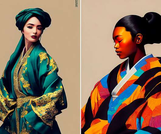
Kimono With Baroque Influence. According to an artist, behind the IG account @japan.midjourney: “I am an AI art creator and recently have been working on combining the traditional Japanese kimono with other international fashion trends. It is amazing how well global fashion blends and what kind of breathtaking creations result from these combos.
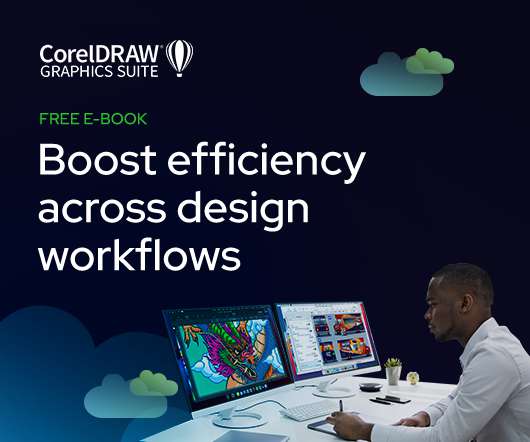
As the design industry evolves, teams are facing new challenges and a need to produce more outstanding creative work than ever. Leaders must learn how to adapt their processes to solve today’s—and tomorrow’s—unique design challenges. In this e-book, you’ll learn how to establish your creative workflow and leverage the power of CorelDRAW® Graphics Suite to streamline the entire design process, from start to finish.
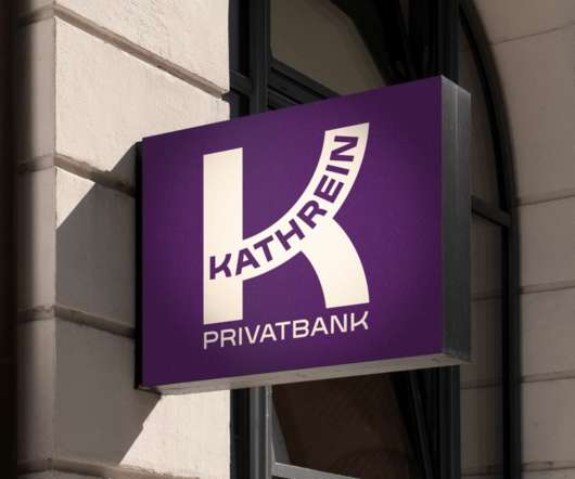
&Walsh Rebrands an Austrian Private Bank with a Personal Touch. abduzeedo 0919—22 &Walsh rebrands Kathrein Privatbank as the most personalized banking experience in Austria. Kathrein Privatbank is a leading private bank in Austria, helping clients to better live their narrative with the most personalized experience. Every product and service they offer is in the pursuit of the personal.
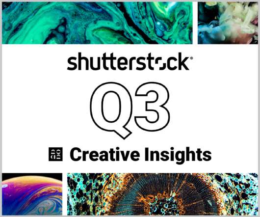
In today’s competitive markets, how do you make sure that your content not only stands out but performs well? How can you predict whether certain design choices will result in clicks, engagement, downloads, and other drivers of ROI? Shutterstock’s Creative Insights Report (Q3) is your window into the hottest trends that are transforming the creative world.
Working as a consultant in the design and construction industry, Melissa McAuliffe wanted to future-proof her job opportunities. So she took the plunge and enrolled in our Melbourne studio! . Read on to hear more about her hybrid study experience, and current job as an exhibition designer for the National Gallery of Victoria ! Why Shillington? What made our design course stand out from the rest?
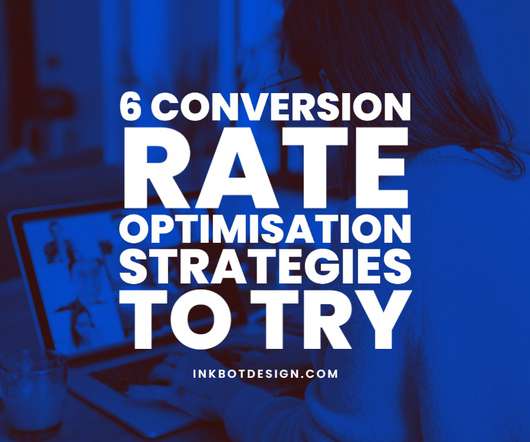
6 Conversion Rate Optimisation Strategies To Try. Conversion rate optimisation (CRO) increases conversions on web pages by changing the website's design. CRO is a form of search engine optimisation (SEO), but the two have essential differences. Conversion rate optimisation can be an overwhelming prospect. It's a lot to think about. Some of the strategies you could try might seem daunting.
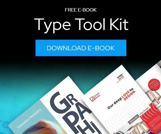
Download this free eBook to learn how you can create stunning typography, using the basics, such as placing text, to advanced controls like ligatures, variable fonts, effects, tracking, range kerning, and everything in between. Learn how to: Use Character Control to add variety to your font styles. Use Paragraph Control to manage spacing, alignment, justification and more.
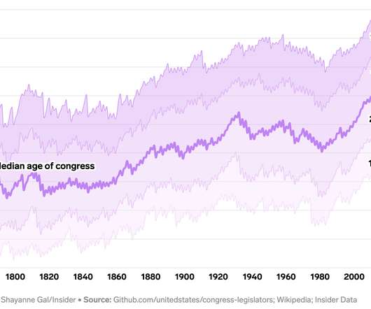
Annie Fu, Walt Hickey, and Shayanne Gal, for Insider, show the disproportionately aging government officials with a series of straightforward charts with lines moving up. You expect age across most occupations to increase with life expectancy, but this seems a bit much. See also the aging distribution over time. Tags: age , government , Insider.
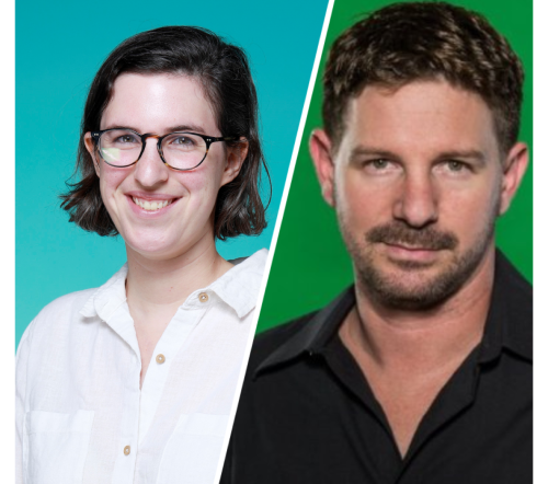
Speaker: Eden Spivak, Design Expert and Editor at Wix & Nir Horesh, Accessibility Lead and Senior Product Manager at Wix
When we design products or websites for people like ourselves, there are many others who are, as a result, left out. From visually impaired users who rely on assistive technology, to people with a temporary injury such as a broken arm, tech users are forever diverse and beautifully unique. The products we design can, and should, reflect the extremely wide range of human experiences and needs.
We organize all of the trending information in your field so you don't have to. Join 66,000+ users and stay up to date on the latest articles your peers are reading.
You know about us, now we want to get to know you!
Let's personalize your content
Let's get even more personalized
We recognize your account from another site in our network, please click 'Send Email' below to continue with verifying your account and setting a password.


Let's personalize your content