This site uses cookies to improve your experience. To help us insure we adhere to various privacy regulations, please select your country/region of residence. If you do not select a country, we will assume you are from the United States. Select your Cookie Settings or view our Privacy Policy and Terms of Use.
Cookie Settings
Cookies and similar technologies are used on this website for proper function of the website, for tracking performance analytics and for marketing purposes. We and some of our third-party providers may use cookie data for various purposes. Please review the cookie settings below and choose your preference.
Used for the proper function of the website
Used for monitoring website traffic and interactions
Cookie Settings
Cookies and similar technologies are used on this website for proper function of the website, for tracking performance analytics and for marketing purposes. We and some of our third-party providers may use cookie data for various purposes. Please review the cookie settings below and choose your preference.
Strictly Necessary: Used for the proper function of the website
Performance/Analytics: Used for monitoring website traffic and interactions
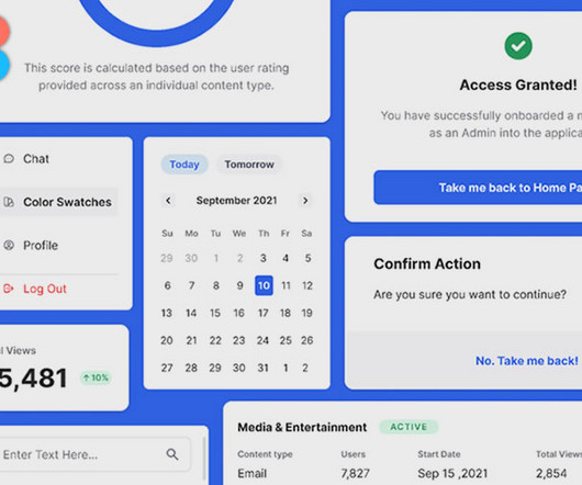
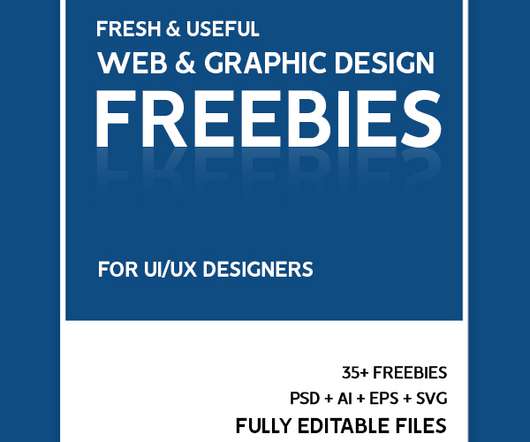
A great dashboard is both attractive and informative. Designing a dashboard from scratch is a huge task, though. If so, check out our collection of free admin dashboard templates for Figma. Dash Free Dashboard UI for Figma Give users an easy-to-navigate experience with this Figma UI template.
Real challenges designers face: The data-driven dilemma: Crafting a beautiful real-time analytics dashboard in Figma is one thing; validating smooth tooltip animations or natural chart transitions is another. Prototyping helps validate a design in its full context, reducing the risks of building something that ultimately misses the mark.
For creatives, it’s perfect for tracking client briefs, organizing assets, and even creating project dashboards that keep everything easily accessible. Notion takes organization to the next level by combining project management, note-taking, and file storage all in one place.
Next Level Data Visualization View example Next-gen data is a more complex trend made by a couple of micro trends in data visualization, where traditional static charts and dashboards are giving way to dynamic, immersive ones. Lets users create and personalize their own charts , widgets, and dashboards.
The intuitive dashboard takes the hassle out of having to remember to adjust profiles. This allows easy personalisation of settings, most crucially for the calibration of colour profiles and monitor performance if you work with an external display.
Designers are now creating holographic dashboards for cars and homes. Wouldnt you love to see your favorite brands come to life? Holographic Interfaces Are Here Holographic technology isnt just for sci-fi movies anymore. These interfaces are sleek, interactive, and ultra-futuristic.
Create Starter Layouts and Templates In addition to components, offer pre-built layouts like headers, forms, dashboards, or app screens. This helps bridge the gap between design and code and makes it easier to manage design updates programmatically.
The provided visuals show the identity applied seamlessly across various touchpoints: Digital: The website and integrated TradingView dashboard look clean and data-driven, using the pattern and gradient effectively. How does it all look in action? Pretty slick, actually.
At the same time, you onboard them through clunky processes and confusing dashboards that slow them down. Whether you're building a slick dashboard for a B2B platform, a CRM heavy on data, or an AI productivity app, they have it all covered. Still, the reality is that it doesn't matter if your design doesn't deliver.
Recall that overwhelming feeling of staring at the endless navigation, the seemingly infinite buttons on every page, the dashboard that seems like its trying to tell you an answer, if only you knew how to speak its language. What questions are going to be answered by the dashboard? Feature factoriesbad Go pull up your product roadmap.
But lately, she's been staring at her Google Analytics dashboard with growing panic. She's brilliant at what she does—creating logos that make startups look like they've been around forever and crafting brand identities that actually mean something. Once, her SEO game was solid.
Personalized Content Recommendations Mega menus are starting to behave more like smart dashboards. Large SaaS Platforms: Software-as-a-Service websites with multiple tools, dashboards, help docs, and user roles can use mega menus to centralize navigation.
So, please take a moment now: dive into your analytics dashboards, investigate those numbers, and let them inform you of your next steps. By monitoring critical metrics and adapting based on real data, you can craft a social media presence that evolves with your audience and drives engagement.
Usecase 1Amplitude smart analytics through smartqueries The shift from traditional dashboards to conversational interfaces in Amplitude illustrates how searchs evolution is reshaping professional tools. Lets explore how modern products are already embracing thisshift.
Monospaced numbers Monospaced numbers have a uniform width, allowing them to align vertically in tables, forms, and dashboards. This is especially valuable in data-dense layouts, such as tables, dashboards, or mobile screens, where space is limited and clarity is essential. This improves readability and supports clear data comparison.
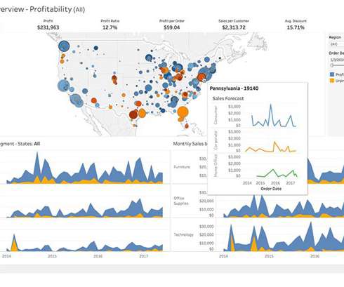
The Kinsta hosting dashboard displays data transfer alongside traffic volumes. It’s fairly easy to measure using the developer tools in any modern web browser. Often your web hosting account will include statistics for the total data transfer of any web application ( Fig 2.1 ).
The Trafft dashboard streamlines workforce coordination, letting you set employee schedules, assign services and locations, and oversee clients and staff at multiple locations in one seamless tool. Preview Brizy AI Builder Rating (average): 4.1 from 5 on Trustpilot, 4.5 from 5 on G2, 4.6 Want to see Trafft live? Click on the video.
Dashboard Statistic Powerpoint Template This dashboard statistic template offers a sleek, modern interface for presenting key metrics and KPIs. Find Data Dashboards PowerPoint Presentation Template A comprehensive data dashboard template that combines various visualization styles in one cohesive presentation.
But once installed, reality often tells a different story: slow performance, limited templates, outdated aesthetics, and bloated dashboards that require hours of tinkering. With thousands available, most promise stunning designs, lightning-fast load times, and drag-and-drop freedom.
But it kept hold of its most valuable brand codes: its name, the Mini dashboard, its proportions and the brand’s cheeky spirit. Mini and Lucozade are two such examples: in 2015, Mini reinvented itself as a fun, adventurous car brand – global but with British roots.
Through our analytics dashboards and conversations with our insights team, I noticed that merchandisers were frequently reordering elements on the page — moving product carousels up, shifting grids down — trying to optimize for engagement.
You will receive access to the Webflow dashboard after completing your registration by providing necessary information and email address verification. The integration of the cloning process will instantly generate a template duplicate inside your dashboard so you can start making changes right then.
Think internal tools, customer onboarding flows, or analytics dashboards. The winning formula is to give interns ownership of complete, small features that real customers will use, but within products that aren't mission-critical. How do I measure the success of my intern programme's impact on digital products?
Account dashboards, help centers Tie each stage together with context-aware CTAs—for instance, “See sizing guide” on a product page. Blog, resource center, FAQs Consideration “Which solutions exist?” Category hubs, comparison tables Decision “This looks right.” Product pages, testimonials, checkout Post-Purchase “Will they support me?”
For whoever's reading, if anyone still reads these long scrolls, take a look, a glimpse into the design dashboard of 2009. Bet you could even do it in Figma now, maybe I'll try, another experiment down the road. Quite something, wasn't it? Just quite something. Photoshop tutorial video Download Photoshop file Download source file
Security and VPN Solutions LastPass Business Best for: Team password management and security LastPass Business helps remote teams maintain security by providing centralized password management and secure sharing of credentials across team members.
The output of these methods can include personas, empathy maps, user journeys, and analytics dashboards. In act one, researchers might use methods including contextual inquiry, ethnography, diary studies, surveys, and analytics. Act two : Next, there’s character development.
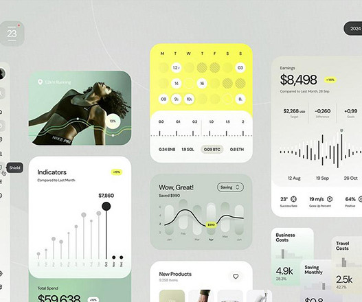
Data Visualization & Interactive Dashboards Raw numbers can be hard to understand, but data is what makes choices possible. Neumorphism can enable brands to develop a distinctive visual identity with modern yet approachable quality.
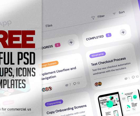
To do Dashboard Freebie. Here’s a free Figma file with a To Do dashboard concept that I’ve been working on recently. Free Shipment Dashboard – UI Kit Freebie. We Create Premium Resource for Graphic Designers to use it in your upcoming design projects. Mockup is always useful to create great presentation. Download Freebie.
Free Download To do Dashboard Freebie Here’s a free Figma file with a To Do dashboard concept that I’ve been working on recently. Mockup is always useful to create great presentation. The aim was to create a simple and clean design that makes managing tasks easier.
Dashboards. Actual dashboards. Marketers usually use dashboards to see how successful they are in business. It arranges them according to what happened when, so you have an insight into that as well. It shows all the activities and tells you when they started and when they ended.
We particularly like the cute physical dashboard mascot we presume you can have if you're a customer.asking for a friend. The colour palette is soft and uplighting with pinks, yellows, greens and off-white hues – applied across campaigns and illustrations, the company's website and other marketing materials.
Here you'll find the kind of forward-thinking mockups you won't find elsewhere: everything from exterior poster and signage mockups to premium black flag mockups, minimalist watch mockups to automobile dashboard mockups, and more.
Angela, my data analytics guru, creates dashboards on Data Studio and helps educate people on how that information can help their businesses grow. I also work with several different copywriters, photographers, videographers, social media experts and marketing folks.
You will find in this list everything from dashboard UI, landing pages, mobile apps, web app designs, screens, wireframes, and whatnot. Concise Dashboard UI Kit. Dashboards UI Kit. HR Management Dashboard UI Kit. Modular UI Dashboard. Sneat Sketch Admin Dashboard. Clean and Modern iOS UI Kit. Harmony UI Kit.
Read also: 8 Powerful VS Code Extensions for Front-End Developers Build a MERN React Admin Dashboard In this video, you will learn how to develop and deploy a stack admin dashboard using MERN (MongoDB, Express, React, Node) stack. A good source of inspiration if you’d like to improve the development experience Visual Studio Code.
Download Reuss – SEO Marketing Agency WordPress Theme Download Reveal – Directory & Listing WordPress Theme Reveal is a smart business listing & directory WordPress theme with a modern admin dashboard that will help you create a local or global directory site.
Tremor Tremor is a React library specifically designed for building dashboards. It allows you to create everything from simple to advanced complex dashboards effortlessly. It allows you to build a variety of charts, graphs, and dashboards. This is a great tutorial if you’re looking to master creative front-end web development.
This product help you create a beautiful greeting cards, wonderful invitations, dashboards and stickers for Mother`s Day. Download Mother`s Day Greeting Quotes And Cards Mother`s Day greeting quotes and cards is a unique lovely and positive lettering phrases and beautiful greeting cards to express your love and appreciation to mothers.
100+ Components 2 Dashboards 288 Icons Stickies, annotations, and flow chart lines. 28 Mobile Screens Fonts used : Karla Auto-layout Resizing Constraints Fully-Layered Free Dashboard UI Figma An important factor you need to consider when designing dashboards is to present the data clearly and simply. What’s inside?
It is a complete solution for both Employers and Candidates offering different job layouts, advanced stats, premium dashboard for each user role and advanced searching options. Cariera is a professional oriented WordPress Theme based on WP Job Manager. Preview/Download.
We organize all of the trending information in your field so you don't have to. Join 66,000+ users and stay up to date on the latest articles your peers are reading.
You know about us, now we want to get to know you!
Let's personalize your content
Let's get even more personalized
We recognize your account from another site in our network, please click 'Send Email' below to continue with verifying your account and setting a password.


Let's personalize your content