This site uses cookies to improve your experience. To help us insure we adhere to various privacy regulations, please select your country/region of residence. If you do not select a country, we will assume you are from the United States. Select your Cookie Settings or view our Privacy Policy and Terms of Use.
Cookie Settings
Cookies and similar technologies are used on this website for proper function of the website, for tracking performance analytics and for marketing purposes. We and some of our third-party providers may use cookie data for various purposes. Please review the cookie settings below and choose your preference.
Used for the proper function of the website
Used for monitoring website traffic and interactions
Cookie Settings
Cookies and similar technologies are used on this website for proper function of the website, for tracking performance analytics and for marketing purposes. We and some of our third-party providers may use cookie data for various purposes. Please review the cookie settings below and choose your preference.
Strictly Necessary: Used for the proper function of the website
Performance/Analytics: Used for monitoring website traffic and interactions
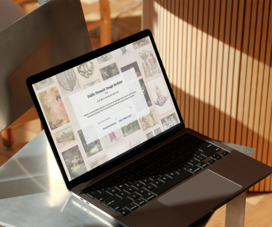
If you're seeking inspiration from centuries of visual culture and a browsing experience that is both intuitive and immersive, this might just be the platform for you. Catalogue View lets users search and browse by theme, style, date, and more, while Infinite View offers a visually immersive, 360 scrollable experience.
The 2025 report surveyed 1,000 employers representing over 14 million workers across 55 countries and identified graphic design as the 11th fastest-declining job category over the next five years. Because the latest Future of Jobs Report from the World Economic Forum (WEF) has delivered sobering news for the profession.
Their goal was to elevate Hip Pop from an indie challenger to a mainstream category leader, moving away from typical health drink aesthetics. This rebrand speaks to a growing traveller demand for authenticity and meaningful experiences, allowing Sandals to define itself as an extension of the Caribbean itself.
Conducting a visual design audit helps you identify and fix these issues before they impact your brand or userexperience. ” – Forbes Here are a few key reasons to make it part of your process: Brand consistency: Inconsistent use of colors, fonts, or imagery can weaken your brand identity and confuse users.
As w eibel explains, beyond just saving time, its about working more effectively, keeping all the parts consistent, and making sure users have a clear and organized experience [1]. User profile card showing that the consistent use of fonts contributes to a clear and organized userexperience.
These shapes help fill space in creative ways while staying user-friendly. When it comes to UI/UX design , it can bring abstract design into the mix through animations and micro-interactions that improve user flow. This makes everything feel more personal and organic—no two users will experience the same exact motion.
This Adobe Stock Christmas card template, created by DesignCoach , is designed to help users capture the spirit of Christmas professionally and appealingly. Since the template is fully customizable in Adobe InDesign, users can easily adjust colors, text, and even graphics to fit their event’s specific theme or branding.
In short, the iPad is ideal for users of Procreate, Affinity, and Clip Studio. It’s not a bad experience if you’re just drawing, but if you rely on actions or use a lot of filters, it’s undercooked. The user interface is modified to suit the format and can take a little getting used to, but both apps run really well on iPad.
In contrast, categories like sports broadcasting rely on distilled mechanics, like strong typographic systems and symbolic behaviours that scale. And when AI starts to shape motion experiences based on data, that's when things get interesting. In product-driven brands like Google or IBM, motion becomes part of a broader design grammar.
Attendees and participants can identify with these categories, making navigation through the fair more intuitive and enhancing the userexperience. This thoughtful categorization doesn’t just make the fair’s offerings visually engaging; it adds a layer of functionality to the design.
Download at YouWorkForThem Download at Creative Market Overview of the 426-Asset Collection: Boldly Modern and Versatile Vanzyst’s toolkit provides an impressive range of 426 graphic elements, split into two main categories: 322 geometric shapes and 104 letters and numbers.
The standout feature, Multiple Database Connections (MDC), allows users to query and join tables from different databases directly within WordPress. Users have access to a library of customizable templates to speed up their work. The employee and customer panels streamline management and userexperience.
It presents a clean, well-organized two-page layout , offering a streamlined userexperience ideal for both print and digital submissions. Each section — from “About” and “Experience” to “Education” and “Skills” — is organized in a way that facilitates quick, intuitive customization.
The Ratio font family from TOMO Fonts falls decisively into that second category. The clarity of the Ratio font makes it a superb choice for user interfaces. UI/UX and Web Design: The font’s high readability, even at smaller sizes, makes it a top contender for user interfaces on apps and websites.
UserExperience: Fonts impact usability in web design. A good font enhances the user journey, while a bad choice can create frustration. So go ahead, experiment, and find the perfect font that speaks to you and your brand! Let's break down some top contenders in this category. They radiate simplicity and modernity.
Think clear signage, user-friendly interfaces, and well-organized layouts. Its not just about aesthetics; its about crafting an experience. Memorable Experiences: Think about a website or app you truly love. The emotions connected with the experience will last in your memory longer. It’s functional.
The greeting card app landscape has evolved into two main categories: apps for creating and customizing cards, and apps specifically designed for emailing digital greeting cards. They’re perfect for users who want their cards to reflect their unique style and personal touch.
Designing for multiple platforms, like iOS, Android, and web, can be challenging when each system has its own guidelines, user expectations, and interface patterns. A well-built cross-platform UI kit ensures that your interfaces feel familiar no matter where users interact with them. Why Build a Cross-Platform UI Kit?
Key sections like “About Me,” “Work Experience,” “Technical Skills,” and “Portfolio” are laid out in an organized and visually digestible way, creating a logical flow that guides the reader smoothly from one section to the next. If so, feel free to browse WE AND THE COLOR’s Templates category. Subscribe to our newsletter!
Good font pairing can: Guide users through content with a clear visual hierarchy Help users identify brand voice and personality at a glance Ensure consistency across multiple platforms (web, mobile, social, etc.) This contrast helps users understand the hierarchy and adds visual interest.
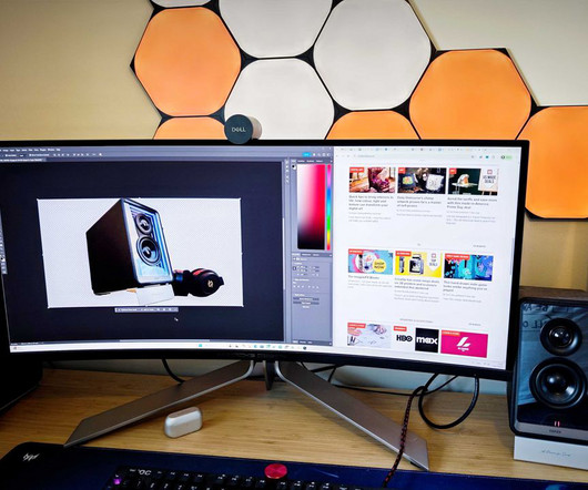
With a 240Hz refresh rate, its ideal for gamers, and the 3440x1440 resolution and 1000 nits of max brightness will be appealing to creative users too. Arriving in a box that could eat most other monitor boxes for breakfast, it told me this test wasnt going to be a subtle, unassuming experience. DisplayPort 1.4, DisplayPort 1.4,
📖 Reading Time: 5 minutes 🏷️ Categories: Design, Branding, Marketing 📅 Published: [DATE] Top 8 Free iPhone Apps Every Designer Should Know About The iPhone isn’t just a communication device; it’s one of the most underrated tools in a designer’s arsenal. Speed, safety, and accuracy define Clever Cleaner.
In userexperience (UX) design, there’s a concept called “affordance.” First, the users changed. Your Interface, Your Experience: The Future of Digital Design So, what does this cyclical journey of skeuomorphism in design mean for you? These weren’t just cute decorations. A few critical things changed.
The platform is particularly good for artists who can produce high-volume, commercially viable graphics, templates , and design elements that appeal to business users. Your digital art can be discovered by millions of users through Etsy’s internal search and even Google searches.
Generative Fill in Adobe Photoshop is a sophisticated AI-powered tool that allows users to add, remove, or modify content within an image using simple text commands. The Art of the Prompt: From Vague Ideas to Visual Reality This is where most users can elevate their results from mediocre to magnificent. The key is specificity.
In my early days of marketing, we experimented by replacing a standard email with an embedded video explaining our services. And that's the magic of video advertising—when you do it right, it's not just a marketing tool; it's an experience. It felt more integrated and less like an interruption—a credit to the viewer experience.
Users can easily insert their own content into the placeholder frames. It offers a tangible experience that a screen cannot replicate. Feel free to find other professional graphic design assets in the Templates category here at WE AND THE COLOR.
Navigation is one of the first things users interact with on a website, and when it’s done well, they barely even notice it. If your site has lots of pages or product categories, a mega menu might just be your best option. If your site has lots of pages or product categories, a mega menu might just be your best option.
Unpacking the Pixelbuddha Fractal Effect Photoshop Mockup Pixelbuddha Studio has masterfully packaged this complex visual into an incredibly user-friendly mockup. Experiment with Both Ripple Directions Before finalizing your design, always test both the vertical and horizontal ripple effects.
Accessibility Matters: Beyond the Average User Accessibility is paramount. of women worldwide experience some form of color vision deficiency. Experiment, see what resonates, and don’t be afraid to break a few rules. Your design has to speak to people where they are at, not where you think they are at.
📖 Reading Time: 5 minutes 🏷️ Categories: Design, Branding, Marketing 📅 Published: [DATE] Elevating Your Online Presence Through Strategic Branding and Digital Experiences Let's be honest—when did you last trust a company with a sketchy website? A strong brand identity can directly influence user behaviour.
After five-and-a-half years of learning, experimenting, and pushing through challenges, Flow finally made its big screen debut in March 2025 – and went on to earn around $36 million at the box office. Gints’ story proves it’s not about using the most expensive tools – it’s about vision, creativity, and having the guts to push through.
📖 Reading Time: 5 minutes 🏷️ Categories: Design, Branding, Marketing 📅 Published: [DATE] Top 10 Best SaaS Design Agencies to Work With You've got a great SaaS idea, product-market fit, and some early traction. Users expect an easy, intuitive experience — and they aren't going to hang around.
From classrooms to living rooms to office breakrooms, digital coloring is making its markand a variety of platforms are competing to provide the best experience. It’s ideal for users seeking a focused, immersive environment to relax or spark artistic joy. How to Use: Users simply choose a design and begin coloring.
But once you experience its charm, returning to anything else is hard. It's about creating thoughtful, intentional designs that speak to the user without overwhelming them. Minimalist designs often allow users to understand and navigate content without sifting through unnecessary clutter. What is Minimalism? It's a mindset.
Focus on Content: Its simplicity ensures the emphasis remains on your skills, experience, and accomplishments. Organized Sections: Key categories such as “Work Experience,” “Education,” “Skills,” and “References” are clearly defined.
In testing, the XM6 not only matches but in many cases surpasses the Bose QuietComfort Ultra, previously considered the gold standard in this category. Sony has dramatically improved its active noise cancellation (ANC) with the WH-1000XM6. Sony continues to deliver on sound quality with a refined version of its signature tuning.
This typeface is not merely another addition to the sans-serif category; it is a thoughtful and versatile tool engineered for clarity, expression, and enduring appeal, making it a vital asset for today’s designers. In print, it provides a comfortable reading experience.
Through connecting technology as we know it now to ancient technology, a narrative of civilisation’s triumph is created, a universal experience. “My Sculptor and painter Seth Steinman may have an idea: at the beginning of all technology, stones and wood. “My
This single decision can shape a brand’s voice, dictate the mood of a message, and fundamentally alter user perception. You can now subtly alter the weight of a headline as a user interacts with a page or fine-tune lettering on a package design to achieve flawless visual harmony.
The design of a magazine is the first handshake with the reader, setting the tone for the entire experience. The versatility of this design makes it suitable for a wide range of users and industries. Feel free to take a look at WE AND THE COLOR’s Templates category. Who Should Use This Print-Ready Magazine Template?
📖 Reading Time: 5 minutes 🏷️ Categories: Design, Branding, Marketing 📅 Published: [DATE] The Future of Graphic Design: Trends and Predictions Forget the crystal ball gazing into the graphic design industry. AI can create dynamic visual content that adapts to user data. The expectation of a personalised experience is growing.
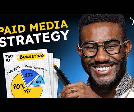
7 Ways to Transform Your Site for a Holiday Shopping Experience The lead-up to Christmas is retailers' busiest the year, catering to the rush of shoppers searching to buy the perfect gift. With US households spending an average of $1,387 during Christmas, it is a prime opportunity to create the ultimate holiday shopping experience.
The truth is most brands and users merely focus on creativity and the content aspects of a social media strategy. Its owing to this theory that followers begin to associate positive feelings with a brand once they repeatedly experience its visual style and tone of voice. Theres a psychology behind why consistency appeals to audiences.
We organize all of the trending information in your field so you don't have to. Join 66,000+ users and stay up to date on the latest articles your peers are reading.
You know about us, now we want to get to know you!
Let's personalize your content
Let's get even more personalized
We recognize your account from another site in our network, please click 'Send Email' below to continue with verifying your account and setting a password.


Let's personalize your content