This site uses cookies to improve your experience. To help us insure we adhere to various privacy regulations, please select your country/region of residence. If you do not select a country, we will assume you are from the United States. Select your Cookie Settings or view our Privacy Policy and Terms of Use.
Cookie Settings
Cookies and similar technologies are used on this website for proper function of the website, for tracking performance analytics and for marketing purposes. We and some of our third-party providers may use cookie data for various purposes. Please review the cookie settings below and choose your preference.
Used for the proper function of the website
Used for monitoring website traffic and interactions
Cookie Settings
Cookies and similar technologies are used on this website for proper function of the website, for tracking performance analytics and for marketing purposes. We and some of our third-party providers may use cookie data for various purposes. Please review the cookie settings below and choose your preference.
Strictly Necessary: Used for the proper function of the website
Performance/Analytics: Used for monitoring website traffic and interactions
Image licensed via Adobe Stock Designers should pay attention to a new report from the World Economic Forum. Worried about your job in graphic design? That's a stark turnaround from the previous report, which categorised graphic design as a "moderately growing" profession. If not, then maybe you should be.
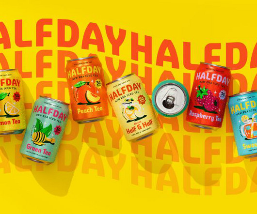
With the better-for-you drinks category becoming increasingly crowded, HALFDAY needed to ensure its functional benefits were clear, but also that the great classic taste of the liquid shone through," Bruce explains. The team chose Strippy Regular as the headline font, embracing its bold, square shapes reminiscent of '90s editorial design.
With more than 700 responses so far, these are the top winners. Porto Rocha Porto Rocha is a New York-based agency that unites strategy and design to create work that evolves with the world we live in. The studio had an exceptional start to 2025 by collaborating with Roblox on a brand new design system.
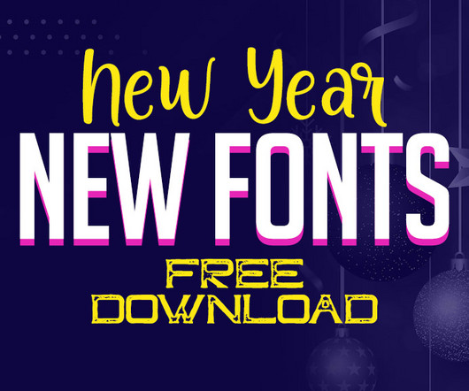
As we usher in the New Year, it’s the perfect opportunity to revamp your design toolkit with a fresh collection of fonts. Unlimited Downloads Over 1,500,000+ Fonts, Mockups, Freebies & Design Assets Mockups 6,131 items Fonts 5,191 items Download Now List of Free New Fonts: 1. Every letter has a christmas design theme.
Overall, the iPad has great drawing “feel” and all the pinch & zoom responsiveness you’d expect from a premium touchscreen. Affinity Photo / Affinity Designer – Yes Affinity Photo and Designer both work identically to their desktop counterparts. There are three main iPad models suited to artists and illustrators.
Creating efficient, consistent, and flexible typography for digital platforms using modern design system principles. When designers no longer have to reinvent the wheel for every project, the entire process becomes much smoother and more efficient. This is the beauty of a design system, it makes the whole process smoother and faster.
It's been part of branding for decades – from broadcast design to animated logos – but it's rarely been treated systematically. This led to principles such as rhythm, modularity, and responsiveness. In product-driven brands like Google or IBM, motion becomes part of a broader design grammar. It was there to support.
Over time, even the most thoughtfully designed brand or product can start to drift. That’s where a visual design audit comes in. A visual design audit is a structured review of your product’s visual language, everything from your logo and typography to UI components, imagery, and spacing. Why Conduct a Visual Design Audit?
Here’s a fresh look at what’s coming up in design for 2025! We’ll go on a hunt for bold, abstract, and naturalist designs, cutting-edge AI tools, and so much more, all pushing boundaries and rethinking what we already know about design. Here are the Top 10 Graphic Design Trends in 2025: 1. Personalization Design 7.
Whether you’re a designer, developer, or hobbyist, crafting a unique typeface can enhance branding, digital projects, and creative designs. In this guide, we’ll explore step-by-step methods and the best software to help you design your own fonts efficiently. Happy designing! <p>The Why Create Custom Fonts?
We speak with Brian Collins, renowned designer and co-founder of COLLINS agency, about championing the possibilities of design and wanting to create a space for young talent to network. Design is what we make possible". Part of his ongoing work is challenging the reductive view that all designers do is make things look good.
Black Friday is known for its blockbuster discounts across a wide range of products, including tools and resources for designers and developers. With a large and comprehensive selection of prebuilt websites supported by an impressive array of design and build features, BeTheme could claim to be the most extensive WordPress theme available.
Designing for multiple platforms, like iOS, Android, and web, can be challenging when each system has its own guidelines, user expectations, and interface patterns. This is where cross-platform UI kits come in to help streamline the design process, create consistency, and speed up development.
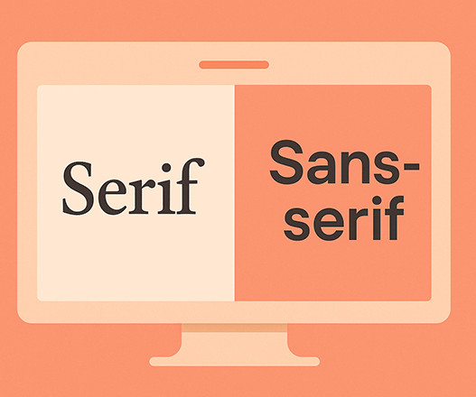
30 Best Modern Fonts for Web and Print Design You know that moment when you see a beautifully designed poster or website, and you can't entirely focus on why it looks so good? Fonts aren't just pretty letters on a screen; they're the silent communicators of your design. User Experience: Fonts impact usability in web design.
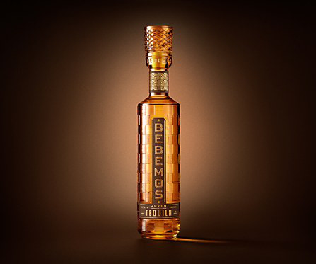
Exhibit Bebemos Tequila packaging Bebemos Tequila combines 1970s nostalgia with modern design, crafted by Chad Michael Studio. Responses by Chad Makerson Michael, designer, Chad Michael Studio. Bebemos was designed for the confident coastal soul: laid-back, liberated and driven by experience over status. Elegant but warm.
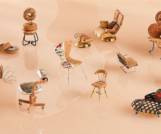
Only for a good cause… On behalf of Design Milk and humbly at the behest of our friends at Design Within Reach (DWR) , purveyors of authentic modern design I accepted an invitation and the awesome responsibility to judge the finalists competing in their Champagne Chair Contest , held in partnership with Pommery , now in its 21st iteration.
Whether you’re building a design system, creating social content, or launching a responsive website, strong font pairing gives your visuals clarity and consistency. Text has to be readable on different screen sizes, responsive within layouts, and optimized for both quick scanning and longer reads.
Words Sponsored Content — Date 16 June 2025 Sponsored Content Work Graphic Design Illustration Exhibition Sustainability This summer, New Designers returns to London for its 40th anniversary – it’s a milestone that feels as much about celebrating the future as it is about honouring the past. Get tickets for New Designers 40 here!
This guide is for the entrepreneur, the marketer, and the creator who understands this power but doesn’t have a design background. A visual identity designed for a 22-year-old tech entrepreneur will look very different from one for a 55-year-old gardening enthusiast. These words will become your creative compass. Get specific.
If you nod your head, you’ve experienced skeuomorphism in design. We entered the era of Flat Design. The story of skeuomorphism in design isn’t just a footnote in tech history; it’s a fascinating cycle that reveals how we think, how we learn, and what we crave from our technology. What Exactly Is Skeuomorphism in Design?
Okay, buckle up friends, because we’re about to talk design. Ever stared at a design and thought, That should be working, but it justisnt? This is the challenge of color for designers. This is powerful stuff when thinking about design. As a designer, you need to be aware of these cultural nuances.
📖 Reading Time: 5 minutes 🏷️ Categories: Design, Branding, Marketing 📅 Published: [DATE] 50 Simple Logos That Prove Less is More Okay, let's get one thing straight. The world of design, especially logo design, is drowning in complexity. It's a swamp of overthinking, over-designing, and, frankly, over-compensating.
📖 Reading Time: 5 minutes 🏷️ Categories: Design, Branding, Marketing 📅 Published: [DATE] Book Covers: How They Make or Break Your Passive Income We all know the phrase “don't judge a book by its cover.” However, being in charge of your publication means you are fully responsible. Your cover IS your marketing.
A wave of artificial intelligence is washing over the creative world, and for many designers, it feels like a tidal wave. The conversation around AI in design is not about replacement; it is about reframing your entire creative process. Design Isn’t Obsolete—It’s Evolving Let’s get one thing straight.
They trigger an instant “I NEED this” response. I remember a campaign at Inkbot Design where we utilised skippable in-stream ads. At Inkbot Design, we trialled out-stream ads on a blog post about design trends. At Inkbot Design, we once had a project where we aimed to launch a new design tool.
📖 Reading Time: 5 minutes 🏷️ Categories: Design, Branding, Marketing 📅 Published: [DATE] Elevating Your Online Presence Through Strategic Branding and Digital Experiences Let's be honest—when did you last trust a company with a sketchy website? Memorability in visual design involves balancing aesthetics with usability.
Words Paul Moore — Date 24 July 2025 Work Graphic Design Photography Logo Rebrand Society Branding History Good design looks good, maybe even feels good. In response, Studio Select crafted a brand look that challenged established codes and transmuted into a dialogue about why certain symbols are linked to “high taste”.
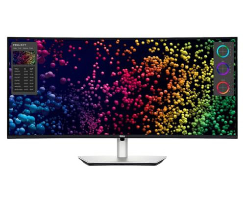
📖 Reading Time: 5 minutes 🏷️ Categories: Design, Branding, Marketing 📅 Published: [DATE] The 5 Best Ultrawide Monitors for Creatives Let's get one thing straight. Your design file is open, large and clear. When clients approve a design, they approve a specific set of colours. Most advice on buying monitors is rubbish.
But if you've spent more than five minutes in a meeting or scrolling through design briefs, you'll know there's a whole lexicon of tired, overused buzzwords that have lost all meaning. Premium If you've ever worked on a design brief for a tech company, you'll know that "premium" is a go-to descriptor.
Most designers and illustrators have considerable expenses to pay and also spend a large proportion of their time on essential unpaid work, such as marketing and admin. Some provided very helpful insight, while some responses were ignorant to the cost of running an illustration business.
That said, this is a book for designers, and to that end, I’d like to start with a story—well, a journey, really. Though I had been formally trained in graphic design, typography, and layout, what fascinated me was how these traditional skills might be applied to a fledgling digital landscape. What were the rules? Very skeuomorphic.
📖 Reading Time: 5 minutes 🏷️ Categories: Design, Branding, Marketing 📅 Published: [DATE] Top 10 Best SaaS Design Agencies to Work With You've got a great SaaS idea, product-market fit, and some early traction. Still, the reality is that it doesn't matter if your design doesn't deliver.
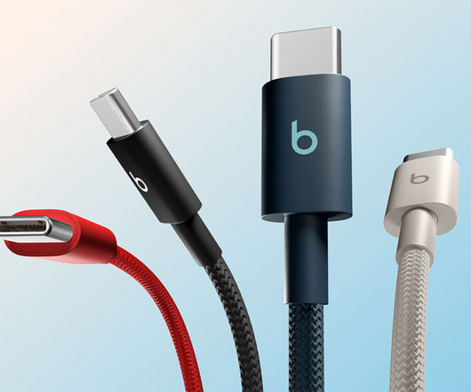
Beats by Dre may be best known for its iconic headphones and speakers, but the Apple-owned audio brand is officially branching into a new product category: charging cables. Beats Cables arent your average charging wires. Supports fast charging on compatible models and works with CarPlay and syncing.
Third, design and visuals. Brand reliability perception stems from response times, communication style, and personalization levels. Microsoft achieves visual uniformity across platforms through consistent color schemes, logo placement, and design elements. And lastly, the fourth element to focus on is tone and language.
📖 Reading Time: 5 minutes 🏷️ Categories: Design, Branding, Marketing 📅 Published: [DATE] Must-Have Branding Tools for Freelancers Who Do It All Freelancers wear many hats and juggle client work, outreach, finance, and branding alone. Branding becomes more than design in a space where first impressions are everything.
Headline font selection can make or break your design project. Whether you’re crafting a magazine cover, designing a website, or creating marketing materials, the typeface you choose for your headlines sets the entire tone and determines whether readers will engage with your content or scroll past it.
They have associations and can trigger specific emotional responses. Feel free to browse WE AND THE COLOR’s Graphic Design and Branding categories for your daily dose of creative inspiration. What are their cultural associations with different colors? These are all important points. It can also suggest danger or warning.
As AZURE heads into the 15th anniversary of our international AZ Awards program, we are announcing a longer submission period, new categories, more exposure for finalists and other perks. Trained at OCAD University in graphic and furniture design, Ghaemi has a deep interest in understanding how people see and interact with the world.
Every issue is packed with art and design inspiration Delivered to your IOS or Android device Never miss an issue From £9.99 View Deal Trending Enter Brand Impact Awards Apple WWDC Fashion x graphic design How to 3D print props Recommended reading Branding From Amazon to Adobe: is 2025 the year of the quiet rebrand?
📖 Reading Time: 5 minutes 🏷️ Categories: Design, Branding, Marketing 📅 Published: [DATE] Human-Centred Website Design: Create Empathy-Led Experiences Most websites treat visitors like data points rather than real people. When you design with empathy, you create experiences that work better for everyone.
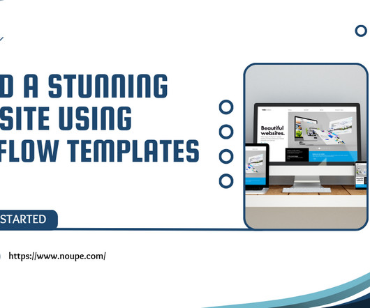
Websites that are well-designed both interest viewers and improve user experience which results in more visitors making purchases. Webflow functions as the web design solution at this point. Through Webflow users can develop responsive websites while needing minimal coding experience. Why Choose Webflow for Your Website?
Designing for everyone, not just the average When design treats users as identical, experience suffers. During my time leading design at a major e-commerce company, one project has stuck with me: a banner test that seemed successful on the surface but ultimately revealed a blind spot in our thinking.
Soon after, they suggested standardizing responses to further reduce token consumption. They ended up recreating the same old chatbot that traps users in an endless loop of generic responses, offering no real solution. Users get stuck in an endless cycle of I didnt understand responses, leading them to abandon the chatbot entirely.
Every issue is packed with art and design inspiration Delivered to your IOS or Android device Never miss an issue From £9.99 Every issue is packed with art and design inspiration Delivered to your IOS or Android device Never miss an issue From £9.99 Why not try a subscription? But what follows that initial connection?
We organize all of the trending information in your field so you don't have to. Join 66,000+ users and stay up to date on the latest articles your peers are reading.
You know about us, now we want to get to know you!
Let's personalize your content
Let's get even more personalized
We recognize your account from another site in our network, please click 'Send Email' below to continue with verifying your account and setting a password.


Let's personalize your content