This site uses cookies to improve your experience. To help us insure we adhere to various privacy regulations, please select your country/region of residence. If you do not select a country, we will assume you are from the United States. Select your Cookie Settings or view our Privacy Policy and Terms of Use.
Cookie Settings
Cookies and similar technologies are used on this website for proper function of the website, for tracking performance analytics and for marketing purposes. We and some of our third-party providers may use cookie data for various purposes. Please review the cookie settings below and choose your preference.
Used for the proper function of the website
Used for monitoring website traffic and interactions
Cookie Settings
Cookies and similar technologies are used on this website for proper function of the website, for tracking performance analytics and for marketing purposes. We and some of our third-party providers may use cookie data for various purposes. Please review the cookie settings below and choose your preference.
Strictly Necessary: Used for the proper function of the website
Performance/Analytics: Used for monitoring website traffic and interactions
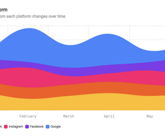
Here we explore the evolving world of line charts and how they’re shaping the nature of modern datavisualization. Line charts are a cornerstone of data storytelling. However, their design continues to evolve to accommodate our ever-demanding and real-time data needs. Sampling data based on days, weeks, months, and years.
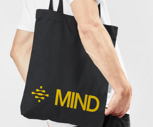
In an industry where technical complexity often translates into visual confusion, Eddie Opara and his team at Pentagram have crafted something remarkable for MIND—a data security platform that operates at machine speed. With 85% of organisations suffering data loss events annually and breach costs averaging $4.88
Throughout a 20-month collaboration, Studio Morfar delivered not only a full visual identity and website but also embedded with Kin's internal team to steer UX, product storytelling and performance marketing. Visually, that difference is clear. Studio Morfar helped us bring that to life – from the visual story to the growth strategy."
Next Level DataVisualization 9. As audiences are bombarded with visual content more than ever, abstract design can offer a fresh alternative that is complex but still approachable. View example View example In graphic design , abstract elements can create striking visuals that feel modern and free-flowing.
With no true category leaders from which to draw inspiration, Otherway instead looked beyond the sector for inspiration. "As Although mortgages are one of life's biggest financial decisions, the category has historically lacked a human touch, so incorporating authenticity and emotion was crucial.
Whether it's a clever sound on social media or a brand melody that triggers recognition on streaming platforms, audio will drive connection in a way visuals alone can't achieve. This type of communication assumes that people in the same age category naturally share similar behaviours, preferences, and values.
📖 Reading Time: 5 minutes 🏷️ Categories: Design, Branding, Marketing 📅 Published: [DATE] Graphic Designer Skills: What Design Students Need To Develop Design learners often look for ways to sharpen their talent. Whether drafting layouts for an essay or creating themed visuals, the process shapes understanding.
wpDataTables – Up to 70% Off wpDataTables is the best choice for anyone creating informative tables and charts from large amounts of complex data. wpDataTables offers an immense set of data management tools and chart-building features, while providing straightforward approaches to completing tasks. Check out BeTheme 2.
People are likelier to stop scrolling and focus on a video, mainly when it includes compelling visuals or a story. Instagram Video Ads Finally, we can’t overlook Instagram, the visual darling of social media. Navigating regulations and ensuring data protection keeps you on the right side of the law and builds trust with your audience.
This specific training data is what allows Adobe to state that the content you generate is “commercially safe,” a massive advantage for professional designers, marketers, and agencies who need to use their creations without worrying about copyright infringement. What’s Next?
So, are you ready to discover how design can become more than just visually appealing? It’s hard to engage with dry data. Use Visuals Strategically: Colors, images, and typography can all be used to evoke specific emotions. Airbnb : Airbnb’s website and app prioritize storytelling and visual appeal.
By converting a layer to a Smart Object (right-click on the layer > Convert to Smart Object), you protect the original source data. This visual system makes scanning your layer stack much faster. Try Photoshop for free Feel free to find other inspiring articles in the Design category here at WE AND THE COLOR.
📖 Reading Time: 5 minutes 🏷️ Categories: Design, Branding, Marketing 📅 Published: [DATE] Book Covers: How They Make or Break Your Passive Income We all know the phrase “don't judge a book by its cover.” ” Yet, it's hard to deny that attraction when a book cover is visually pleasing and invites you to pick it up.
📖 Reading Time: 5 minutes 🏷️ Categories: Design, Branding, Marketing 📅 Published: [DATE] Monetising Unused Assets: Turn Them Into (Repeatable) Profit Did you know you might be sitting on a potential income source without realising it? That might include logo examples, colour palettes, blog or landing page visuals, style guides, etc.
If your site has lots of pages or product categories, a mega menu might just be your best option. A mega menu is an expanded drop-down menu that shows multiple categories, links, or sections at once. A well-designed mega menu reduces friction by laying out options clearly and visually. What Is a Mega Menu? ” 61.5%
Some data from Q2 2025 is in, and it paints a clear picture of where we are and where we are heading. This data confirms a fundamental shift: AI is now a standard part of the creative toolkit. But the data suggests a shift in the type of work, not an elimination of it. This is not speculation. We would love to hear your opinion.
📖 Reading Time: 5 minutes 🏷️ Categories: Design, Branding, Marketing 📅 Published: [DATE] Top 10 Best SaaS Design Agencies to Work With You've got a great SaaS idea, product-market fit, and some early traction. Cons: Not built for a heavily data-driven or enterprise SaaS tool.
📖 Reading Time: 5 minutes 🏷️ Categories: Design, Branding, Marketing 📅 Published: [DATE] The Future of Graphic Design: Trends and Predictions Forget the crystal ball gazing into the graphic design industry. It's making it incredibly easy to produce generic, soulless, and strategically empty visual content. It's automating blandness.
📖 Reading Time: 5 minutes 🏷️ Categories: Design, Branding, Marketing 📅 Published: [DATE] 30 Abstract Logos That Actually Work (And Why Most Don't) Let's get one thing straight. To be a unique, unmistakable visual trigger for your brand. It's a custom visual asset—a mark. You don't need a house in your logo if you sell homes.
📖 Reading Time: 5 minutes 🏷️ Categories: Design, Branding, Marketing 📅 Published: [DATE] Elevating Your Online Presence Through Strategic Branding and Digital Experiences Let's be honest—when did you last trust a company with a sketchy website? Memorability in visual design involves balancing aesthetics with usability.
Designers at the time were all figuring out how to apply design and visual communication to the digital landscape. For example, this iteration of my personal portfolio site (“the pseudoroom”) from that era was experimental, if not a bit heavy- handed, in the visual communication of the concept of a living sketchbook. Accessibility.
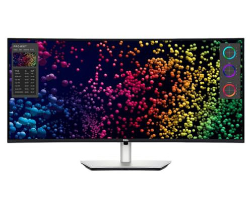
📖 Reading Time: 5 minutes 🏷️ Categories: Design, Branding, Marketing 📅 Published: [DATE] The 5 Best Ultrawide Monitors for Creatives Let's get one thing straight. This allows one cable to carry video, data, and enough power (90W+) to charge your laptop. The honest take: You cannot deny the visual punch of OLED.
📖 Reading Time: 5 minutes 🏷️ Categories: Design, Branding, Marketing 📅 Published: [DATE] The Instagram Logo: A Necessary Betrayal of Nostalgia The collective meltdown when Instagram changed its logo in 2016 was entirely predictable. Don't spend months perfecting a visual identity for a business model that might not exist in six weeks.
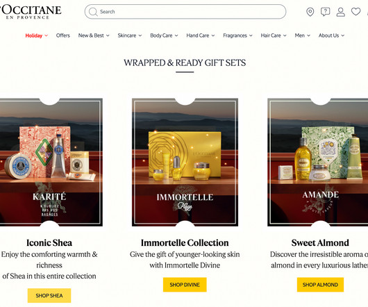
Use your homepage to show off your top gift ranges and seasonal offers, designing full-screen banners with eye-catching visuals and festive fun. Many eCommerce websites add a ‘Gifts’ tab in the navigation bar, breaking down the drop-down list by creating categories such as ‘Gifts for her’, ‘Gifts for him’, ‘Gifts for children’, and so on.
Its about crafting a visual language that speaks directly to the brand’s audience. They usually create contrast and add visual interest. Use the data to make your final decision. Feel free to browse WE AND THE COLOR’s Graphic Design and Branding categories for your daily dose of creative inspiration.
Imagine getting back hours previously spent on repetitive actions, allowing you to focus on the strategic thinking, the imaginative leaps, and the nuanced craft that truly defines your work, whether that’s designing stunning visuals, analyzing complex data, or collaborating effectively with your team. The vision?
What if it could tell a compelling visual story about you? It likely involved strong visuals, a clear narrative flow, and a design that kept you engaged. However, it often lacks personality and visual appeal. A resume presentation, on the other hand, transforms your professional summary into a dynamic visual experience.
The Information is Beautiful Awards, brought back with the help of the DataVisualization Society, announced the shortlist recently. It is a collection of 89 entries narrowed down from almost one thousand by a judging group comprised of visualization professionals.
📖 Reading Time: 5 minutes 🏷️ Categories: Design, Branding, Marketing 📅 Published: [DATE] Human-Centred Website Design: Create Empathy-Led Experiences Most websites treat visitors like data points rather than real people. Display Relatable Visuals People respond to what feels familiar. It also creates trust.
With a bold, minimalist approach, the new visual system reflects Parsyl’s mission to innovate while ensuring trust and stability in an often static industry. Parsyl disrupted this norm by integrating advanced data technologies to address risks in the supply chain of sensitive goods like vaccines and perishables.
📖 Reading Time: 5 minutes 🏷️ Categories: Design, Branding, Marketing 📅 Published: [DATE] Your Customer Acquisition Strategy is Broken. Your brand—your logo, website’s visual language, and core message—has about three seconds to provide a compelling answer. Are you a data wizard who loves spreadsheets? Let's Talk About Why.
It’s why D&AD’s decision to split branding into two categories this year – New Brand and Brand Identity Refresh – wasn’t just semantics. As Jury President for the Brand Identity Refresh category, I see the refresh process not as a cosmetic overhaul, but as evolution in its truest sense.
In healthcare, solutions like NeoMeds Kardia accelerate heart attack diagnosis, while others apply AI to clinical data analysis, assisted diagnosis, and treatment discovery. These examples prove that AI adds real value when built on strong data foundations and clear objectives. Because it cannot learn from new data or interactions.
The Missed Opportunity Hidden in the Data Let’s revisit the project I mentioned at the top of the article, and what it revealed about how I approached this idea of adaptive user experience design. That’s when it clicked: Why were we forcing a single layout on everyone when behavioral data already told us what different users prioritized?
Image credit: Hota) The word branding, once primarily tied to visual identity and communication, has undergone significant changes. User interface (UI) design, as the visual expression of user experience, establishes the brands aesthetic and interactive vocabulary. Here’s how it works.
📖 Reading Time: 5 minutes 🏷️ Categories: Design, Branding, Marketing 📅 Published: [DATE] 5 Website Design and Content Strategies To Connect With Customers How do you use website design and content to connect with your ideal customers? This includes all relevant demographic data, like age, location, gender, and socioeconomic status.
Working with creative studio Otherway, Naked Paper has unveiled a bold rebrand that repositions its unbleached, brown toilet paper as a premium, purpose-driven product in a category that has long relied on bleaching, fluff, and marketing spin. Visually, the new identity is as stripped-back as its name suggests. Data and facts.
We need frameworks tailored to the traits that fundamentally set AI apart from traditional software, including: its capabilities for autonomy and collaboration , its probabilistic nature , its early need for quality data, and its predictable unpredictability. Humans tend to be perpetually surprised by its abilitiesand its inabilities.
Image credit: Wonderhood Studios) Weve just launched a new category at this years Brand Impact Awards : Emerging Tech. This category is all about those using tech such as AI and AR in their branding schemes, and heres an example of a piece of work that fits the category exactly. Here’s how it works.
📖 Reading Time: 5 minutes 🏷️ Categories: Design, Branding, Marketing 📅 Published: [DATE] How AI Video Creation is Revolutionising Marketing Today, visibility is currency, and video is the gold standard. And the data proves it. It holds people's attention through visual elements , auditory components, and emotional connections.
A generative animation based on multiple layers of color and data, mixed, moved and painted over in realtime. Richter works with data from 4 of 24 highres images, 30mb in total. Both artists use different tools and are not aware of the details of each others process, meeting through the interface of pixels as data. v2.2.2025.03
📖 Reading Time: 5 minutes 🏷️ Categories: Design, Branding, Marketing 📅 Published: [DATE] B2B Brand Positioning: Choose Who to Ignore Most business-to-business companies are utterly, painfully invisible. It’s Not Your Logo, Your Website, or a Clever Slogan Your logo is a visual trigger. One is a category.
📖 Reading Time: 5 minutes 🏷️ Categories: Design, Branding, Marketing 📅 Published: [DATE] Top 10 Best Shopify Web Design Agencies in the US Let’s Be Honest: Picking the Right Design Partner Is Tough Launching an eCommerce brand? Top agencies use wireframes like mad, test navigation flows, and know how to prioritise visually.
We organize all of the trending information in your field so you don't have to. Join 66,000+ users and stay up to date on the latest articles your peers are reading.
You know about us, now we want to get to know you!
Let's personalize your content
Let's get even more personalized
We recognize your account from another site in our network, please click 'Send Email' below to continue with verifying your account and setting a password.


Let's personalize your content