This site uses cookies to improve your experience. To help us insure we adhere to various privacy regulations, please select your country/region of residence. If you do not select a country, we will assume you are from the United States. Select your Cookie Settings or view our Privacy Policy and Terms of Use.
Cookie Settings
Cookies and similar technologies are used on this website for proper function of the website, for tracking performance analytics and for marketing purposes. We and some of our third-party providers may use cookie data for various purposes. Please review the cookie settings below and choose your preference.
Used for the proper function of the website
Used for monitoring website traffic and interactions
Cookie Settings
Cookies and similar technologies are used on this website for proper function of the website, for tracking performance analytics and for marketing purposes. We and some of our third-party providers may use cookie data for various purposes. Please review the cookie settings below and choose your preference.
Strictly Necessary: Used for the proper function of the website
Performance/Analytics: Used for monitoring website traffic and interactions
Spanning categories such as Editorial, Children's Books, Science & Technology, and Site Specific, this year's entries highlight the sheer breadth and talent of contemporary illustrators, with judges praising the innovation, emotion and technical brilliance across the board. We're impressed by all of the work on display. Who Flew The Coop?
People can use the search tool, or browse our categories by artist, century, style, theme, or tag," Green notes. The team has put considerable effort into developing useful metadata to enhance the searchability of images, making the archive both deep and accessible. Another challenge moving forward will be securing sustainable funding.
The right typeface can bring a brand to life, enhance readability and accessibility, and convey your intended message with clarity and style. Beautiful type doesn't always mean accessible type," points out Grace Ellins , senior graphic designer at the Office for National Statistics. "So So it's worth considering how you go about it.
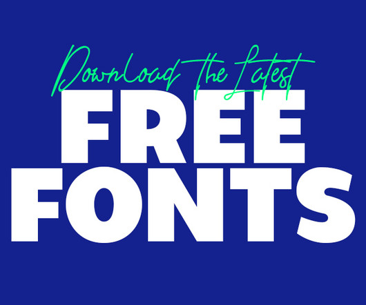
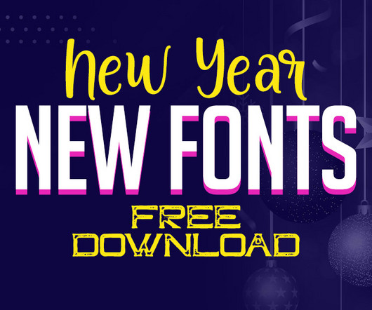
You don’t need to break the bank to access high-quality fonts—there are dozens of free options available that can instantly elevate your designs. Whether it’s for event flyers, product launches, or website banners, the latest free fonts in this category are guaranteed to stand out. The good news?
In this article, we introduce an inspiring collection of fonts that are not only versatile but also free to download, ensuring you have access to high-quality resources without stretching your budget. Accessible online, free fonts provide flexibility and affordability, fostering creativity while adhering to licensing terms.
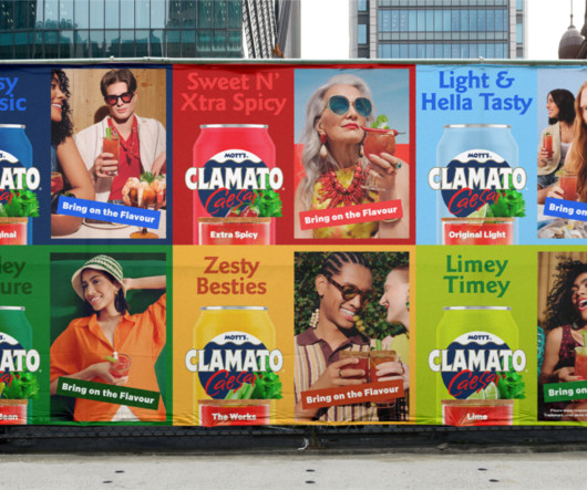
Competitor analysis also revealed that there are few similar options out there, aside from more "craft cocktails" and less accessible offerings. In homage to its distinctive taste, the brand platform, 'Bring on the Flavour', informed the strategic narrative and visual world.
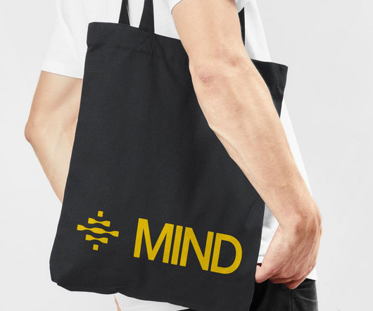
million, MIND's mission to put data loss prevention and insider risk management on autopilot demanded an identity that could convey both sophistication and accessibility. The approach reflects Eddie's understanding that clarity is a competitive advantage in complex technical categories.
An honorary mention in the automobile category goes to Ford. Thank you for reading 5 articles this month* Join now for unlimited access Enjoy your first month for just £1 / $1 / €1 Join now Already have an account ? But other words can be turned into ambigrams through clever use of typography or calligraphy.
By prioritizing clarity, typography improves both user experience and accessibility, making content more engaging and easier to navigate[6]. Typography and accessibility in designsystems Designing for accessibility ensures that digital products accommodate users with disabilities, from mild impairments to severe limitations.
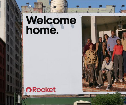
Holt clarifies: "The goal was to bring greater intention, uniqueness and meaning to every touchpoint, giving the business a scalable system that not only elevated the brand but also made the complex world of mortgages clearer and more accessible to more people." Rocket operates at an immense scale, so consistency was essential.
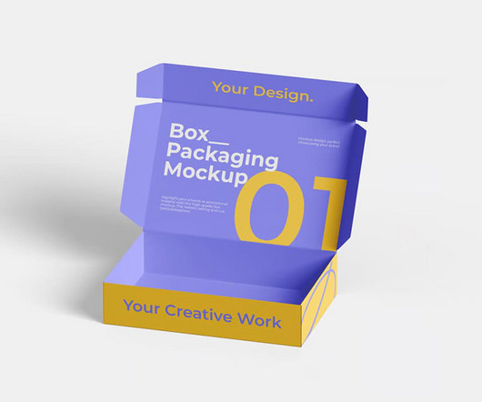
Here, we present 50+ box packaging mockups , divided into premium and free categories, to help you elevate your designs. Dive into the Free Box Packaging Mockups to access stunning templates without spending a dime. Explore these collections to find the perfect match for your creative needs.
Look for shades that are too similar, poorly contrasted, or not accessible. Use tools like color contrast checkers to evaluate how well your palette works in real-life interfaces and to identify any combinations that might not meet accessibility guidelines. Start comparing what you see against your brand guidelines or design system.
POV Forward Thinking Review of the Year Editorial Team Jenny Brewer Olivia Hingley Ellis Tree Elizabeth Goodspeed Liz Gorny Extra nice Extra Search Account Social Inclusive Sans expands upon Penguin’s history with playfulness and curiosity Accessibility and boldness are the key focus in Olivia King’s customised typeface for the publishing giant.
To help you out, I've brought 20 of these together in the list below, grouped into categories. Figma (free tier) Figma's free plan includes access to basic AI features, such as text generation for prototypes, and collaborative features enhanced by AI suggestions. Oh, and by the way, they all have free versions.
Download at YouWorkForThem Download at Creative Market Overview of the 426-Asset Collection: Boldly Modern and Versatile Vanzyst’s toolkit provides an impressive range of 426 graphic elements, split into two main categories: 322 geometric shapes and 104 letters and numbers.
We weren’t just designing a brand – we were helping define a new category in longevity supplements, advancing a vision for science-backed healthy ageing. I think the design community has always been open and welcoming, but there’s still room to grow when it comes to access. Visit our corporate site.
This guide explores 70+ Japanese-style fonts , categorized by their design styles, and provides insights into how each category can enhance modern design and branding. The Open Type features can be accessed by using Open Type savvy programs such as Adobe Illustrator, Adobe InDesign, Adobe Photoshop Corel Draw X version, And Microsoft Word.
It gives you access to Photoshop , Illustrator , InDesign , and over 20 other creative apps. Additionally, feel free to take a look at our guide to the best graphic design software in 2025 or find creative inspiration in the Graphic Design category. The latest news on professional software can be found in the Technology category.
With a monthly or annual subscription, you get access to thousands of graphics, templates, mockups, fonts, and more—all with commercial licensing included. It’s ideal for professionals who work on a wide range of projects and want consistent access to premium assets without paying per item.
Let's break down some top contenders in this category. 26 – FS Me – Enhanced Readability for Accessibility Starting with FS Me , this font is a fantastic choice if accessibility is on your radar. Let's explore two vital components: scalable fonts and accessibility in typography.
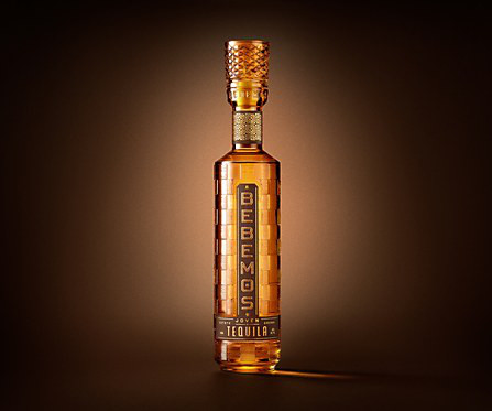
Background: The purpose of the Bebemos Tequila project was to create a brand that captured the soulful, sun-drenched energy of 1970s beach culture—something that, despite its visual richness and emotional appeal, hadn’t yet been tapped within the tequila category.
Users have access to a library of customizable templates to speed up their work. The collection spans 190 categories and 28 unique styles. At least one of the listed offers will likely save you money, enhance your workflow, or give you access to valuable tools and resources. Don’t put this list aside where it might be forgotten.
Adobe Fonts : If you have an Adobe subscription , you have access to a vast collection of high-quality fonts. Check out our selection of the 50 best fonts based on 10 typography trends for 2025 or browse through WE AND THE COLOR’s Fonts category for more. They also offer pairing suggestions. You got this!
Etsy Etsy remains one of the most popular and accessible platforms for selling digital art online. The platform doesn’t charge listing fees or monthly subscriptions, making it accessible for emerging artists. Amazon Merch on Demand Amazon Merch on Demand offers artists access to Amazon’s massive customer base.
📖 Reading Time: 5 minutes 🏷️ Categories: Design, Branding, Marketing 📅 Published: [DATE] Top 8 Free iPhone Apps Every Designer Should Know About The iPhone isn’t just a communication device; it’s one of the most underrated tools in a designer’s arsenal.
A brand more commonly known for competitive esports screens and peripherals, often at prices easily accessible to the mass proletariat, the AOC AGON PD34 is one of the industry leaders reminders that they know exactly what theyre doing when it comes to tech expertise and design flair when the occasion calls for it. Visit our corporate site.
📖 Reading Time: 5 minutes 🏷️ Categories: Design, Branding, Marketing 📅 Published: [DATE] 10 Famous Logos That Broke Design Rules and Won There’s a whole cottage industry built on “logo design rules.” Freddie made the brand feel friendly, human, and accessible. ” You’ve heard them. Keep it simple. Make it timeless.
Imagine having access to a curated collection of the most stunning designs from around the globe. Dive into a Sea of Design Categories on Pinterest The WE AND THE COLOR Pinterest account is organized into distinct boards. Each board focuses on a specific design category. This is where Pinterest comes in.
Accessibility Matters: Beyond the Average User Accessibility is paramount. Its a nuanced dance of perception, psychology, culture, and accessibility. If so, feel free to browse through our Graphic Design category or become a part of our Reddit design community to discuss current trends, ask questions, or just find inspiration.
Generally, fonts fall into a few main categories: Serif Fonts: These have small “feet” or lines attached to the main strokes of the letters. Display Fonts: This is a broad category of decorative fonts best used for headlines to make a bold statement. They often feel traditional, reliable, and sophisticated.
We have screens in our pockets, streaming services galore, and access to content like never before. This pairing gives the festival a unique visual signature one that feels both established and contemporary, refined yet accessible. Feel free to browse WE AND THE COLOR’s Graphic Design and Branding categories for more.
If you are looking to create visuals that stop the scroll and demand a closer look, this effect provides an accessible yet powerful pathway. Download from Adobe Stock Feel free to find other popular graphic design assets in the Templates category here at WE AND THE COLOR.
The greeting card app landscape has evolved into two main categories: apps for creating and customizing cards, and apps specifically designed for emailing digital greeting cards. The platform offers hundreds of templates created by professional designers, along with access to over 2 million photos and 130+ fonts.
With Elfkin, you can easily access these options to experiment and refine your designs. The OTF format is what gives you easy access to all those wonderful alternates and ligatures in professional design software like Adobe Illustrator, Photoshop, and InDesign. If so, feel free to visit WE AND THE COLOR’s popular Fonts category.
But that doesnt mean that brand strategy isnt important, and the best creative work often has a team of talented strategists behind it, as we see with the dedicated Brand Strategy category at the Brand Impact Awards (BIAs). Whats the dynamics of the category? Whos leading the category? Why are they their competitors?
📖 Reading Time: 5 minutes 🏷️ Categories: Design, Branding, Marketing 📅 Published: [DATE] 40 Geometric Logos: The Power of Shapes in Branding Let’s be honest. The circle's swirling red, white, and blue gives a sense of dynamic energy and flow within a friendly, accessible shape. It feels fun and accessible, like one of their bricks.
If your site has lots of pages or product categories, a mega menu might just be your best option. In this post, we explore the latest best practices for designing mega menus in 2025 and how to keep your navigation clear, accessible, and easy to use. What Is a Mega Menu? What Is a Mega Menu?
Her project is designed specifically for teenagers navigating uncertainty, using accessible and positive imagery to offer support. Nataliya Green’s editorial illustrations encourage young people to keep physically active in support of their mental wellbeing.
A major critique of neumorphism design is its accessibility issues, as the low-contrast elements can be very difficult for people with visual impairments to see clearly. Feel free to find other trending topics in WE AND THE COLOR Design and Web Design categories, or read more about Skeuomorphism in Design in an article on our Reddit group.
Whether you are storyboarding on a train or capturing an idea on the go, you have access to the same powerful AI models that fuel Photoshop and Premiere Pro. Try Adobe Firefly Feel free to browse WE AND THE COLOR’s AI and Technology categories for more.
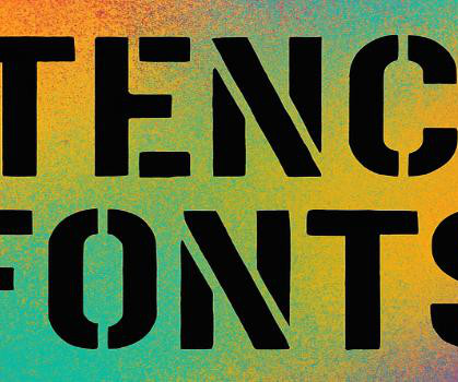
It’s one of those fonts that works equally well for technical documentation and creative projects – that versatility is rare in the stencil category. While it might seem like a novelty font, I’ve found it surprisingly useful for legitimate applications where you need to create a sense of exclusivity or insider access.
AI is making certain types of creative work cheaper and more accessible, which increases demand. Feel free to browse WE AND THE COLOR’s AI , Graphic Design , or Templates categories for related content. But here’s the twist: the total volume of orders skyrocketed by 121%, leading to an overall revenue increase of 56%.
To access these, you’ll need professional design software like Adobe Illustrator, Photoshop, or InDesign. Download from Creative Market Feel free to explore other trending typefaces for different design projects in the Fonts category here at WE AND THE COLOR. So, the final question is a simple one.
We organize all of the trending information in your field so you don't have to. Join 66,000+ users and stay up to date on the latest articles your peers are reading.
You know about us, now we want to get to know you!
Let's personalize your content
Let's get even more personalized
We recognize your account from another site in our network, please click 'Send Email' below to continue with verifying your account and setting a password.


Let's personalize your content