This site uses cookies to improve your experience. To help us insure we adhere to various privacy regulations, please select your country/region of residence. If you do not select a country, we will assume you are from the United States. Select your Cookie Settings or view our Privacy Policy and Terms of Use.
Cookie Settings
Cookies and similar technologies are used on this website for proper function of the website, for tracking performance analytics and for marketing purposes. We and some of our third-party providers may use cookie data for various purposes. Please review the cookie settings below and choose your preference.
Used for the proper function of the website
Used for monitoring website traffic and interactions
Cookie Settings
Cookies and similar technologies are used on this website for proper function of the website, for tracking performance analytics and for marketing purposes. We and some of our third-party providers may use cookie data for various purposes. Please review the cookie settings below and choose your preference.
Strictly Necessary: Used for the proper function of the website
Performance/Analytics: Used for monitoring website traffic and interactions
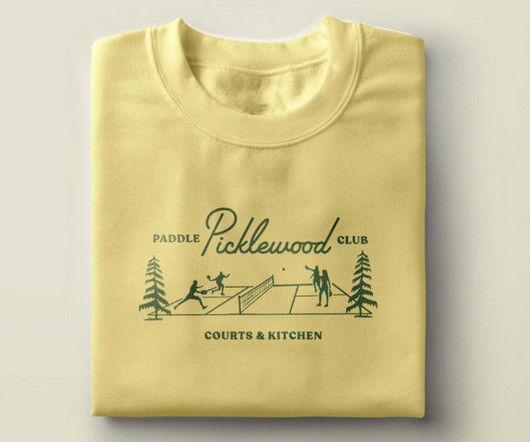
And they turned to local creative website agency People People to define and create a memorable brand and visual identity. From the midcentury script typography to the playful supporting illustrations and colour palette to the custom plaid and argyle patterns, everything is designed with tongue-in-cheek. It's pickleball, after all."
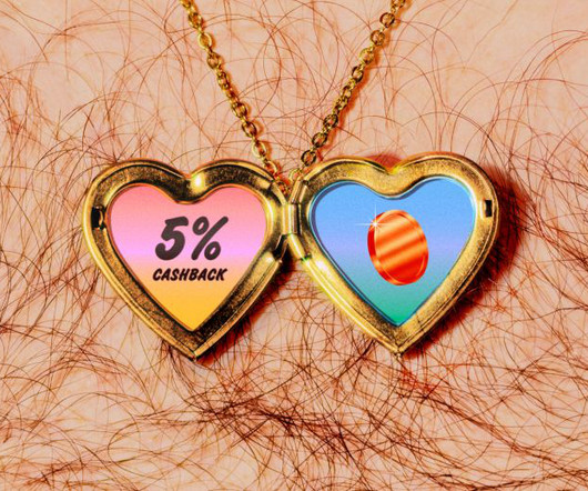
To help spread their message far and wide, Fluz recently teamed up with Koto , a brand and digital agency with studios in Berlin, London, Los Angeles, New York and Sydney, to craft a fresh brand to fuel Fluz's expansion. Typography and colours At the centre of the new identity is a bold and confident wordmark.
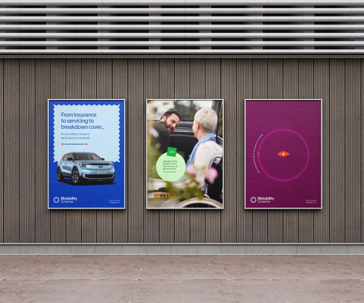
SomeOne founding partner Simon Manchipp delves into their recent project with the Motability Scheme, explaining why brands in this sector need to change. Nowadays, there's no excuse for brands and services to be inaccessible with so many tools at their disposal to ensure otherwise.
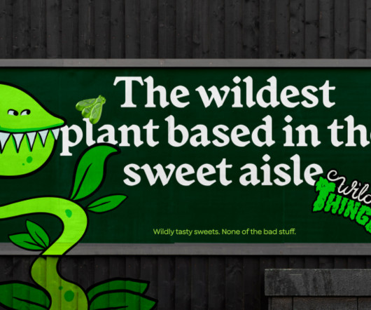
How&How helps Wild Thingz build a category-defining rebel sweetie brand from scratch – something that pleases both parents and kids. Enter Wild Thingz (previously Just Wholefoods), the latest star of How&How's branding efforts. This was a full brand build – from concept to launch and beyond.
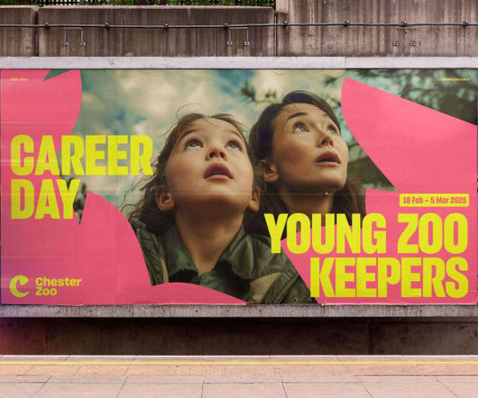
At the cutting edge of conservation, Chester Zoo wanted a new brand and website to champion these nature-positive efforts. The branding agency soon got to work repositioning Chester Zoo's look and feel in a way that represented both the experience within the zoo gates and its greater purpose of serving nature as a whole.
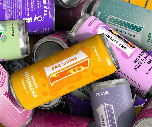
One Living by Derek&Eric From simplified skincare to tech-infused cosmetics, these cutting-edge branding initiatives are reshaping the health and beauty landscape worldwide. This pressure has sparked a wave of innovation in health and beauty branding. Today, that sentiment extends far beyond just facial care. Want examples?
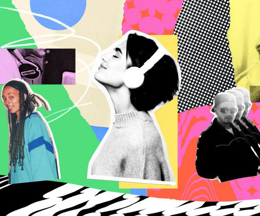
Illustration by Mia Angioy for Creative Boom In the last of our special six-part series, we explore how sonic branding can elevate your brand's presence by leveraging Epidemic Sound's expansive library of music and sound effects. In 2024, the auditory experience has become crucial to crafting a cohesive and memorable brand presence.
Paula Scher , Michael Bierut, Marina Willer, Samar Maakaroun, Eddie Opara and others have led some of the most iconic branding and design projects of our time, and it's ultimately Pentagram's ability to evolve while maintaining high standards of creativity that's led them to top our list.
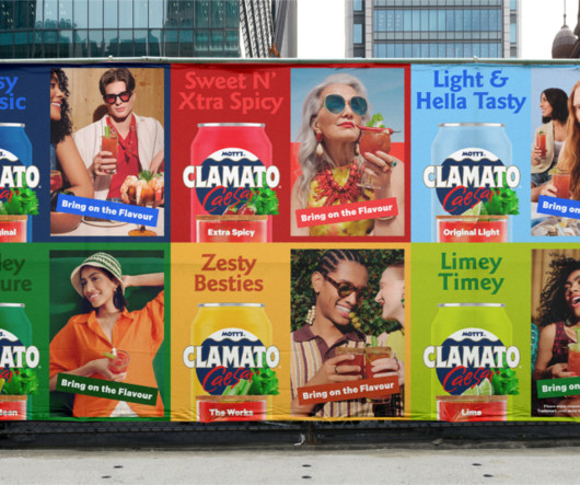
Mott's Clamato Caesar is a legacy brand that has barely changed for decades, but its new identity has found a way of reinforcing its heritage with a modern and desirable touch. Montreal and LA-based studio Wedge has been behind the brand evolution of Mott's Clamato Caesar, "Canada's Cocktail", since 1969.
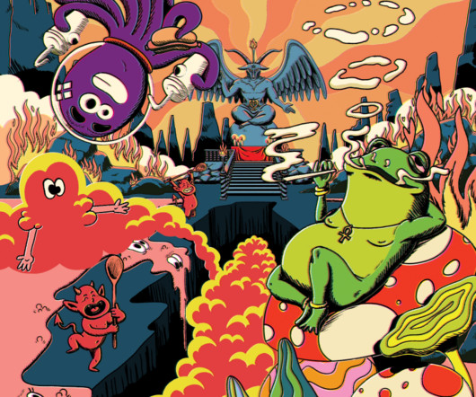
Your eyeballs are in for a wild ride if you happen to land on any of the social accounts promoting The Great Frog a jewellery brand going back to the 1970s, famous for its eclectic rock star collections. We then used After Effects to add the glows, dust and colour offset transitions." Colour testing the lava lamp scene.
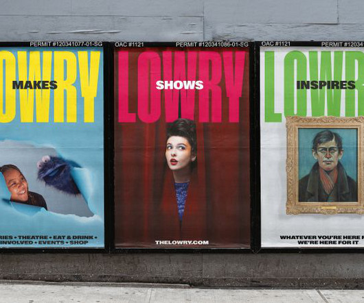
With big, industrial-era typography, a "straight-talking" tone of voice and a vibrant colour palette, the new identity marks a fresh chapter for the arts centre. It is marking this milestone with a bold brand refresh by EDIT Brand Studio. What's Next for Lowry?
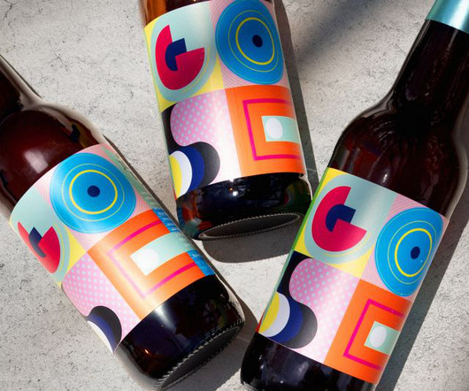
GOSE required an identity as unique as its product, which Bala delivered through semi-abstract illustrations and an acidic colour palette that reflects the beer's salty flavour. Hues of green, blue, and yellow are set against magenta, pink, and dark blue, evoking acidic sensations that complement the brand's eccentric narrative.
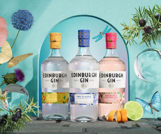
Some elements of the new identity are inspired by the architecture of the brand's new home in Edinburgh's city centre, The Arches. The Glasgow team of international design studio D8 has designed a new brand world for Edinburgh Gin, supporting the redesign of its core range bottles, which happened back in 2023.
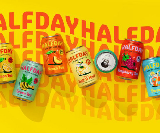
Through its new identity, HALFDAY is serving up bold colours, playful illustrations, and a healthy dose of '90s nostalgia, proving that prebiotic tea can still have a rebellious streak. But for HALFDAY, a ready-to-drink iced tea brand aiming to balance nostalgic flavour with modern-day wellness, standing out was exactly the goal.
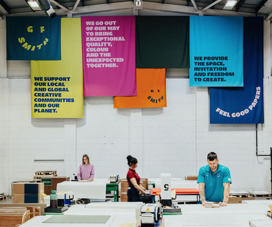
A deep dive into how design studio TEMPLO reimagined GF Smith's brand identity, balancing heritage with a bold, dynamic vision that embraces colour, movement, and a global creative community. But even the most established brands must evolve. It was monochrome, but GF Smith is all about colour.
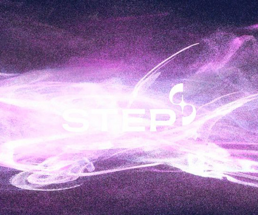
While brands in the fusion space are already falling into stereotypes, STEP is standing out from the crowd with a colour palette inspired by the synthetic image of future plasma. Among Equals is behind the identity for new UK energy programme STEP, designed to position the brand as ambitious as NASA's Apollo missions.
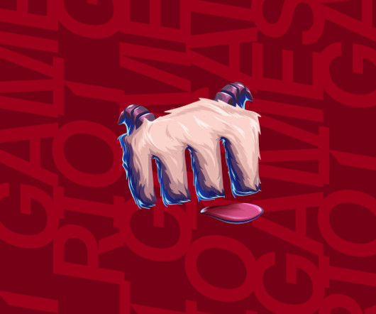
At the heart of this redesign is a deep dive into player passion, creating a brand experience that resonates across every game and media platform Riot touches. What emerged was that, while Riot owns many properties across multiple media, there is a unified brand purpose at the heart of everything it does: making the player experience better.
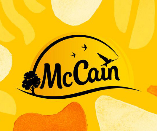
BrandOpus has refreshed the design of McCain Foods' whole GB and EU packaging portfolio, which now includes a new bespoke typeface and printed brand assets. This latest project has seen the new brand assets introduced on pack across all products, from croquettes and chips to wedges and fries.
Often collaborating with luxury brands, she brings a refined touch to editorial, branding and conceptual projects. Macarena Luzi Macarena Luzi, based in Los Angeles, makes vibrant, abstract landscapes filled with colour and movement. Karlotta Freier 2. Read our exclusive interview with him to learn more. Stefano Colferai 3.
A few years ago, the question was: should your brand identity include motion? So nowadays, the question is more like: how is motion interwoven into the heart of your brand? And rather than being a mere "add-on" to brand identity, it needs to be integrated into the brand identity process from the very start.
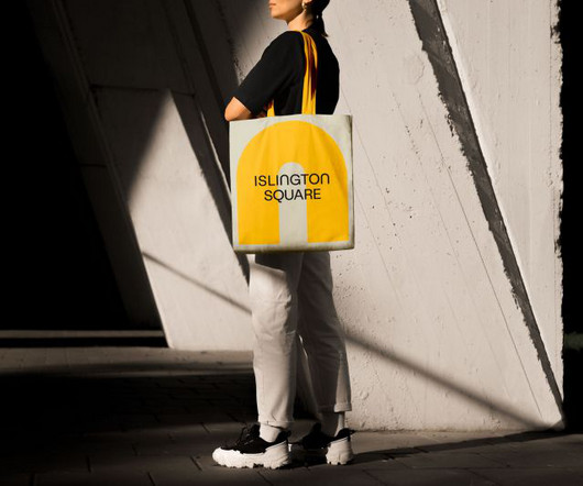
While Islington Square's original brand focused on residential sales, this new iteration aims to capture its transformation. It needed to transition from a property-led brand to one that champions place and experience, speaking to a wider audience and showcasing the vibrant lifestyle and cultural experiences that define it.
She says: "British Airways is such an iconic name, and it's inspiring to collaborate with a brand that connects people and destinations worldwide." For the editorial, BA required a set of six colourful, patterned illustrations to accompany the various sights highlighted in the article.
A new monogram, sleek colour palette and complementary family of typefaces all contribute to a more memorable and emotive brand experience for the accessible luxury bathroom supplier. So, the brief asked SUN to communicate this through the new brand.
"As an exciting and disruptive extension to our line, Refreshers is designed to drive penetration, recruiting new users and boosting our ambition to become the most loved RTD coffee brand in the market." The rebrand brings a sense of freshness and flair that matches the product's personality.
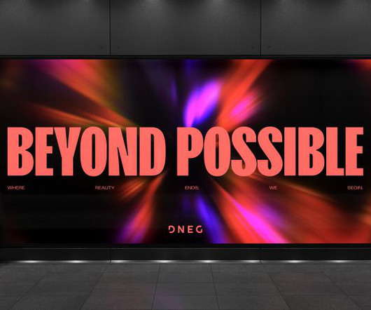
With a dynamic new identity, DesignStudio's brand refresh for DNEG embraces motion, creativity, and innovation, reinforcing the VFX giant's position as an industry leader. DNEG, the world-renowned visual effects and animation studio with seven Academy Awards to its name, has revealed a brand refresh in collaboration with DesignStudio.
One of the biggest challenges was bringing my style through the means of two colours per artwork for a large scale outdoors. I draw inspiration from the vulnerability of nature, fleeting moments of human interaction with the world around us, and the bold spectrum of colours that can evoke entire moods and memories," he says.
He predicts that next year: "AI will transition from being a behind-the-scenes tool for processes and sketches to an actual execution tool, creating brand assets and content in real-time. That's something that I think will be more important to brands going forward." Kiser Barnes, partner and CCO at Red Antler , believes so.
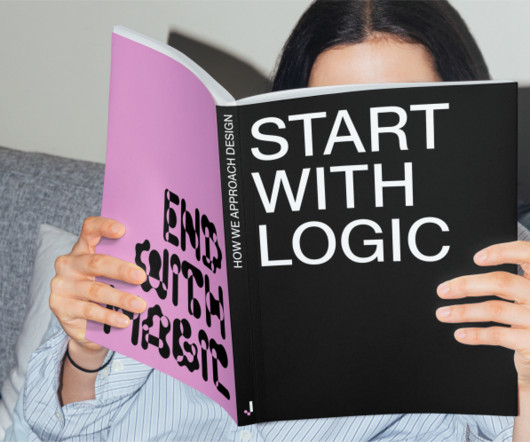
This time, we've asked Laura Stein, CCO of Bruce Mau Design , to reveal her top five books that have shaped her approach to design, branding, and sustainability. Her work lies in culture, fashion, architecture, technology, education, and place across brand, print, motion, digital, and environmental. Barbara Kruger: Thinking of You.
Influur helps content creators get work with brands for a decent compensation. Influur is a specialist agency that connects these creators, specifically in the areas of music, dance and lifestyle, with brands, helping them form impactful partnerships and reach specific target groups. It's a strange world we live in.
This approach ensured the typography seamlessly integrated with the film's visual narrative while maintaining a strong, recognisable brand presence across digital and print applications. Ensuring consistency across different media was a priority, and the application of typography and colour really tied it all together.
A typeface can define the character of a brand just as much as a logo or colour palette," he says. The goal is to craft something that not only fits their identity but also adds a unique typographic voice that strengthens their overall branding; we often reference local elements or heritage that resonate with the client's vision."
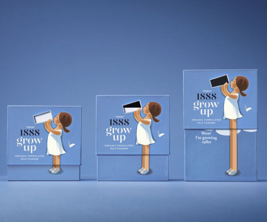
From soft, retro-inspired illustrations to packaging that demonstrates the product's effects, Them 1888's new milk powder brand is set to stand out among competitors. Danish brand Them 1888 has set out to satisfy this demand with a fresh look for its powdered milk product Grow Up, designed by the Danish agency Simply.
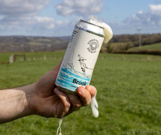
Supple Studio and Studio Spilsbury came together to lead a refresh of the brand and packaging system that puts the farm at the heart of the brewery's visual and verbal identity. But the brand's farm-first ethos goes beyond the logo. Expect homegrown textures, characterful illustrations, and evocative beer names. "We
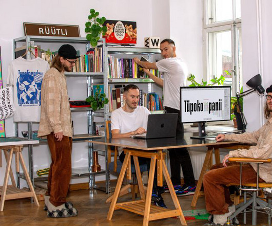
Reflecting its commitment to social change, the Hague-based design agency has crafted a colourful and impactful new identity for itself. Founded in 2007, it offers a comprehensive range of design services, from strategic branding to digital solutions, all crafted in its own studio. End with magic".
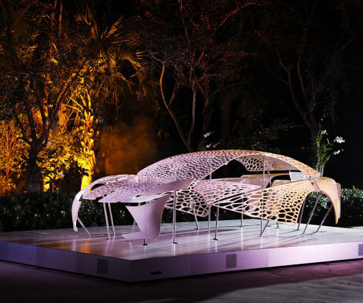
The project marks the automotive brand's ninth year showcasing its commitment to design at the annual event and its third year collaborating with the Institute of Contemporary Art, Miami (ICA Miami). I think there is a need for brands to use these new materials.
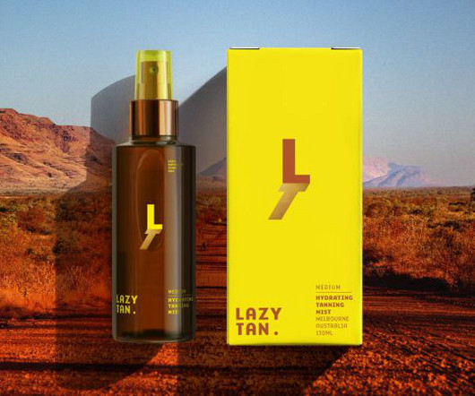
Enter Lazy Tan, the brand that wants to flip the script with its innovative, easy-to-apply, skin-friendly formula. Of course, the self-tan market has boomed in recent years, and we've seen everything from celebrity brands to natural claims, foams, oils, moussesyou name it.
Leeds International Festival of Ideas covers some tricky topics, so the branding and visual assets needed to be sensitive. Credit: Tom Martin When it came to branding, the event organisers turned once again to Leeds and Glasgow-based design studio Rabbithole. Rabbithole explains how it developed it.
Aseil's journey to founding Design Wolf LDN took several creative turns, from earning a first-class honours degree in Interior Architecture to working on Netflix sets and fashion shoots before finding her true calling in brand design. I used to spend hours coming up with ideas and designing brand templates for them.
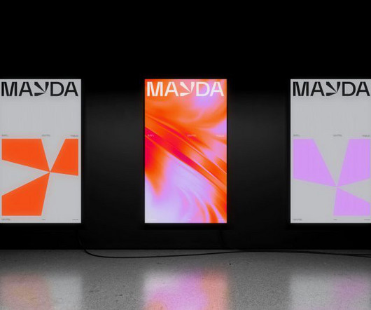
Creative studio Mayda has unveiled a dynamic brand identity, drawing inspiration from its namesake – a mysterious island that appeared and disappeared from historical maps. Our identity really embraces that," he continues, "building on the metaphor by putting the perspective point of the horizon at the heart of the brand."
Elections in the UK and the US led many big brands to put off their decision-making and budgeting – they want to see the lie of the land economically before investing in creative. Brands are more and more focused on not only telling relevant stories but also on counting on the right people to tell those stories.
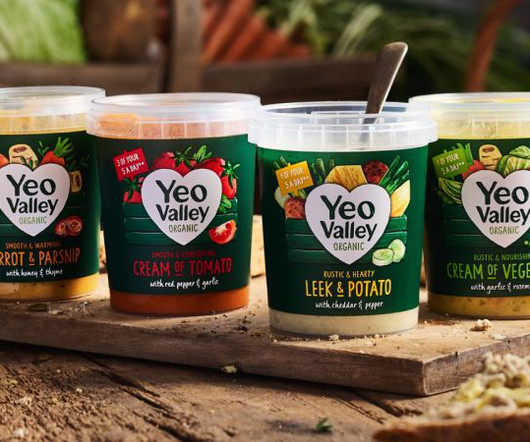
New illustrations are a key part of the brand's new identity, designed to help its new Greek and Kefir products stand out on the shelf. Most people will have seen the brand on supermarket shelves or had it in their homes, but what you might not know is that Yeo Valley is a real place in the heart of Somerset, owned by the Mead family.
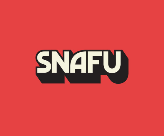
In the new and improved brand, expect graphics inspired by art books on Cold War propaganda, spy movie posters from the 1950s and '60s, and vintage adventure and educational book covers. FilmNation described the SNAFU brand as "not afraid of the messy mishaps" and, while messiness can be fun, it can be hard to get right.
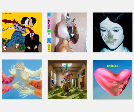
There's no doubt that this year, album art has been an integral part of music artists' brands. During this process, Palm says she learned a lot about blue and how light affects how we perceive colour. Lin's work on this album cover is characterised by bold colours. who were the Glastonbury Park stage headliners in 2024.
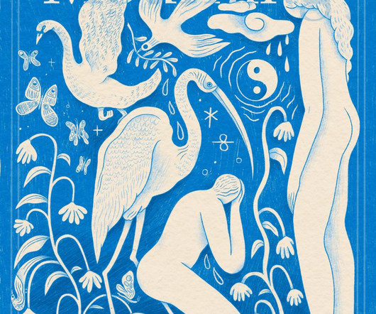
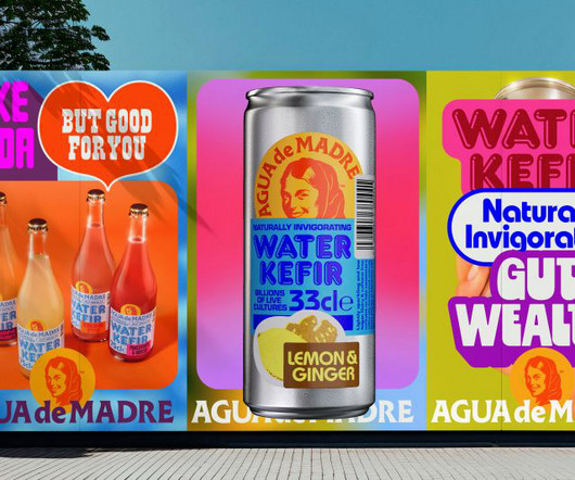
Designed by award-winning creative director Chris Chapman, adam&eveDDB's new brand identity for Agua de Madre fizzes with joy and purpose. We decided it would be a good idea to keep the illustration of the Madre's face and the font of the wordmark," he explains, "as these felt like the most salient features of the branding. "By
We organize all of the trending information in your field so you don't have to. Join 66,000+ users and stay up to date on the latest articles your peers are reading.
You know about us, now we want to get to know you!
Let's personalize your content
Let's get even more personalized
We recognize your account from another site in our network, please click 'Send Email' below to continue with verifying your account and setting a password.


Let's personalize your content