


Why accessibility shouldn't compromise on aesthetic
Creative Boom
NOVEMBER 25, 2024
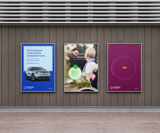
The colour palette has also been optimised for accessibility by retaining the Motability Scheme blue but introducing more combinations, hues, and saturations. Easy-to-read stickers now appear throughout communications, designed to match the new Motability Scheme' M' and highlight key information.


Let's personalize your content