This site uses cookies to improve your experience. To help us insure we adhere to various privacy regulations, please select your country/region of residence. If you do not select a country, we will assume you are from the United States. Select your Cookie Settings or view our Privacy Policy and Terms of Use.
Cookie Settings
Cookies and similar technologies are used on this website for proper function of the website, for tracking performance analytics and for marketing purposes. We and some of our third-party providers may use cookie data for various purposes. Please review the cookie settings below and choose your preference.
Used for the proper function of the website
Used for monitoring website traffic and interactions
Cookie Settings
Cookies and similar technologies are used on this website for proper function of the website, for tracking performance analytics and for marketing purposes. We and some of our third-party providers may use cookie data for various purposes. Please review the cookie settings below and choose your preference.
Strictly Necessary: Used for the proper function of the website
Performance/Analytics: Used for monitoring website traffic and interactions
The Canadian agency is all about smart, strategic branding that breathes life into real estate, cultural, and hospitality spaces. With a collaborative vibe and a knack for timeless design, its team creates brands that don't just look great—they feel like they truly belong. We value input from all levels, ensuring the best ideas emerge.
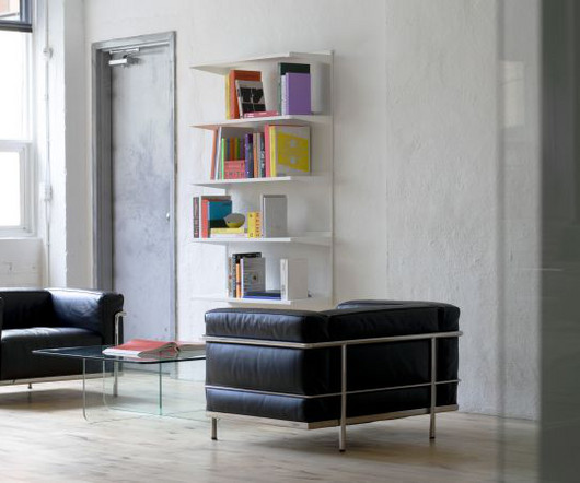
A few years ago, the question was: should your brand identity include motion? So nowadays, the question is more like: how is motion interwoven into the heart of your brand? And rather than being a mere "add-on" to brand identity, it needs to be integrated into the brand identity process from the very start.
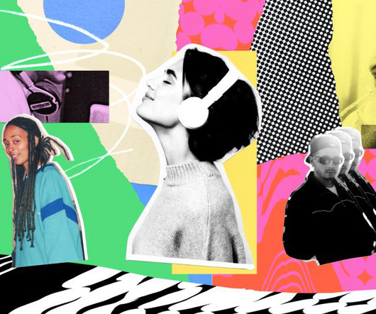
Illustration by Mia Angioy for Creative Boom In the last of our special six-part series, we explore how sonic branding can elevate your brand's presence by leveraging Epidemic Sound's expansive library of music and sound effects. In 2024, the auditory experience has become crucial to crafting a cohesive and memorable brand presence.
Paula Scher , Michael Bierut, Marina Willer, Samar Maakaroun, Eddie Opara and others have led some of the most iconic branding and design projects of our time, and it's ultimately Pentagram's ability to evolve while maintaining high standards of creativity that's led them to top our list. The results are now in, and here they are.
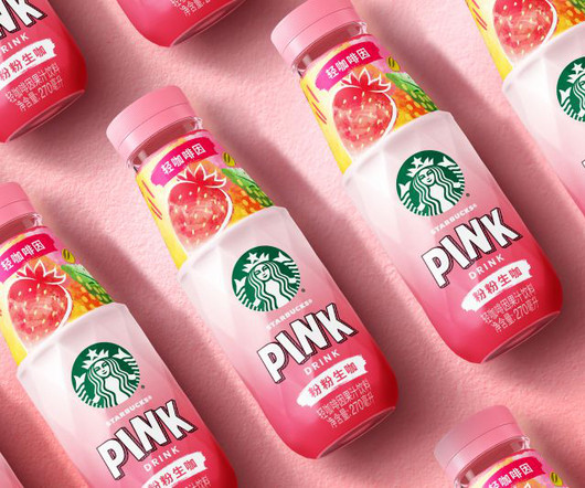
To stand out in China's crowded RTD market, Marks has given Starbucks' fan-favourite Refreshers a striking new look, complete with a dynamic bottle shape and vivid visuals. The change aims to carve out fresh space in China's fiercely competitive ready-to-drink (RTD) market. Design-wise, the label balances familiarity with flair.
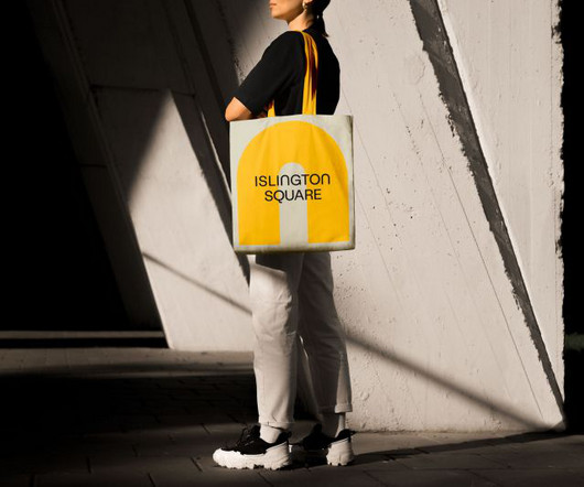
While Islington Square's original brand focused on residential sales, this new iteration aims to capture its transformation. It needed to transition from a property-led brand to one that champions place and experience, speaking to a wider audience and showcasing the vibrant lifestyle and cultural experiences that define it.
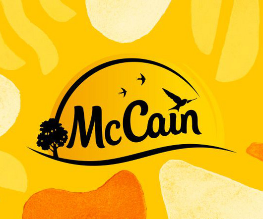
BrandOpus has refreshed the design of McCain Foods' whole GB and EU packaging portfolio, which now includes a new bespoke typeface and printed brand assets. This latest project has seen the new brand assets introduced on pack across all products, from croquettes and chips to wedges and fries.
Senior designer Rose O'Mahony, who's been at Springetts Brand Design for 11 years, exemplifies this shift. "I Image licensed via Adobe Stock From financial milestones to family time, creative professionals reveal their evolving definitions of achievement and fulfilment. Well, actually, that's not the case at all. And why do we know this?
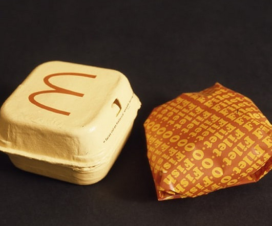
In the 1970s, McDonald’s was at a pivotal point in its growth, and the fast-food giant sought to enhance its brand identity. They analyzed various aspects of the restaurants, interviewing employees, managers, and customers to gather insights into the brand’s strengths and weaknesses.
Manchester-based branding agency Alphabet started life in 2016 and has cemented its place as an ideas-driven agency with an ethos rooted in a quote by Saul Bass , the legendary designer who's probably best known for his iconic Alfred Hitchcock movie posters. Co-founder Abbas Mushtaq shares insights on their journey.
Brand writer Sarah Farley shares a similar view, adding that brands have hijacked the word "purpose" for virtue signalling. Strategy Quite a few creatives seem to be pushing back on the word "strategy," and who can blame them? It's time to give them a proper send-off so we can all start speaking like humans again.
Taxi Studio has revealed its work on Carlsberg Elephant, which was designed to communicate its new premium position in India's evolving drinks market. With an incredible annual growth rate of 40%, Elephant is one of India's best-loved brews and an integral player in Carlsberg's growth strategy in this market.
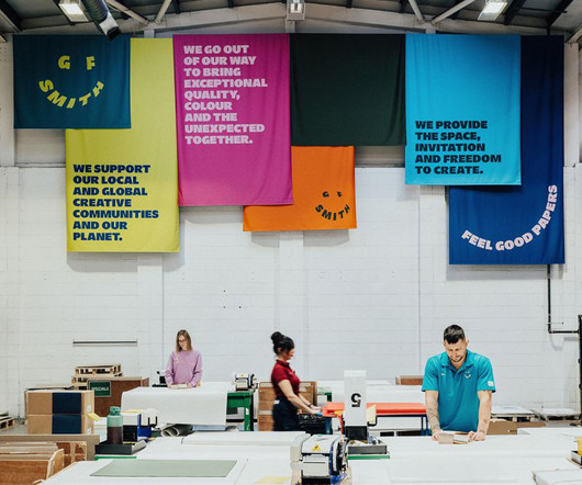
A deep dive into how design studio TEMPLO reimagined GF Smith's brand identity, balancing heritage with a bold, dynamic vision that embraces colour, movement, and a global creative community. But even the most established brands must evolve. The 2014 identity is a great piece of design, and it served GF Smith brilliantly for a decade.
From sustainability strategies and AI-driven creative processes to fostering new talent and redefining brand simplicity, these thought leaders have shared their visions and strategies for 2025 with us. Brand innovation with purpose Sustainability is only one element in a growing trend for agencies to want to go good.
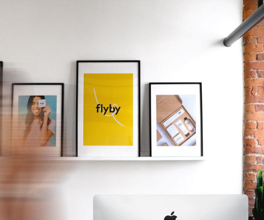
Creating a powerful brand with a unique visual identity requires more than just logo designs; it’s about building an emotional connection, crafting an impactful message, and visually representing values. Each element of logo designs — colors, typography, shapes — all contribute to how a brand is perceived. But how is this achieved?
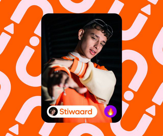
Influur helps content creators get work with brands for a decent compensation. Influur is a specialist agency that connects these creators, specifically in the areas of music, dance and lifestyle, with brands, helping them form impactful partnerships and reach specific target groups. It's a strange world we live in.
It's often assumed that B2B branding projects are, on the whole, not quite as interesting as their consumer-facing counterparts. And there's no denying that B2C brands have to do more legwork when it comes to standing out – it's the eye-catching stuff that attracts shoppers or prompts them to try something new. We discover more.
Now, it has an identity that competes with global brands without compromising on its roots in the country's culture. Known for its unconventional campaigns and innovative designs over the last nine years, the brand contributes approximately 74% to the company's total revenue, selling millions of pairs globally.
Retro-futurism reflects a playful yet sophisticated look, making it popular across branding, website design, and digital art. Branded Content and Advertising: Companies like Apple and Nike have incorporated retro-futuristic elements in their marketing, creating ads that nod to vintage designs but with a high-tech edge.
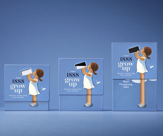
From soft, retro-inspired illustrations to packaging that demonstrates the product's effects, Them 1888's new milk powder brand is set to stand out among competitors. Danish brand Them 1888 has set out to satisfy this demand with a fresh look for its powdered milk product Grow Up, designed by the Danish agency Simply.
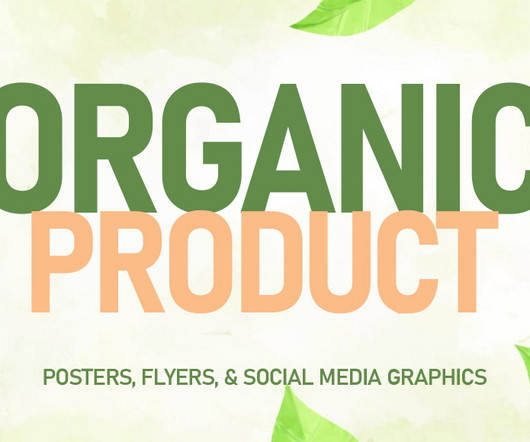
Green marketing made easy starts with stunning visuals that capture the essence of your brand. These designs should reflect your brands commitment to sustainability while showcasing your products in a clean, appealing way. Social media graphics, on the other hand, ensure your brand remains visible in the digital realm.
For brands, that means being ultra transparent about their practices, values, and ethical sourcing while offering unique and personalised experiences. To capture their attention, brands will need to embrace moments that feel human and spark an emotional connection. Let's start with some obvious things.
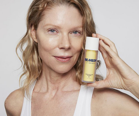
The New York branding agency has been working with skincare expert Dr Muneeb Shah to help disrupt an often confusing and fragmented market. When New York-based brand-building firm Practice teamed up with skincare expert Dr Muneeb Shah, though, they were pushing against an open door. This wasn't AI-scanning product reviews.
The brand unveils a new identity today, with a warm and inviting nature to help it stand out in a competitive market. But providing a good service will never be enough to survive a brutally competitive market. More broadly, a central feature of the brand is a distinctive tone of voice that is warm and inviting.
Global brand consultancy Wolff Olins has created a new visual identity for Decathlon, introducing a new brand icon known as 'L'Orbit' that expresses the brand's new purpose ', to move people through the wonders of sport.' I mean, would you have guessed it was the world's third biggest sports company? Us neither.
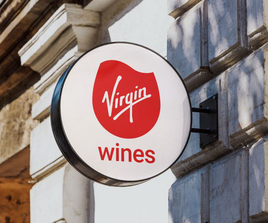
Almost two decades since entering the market with a vision to shake up the traditional wine connoisseur space, Virgin Wines recently decided it needed to adapt and refine its brand to better reflect its unique value proposition. This new logo replaces the previous static wine glass mark.
Their elegant, timeless appeal adds sophistication to designs, especially in branding and editorial content. Custom Typography Brands are investing in custom typefaces to stand out in a crowded digital space. These unique fonts help establish brand identity and foster user recognition.
This cherished brand, boasting a loyal fan base in Southern Helsinki and exceptionally tasty products, faced challenges in sustaining its brick-and-mortar stores and home delivery service," he explains. The market dynamics had shifted significantly during the pandemic," explains Piëtke.
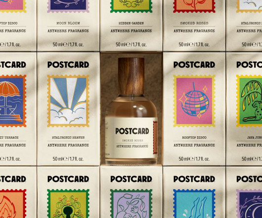
The Singapore-based, sustainable beauty brand has a fresh look and strategy based on the idea of simple joy. Formerly known as Oasis Beauty Kitchen, this sustainable self-care brand began as a humble kitchen enterprise when its founder, Hildra Gwee, developed a skin condition. Postcard, though, offers something quite different.
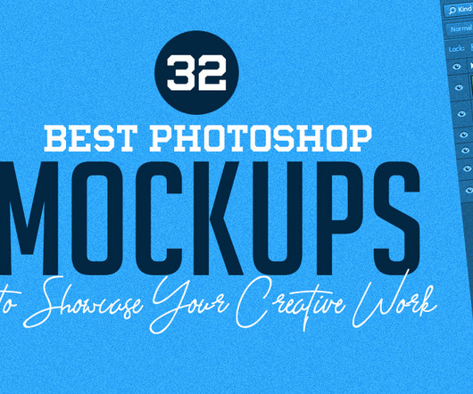
Whether you’re working on branding, packaging, or digital art, using the right Photoshop mockups can significantly enhance your portfolio and elevate your presentations. For instance, if you are designing a product label, look for a mockup that displays a bottle or a box in a context that reflects the product’s market.
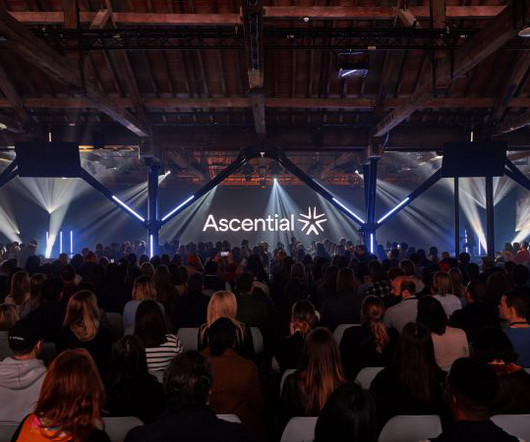
The organiser of events for the marketing and fintech industries has a new dynamic identity, conveying the power of convergence. Following the recent sale of its digital commerce and product design businesses, Ascential has become more streamlined and focused on events serving the marketing and fintech industries.
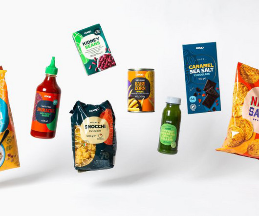
Swedish studio Bercow is helping the Nordic retailer reimagine 3,500 products across four countries, harmonising diverse market identities through clever use of a superellipse. Recently, it decided to consolidate its presence across four Scandinavian markets, which required a comprehensive rebranding effort.
The iconic brand launched its first installation in Milan, Futurespective: Connected World , designed in collaboration with design studio NUOVA. Partnering with a brand so deeply rooted in heritage, yet constantly driven by evolution and reinvention, feels like a natural alignment,” says NUOVA founders Enrico Pietra and Rodrigo Caula.
The brand idea of 'Follow your mood into the moment' is at the core of the visual identity for this new line of luxury hotels. And while you know a mass-marketbrand like TUI offers good value for money, you may be searching for something more high-end. And that's not really surprising.
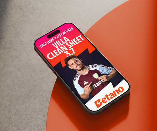
Nomad Studio explains how it crafted an electrifying brand for the online gaming industry—just in time for it to step up to the world stage. Based in Athens, this GameTech company operate two brands, Betano and Stoiximan, in 16 countries and employs more than 2,500 people across three continents. Nomad have a lot of form in this area.
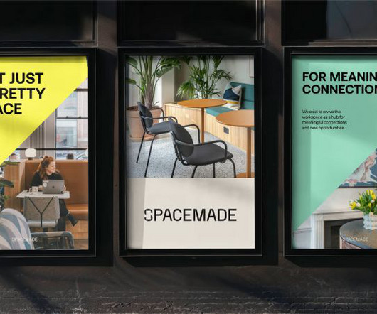
Spacemade is a co-working brand with a difference. The idea had been that while the B2B-intended branding for Spacemade was minimal and somewhat corporate, personality would come through in the designs for the individual locations. Crafted by Wildish & Co., This January, they decided it was time for a new visual identity.
Image licensed via Adobe Stock Creatives share their top tips for building a personal brand, allowing you to unleash your unique creative vision, connect with your tribe, and attract your dream clients. In today's hyper-connected digital landscape, personal branding has become key to success for creative professionals.
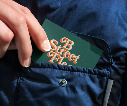
-based designer about how he created a cohesive visual identity for a new seasonal flea market. Traditionally, city centre markets didn't really need much in the way of branding other than maybe a sign at the entrance. I love elevating brands and creating new ones through sound design and thoughtful strategy."
From pioneering entrepreneurs to innovative brand leaders and multidisciplinary creative forces, these are the movers and shakers propelling their respective fields forward. To answer that question, we turned to Frontify , our favourite cloud-based, brand-building platform. and Europe through their remarkable work. In the U.K.,
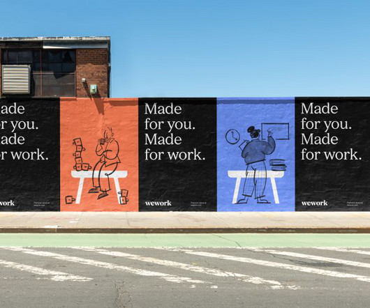
We look at Franklyn's new design refresh for the brand and the backstory behind it. Marketing that service in 2023, though, is certainly not for the faint-hearted. The new branding focuses on the high level of care and intent WeWork puts in its spaces and communities while also shifting the focus to its members. So far, so good.
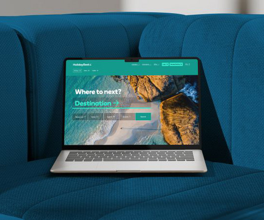
That leaves a gap in the market that the new company Holiday Best aims to fill. London agency Fellow Studio explain how they collaborated on developing this new brand. So, there's definitely room in the market to build a brand people can trust.
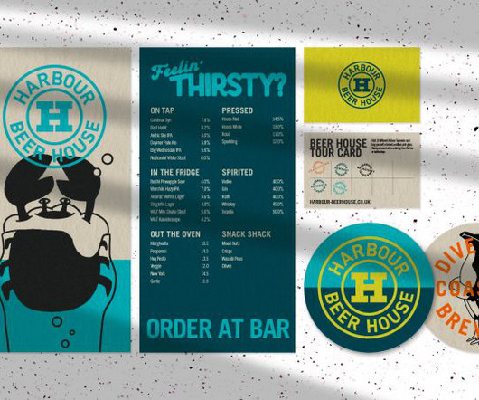
This presented a new opportunity to collaborate and launch a new brand for a series of tap rooms that could appeal to a broad, diverse audience. To help create this new brand, they turned to ORCA , a Bristol-based brand agency with whom they'd already worked on a previous project. In 2023 they achieved B Corp certification.
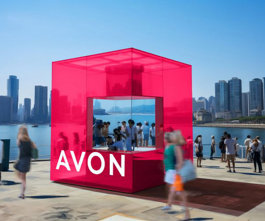
One of the world's biggest beauty brands needed a more consistent identity across all its global platforms. Those of a younger vintage, though, may be unaware that the cosmetics brand, originally founded in 1867, was a huge name throughout the 20th century, known for selling its make-up door-to-door. billion worldwide in 2020.
Strategy and copy agency Opening Line has released a new publication, Between the Lines, which explores the vast and often misunderstood world of brand language through the lens of the creative industries. Generally, the branding industry is more guilty than advertisers when it comes to skipping over the verbal identity.
We organize all of the trending information in your field so you don't have to. Join 66,000+ users and stay up to date on the latest articles your peers are reading.
You know about us, now we want to get to know you!
Let's personalize your content
Let's get even more personalized
We recognize your account from another site in our network, please click 'Send Email' below to continue with verifying your account and setting a password.


Let's personalize your content