Remove 2014 Remove Digital Remove Typography
article thumbnail

GF Smith's Radical Rebrand: How TEMPLO brought a challenger spirit to the iconic paper company

Creative Boom

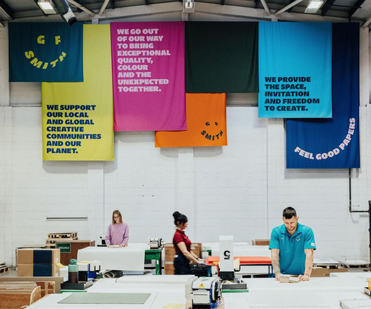
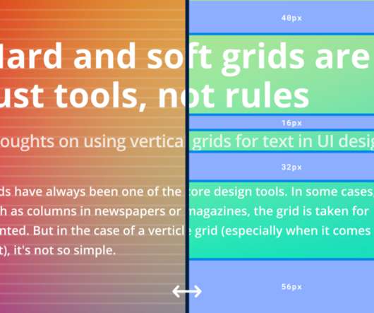
Where the 2014 iteration leaned into a monochrome aesthetic and a heritage-focused narrative, TEMPLO's approach injects colour, movement, and a distinctly human touch. The new identity is designed not just for longevity but also for adaptabilitya vital shift in an industry where brands compete to thrive in both digital and physical spaces.

Branding 282
article thumbnail

Bored of Pinterest? 8 alternatives to try for design inspiration

Creative Boom

Launched in 2014, it's especially popular among conceptual thinkers and experimental creators. Users can create digital mood boards and collaborate with others in a distraction-free environment, making it a favourite for in-depth creative exploration. is a minimalist, ad-free platform for creative research and idea sharing.

Insiders

Sign Up for our Newsletter

This site is protected by reCAPTCHA and the Google Privacy Policy and Terms of Service apply.

article thumbnail

The 20 graphic designers inspiring us the most in 2025

Creative Boom

With an inquisitive approach and a passion for typography, Hugh is a visiting lecturer at The University of Greenwich and a board member of the International Society of Typographic Design. Working in a fractional leadership capacity, Rachel helps teams navigate digital transformation and brand evolution.

article thumbnail

Andy Vella: How I designed the artwork for Songs of a Lost World

Creative Boom

However, we started working more closely and collaboratively after I released my book, Obscure, in 2014. Typography and logo I've always created a new logo for each album. It's got a dark sophistication about it with, again, some playfulness in the typography, although it's hanging onto a slight classicism, too. UK poster art.

Sculpture 535
article thumbnail

40 Geometric Logos: The Power of Shapes in Branding

Inkbot Design

Reebok (the Delta) Shape Focus: Triangle The Observation: In 2014, Reebok adopted the Delta symbol. The arrow hidden between the “E” and “x” is formed by the geometric precision of the typography. Does my brand need to work across various digital and physical media? community, strength, growth)?

article thumbnail

Independent artists to buy prints from this summer

Creative Boom

Maisy Summer Bright, playful prints with charm to spare Maisy Summer is an illustrator, animator, and educator who creates layers of delightful textures, bold colour combinations, and joyful compositions using everything from paper cutting and drawing with scissors to pastels, paints, and digital drawing programs.

Print 243
article thumbnail

Star Wars movie posters from Hungary

Fonts in Use

To most people, the graphic designer and retired typography professor is best known for his ambigrams , and especially those he made for Dan Browns 2000 novel, Angels & Demons. In a 2014 interview , Helnyi was asked about a debate among fans who wondered whether hed even watched Star Wars before designing the poster.

Gallery 51