This site uses cookies to improve your experience. To help us insure we adhere to various privacy regulations, please select your country/region of residence. If you do not select a country, we will assume you are from the United States. Select your Cookie Settings or view our Privacy Policy and Terms of Use.
Cookie Settings
Cookies and similar technologies are used on this website for proper function of the website, for tracking performance analytics and for marketing purposes. We and some of our third-party providers may use cookie data for various purposes. Please review the cookie settings below and choose your preference.
Used for the proper function of the website
Used for monitoring website traffic and interactions
Cookie Settings
Cookies and similar technologies are used on this website for proper function of the website, for tracking performance analytics and for marketing purposes. We and some of our third-party providers may use cookie data for various purposes. Please review the cookie settings below and choose your preference.
Strictly Necessary: Used for the proper function of the website
Performance/Analytics: Used for monitoring website traffic and interactions
From neo-grotesques with a modern edge to culturally significant designs preserving endangered languages, these typefaces reflect the diversity and depth of contemporary typography. With low stroke contrast and two full sets of capitalsLatin and BlackletterPlace shines as a display face and a workhorse for complex typography.
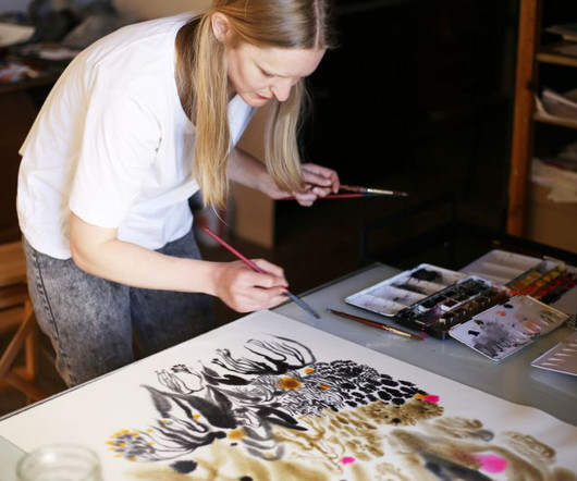
We met Aino-Maija Metsola to discuss her signature style and creative approach to illustrating book covers. Dean contacted her about designing the cover for Orbital, as she felt that Metsola's delicate but powerful style would work well with this text. Her illustrations are both captivating but not too obvious.
Its italics break from traditional flowery styles, offering a bubbly, understated design with a dynamic rhythm. Available in upright and italic styles, each with 13 matching weights, Sans Norm is designed for extensive reconfiguration and adaptable use across various design contexts.
Typography is a funny thing because while it's largely based on fundamental, eternal principles, it nonetheless continues to evolve year after year. This year's selection showcases a diverse range of styles, from timeless classics reimagined for the digital age to cutting-edge designs that push the boundaries of legibility and aesthetics.
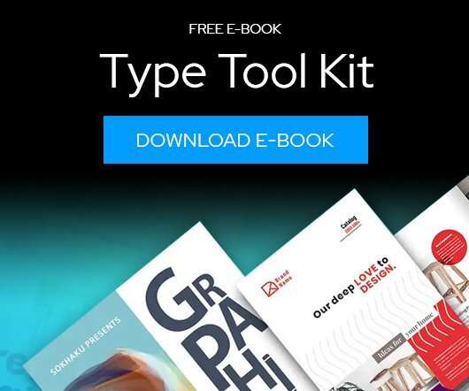
Download this free eBook to learn how you can create stunning typography, using the basics, such as placing text, to advanced controls like ligatures, variable fonts, effects, tracking, range kerning, and everything in between. Learn how to: Use Character Control to add variety to your font styles.
Japanese-style fonts bring a unique blend of tradition and modernity to design projects, making them a popular choice for businesses and creatives alike. Whether you’re working on branding, packaging, or web design, the right Japanese-style font can evoke cultural authenticity, elegance, or contemporary simplicity.
The Power of Fonts in Modern Design Typography is more than just arranging letters; its about evoking emotions and communicating messages effectively. They offer a cost-effective way to explore diverse styles without compromising quality. For graphic designers, the right font can turn a simple project into something amazing.
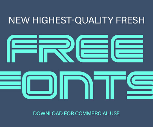
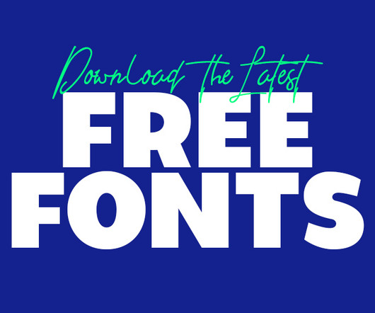
Using the latest free fonts and fresh typographystyles can instantly improve your work and keep your designs looking modern and creative. Whether you’re designing a logo, creating typography for brochures, or working on brand guidelines, the latest free fonts can be a game-changer.
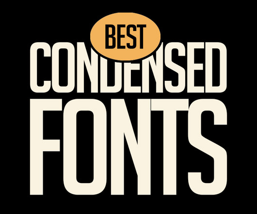
Whether you are working on branding, advertising, or sleek UI designs, condensed fonts provide versatility and style. Homura Condensed Font Homura is a sans-serif display font that is inspired by newspaper headlines and modern typography. It comes in four styles: regular, rounded, slanted, and slanted rounded.
Lauren Hom These talented visual storytellers are capturing imaginations worldwide with their distinctive styles and creative innovation across every medium. The consensus from industry leaders is that to survive as a freelancer , illustrators need to double down on what makes them unique and carve out a distinctive style to set them apart.
The rebrand draws heavily on the museum's iconic modernist architecture by Lina Bo Bardi, using a red-and-black colour palette and strong typography to reflect the building's striking visual presence. HONDO Based between Palma de Mallorca, Spain and London, HONDO specialises in branding, editorial, typography and product design.
Typography is a vital element in any creative project, setting the tone and conveying the message with style. Typography trends are constantly evolving, and staying ahead of the curve means experimenting with new styles that can elevate your work.
Typography is evolving rapidly, reshaping how we perceive and interact with digital designs. This article delves into the latest typography innovations that promise to make digital interfaces more engaging, accessible, and visually appealing. Minimalist and Clean Typography The “less is more” approach remains popular.
It's clear that typography is a primary consideration throughout the characteristically understated, smart, timeless aesthetic of Vanderbrand's work. Again, the typography selection is superb, using Hal Four Grotesk by Studio HanLi, GT America by Grilli Type, and Burgess Pro by Colophon.
As we delve into graphic design trends 2025 , web design trends 2025 , and logo design trends 2025 , we’ll also highlight the influence of AI, typography innovations, and sustainable practices. However, as we head into 2025, one of the most exciting top visual trends is the fusion of these seemingly opposite styles.
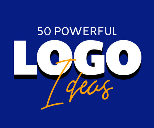
Before diving in, let’s quickly explore some basic concepts and styles for logo ideas. Use Typography to Build Identity Typography-based logos, where the brand name itself becomes the logo, are incredibly effective for startups. Customized logos offer a unique identity, which is particularly important in competitive markets.
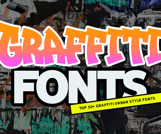
From street to screen, top graffiti fonts for stunning typography and lettering. Whether you’re designing posters, logos, or social media graphics, graffiti fonts are perfect for adding a rebellious touch or emphasizing modern street style. You can choose between solid and plain styles, dramatic shadows, or interesting textures.
Since then, this New Zealand foundry has carved out its niche in the competitive world of typography through a combination of accessible design and creative merchandising. It is "a warm and inviting sans serif family with 27 styles, featuring both slant and weight axes," says Daniel. I think it'll be a mixed bag," he predicts.
We also loved their collaboration with Pink Floyd , which helped the rock band celebrate the Dark Side of the Moon's 50th anniversary in style. Hoodzpah's design work spans branding to type design and is often characterised by a cheeky, whimsical style. John Lewis rebrand by Pentagram Battersea by Pentagram Paypal by Pentagram 2.
The second month of 2025 brings us a rich harvest of new typefaces that perfectly illustrate typography's dual nature: serving designers' practical needs while pushing creative boundaries. marks a significant evolution in accessible typography. million API serves in a single week, its impact on everyday typography is already profound.
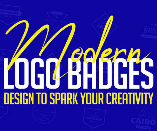
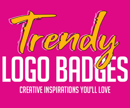
Modern logo badges combine style and practicality, making them a top choice for businesses, events, and creative projects. Each design showcases unique styles, innovative elements, and artistic flair. They are a creative playground where typography, shapes, and symbolism converge. Have a favorite logo badge?
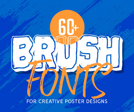
Whether you need to create a festive vibe or a sleek professional look, these brush fonts deliver unmatched style and readability. Whether you are designing logos, posters, invitations, websites, or t-shirts, you are sure to find something to match your design style. Batteny Brush Font Batteny is a classy script font.
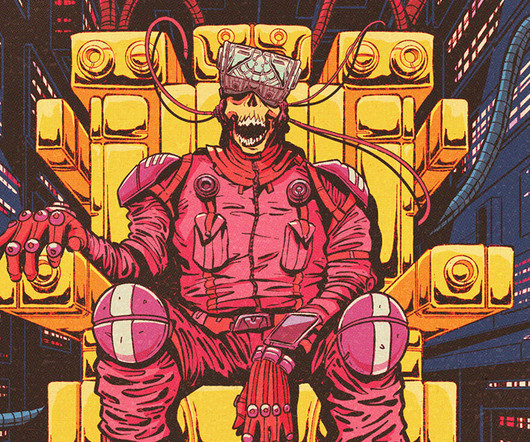
Retro-Futurism: Nostalgia Meets Innovation Retro-futurism is a design style that combines mid-20th-century aesthetics with futuristic elements, blending vintage nostalgia with modern innovation. This style resonates particularly well in industries like gaming, fashion, and tech, where audiences appreciate the fusion of past and future.
Typography to rhythm The style of your brand's typography can also inform the rhythm and pacing of your music. Experiment with genres The key to a successful sonic brand identity is consistently using recognisable styles or genres across your content.
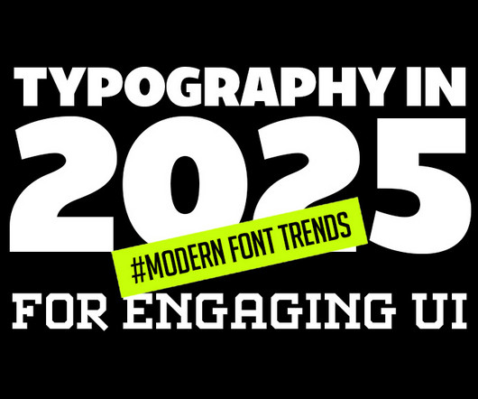
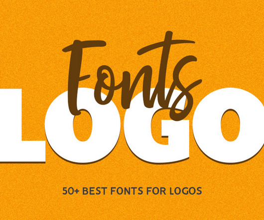
Vaqoeng Modern Magazine Font Logo Font You may also like: 100 Best Free Fonts For 2025 10 Top Visual Trends for 2025 Typography in 2025: Modern Font Trends for Engaging UI 70+ Best Japanese-Style Fonts for Modern Design and Branding Explore 50+ Best Fonts For Logos One of the most effective approaches to logo design is to keep it simple.
Griffins work stands out for its intricate details and surreal compositions, seamlessly blending retro visuals with his signature futuristic style. The collection incorporates the vivid color palettes, dramatic typography , and imaginative world-building that defined the era.
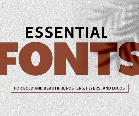
Slipknot Handmade Style Font Fonts for Posters, Flyers, and Logos Choosing the right fonts for posters, flyers, and logos requires understanding the goals of your design. With so many fonts for posters available, understanding how each style works can help you choose the right font for the right project. Siluma A Bold Script Font 28.
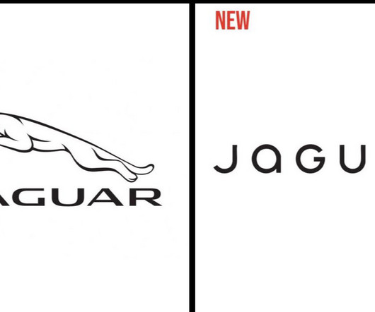
The typography is less “agressive”, with rounded lower-case letters and much bigger letter-spacing. The radical change in style is also very politically connoted, which is always dangerous when doing business. Following a global trend, it takes a much more minimalist approach, going as far as removing the jaguar drawing.
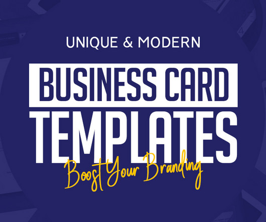
Bold TypographyTypography-centered business card templates have become increasingly popular for their ability to combine clarity with creativity. Bold typography often uses oversized fonts, creative alignment, or a combination of two different font styles.
These designs showcase the latest trends, featuring a mix of intricate vintage styles and sleek modern aesthetics. The “ modern retro ” trend is marked by clean shapes, bold typography, and warm, nostalgic color palettes. These designs evoke familiarity while maintaining relevance for modern audiences.
Originally from Denmark, Julie Solvstrom has become a leading light in Vancouver's creative community with her beautiful, organic approach to illustration and typography. That's not to say her style is traditionalit feels graphic and modern. It's easy to get a bit stuck in your own style sometimes.
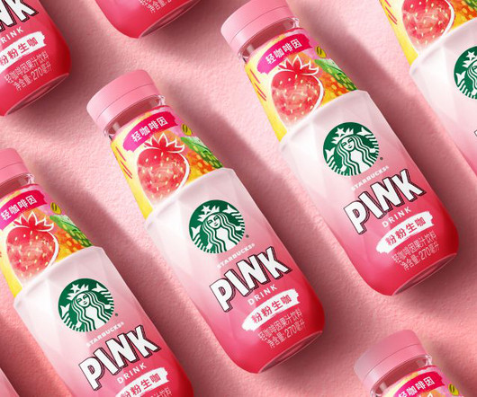
It's aimed squarely at what Marks identifies as 'life autonomists'Gen Z consumers who embrace individuality, community, and aesthetics and whose drinks are an extension of personal style. Key Starbucks RTD equities remain intact, anchoring the product within the broader brand portfolio, but fresh elements elevate the experience.
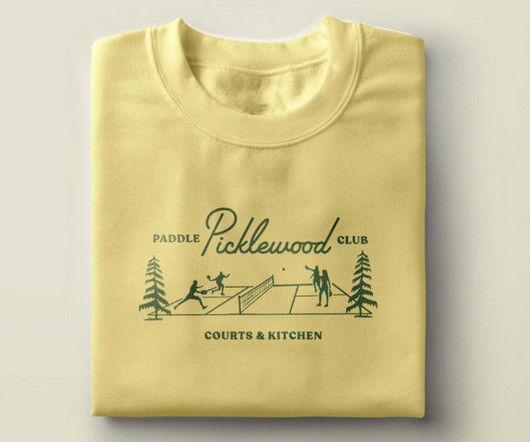
From the midcentury script typography to the playful supporting illustrations and colour palette to the custom plaid and argyle patterns, everything is designed with tongue-in-cheek. Eventually, they zeroed in on colours, patterns, and iconography styles that evoked the preppy country club aesthetic. It's pickleball, after all."
Its annual Pinterest Predicts report, for example, pulls all its millions of data points together to highlight new styles and themes. Whether you're working on branding, typography or photography, this platform is an excellent resource. What makes Pinterest especially unique is its ability to predict future trends.
Developer and digital art director Dan Powell explains how he used custom typography and generative tools to design the brand identity for Frontify Futures, an exciting new platform that explores tomorrow's brand-building landscape. Who knows where branding will go in the future? We wanted it to be something shifting and repositioning.
Each element of logo designs — colors, typography, shapes — all contribute to how a brand is perceived. Analyzing successful logo designs from a variety of industries can open up new possibilities, showing how different styles, colors, and formats work to capture attention.
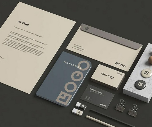
These resources come in a variety of styles and formats, allowing for a personalized and versatile approach to design. Many free stationery mockups are created with high-quality resolution, ensuring that even the most intricate details, such as logo placement and typography, appear crisp and professional.
From elegant script typefaces to whimsical and playful lettering, there’s something for every style and purpose. This list includes a variety of festive lettering styles, from classic to contemporary, that are perfect for your winter projects. We provide various themes and font styles.
In this way, the style is evocative of the broken systems WRAP aims to address and contrasts with sustainability brands that generally show "beautiful natural landscapes or doomsday landfill and forest fires", says May. Through this Burtynsky-inspired style, WRAP can show both in one image.
The typography is clean and sans-serif, further enhancing the brand's no-nonsense, approachable personality. Bright, inviting colours and crisp typography demonstrate the ambition to create a world in which everyone can share in the benefits of living foods. Blume by Grant Blume by Grant Blume by Grant 4.
The result is an arched wordmark that nods to '90s brand typography while remaining contemporary and adaptable across touchpoints. Typography was another key ingredient in capturing the right balance of nostalgia and modernity. We wanted a style that felt natural, joyful, and authentic but a little offbeat," Bruce adds.
Typography has always been a powerful tool in design, blending the art of arranging text with creativity to convey a message. Text art encompasses various styles and techniques, from intricate hand-lettering to modern AI-assisted designs. Simply upload an image, select text styles, and let the AI do the rest.
Creating efficient, consistent, and flexible typography for digital platforms using modern design system principles. At the heart of this approach is typography , which is how we make text look and feel. When typography is well-designed, users can engage with content smoothly without distraction.
As new pages, features, and marketing materials are added, inconsistencies in colors, typography , imagery, and layout can sneak in. What starts as a polished, cohesive system can slowly turn into a patchwork of mismatched styles. TypographyTypography is one of the most visible indicators of design consistency.
We organize all of the trending information in your field so you don't have to. Join 66,000+ users and stay up to date on the latest articles your peers are reading.
You know about us, now we want to get to know you!
Let's personalize your content
Let's get even more personalized
We recognize your account from another site in our network, please click 'Send Email' below to continue with verifying your account and setting a password.


Let's personalize your content