

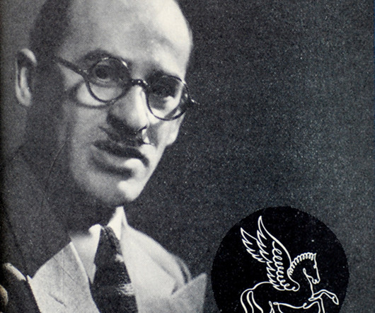
Steven Heller’s Font of the Month: Valvolina
I Love Typography
JANUARY 12, 2022
Read the book, Typographic Firsts. Evoking past, present and future, the geometrically glorious Valvolina with 'its bizarre yet engaging assemblage of contrapuntal shapes' is the topic of this fifth episode of everyone's favorite type column. The post Steven Heller’s Font of the Month: Valvolina appeared first on I Love Typography.


Let's personalize your content