Remove topics type-beer
article thumbnail

Best Alcohol Packaging And Branding That Packs a Punch

Canny

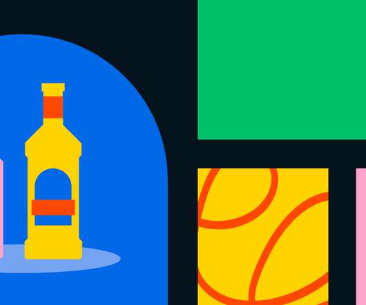
Illustrations are always nice to have on beer logos as they add a sort of character to what’s being presented. They seem like random designs, but they’re actually inspired by the doodles people leave behind on beer mats. Lucha Libre Beer. Anyway, let’s get back on topic. Credit to Shower Beer. Shower Beer.

Brand 148
article thumbnail

Top 10: March Branding

Mindsparkle Mag

Back with our weekly inspiration series, there are packaging, UI and UX interfaces, coffee cups, beer bottles, and stationary, of course! Another topic we're well-known for is font fandom. We're always looking and showcasing put-of-the-blue types that are super eye-catchy and bring something new to the table or our design community.

Brand 52
Insiders

Sign Up for our Newsletter

This site is protected by reCAPTCHA and the Google Privacy Policy and Terms of Service apply.

article thumbnail

Forging singularity with The Type Factory

Abduzeedo

Forging singularity with The Type Factory. From the 21st to the 26th of June 2021, the 10th edition of Algarve Design Meeting (ADM) took place at Fábrica da Cerveja, an old beer factory in Faro, Portugal. In an event that gave design and designers the spotlight, KOBU™ Agency set up an exhibition named “The Type Factory”.

Agency 73
article thumbnail

Top 20 Best Advertising Campaigns of All Time

Inkbot Design

4 – Dos Equis: The Most Interesting Man in the World The most interesting man in the world, an iconic advertising figure created for Dos Equis beer, is instantly recognisable by his Cuban cigars, confident personality and memorable slogan: “I don't always drink beer, but when I do, I prefer Dos Equis. ” ad campaign.

article thumbnail

How NOT to attend a design conference

UX Collective

Interesting popup stalls for all your bites and liquid courage (mostly promoted by Mortiz the local Catalan Pils beer). Whether it’s for a company or your personal brand, attendees will make judgments on you and your content based on the type of conference that’s held. They had great DJs playing outside in the glittering Spanish sun.

article thumbnail

Robot Food cuts the confusion around debt with a new identity for StepChange

Creative Boom

Degular Bold, a friendly sans serif by OH no Type Co., Created in-house by Robot Food designer Ryley Devine, icons are often used to signal information about certain topics, such as housing costs, and can also symbolise more abstract ideas, such as the way debt "weighs you down" (illustrated by an anchor formed from a £).

Brand 387
article thumbnail

“Our isolation makes us resourceful”: a New Zealand design guide

Design Week

A specialist in whakairo (a type of wood carving), the artist wanted to create an identity that tied together both his Māori and European heritage. “While studios might compete for work, they also accept if another studio wins the work — and will have beer with them at the end of the week.”

Client 101