Remove topics mobile-icons
article thumbnail

10 Step Website Redesign Process for 2021

Just Creative

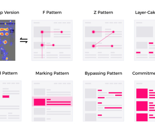
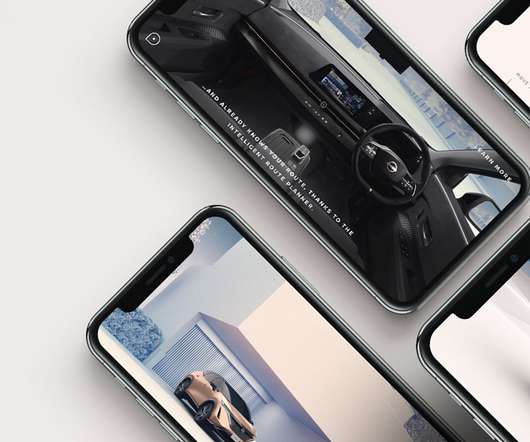
Your Website is Not Mobile Friendly. One of the main sins of web design in 2021 is having a website that is inconvenient or difficult to use on mobile devices. Too many people are browsing on mobile devices today for you to get away with having a bad mobile experience. Focus on the Mobile Experience.

article thumbnail

How Good Web Design Can Boost Traffic

Inkbot Design

With more commerce happening on mobile devices, slow load times simply aren't an option if you want to keep visitors on-site. Google research shows that 53% of mobile site visitors will leave a page that takes longer than 3 seconds to load. Optimise Page Speed Site speed is a foundational component of the overall user experience.

Insiders

Sign Up for our Newsletter

This site is protected by reCAPTCHA and the Google Privacy Policy and Terms of Service apply.

Trending Sources

article thumbnail

60 Best Responsive WordPress Themes (Free and Paid)

HONGKIAT

The shift towards mobile browsing has made responsive website design more important than ever. To help you stay ahead in this mobile-first world, we’ve compiled an extensive list of 60 WordPress themes that excel in responsiveness. Neve Neve’s design focuses on speed and accessibility, offering a mobile-first approach.

Theme 98
article thumbnail

What can product designers learn from UI artists?

UX Collective

Most of this time I had a chance to focus on designing mobile apps, websites, services, and products. Last year my main focus switched to mobile games and I realized one thing — while being so close —  the design of mobile apps and mobile games —  these two fields are separate and do not intersect much.

article thumbnail

An In-Depth Look at Material Design

Inkbot Design

The design language was developed with a “mobile-first” ideology to optimise the user experience. For example, when an Android user clicks the app icon to open an app, the icon seamlessly transforms into the expanded app window itself. Surfaces – The canvas where icons, buttons, menus and information reside.

Layout 80
article thumbnail

Animated Corporate Video Examples to Inspire Your Next Campaign

Canny

Featuring a combination of live-action shots and funky animated text and icons, this video keeps you hooked from start to finish. The video also features a range of cool and quirky icons such as a pencil scribble and a large arrow which is used to click on different elements. DHL logistics. And that’s exactly what they’ve done.

Animation 147
article thumbnail

Optimising Page Layout Design for Better UX

Inkbot Design

Design breakpoints – Create separate grid variations for each layout breakpoint, including desktop, tablet and mobile. Ask questions – Posing interesting questions encourages readers to think more deeply about topics. Map key elements – Determine what elements must fit within the grid (e.g.

Layout 85