Remove tags negative-space
article thumbnail

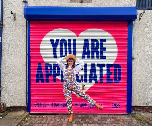
Designer Emily Salinas addresses toxic relationships via Project Lovebomb

Creative Boom

It's a dark topic, but rather than dwelling on the negative, Emily's project takes a positive and constructive stance. "I It aims to reclaim the idea of love bombing from being something negative to something positive, as well as seeking to raise awareness about love bombing and other red flags.

Gallery 370
article thumbnail

Island Smiles Dental Care Branding Process & Interview

Just Creative

After finalizing the name, we moved into the tag line and logo design. This mark cleverly utilizes negative space, making it memorable and the beach themed colors ensures the brand stands out in a sea of similar blue dentist brands. As Maui is an island and smiles are what the dentist creates, Island Smiles, was the perfect fit.

Brand 245
Insiders

Sign Up for our Newsletter

This site is protected by reCAPTCHA and the Google Privacy Policy and Terms of Service apply.

article thumbnail

Design Milk’s Favorite 2023 Designs for the Cannabis Connoisseur

Design Milk

And that’s why we’re fond of this graphical glass design: a purposeful object with the bonus of being worthy of a space on your shelf for display. Yew Yew Sunset Bong This colorful borosilicate glass piece gives off the impression it could be a design object found within the likes of the MoMA gift shop or Design Within Reach.

Sculpture 264
article thumbnail

The Web Design Hack Hall of Fame

Speckyboy Design Magazine

Sometimes, they carry a negative connotation. Element Spacing: Non-Breaking Spaces ( & ) and Spacer.gif. Detail-oriented web designers have often looked for ways to space elements down to the exact pixel. Thus, the non-breaking space (& ) and spacer.gif were used to gain more control over spacing.

article thumbnail

10 Stunning Trends for Website Designers to Follow in 2020

Graphic Design Junction

Take a look at Android ’s web page below: This shows that using fluid shapes results in a better division of space without the use of harsh lines and angles. A good minimalist design is all about having only a few elements on the page and using the negative space to bring the viewer’s attention to them.

article thumbnail

Visual Identity in CHERRYBANG’s Branding

Abduzeedo

Visual Identity in CHERRYBANG’s Branding abduzeedo 0430—24 Discover how CHERRYBANG utilizes bold simplicity and negative space in its streetwear branding to create a stylish and memorable visual identity. This technique, while subtle, is effective in making the brand’s visual identity stand out in a crowded marketplace.

Brand 96
article thumbnail

Noted: New Logo and Identity for Understood by Wolff Olins

Under Consideration / Brand

Your browser does not support the video tag. Your browser does not support the video tag. Your browser does not support the video tag. The new logo introduces a monogram where an abstract “U” emerges from the negative space. Images (opinion after). Sonic logo. Created by Listen. Monogram variations. Illustrations.