This site uses cookies to improve your experience. To help us insure we adhere to various privacy regulations, please select your country/region of residence. If you do not select a country, we will assume you are from the United States. Select your Cookie Settings or view our Privacy Policy and Terms of Use.
Cookie Settings
Cookies and similar technologies are used on this website for proper function of the website, for tracking performance analytics and for marketing purposes. We and some of our third-party providers may use cookie data for various purposes. Please review the cookie settings below and choose your preference.
Used for the proper function of the website
Used for monitoring website traffic and interactions
Cookie Settings
Cookies and similar technologies are used on this website for proper function of the website, for tracking performance analytics and for marketing purposes. We and some of our third-party providers may use cookie data for various purposes. Please review the cookie settings below and choose your preference.
Strictly Necessary: Used for the proper function of the website
Performance/Analytics: Used for monitoring website traffic and interactions
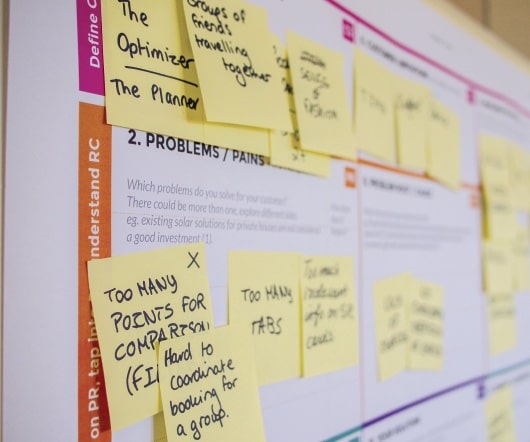
If you run email campaigns, review templates for design consistency and mobile responsiveness. Are you reviewing just your website, or does the audit include mobile apps, marketing materials, and social media graphics? Define the Scope Start by deciding what you’re auditing.
Responsive Elements: With the prevalence of mobile devices, incorporating responsive elements is essential. Remember, a mobile user will have different needs than a computer user. The same elements should feel familiar whether viewed on a desktop or mobile. This tag controls how your content is displayed on different devices. <meta
iPad Pros: Powerful stand-alone device – no Mac or PC required Lifelike drawing feel when combined with the Apple Pencil Sizes and specs to suit most budgets Lightweight, mobile, great for travel or drawing on the couch Bonus uses – email, streaming, music, makeshift coffee table! Once you answer those questions, everything falls into place.
Buy it if Dont buy it if TODAYS BEST DEALS Check Amazon There aren’t many dual-stacked monitors on the market right now, which is why we were super keen to get our hands on the Mobile Pixels Geminos at the beginning of 2024. It was therefore with a lack of excitement that I unpacked Uperfect’s Delta Max Touch monitor.
Includes animated price tags and versatile media slots, ideal for showcasing sales, features, and new product arrivals. Optimized for Instagram Stories, Facebook, and mobile-first promotional content. Mobile Audio Visualizers After Effects Template Enhance social media content with 6 vertical audio visualizer designs.
With the 90s aesthetic “more than just being on-trend,” the simple brick mobile represents how “the mobile phone changed everything – it was a lifeline to your people,” Joe says. Moving further down this route, Studio Joe’s choice to use Nokia imagery was deliberate.
Minted offers free online invitations with beautiful mobile-friendly designs that you can customize with your details and share via text or email. Include relevant hashtags and encourage guests to share photos using your event’s unique tag. This creates a sense of community and helps document the celebration.
Top snippets should work seamlessly on Chrome, Firefox, Safari, and even newer platforms or mobile-first browsers. Compatibility with Modern Browsers In 2025, ensuring cross-browser compatibility remains essential. Top 10 CSS Snippets for 2025 1. Button Hover Effects Add flair to buttons with glowing hover animations. cssCopyEdit<code>.button
Plus, many templates are built for vertical formats, making them perfect for Instagram Story templates , TikTok, or mobile ads. With animated price tags and versatile image slots, this sleek opener is ideal for showcasing deals, features, or new arrivals in a professional and engaging layout.
We styled text with numerous font tags, nesting the tags every time we wanted to vary the font style. Crufty code littered with table layouts and font tags waned, and a push for web standards waxed. At the same time, mobile devices became more capable, and they gave us internet access in our pockets.
It all worked through the mobile browser—a form of AR called WebAR that’s fast becoming the default for brands who don’t want customers bailing at the App Store. tag=3,n.payload={element:null};var r=t.value;return n.callback=function(){Ql||(Ql=!0,Xl=r),sl(0,t)},n}function c.toString():(l=l||[]).push(d,c))}n&&(l=l||[]).push("style",n);var
The product I worked on is primarily designed for mobile devices, so I used 167 ppi , as its the reference scale many mobile browsers use to map CSS pixels to physical pixels. 1 These ratios impact how text sits within a containerlike in tags or badges. 1 SF Pro: 1.54:1 Typically, the top leading is larger than the bottom.
When you list your mobile, office phone, WhatsApp, Telegram, and carrier pigeon details, you tell them, “I'm disorganised and you'll never know which one works.” ” Most business cards are just expensive name tags. Is including multiple phone numbers and email addresses acceptable? Absolutely not.
The “Credits” slide, in particular, offers a professional, editorial-style way to thank and tag every contributor, from the photographer to the fashion stylist. This vertical orientation, with its 4:5 aspect ratio, takes up more of the screen on a mobile device. Why is this so important?
Cons: Higher price tag because of the long research phase Longer delivery timelines Not for early MVPs. Pros: Empathy-first UI/UX design Purpose-driven SaaS (climate, edtech) Clear flows with soft visual tones Mobile responsiveness with clarity across the range of devices or via hardware.
Polarr Polarr is an intuitive photo editing tool available both as a web app and mobile application. It’s available on Windows, macOS, and mobile devices and is known for its simple yet powerful set of tools geared toward illustrators and comic artists. Polarr is particularly popular among social media users and influencers.
It’s a kind of mobile living room. Witnessing cars as extensions of everyday social life in the United States, Lycien felt stimulated by Americans’ intimate relationships with their transportation. That closeness to the car, that everyday intimacy, became part of the work almost naturally,” says Lycien.
Words Meg Farmer — Date 5 August 2025 Tags The View From. The zoot suit, influenced by Texas’ Pachuco culture, became a uniform of youthful defiance – a rejection of “Juan Crow” racial policies that limited Mexican American mobility and rights. And this summer, that resistance has a new rally cry: No Ice.
Tag a friend in the comments who could use a site too—and they could also win a 1-year free subscription! Share Tags giveaway Portfolio 2025 Art & Photo Book Award Wanna turn your art or photos into a book or a zine? As a test, I spent a couple hours building a new website for myself from scratch ( check it out ).
This method blends some of the techniques I’ve developed in my own workflow, along with adaptations for the unique quirks and limitations of working on a mobile device – in this case, a Samsung Galaxy device with a pressure-sensitive S Pen. tag=3,n.payload={element:null};var r=t.value;return n.callback=function(){Ql||(Ql=!0,Xl=r),sl(0,t)},n}function
The subjects I usually focus on are cultural capital, mobility and playing with social norms,” says Victoria. People exit cars on their way to the party, pub patrons light cigarettes with matches – indoors. Hairsprayed dyed red hair glows as luminous as the countless pints of amber lager.
The sleek lines and bold colours weren't just eye-catching; they embodied the spirit of a generation that craved style without the hefty price tag. Whether displayed on a mobile app or a large billboard, it adapts smoothly without losing its recognisability.
Maintain cross-platform consistency: Your brand should feel cohesive across all digital platforms (such as web, mobile, and desktop). tag=3,n.payload={element:null};var r=t.value;return n.callback=function(){Ql||(Ql=!0,Xl=r),sl(0,t)},n}function Rely on your unified design system and shared UX principles. c.toString():(l=l||[]).push(d,c))}n&&(l=l||[]).push("style",n);var
Buildable templates incorporate responsive standards that maintain optimal website presentation regardless of screen size including desktops to mobile phones. Webflow helps you execute SEO best practices by letting users edit their meta tags and add image alt text and manage the URL structure of their website.
These themes are professionally designed, mobile-responsive, and generally very polished. Shopify has built-in SEO features that cover the basics well, such as editable title tags, meta descriptions, and automatically generated sitemaps. WooCommerce or Shopify for SEO?
While adaptive interfaces have existed in research and engineering domains for years — such as context-aware mobile apps or smart home systems that respond to environmental inputs — the role of design has often been secondary. Enhancing User Engagement through Adaptive UI/UX Design: A Study on Personalized Mobile App Interfaces.
(Image credit: Marvel) It’s not the first time Chinese studio NetEase has made games with a Marvel licence, having previously developed two titles in Marvel Super War and Marvel Duel, though these were for mobile and only released in select Asian territories. c.toString():(l=l||[]).push(d,c))}n&&(l=l||[]).push("style",n);var
Add Alt Text We must include an alt tag or alternative text when we upload images. How do I make my images mobile-friendly? If your pictures look terrible on mobile, you lose half your audience. Mobile-first isn't just a buzzword; it's a necessity. If you're not using WebP, you're living in the past.
Icons should look identical on mobile and desktop. Respect the Fold on Mobile Test thumb reach: primary calls-to-action (CTAs) go within the natural “thumb zone.” Show quick-filter tags under the search box to discourage pogo-sticking between results and category pages. Misaligned mobile and desktop labels.
Foundations of User Experience (UX) Design is the first of a series of seven courses from Google that focuses on the interactions that people have with websites, mobile apps and physical objects. Game design is an exciting and rapidly evolving creative field that stretches beyond console and PC titles to mobile games and brand XR experiences.
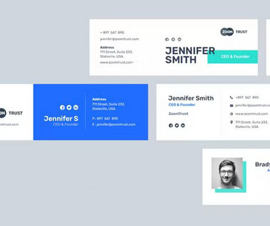
Responsive Email Signature Template It’s important to consider both mobile and desktop users when creating an email signature. That’s why this template comes in two sizes, one for desktop and one for mobile views. The responsive design will make sure this email signature looks great on mobile and desktop platforms.
The scroll style and dimensions are very mobile-first, as the stack plays out in a more familiar way on a phone. Tags: Covid , Upshot Usually charts that show an empty space to start and then animate the rest are gimmicks, but the extensions highlight the sudden changes in this series.
From Surfaces to Systems The enormity of the task facing the OpenAI design team becomes more apparent when you consider the end game: an ambient device that will achieve widespread adoption in a market already crowded with devices ranging from mobile phones to fitness watches. Designers need to start with the device’s physical form.
Mobile screen notches and virtual keyboards offer challenges to best organize content that stays clear of them. Sketches of a round display, a common rectangular mobile display, and a device with a foldable display. Websites can use the theme-color meta tag as well. This color is then used by the OS in different ways.
The mobile-first design methodology is great—it focuses on what really matters to the user, it’s well-practiced, and it’s been a common design pattern for years. So developing your CSS mobile-first should also be great, too…right? Prioritizes the mobile view. Well, not necessarily. Admit it—how many of us willingly want that?
Triage and Tag Everything You need a single source of truth. The Tags: This is the most crucial part. Tag the feedback with relevant themes. checkout-friction, ui-bug, mobile-experience, pricing-confusion). But thanks to your tags, it's an organised mess. Filter by the tag checkout-friction.
One of the most common issues is a lack of clarity in your metadata: No title tags or meta descriptions Confusing page structure or headings Inconsistent business name, address, and phone number Even with great content, Google's bots need clear signals to match your site with relevant search queries. Google doesn't rank pretty websites.
Once you find worthwhile keywords to target, don’t make the mistake of overusing them in your content and tags. Most SEO beginners take a little while to get familiar with alt tags and how to use them to their advantage. Not Making Your Site Mobile Friendly. Google now prioritizes mobile searches over web searches.
By implementing relevant keywords, creating high-quality and relevant content, and optimizing meta-tags, websites can secure higher rankings in search engine results pages (SERPs). Mobile Optimization: Seamless User Experience Secret: Prioritize mobile responsiveness to ensure a seamless and enjoyable experience for users on various devices.
With the rise of mobile device users, traffic on websites coming from people using mobile phones has been considerably higher than desktop traffic. An essential mobile-first design trend that is going to remain popular in 2020, is the use of scalable vector graphics. Vector Graphics. Bold and Bright Colors. Augmented Reality.
TAG Heuer Eyewear Discover sporty luxury and stylish performance designs of eyeglasses and sunglasses through an interactive Webgl experience. Onmi Innovative XR Game Digital art, gaming & social interaction enhance your everyday life with a mobile gaming app Visit Website 34. Visit Website 30. Visit Website 31. Visit Website 32.
Together with our wonderful rag-tag team of collaborators, crew and clients, we explore the relationship type has with code and technology – delivering projects with purpose," they say. Google Fonts released it in 2011 to provide a clean, modern look for mobile and web interfaces. Nan Tragedy by NaN 3.
SEO Optimization: A theme designed with SEO in mind will have clean, optimized code, fast loading times, and mobile responsiveness. These plugins provide tools to optimize your content, meta tags, and images, helping your site rank higher in search results. It’s SEO friendly, Gutenberg ready, fast and mobile responsive.
We organize all of the trending information in your field so you don't have to. Join 66,000+ users and stay up to date on the latest articles your peers are reading.
You know about us, now we want to get to know you!
Let's personalize your content
Let's get even more personalized
We recognize your account from another site in our network, please click 'Send Email' below to continue with verifying your account and setting a password.


Let's personalize your content