This site uses cookies to improve your experience. To help us insure we adhere to various privacy regulations, please select your country/region of residence. If you do not select a country, we will assume you are from the United States. Select your Cookie Settings or view our Privacy Policy and Terms of Use.
Cookie Settings
Cookies and similar technologies are used on this website for proper function of the website, for tracking performance analytics and for marketing purposes. We and some of our third-party providers may use cookie data for various purposes. Please review the cookie settings below and choose your preference.
Used for the proper function of the website
Used for monitoring website traffic and interactions
Cookie Settings
Cookies and similar technologies are used on this website for proper function of the website, for tracking performance analytics and for marketing purposes. We and some of our third-party providers may use cookie data for various purposes. Please review the cookie settings below and choose your preference.
Strictly Necessary: Used for the proper function of the website
Performance/Analytics: Used for monitoring website traffic and interactions
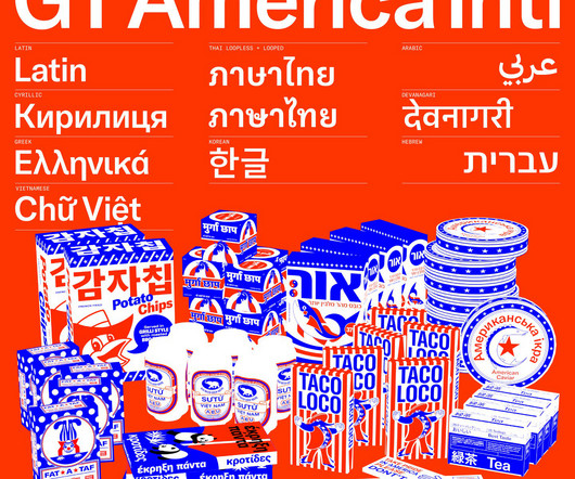
Again, the typography selection is superb, using Hal Four Grotesk by Studio HanLi, GTAmerica by Grilli Type, and Burgess Pro by Colophon. Vanderbrand doesn't just work on place-related brands; it also works with Together Design Lab (TDL), a team of planners, designers, and architects at Toronto Metropolitan University.
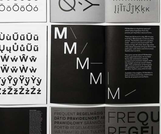
GTAmerica. Designed by Noël Leu and Seb McLauchlan , GTAmerica is essentially the missing bridge between 19th century American Gothics and 20th century European neo-grotesk typefaces.
They paired the bold and expressive typography of GT Alpina (primary typeface) and the structured grotesque GTAmerica (secondary typeface) with the condensed and curvaceous Domain Display (CRUDE’s new logo). Typography plays a key role is communicating CRUDE’s edgy, playful, and straight-forward tone of voice.
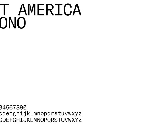
Font selections – Antarctica and GTAmerica Mono – harmonize seamlessly with the color palette. Representing a USA-based client like Apex Linear demands precision. Saul's strategy, art direction, and graphic design choices are manifestations of this exacting approach.
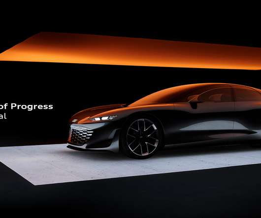
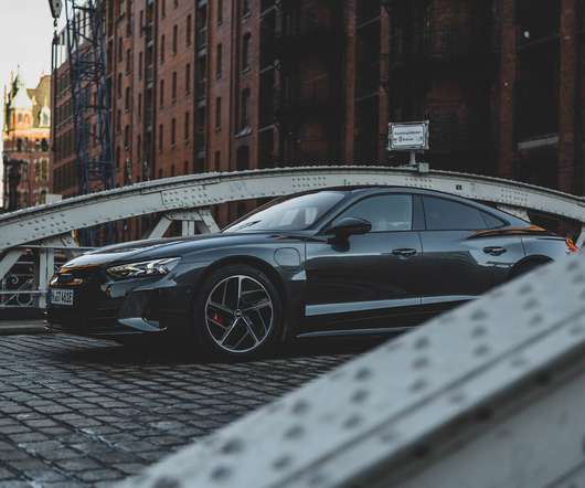
Audi RS e-tron GT. Affairs and Sustainability for North America, alongside Byron and Dexter Peart of housewares brand Goodee, discussing sustainability. This is a future driven by the values, mindset and aspirations of our progressive customers,” Paladino says. The interior of the Audi grandsphere. Astronaut Chris Hadfield.
Jones says that only one typeface was chosen for the new look – GTAmerica – which combines “the history of high impact, page-filling, sporty American gothics with functional and accessible European Neo-Grotesques” [link]. New campaign photography has been created in collaboration with Phil Haynes.
The new identity revolves around two fonts: GTAmerica Black and Editor Regular. “Still Remarkably On and Off”. Our voice can hyper-link content and characters together ala Wikipedia or IMdb but the design and motion behavior remains decidedly analog, anachronistic even. Gretel project page. Sample typography.
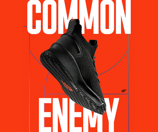
At the heart of Common Enemy's design system lies the display typeface, GTAmerica. Rooted in an assertive and urgent approach to typography and color, the brand identity reflects the dynamism and diversity of basketball culture while paying homage to historic protest movements.
Among its latest fleet of electric vehicles is the e-tron GT. As North America adopts measures towards a more sustainable future, we are collectively on the right track. Progress is at the core of Audi’s ethos. billion to build out Canada’s charging infrastructure).
The typefaces featured in previous issues, GTAmerica and GT Super designed by the Grilli Type Foundry, have been brought forward into this new iteration but are used in a different way. “We’ve worked with the typefaces by mixing the serif and sans serif together in the titles,” Rowe says.
The choice of the condensed sans-serif typeface, GTAmerica, draws inspiration from both American Gothics of the 19th century and European Neo-Grotesk typefaces of the 20th century. The design of Common Enemy is centered around a bold and urgent approach to typography and color.
We used a special adaptation of the Grilli typeface GTAmerica Compressed Light for the brand typeface with the ‘N’s reversed as part of the standard character set. Everything is clean and modern – specifically designed to work well on small scale devices such as phones and tablets.
Software offerings only available for customers located in the Americas. Featuring an adjustable stand and battery-less pen, these little features can make the world of difference providing you with comfort when using the Kamvas GT-191 for hours on end. $399.95. Buy on Amazon. The Best Graphics Tablet for Artists and Illustrators.
“The project helped us reflect on how interconnected different writing systems are and how they are the result of long historic processes,” says co-founder Noël Leu.
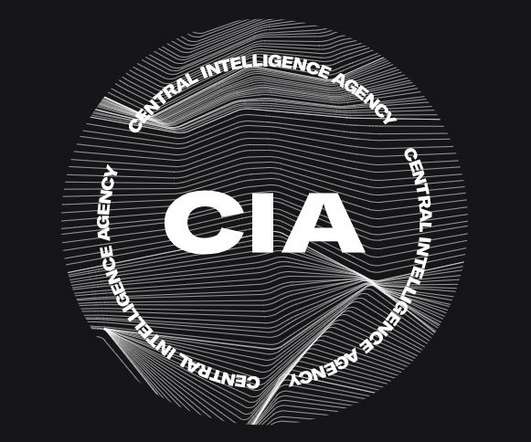
The US federal agency’s new website hopes to appeal to young recruits using contemporary graphics and typefaces such as GTAmerica, which has prompted some scathing comparisons.
The font Timmons — by graphic designer Matt Willey — was used for the paper’s headlines, chosen for its “impact” The main copy uses GTAmerica, which provided a “legible typeface in a neutral manner”, Stiff says.
PRO: GT Metrix analysis starts with its grade and evaluated vitals. GT Metrix also provides a comprehensive audit on your website pointing to specific issues. The options are Asia (Tokyo), Pacific (Australia), Europe (Germany), Europe (London), North America (USA), South America (Brazil).
It's been: A victory symbol in countless Grand Prix races A badge of honour on legendary race cars like the 250F A rallying point for Maserati racing teams and fans alike Each appearance on the track cements the logo's association with speed, precision, and victory.
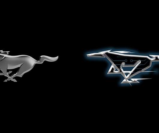
As a kid growing up in America, it’s hard not to. When I first saw that iconic badge on the front of Ford’s new electric crossover, it looked a little strange and out-of-place to me (and not because I’m one of the Mustang faithful that believes the badge only belongs on a grille that’s wrapped around a big V8 engine).
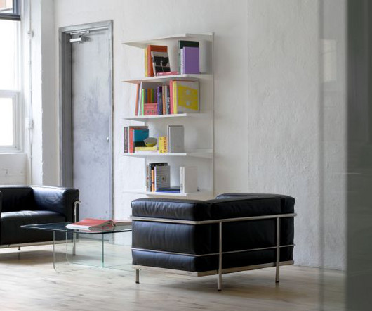
Opinion by Richard Baird OneFourFive Clarendon is a modern workspace, developed by Salta, designed by Architectus and created for future-focused businesses looking to situate themselves in Southern Melbourne. The development aims to attract like-minded progressive people with a conscious focus on connectivity and local activity.
It wasn't until the 1960s that Nintendo of America officially adopted the Roman script for its products. Today, Capcom is a global gaming giant with many subsidiaries in Japan, Asia, Europe, and North America. The debut emblem consists of the stylised GT symbols, the abbreviation for the video game's full name, Gran Turismo.
We organize all of the trending information in your field so you don't have to. Join 66,000+ users and stay up to date on the latest articles your peers are reading.
You know about us, now we want to get to know you!
Let's personalize your content
Let's get even more personalized
We recognize your account from another site in our network, please click 'Send Email' below to continue with verifying your account and setting a password.


Let's personalize your content