This site uses cookies to improve your experience. To help us insure we adhere to various privacy regulations, please select your country/region of residence. If you do not select a country, we will assume you are from the United States. Select your Cookie Settings or view our Privacy Policy and Terms of Use.
Cookie Settings
Cookies and similar technologies are used on this website for proper function of the website, for tracking performance analytics and for marketing purposes. We and some of our third-party providers may use cookie data for various purposes. Please review the cookie settings below and choose your preference.
Used for the proper function of the website
Used for monitoring website traffic and interactions
Cookie Settings
Cookies and similar technologies are used on this website for proper function of the website, for tracking performance analytics and for marketing purposes. We and some of our third-party providers may use cookie data for various purposes. Please review the cookie settings below and choose your preference.
Strictly Necessary: Used for the proper function of the website
Performance/Analytics: Used for monitoring website traffic and interactions
Top 10 City Logos: Design, Creativity, and Storytelling Have you ever admired a city's logo and wondered what it stands for? A well-designed logo can convey a city's identity, culture and values in a single image. In today's world, where cities compete for tourists, businesses and investors, a city logo can be a powerful tool to differentiate and establish itself in the global marketplace.
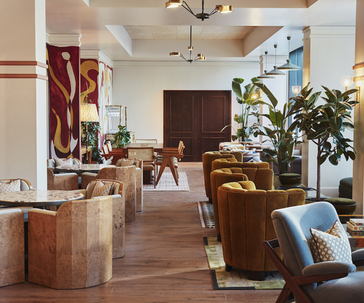
The Hoxton Shepherd’s Bush is a boutique hotel located in London, designed by AIME Studios. This retro-inspired hotel features 237 cozy bedrooms, a Thai-Americana restaurant named Chet’s, a serene terrace, a spacious lobby with a mix of earthy-toned bespoke and vintage furniture, and a communal central bar. The interiors of The Hoxton Shepherd’s Bush pay homage to the local area with references to the nearby London Transport Museum Depot and the retro transport design.
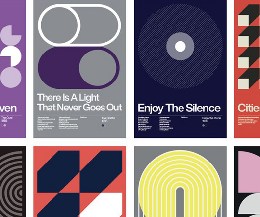
Check out this fantastic New Wave poster collection based on simple geometric shapes. Inspired by Bauhaus architecture and design as well as modernism, architecture, minimalism, and Swiss design shapes, David Vineïs, a Paris-France-based graphic designer created this stunning poster collection as a tribute to some of the best New Wave songs. Consisting of simple geometric shapes as known from good old Swiss graphic design principles, David Vineïs produced some stunning graphics that visualize ea
Typically, when someone says you’re being strung along, it’s rarely intended to communicate anything positive. But in the case of String Furniture’s modular shelving system, the design classic continues to be associated with the best of modern design – a flexible, expandable, contemporary classic with an airy aesthetic that seems to never wear out its welcome regardless of era or interior space.
Speaker: Amber Asay, Creative Director and Founder of award-winning design studio Nice People
Understanding what trends are happening and how they’re impacting the competitive landscape is crucial to providing top dollar design strategy to your clients. With so many trends coming and going, it can be overwhelming to determine which ones you should capitalize on and which ones might not be worth the trouble. In this exclusive webinar with Amber Asay, we’ll explore graphic design trends that need to die, trends that are starting to pick up and why, trends that have come and gone, and how t
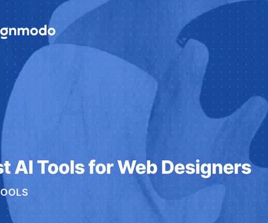
This post is originally published on Designmodo: 11 Best AI Tools for Web Designers Do you know that our beloved science fiction stories from Isaac Asimov’s books are slowly but surely becoming a reality? No, we will not see robots uprising any time soon.
Following on from Netflix’s superbowl ad that promises to show more EVs in its programmes to normalise them, the streaming platform has now released an updated graphic toolkit that connects iconography, typography and illustration. Created by Koto, the team built on the existing system but wanted to steer clear of the “over-saturated, over-done, one-dimensional” approach often seen in the tech and.
Following on from Netflix’s superbowl ad that promises to show more EVs in its programmes to normalise them, the streaming platform has now released an updated graphic toolkit that connects iconography, typography and illustration. Created by Koto, the team built on the existing system but wanted to steer clear of the “over-saturated, over-done, one-dimensional” approach often seen in the tech and.
When discussing accessibility, the first person that pops into the minds of people is probably a person in a wheelchair. Thinking about software accessibility, the next two types of disabilities might come into mind are blindness and deafness. These are three types of disabilities most people commonly think of when talking about accessibility: blindness, deaf and hard of hearing and mobility impairments.
Welcome to issue #226 of The Process , where we look closer at how the charts get made. I’m Nathan Yau, and I’m thinking about the real bits behind the charts that help you understand the data better and care a little more. Become a member for access to this — plus tutorials, courses, and guides.
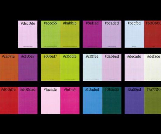
Senior designer at Christopher Doyle & Co. Stephen Grace invites creatives to look at colours differently in his new digital zine #dec0de , which turns HEX codes into words and presents them with their matching colour. Most designers worth their salt will be familiar with HEX colour codes. Comprised of three two-symbol elements, these codes are an industry standard that allows designers to describe the exact shade of colour they are working with.
Avoid “vanity interviews” with techniques from academic historians. From Teresa Torres's Continuous Discovery Habits to Marty Cagan’s Inspired , references to the importance of constant conversations with users abound. The fact is that good product managers interview customers, a lot. But most of them have never been trained to conduct those interviews.
Brands must create and share impactful content to thrive, but they have less people, tighter budgets, and fewer resources to do so. Learn how to publish and market digital content with the same professionalism as organizations with million-dollar budgets.
Paper app by WeTransfer is a popular drawing/ sketching app among designers, developers, and illustrators for its flexibility and ease of use. Creatives use it for brainstorming, mind-mapping , or prototyping. In fact, Paper is featured as one of the best note-taking apps in one of our posts. I’m a user of the Paper app, and I find it to be having a lot of features that are sought-after.
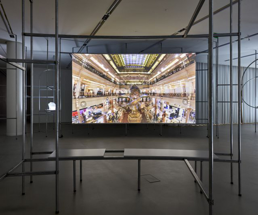
Sojung Jun, Despair to be reborn, 2020, 24min 45sec, single channel video Image Courtesy: Fondation d'entreprise Hermès, Photograph by Sangtae Kim Korean art is finally receiving the attention it deserves with the V&A's exhibition Hallyu! The Korean Wave, the launch of Frieze Seoul and the highly lauded Korean Pavilion at the Venice Biennale. The film Parasite was the first South Korean film to receive any Academy Award recognition and one of only three to win both the Palme d'Or and the Aca
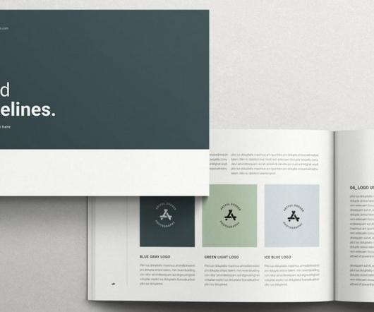
Available for download on Adobe Stock, this brand guidelines template by TemplatesForest comes with 20 fully customizable pages. The creative people at studio TemplatesForest created this easy-to-use brand guidelines template for Adobe InDesign. Designed in the landscape format, the template has been equipped with 20 customizable pages. You can choose between two standard sizes A4 and US Letter.
Eslam Muhammed is an international Art Director, 3D Digital Creator, Brand Builder, and a coffee enthusiast. He specializes in creating immersive experiences and visuals using new digital formats. Eslam collaborates with individuals, teams, and businesses to produce outstanding work that inspires people to see, think, feel and act in ways that were previously unimaginable.
Thomas Edison once said “Vision without execution is hallucination.” This statement applies not just to invention, but to graphic design. One of the greatest strengths of graphic designers is the ability to first develop a concept and then execute it to make it real. From visualization and ideation all the way through to actuation and execution, each step of this process takes skill and expertise.
Audience recordings of live concerts date back to the late 1960s. By the mid-70s, with the advent of high-quality portable tape decks, many major markets in America had at least one fearless taper. The most celebrated audience taper of the period, Mike Millard, recorded in and around Southern California beginning in 1974 and continuing into the early 90s.
Lee Madgwick is a UK-based artist whose paintings are a window into a dreamlike atmosphere that takes us on an ethereal journey to a forgotten place. His works are infused with a potent realism that draws us in and holds us spellbound. Madgwick’s paintings depict houses and other large structures that are situated in secluded rural areas and seem to be out of place from their surroundings.
Enhanced by AR, a printed annual report by Mucho brings order to chaotic typographic illustrations to reflect the University of California’s investment strategy.
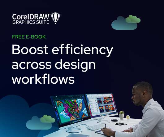
As the design industry evolves, teams are facing new challenges and a need to produce more outstanding creative work than ever. Leaders must learn how to adapt their processes to solve today’s—and tomorrow’s—unique design challenges. In this e-book, you’ll learn how to establish your creative workflow and leverage the power of CorelDRAW® Graphics Suite to streamline the entire design process, from start to finish.
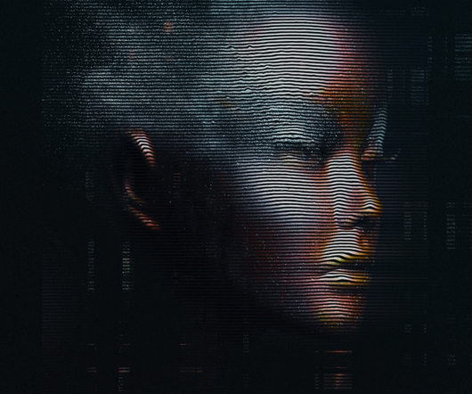
Digitalized - futuristic illustrations abduzeedo 0216—23 We have posted projects from RETOKA , but we’re always amazed with the work they produce, exploring where digital art meets futuristic design! This innovative studio has recently unveiled a set of illustrations that will leave you in awe. The series features digitalized portraits of humanoids that look like holograms, and they are simply mesmerizing.
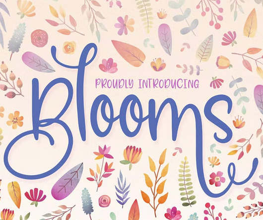
Here are the best spring fonts (free and premium) that will add life through flowers, blooms, and other natural elements. The post 30+ Best Spring Fonts for Fresh Designs appeared first on Vandelay Design.
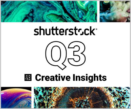
In today’s competitive markets, how do you make sure that your content not only stands out but performs well? How can you predict whether certain design choices will result in clicks, engagement, downloads, and other drivers of ROI? Shutterstock’s Creative Insights Report (Q3) is your window into the hottest trends that are transforming the creative world.
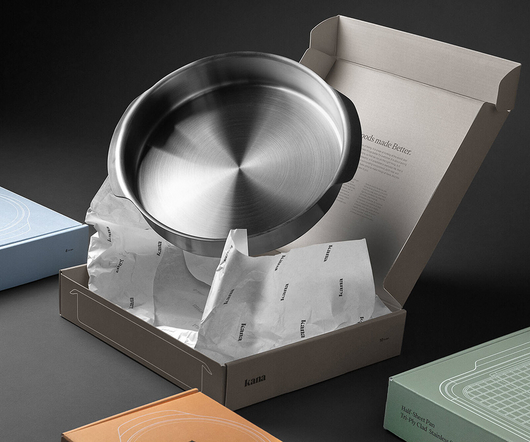
Functional kitchenware is wonderful, but when it’s also aesthetically pleasing we’re likely to love it all the more. Meet Milo bakeware , Kana’s newest addition to the brand. Ergonomically designed with large handles, tri-ply clad stainless steel, and an aluminum core for even heat distribution and retention, this dishwasher-safe bakeware features all of the strength and versatility that we love.
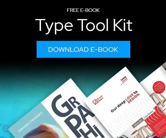
Download this free eBook to learn how you can create stunning typography, using the basics, such as placing text, to advanced controls like ligatures, variable fonts, effects, tracking, range kerning, and everything in between. Learn how to: Use Character Control to add variety to your font styles. Use Paragraph Control to manage spacing, alignment, justification and more.
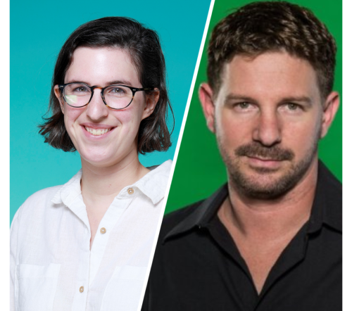
Speaker: Eden Spivak, Design Expert and Editor at Wix & Nir Horesh, Accessibility Lead and Senior Product Manager at Wix
When we design products or websites for people like ourselves, there are many others who are, as a result, left out. From visually impaired users who rely on assistive technology, to people with a temporary injury such as a broken arm, tech users are forever diverse and beautifully unique. The products we design can, and should, reflect the extremely wide range of human experiences and needs.
We organize all of the trending information in your field so you don't have to. Join 66,000+ users and stay up to date on the latest articles your peers are reading.
You know about us, now we want to get to know you!
Let's personalize your content
Let's get even more personalized
We recognize your account from another site in our network, please click 'Send Email' below to continue with verifying your account and setting a password.


Let's personalize your content