This site uses cookies to improve your experience. To help us insure we adhere to various privacy regulations, please select your country/region of residence. If you do not select a country, we will assume you are from the United States. Select your Cookie Settings or view our Privacy Policy and Terms of Use.
Cookie Settings
Cookies and similar technologies are used on this website for proper function of the website, for tracking performance analytics and for marketing purposes. We and some of our third-party providers may use cookie data for various purposes. Please review the cookie settings below and choose your preference.
Used for the proper function of the website
Used for monitoring website traffic and interactions
Cookie Settings
Cookies and similar technologies are used on this website for proper function of the website, for tracking performance analytics and for marketing purposes. We and some of our third-party providers may use cookie data for various purposes. Please review the cookie settings below and choose your preference.
Strictly Necessary: Used for the proper function of the website
Performance/Analytics: Used for monitoring website traffic and interactions
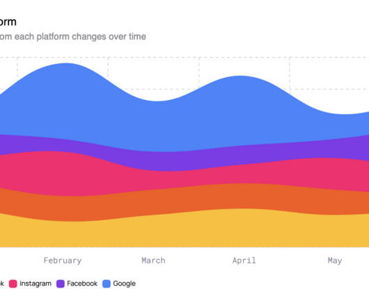
Here we explore the evolving world of line charts and how they’re shaping the nature of modern data visualization. Line charts are a cornerstone of data storytelling. However, their design continues to evolve to accommodate our ever-demanding and real-time data needs. Sampling data based on days, weeks, months, and years.
Graphic designers work with one of the most data-intensive forms of media, meaning their data size can quickly swell. The worst part is that, … The post How to Unify, Sort, and Protect Your Graphic and Other Data Sets across Platforms first appeared on Graphic Design Junction. You have partially finished files.
This trend is not just about using artificial intelligence to assist in design tasks but about leveraging machine learning algorithms to generate complex, data-driven designs autonomously. Data-Driven Creativity: Generative design enables creatives to harness data as a design tool. What is AI-Powered Generative Design?
Understanding that these are just statistical models that generate data purely based on learned data is key, and progress has certainly plateaued," adds Alex. "DALL-E still struggles when responding to feedback about specific attributes and changes to details.
Using Shutterstock.AI, our proprietary AI tool, we’ve crunched 700 billion industry data points to provide an in-depth look at what kind of design and marketing content engages audiences and drives results. Download this report to discover: The top visual themes and imagery that draw the most attention in the market.
Because health is becoming inextricably linked with wearables and tech, but someone has to make sense of all that data, or it's next to useless. Visualising health data is becoming the 'new luxury,'" stresses Sarah Williams, co-CEO of Beardwood&Co. The key focus? Making the unseen visible and the future predictable."
Data enthusiasts are in for a treat with Tiziana Alocci, award-winning data artist and founder of NECESSITY.INK. As co-founder of Typeradio.org and a member of the prestigious Alliance Graphique Internationale, Liza brings a global perspective that's sure to provoke and inspire.
Its annual Pinterest Predicts report, for example, pulls all its millions of data points together to highlight new styles and themes. And its user-friendly interface and endless supply of ideas means it continues to be popular 15 years from its founding. What makes Pinterest especially unique is its ability to predict future trends.
While tools like Figma excel at crafting pixel-perfect interfaces, they fall short when it comes to capturing dynamic interactions — animations, conditional behaviors, or real-time data feedback. Data points should be enhanced with visual indicators for up/down trends and the chart should support interactive touch/mouse events.
Product managers (PMs) must gather and analyze product data, create product roadmaps for multiple stakeholders, identify roadblocks, and track a long list of milestones—all while staying on a tight schedule. Using a visual planning tool like MindManager® can make this process a whole lot easier.
Next Level Data Visualization 9. The design can then adjust based on this immediate data. Key Elements of Personalization in 2025: Uses real user data to shape things like layout, colors, and content. This kind of integration makes data feel like a natural part of your workflow rather than an afterthought. View example 8.
In an industry where technical complexity often translates into visual confusion, Eddie Opara and his team at Pentagram have crafted something remarkable for MIND—a data security platform that operates at machine speed. With 85% of organisations suffering data loss events annually and breach costs averaging $4.88
Data artist Tiziana Alocci followed with a provocative question: "Is 'listening' our most radical design tool?" Her exploration of transforming invisible data into poetic audiovisual installations demonstrated why her work with clients like the British Library and Wired UK has garnered such acclaim.
“Lossy” compression (JPEG) squeezes hard and loses some water (data) but makes the file smaller. “Lossless” compression (PNG) is a gentle squeeze – it keeps all the data but a larger file size. File Extension Description.BMP Adobe Photoshop Document is used to create layered images.TIF /.TIFF
It's a subtle, living mechanic; each article contains a log of the wind data in its code as a kind of Easter Egg." "But here's the twist: wind speed and direction in St. Gallen, Switzerland—Frontify's HQ—nudges the wheel unpredictably off-centre. Another favourite of Daniel's—yet to be released—is an expanded version of Conway's Game of Life.
Data Merge: This is arguably InDesign’s most powerful automation tool. Pro Tip: To fully automate your design workflow for a multi-page catalog, create a template with Master Pages for structure, Object Styles for image frames, and then use Data Merge to pour in all the product information from a single spreadsheet.
Rather than replacing the designer, AI acts as a co-creator, helping designers test concepts quickly, refine aesthetics, and even personalize design elements based on data insights. This collaboration between humans and AI allows for creative possibilities that were previously challenging or time-consuming.
Design assets were continuously refined based on live data, from App Store screenshots to audience-specific ad copy, proving that personality and performance can, in fact, coexist. Kin stores all memory locally and uses full encryption, setting it apart from enterprise AI tools built on mass data harvesting.
Download Digital Marketing Insights Elevate your digital marketing strategy with our insights design template, featuring a modern and visually appealing layout that effectively presents data, trends, and key metrics for straightforward analysis.
Consequently, they inherit all the biases, stereotypes, and cultural blind spots present in that data. We need to know what data our tools are trained on. It reflects our data, our biases, and our collective visual language back at us. Simultaneously, the creators of AI platforms must be pushed toward greater transparency.
Sales Data : Take a closer look at your sales figures. This data will help you align your brand strategies with what drives revenue. Key Metrics to Track Identifying key performance indicators (KPIs) will give you quantifiable data to assess your rebrand's impact. Where do they falter?
Storytelling works in ads, data displays, or project boards. By picking a clear theme or mood, designers set the stage. Every part must support that story—graphics, shapes, and space help guide meaning. A bold image can express tension. A soft tone may offer peace. When images follow a clear path, the viewer stays focused.
We're heading toward dynamic systems that adapt in real time and brand identities that aren't just animated – they're responsive, alive, and shaped by data. And when AI starts to shape motion experiences based on data, that's when things get interesting. The future of motion branding Future-proofed brands have to move.
wpDataTables – Up to 70% Off wpDataTables is the best choice for anyone creating informative tables and charts from large amounts of complex data. wpDataTables offers an immense set of data management tools and chart-building features, while providing straightforward approaches to completing tasks. Check out BeTheme 2.
Here's how to ensure your layout remains fresh and compelling: Regularly Analyse Data: Use analytics tools to review your key performance indicators (KPIs) consistently. Leverage Data: Use accurate user data to understand how your audience interacts with your layout. A/B Testing (Again!)
The new identity also foregrounds Rocket's data-driven approach through a structure that simplifies complex information, making homeownership easier to understand. "This shift makes the brand more relatable and ensures Rocket is seen not only as a mortgage provider but also as a passionate advocate for homeownership," He adds.
Practice brought abstract data to life, transforming complex insights into tangible, digestible visuals. The copy captures the essence of Clarifys mission: empowering healthcare providers to make data-driven decisions with ease. This concept informs everything, from the logotype to dynamic web experiences.
A/B Testing for Video Ads Now, let's chat about A/B testing—one of the best ways to refine your video ads based on accurate data. Analyse Results : Once enough data has been collected, consider watch time, engagement, and conversion metrics and review the performance of both versions. Increased engagement and a higher conversion rate.
Responsible design “There are parts of the world where mobile data is prohibitively expensive, and where there is little or no broadband infrastructure.” “ I Used the Web for a Day on a 50 MB Budget ” Chris Ashton One of the biggest assumptions we make is that people interacting with our designs have a good wifi connection and a wide screen monitor.
Product Data Sheet Template Photoshop PSD Minimal Product Data Sheet Template InDesign INDD Technical Data Sheet Template Photoshop PSD Software Company Data Sheet InDesign INDD Project Fact Sheet Template InDesign INDD Research Fact Sheet Template InDesign INDD Cashflow Report Templates Every business needs to know where they stand financially.
Some data from Q2 2025 is in, and it paints a clear picture of where we are and where we are heading. This data confirms a fundamental shift: AI is now a standard part of the creative toolkit. But the data suggests a shift in the type of work, not an elimination of it. This is not speculation.
See how waves & data shape a unique financial visual identity. Its simple, memorable, and hints at movement and data. The provided visuals show the identity applied seamlessly across various touchpoints: Digital: The website and integrated TradingView dashboard look clean and data-driven, using the pattern and gradient effectively.
By converting a layer to a Smart Object (right-click on the layer > Convert to Smart Object), you protect the original source data. Have you ever shrunk an image and then tried to scale it back up, only to find it’s a blurry mess? That’s destructive editing.
Creating a polished and visually appealing annual report is essential for any organization aiming to communicate its achievements, goals, and financial data effectively. Step 5: Update Data Visualizations and Tables For financial sections, the template includes tables and charts.
For Biersteker, data provides unique insights into changes on the ground, and through a recent collaboration with the Indonesian Coffee and Cocoa Research Institute (ICCRI), he devised a way to literally illuminate environmental impacts. ” Explore more on Bierksteker’s website and Instagram.
This invoice will help you in your business to save time, organize your product data, and identify your customers and items. Download Organic Invoice Template Professional invoice samples of the highest quality for any business or individual use. It is designed for individual and corporate use.
She is constantly evolving in real-time as her brain takes in tons of sensory data. Katherine Duclos So much of Duclos processing happens unconsciously, and so there are times when she will wake up with new knowledge or the capacity to understand something that she didnt before.
This technology allows creators to attach tamper-evident attribution data to their work, providing a clear way to see who made an image and if it has been altered. Moreover, the Content Authenticity Initiative, which Adobe co-founded, is working to create a standard for digital content provenance.
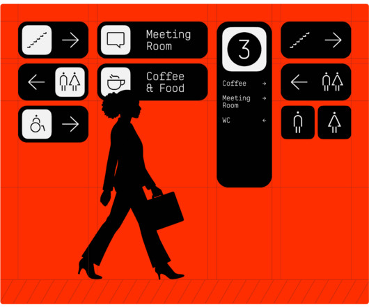
This thoughtful approach to data visualization speaks to the "Science" aspect, presenting complex information in a clear, organized manner. Consider the event schedules and timelines presented. The graphic representation of time slots and events, using distinct shapes and a clear visual hierarchy, makes information digestible.
This specific training data is what allows Adobe to state that the content you generate is “commercially safe,” a massive advantage for professional designers, marketers, and agencies who need to use their creations without worrying about copyright infringement.
Use this data to identify guests who may need follow-up communications. These integrations reduce manual data entry and minimize planning errors. Tracking capabilities help you monitor invitation performance and guest responses. Most platforms provide analytics showing open rates, click-through rates, and response patterns.
Data-Driven Personalisation: This is a big one. AI can create dynamic visual content that adapts to user data. A motion graphic that visualises the data is compelling. It uses personal listening data to create a unique, shareable, and highly branded visual story for millions of individual users. That’s AI in action.
The dots and chevrons represent data points and movement. Data shows it takes 5-7 impressions for a consumer to form a memory of a logo [ source ]. Because their services—like “cloud computing,” “data analytics,” or “social connection”—are intangible and difficult to represent literally.
You could use this time to learn how to create interactive PDFs with embedded videos and links, design complex data-rich annual reports, or master GREP styles to automate formatting. Take the course Adobe InDesign : Many designers only scratch the surface of InDesign.
We organize all of the trending information in your field so you don't have to. Join 66,000+ users and stay up to date on the latest articles your peers are reading.
You know about us, now we want to get to know you!
Let's personalize your content
Let's get even more personalized
We recognize your account from another site in our network, please click 'Send Email' below to continue with verifying your account and setting a password.


Let's personalize your content